
Learn more about Rad Controls for Windows 8 here
In last blog post we learnt to work with RadDataGrid in three simple steps. In this post let us have a look on how we could work with Columns in RadDataGrid. Before we move ahead and understand how to work with columns width and columns header, let us have some understanding on columns in RadDataGrid. There are two kinds of columns in RadDataGrid.

TextColumn renders each cell value as System.String object whereas TemplateColumn renders as DataTemplate. In this post we will focus our discussion on TextColumn. It inherits DataGridColumn.
It got following important properties
- Header
- HeaderStyle
- SizeMode
- Width
- SortDirection

We will use Product business object from LAST POST . You will notice in output of last post that RadDataGrid columns were taking default width. Width of column was stretched to maximum. We got output as following

Now if you want to set width of each columns you need to follow following steps
Make sure AutoGenerateColumns property is set to false

After this you need to manually create columns. In column creation you need to set width of the column. Create RadDataGrid.Columns inside RadDataGrid.

After creating RadaDataGrid.Columns you need to create RadDataGrid.Columns. In columns you can set
- Header : Set value of header text
- Width : Fixed width of the column
- PropertyName : Set this as property name of business object you want to display in this column.

So putting all together you can create fixed width text column in RadDataGrid as following. We have XAML from previous post. Modified XAML with fixed column width is as following
<Grid Background="{StaticResource ApplicationPageBackgroundThemeBrush}">
 <telerik:RadDataGrid
 x:Name="ProductGrid"
 AutoGenerateColumns="False"
 Width="500">
 <telerik:RadDataGrid.Columns>

<telerik:DataGridTextColumn
 PropertyName="ProductName"
 Header="Name"
 Width="200"/>
 <telerik:DataGridTextColumn
 PropertyName="ProductPrice"
 Header="Price"
 Width="50"/>
 <telerik:DataGridTextColumn
 PropertyName="ProductType"
 Header="Type"
 Width="150"/>
 <telerik:DataGridTextColumn
 PropertyName="InStock"
 Header="In Stock"
 Width="100"/>
 </telerik:RadDataGrid.Columns>
 </telerik:RadDataGrid>
 </Grid>
On running application you will get RadDataGrid with fixed column width as following

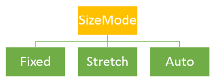
Other important property of column is SizeMode. This property can be set with following three values

- Width property takes effect only when SizeMode is set to Fixed.
- If SizeMode is set to Auto then column takes only width which is required. It overrides value of width.
- If SizeMode is set to Strech then column will override width value and stretch to all available space.

If you modify above RadDataGrid with setting SizeMode property of fourth column as Auto then RadDataGrid will render as following

In this post we used some of the discussion from last post so did not discuss about binding and Product class in earlier part of this post. However For your reference find definition of business class Product below
public class Product
 {

 public string ProductName { get; set; }
 public double ProductPrice { get; set; }
 public string ProductType { get; set; }
 public bool InStock { get; set; }
 }
ItemSource of RadDataGrid is set as below,
protected override void OnNavigatedTo(NavigationEventArgs e)
 {

this.ProductGrid.ItemsSource = GetProducts();
 }
GetProducts() class is defined as below,
private List<Product> GetProducts()
 {
 List<Product> lstProduct = new List<Product>
 {
 new Product
 {
 ProductName ="Pen",
 ProductPrice = 100,
 ProductType = "Education",
 InStock = true
 },
 new Product
 {
 ProductName ="Pencil",
 ProductPrice = 50,
 ProductType = "Education",
 InStock = false
 },
 new Product
 {
 ProductName ="Math Book",
 ProductPrice = 345,
 ProductType = "Education",
 InStock = true
 },
 new Product
 {
 ProductName ="Ball",
 ProductPrice = 23,
 ProductType = "Sports",
 InStock = true
 },
 new Product
 {
 ProductName ="Cricket Bat",
 ProductPrice = 560,
 ProductType = "Sports",
 InStock = true
 },
 new Product
 {
 ProductName ="Baseball Bat",
 ProductPrice = 550,
 ProductType = "Sports",
 InStock = false
 },
 };

return lstProduct;
 }
In this way you can work with column width. I hope you find this post useful. Thanks for reading.
 Helping Ninja Technologists
Pingback: How to set Column Header Style of Telerik RadDataGrid in XAML based Windows Store Application | Telerik Helper
Pingback: How to work with Images in RadDataGrid in XAML based Windows Store Application | Telerik Helper