
In our quest to beautify the web, we present more “cool” UI available for the plain & humble Kendo UI button. Kendo UI provides four types of buttons:
- Button
You can use Kendo button in your application. To learn how, follow my previous article :
Beautiful Buttons with Kendo UI in Angular v5 app
- ButtonGroup
- DropDownButton
- SplitButton
This post will cover the “ButtonGroup” control.
ButtonGroup
ButtonGroup is a collection of two or more Buttons. Some features of this:
- Each button in the ButtonGroup can be separately configured depending on the requirements of your project.
- You can use any type of button in a ButtonGroup, like Button, Icon Button, or Image Button. Again, it depends on your project requirement.
- Kendo UI ButtonGroup also gives you selection modes. By default, it is Multi-selection with an option to change it into single mode.
For using Kendo UI buttons, you need to install Kendo in your Angular application. To learn the process of installation, follow my previous article and make your Angular app ready.
Power up your Angular 5 Application with Kendo UI
When ready with your Angular v5 app along with Kendo UI Buttons module, follow the following process.
Let us use three Kendo buttons in our app like this (output would be like the image):

kendoButton>Yes
kendoButton>No
kendoButton>Cancel
Now, if you need to use ButtonGroup, then write –
as Angular Directive for binding more than one buttons in a group.
kendoButton >Yes
kendoButton >No
kendoButton >Cancel
Now, serve your Angular app with “ng serve –open” again and see the difference in output:
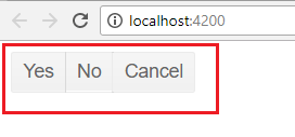
This looks much better as a ButtonGroup.
If you select or click any button, it is not immediately visible which button was selected. To include this important functionality, you can use toggable property of kendoButton and make it “true”:
[togglable]=“true”
The code now looks like the following:
kendoButton [togglable]=“true”>Yes
kendoButton [togglable]=“true”>No
kendoButton [togglable]=“true”>Cancel
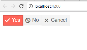
Now, if you click any button in ButtonGroup, it’ll be in selected mode.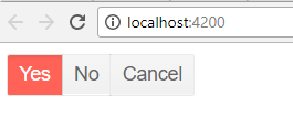
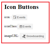
Icon buttons in ButtonGroup
Let’s further improve this by including an icon with the button. Here is an example of how you can use Icon button in ButtonGroup:
kendoButton [togglable]=“true” [icon]=“‘check'”>Yes
kendoButton [togglable]=“true” [icon]=“‘cancel'”>No
kendoButton [togglable]=“true” [icon]=“‘close'”>Cancel
The result is much better with visual cues as follows:
Here are some more icons available for Kendo UI Icon buttons.
https://www.telerik.com/kendo-angular-ui/components/styling/icons/#toc-actions
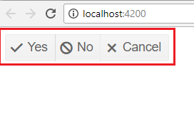
Kendo UI ButtonGroup Selection Mode:
Using Selection mode, you can restrict the number of buttons that can be selected in a ButtonGroup. By default, the selection mode of the ButtonGroup is set to multiple. If you want to select one at the time, set selection to single.
[selection]=“‘single'”
Use this code.
<kendo-buttongroup [selection]=“‘single'”>
kendoButton [togglable]=“true” [icon]=“‘check'”>Yes
kendoButton [togglable]=“true” [icon]=“‘cancel'”>No
kendoButton [togglable]=“true” [icon]=“‘close'”>Cancel
Again, serve your Angular App (ng serve –open). Now, user can select only one option at a time.

Disabled ButtonGroup
You can enable or disable the ButtonGroup or an individual button in a ButtonGroup for Angular App.
“disable” is a property for both, ButtonGroup or button. Set “disable” to “true” if you want to disable a ButtonGroup. By default, Kendo UI ButtonGroup sets it to “false” that’s why all the buttons in a group are enabled.
To disable a specific button, set its own disabled attribute to true and leave the disabled attribute of the ButtonGroup undefined. If you define the disabled attribute of the ButtonGroup, it will take precedence over the disabled attributes of the underlying buttons and they will be ignored.
[disabled]=“true”
Example:
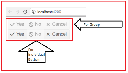
Here are two ButtonGroups in which I used “disable” for ButtonGroup level and also for individual button.
<kendo-buttongroup [selection]=“‘single'” [disabled]=“true”>
kendoButton [togglable]=“true” [icon]=“‘check'”>Yes
kendoButton [togglable]=“true” [icon]=“‘cancel'”>No
kendoButton [togglable]=“true” [icon]=“‘close'”>Cancel
<kendo-buttongroup [selection]=“‘single'”>
kendoButton [togglable]=“true” [icon]=“‘check'”>Yes
kendoButton [togglable]=“true” [icon]=“‘cancel'” [disabled]=“true”>No
kendoButton [togglable]=“true” [icon]=“‘close'”>Cancel
Watch the output:
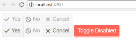
Toggle Disabled
You can toggle “disabled” property at run time using component of Angular app. Edit your “app.component.ts” or any component code file where you want to write the function to toggle disable.
export
class AppComponent {
public isDisabled: boolean = true;
public toggleDisabled(): void {
this.isDisabled = !this.isDisabled;
}
}
Now, create a new kendoButton in the app where you want to bind this function.
<button
kendoButton (click)=“toggleDisabled()” [primary]=“true”>Toggle Disabled
And set [disabled]=“isDisabled” in HTML view. Like:
<kendo-buttongroup [selection]=“‘single'” [disabled]=“isDisabled”>
kendoButton [togglable]=“true” [icon]=“‘check'”>Yes
kendoButton [togglable]=“true” [icon]=“‘cancel'”>No
kendoButton [togglable]=“true” [icon]=“‘close'”>Cancel
<kendo-buttongroup [selection]=“‘single'”>
kendoButton [togglable]=“true” [icon]=“‘check'”>Yes
kendoButton [togglable]=“true” [icon]=“‘cancel'” [disabled]=“isDisabled”>No
kendoButton [togglable]=“true” [icon]=“‘close'”>Cancel
<button
kendoButton (click)=“toggleDisabled()” [primary]=“true”>Toggle Disabled
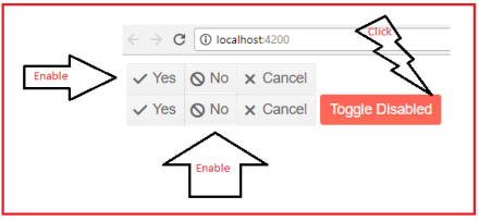
Click on the button to Disable Toggle.
After clicking on “Toggle to Disabled”, your all disabled ButtonGroups or Buttons will be enabled.
Hope you enjoyed reading this article. Stay tuned for next one on “Kendo UI Dropdown Button”.


 Helping Ninja Technologists