Join me for webinar on 25th April 2013: Create faster Enterprise Apps for Windows 8 and win Telerik Ninja T-shirt

Learn more about Rad Controls for Windows 8 here

If you are a Windows Store App developer and want to quickly create Enterprise App then this webinar is for you.

Register here to attend webinar

image

You will learn to create Enterprise App harnessing goodness of DataGrid in this webinar.

image

We will follow following agenda in webinar ,

  • Introduction of RadControls for Windows 8
  • First look of all RadControls
  • Setting up environment to work with RadControls for Windows 8.
  • Getting started with RadDataGrid
  • Working with different kinds of columns in RadDataGrid
  • Working with Services in RadDataGrid
  • Charts in RadDataGrid
  • Grouping and Filtering in RadDataGrid.

Register here to attend webinar

In this webinar we will focus on Data Grid along with other controls. During webinar we will be selecting two active participants from the webinar and sending them the much in demand Telerik Ninja T-Shirt. You will be coming, right?

image

Register here to attend webinar

Learn more about Rad Controls for Windows 8 here

See you in webinar, If you have any query reach me at dhananjay.kumar@telerik.com

Advertisement

How to work with Images in RadDataGrid in XAML based Windows Store Application

Learn more about Rad Controls for Windows 8 here

Before you start with this post I recommend you to read following blog posts to get it started with RadDataGrid.

Video: Getting started with RadDataGrid in XAML based Windows Store Application

Three Steps to work with RadDataGrid in XAML based Windows Store Application

In this post we will take a look on working with Images as column value in RadDataGrid. As we discussed in this post that there are two types of columns in RadDataGrid.

image

To work with images we need to work with TemplateColumns. TemplateColumn uses DataTemplate to define content of column. To start with let us create business class Product. We will display collection of Products in RadDataGrid. Product class is defined as following. Along with other properties there is a property of Product Image. ProductImage property will hold URL of Image to be displayed for each Products.


public class Product
 {
 public string ProductName { get; set; }
 public double ProductPrice { get; set; }
 public string ProductType { get; set; }
 public BitmapImage ProuctImage { get; set; }
 }

Next let us create collection of Products locally. GetProducts function will return list of Products. We will bind this function as ItemSource of RadDataGrid.


private List<Product> GetProducts()
 {
 List<Product> lstProduct = new List<Product>()
 {
 new Product
 {
 ProductName = "Pen",
 ProductPrice = 100,
 ProductType = "Education",
 ProuctImage = new BitmapImage(new Uri("/ProductImages/Pen.jpg",UriKind.Relative))
 },
 new Product
 {
 ProductName ="Pencil",
 ProductPrice = 50,
 ProductType = "Education",
 ProuctImage = new BitmapImage(new Uri("/ProductImages/Pencil.jpg",UriKind.Relative))

 },
 new Product
 {
 ProductName ="Math Book",
 ProductPrice = 345,
 ProductType = "Education",
 ProuctImage = new BitmapImage(new Uri("/ProductImages/Mathbook.jpg",UriKind.Relative))

 },
 new Product
 {
 ProductName ="Ball",
 ProductPrice = 23,
 ProductType = "Sports",
 ProuctImage = new BitmapImage(new Uri("/ProductImages/Ball.jpg",UriKind.Relative))

 },
 new Product
 {
 ProductName ="Cricket Bat",
 ProductPrice = 560,
 ProductType = "Sports",
 ProuctImage = new BitmapImage(new Uri("/ProductImages/Cricketbat.jpg",UriKind.Relative))

 },
 new Product
 {
 ProductName ="Baseball Bat",
 ProductPrice = 550,
 ProductType = "Sports",
 ProuctImage = new BitmapImage(new Uri("/ProductImages/Baseballbat.jpg",UriKind.Relative))

 },
 };
 return lstProduct;
 }

As of now we have data source in place. Next we need to create RadDataGrid. After creating RadDataGrid we will create DataGridTemplateColumn with DataTemplate. To create RadDataGrid with image as one of the column value we need to follow following steps inside RadDataGrid.

Step 1: Create DataGridTemplateColumn

Step 2: Create DataGridTemplateColumn.CellContentTemplate

Step 3: Create DataTemplate and put Image inside this

We can create RadDataGrid Column with Image in column value as following,

image

We can create columns for each properties in the same way we created for ProductImage property. Final RadDataGrid with columns can be created as following,


<Page
 x:Class="RadDataGridProductDemo.MainPage"
 xmlns="http://schemas.microsoft.com/winfx/2006/xaml/presentation"
 xmlns:x="http://schemas.microsoft.com/winfx/2006/xaml"
 xmlns:local="using:RadDataGridProductDemo"
 xmlns:d="http://schemas.microsoft.com/expression/blend/2008"
 xmlns:mc="http://schemas.openxmlformats.org/markup-compatibility/2006"
 xmlns:telerik="using:Telerik.UI.Xaml.Controls.Grid"
 mc:Ignorable="d">

<Grid Background="{StaticResource ApplicationPageBackgroundThemeBrush}">
 <telerik:RadDataGrid x:Name="ProductGrid" AutoGenerateColumns="False">
 <telerik:RadDataGrid.Columns>
 <telerik:DataGridTemplateColumn Header="Name" >
 <telerik:DataGridTemplateColumn.CellContentTemplate>
 <DataTemplate>
 <TextBlock Text="{Binding ProductName}"
 VerticalAlignment="Center"
 HorizontalAlignment="Center"/>
 </DataTemplate>
 </telerik:DataGridTemplateColumn.CellContentTemplate>
 </telerik:DataGridTemplateColumn>
 <telerik:DataGridTemplateColumn Header="Photo" >
 <telerik:DataGridTemplateColumn.CellContentTemplate>
 <DataTemplate>
 <StackPanel>
 <Image Source="{Binding ProductImage}"
 Height="100"
 Width="100" />
 </StackPanel>
 </DataTemplate>
 </telerik:DataGridTemplateColumn.CellContentTemplate>
 </telerik:DataGridTemplateColumn>
 <telerik:DataGridTemplateColumn Header="Price" >
 <telerik:DataGridTemplateColumn.CellContentTemplate>
 <DataTemplate>
 <TextBlock Text="{Binding ProductPrice}"
 VerticalAlignment="Center"
 HorizontalAlignment="Center"/>
 </DataTemplate>
 </telerik:DataGridTemplateColumn.CellContentTemplate>
 </telerik:DataGridTemplateColumn>
 <telerik:DataGridTemplateColumn Header="Type" >
 <telerik:DataGridTemplateColumn.CellContentTemplate>
 <DataTemplate>
 <TextBlock Text="{Binding ProductType}"
 VerticalAlignment="Center"
 HorizontalAlignment="Center"/>
 </DataTemplate>
 </telerik:DataGridTemplateColumn.CellContentTemplate>
 </telerik:DataGridTemplateColumn>

 </telerik:RadDataGrid.Columns>
 </telerik:RadDataGrid>
 </Grid>
</Page>

Now go ahead and run application. You will find Product Images as one of the column value.

image

In this way you can work with Images as column value in RadDataGrid. I hope you find this post useful. Thanks for reading.

Learn more about Rad Controls for Windows 8 here

Working with Columns width in RadDataGrid in XAML based Windows Store Application

Learn more about Rad Controls for Windows 8 here

In last blog post we learnt to work with RadDataGrid in three simple steps. In this post let us have a look on how we could work with Columns in RadDataGrid. Before we move ahead and understand how to work with columns width and columns header, let us have some understanding on columns in RadDataGrid. There are two kinds of columns in RadDataGrid.

image

TextColumn renders each cell value as System.String object whereas TemplateColumn renders as DataTemplate. In this post we will focus our discussion on TextColumn. It inherits DataGridColumn.

It got following important properties

  1. Header
  2. HeaderStyle
  3. SizeMode
  4. Width
  5. SortDirection

image

We will use Product business object from LAST POST . You will notice in output of last post that RadDataGrid columns were taking default width. Width of column was stretched to maximum. We got output as following

image

Now if you want to set width of each columns you need to follow following steps

Make sure AutoGenerateColumns property is set to false

image

After this you need to manually create columns. In column creation you need to set width of the column. Create RadDataGrid.Columns inside RadDataGrid.

image

After creating RadaDataGrid.Columns you need to create RadDataGrid.Columns. In columns you can set

  1. Header : Set value of header text
  2. Width : Fixed width of the column
  3. PropertyName : Set this as property name of business object you want to display in this column.

image

So putting all together you can create fixed width text column in RadDataGrid as following. We have XAML from previous post. Modified XAML with fixed column width is as following


<Grid Background="{StaticResource ApplicationPageBackgroundThemeBrush}">
 <telerik:RadDataGrid
 x:Name="ProductGrid"
 AutoGenerateColumns="False"
 Width="500">
 <telerik:RadDataGrid.Columns>

<telerik:DataGridTextColumn
 PropertyName="ProductName"
 Header="Name"
 Width="200"/>
 <telerik:DataGridTextColumn
 PropertyName="ProductPrice"
 Header="Price"
 Width="50"/>
 <telerik:DataGridTextColumn
 PropertyName="ProductType"
 Header="Type"
 Width="150"/>
 <telerik:DataGridTextColumn
 PropertyName="InStock"
 Header="In Stock"
 Width="100"/>
 </telerik:RadDataGrid.Columns>
 </telerik:RadDataGrid>
 </Grid>

On running application you will get RadDataGrid with fixed column width as following

image

Other important property of column is SizeMode. This property can be set with following three values

image

  1. Width property takes effect only when SizeMode is set to Fixed.
  2. If SizeMode is set to Auto then column takes only width which is required. It overrides value of width.
  3. If SizeMode is set to Strech then column will override width value and stretch to all available space.

image

If you modify above RadDataGrid with setting SizeMode property of fourth column as Auto then RadDataGrid will render as following

image

In this post we used some of the discussion from last post so did not discuss about binding and Product class in earlier part of this post. However For your reference find definition of business class Product below


public class Product
 {

 public string ProductName { get; set; }
 public double ProductPrice { get; set; }
 public string ProductType { get; set; }
 public bool InStock { get; set; }
 }

ItemSource of RadDataGrid is set as below,


protected override void OnNavigatedTo(NavigationEventArgs e)
 {

this.ProductGrid.ItemsSource = GetProducts();
 }

GetProducts() class is defined as below,

private List<Product> GetProducts()
 {
 List<Product> lstProduct = new List<Product>
 {
 new Product
 {
 ProductName ="Pen",
 ProductPrice = 100,
 ProductType = "Education",
 InStock = true
 },
 new Product
 {
 ProductName ="Pencil",
 ProductPrice = 50,
 ProductType = "Education",
 InStock = false
 },
 new Product
 {
 ProductName ="Math Book",
 ProductPrice = 345,
 ProductType = "Education",
 InStock = true
 },
 new Product
 {
 ProductName ="Ball",
 ProductPrice = 23,
 ProductType = "Sports",
 InStock = true
 },
 new Product
 {
 ProductName ="Cricket Bat",
 ProductPrice = 560,
 ProductType = "Sports",
 InStock = true
 },
 new Product
 {
 ProductName ="Baseball Bat",
 ProductPrice = 550,
 ProductType = "Sports",
 InStock = false
 },
 };

return lstProduct;
 }

In this way you can work with column width. I hope you find this post useful. Thanks for reading.

Learn more about Rad Controls for Windows 8 here

How to work with Pie Charts in JavaScript based Application for Windows 8

In this post we will take a look on working with Pie Charts in JavaScript based Application for Windows Store. We will follow step by step approach in this blog post.

Step 1: Add References

Very first we will add Telerik JS and CSS files references in the project. If first time you are working with Rad Controls in Windows 8, I suggest you to read blog post to setup the environment

After adding the files in the project we need to refer them on the html file . Files can be referred as given in following code snippet.

<!--Telerik References -->
 <script src="/Telerik.UI/js/jquery.js"></script>
 <script src="/Telerik.UI/js/ui.js"></script>
 <link href="/Telerik.UI/css/dark.css" rel="stylesheet" />
 <link href="/Telerik.UI/css/common.css" rel="stylesheet" />

Step 2: Create a Chart

A Pie chart can be created by setting data-win-control attribute of a div as Telerik.UI.RadChart and setting series type as pie


<div id="performancechart" data-win-control="Telerik.UI.RadChart"
 data-win-options="{
 series: [{
 type: 'pie',
 data : [

{value:30,category:'Math'},
 {value:20,category:'Physics'},
 {value:22,category:'Chemistry'},
 {value:28,category:'Economics'}

 ],
 lables :
 {
 visible:true
 }

 }
 ]}"

 />

&nbsp;

In above code snippet,

  • We are setting data-win-control attribute as Telerik.UI.RadChart
  • In data-win-options , series type is set as pie
  • In data-win-options data is set locally.
  • Data array contains two properties. They are values and categories

At this point if we go ahead and run the application, we will get an output something like below

image

Step 3: Configure More Pie Chart options

You can configure common options of char series as discussed in this blog post . Apart from common options you can configure options like following,

  1. colorField
  2. explodeField
  3. categoryFiled

Assume you have data source as following

image

You can configure these values for pie chart as following

image

On running you will pie chart as following. You will find that colours of categories have been changed.

image

You can explode a category as following. Even though in following example we are setting explode attribute with explode property in data array, you are free to set any property of data array as explode field by setting explodeField attribute as we set colorField.

image

On running you will pie chart as following.

image

In this we can work with pie charts. Below is the consolidated code of above discussion


<!DOCTYPE html>
<html>
<head>
 <meta charset="utf-8" />
 <title>TestDemoJavaScript</title>

<!-- WinJS references -->
 <link href="//Microsoft.WinJS.1.0/css/ui-dark.css" rel="stylesheet" />
 <script src="//Microsoft.WinJS.1.0/js/base.js"></script>
 <script src="//Microsoft.WinJS.1.0/js/ui.js"></script>

<!--Telerik References -->
 <script src="/Telerik.UI/js/jquery.js"></script>
 <script src="/Telerik.UI/js/ui.js"></script>
 <link href="/Telerik.UI/css/dark.css" rel="stylesheet" />
 <link href="/Telerik.UI/css/common.css" rel="stylesheet" />

 <!-- TestDemoJavaScript references -->
 <link href="/css/default.css" rel="stylesheet" />
 <script src="/js/default.js"></script>
</head>
<body>

 <h1>Chart Demo</h1>

<div id="performancechart" data-win-control="Telerik.UI.RadChart"
 data-win-options="{
 series: [{
 type: 'pie',
 data : [

{value:30,subject:'Math',color :'red',exlode : 'true'},
 {value:20,subject:'Physics',color:'blue',explode:'false'},
 {value:22,subject:'Chemistry',color:'green',explode:'true'},
 {value:28,subject:'Economics',color:'gray',explode:'true'}

 ],
 field: 'value',
 categoryField: 'subject',
 colorField :'color',
 lables :
 {
 visible:true
 },
 tooltip :
 {
 visible : true
 }

 }
 ]}"

 />

&nbsp;

</body>
</html>

&nbsp;

Future Post

In this post we learnt working with pie Charts. We focused on only one type of series. In further posts we will explore various series type and working with remote data in the Rad Chart. I hope you find this post useful. Thanks for reading.

How to work with RadChart in JavaScript based Application for Windows 8

In this post we will take a look on working with RadChart in JavaScript based Application for Windows Store. We will follow step by step approach in this blog post.

Step 1: Add References

Very first we will add Telerik JS and CSS files references in the project. If first time you are working with Rad Controls in Windows 8, I suggest you to read blog post to setup the environment

After adding the files in the project we need to refer them on the html file . Files can be referred as given in following code snippet.


<!--Telerik References -->
 <script src="/Telerik.UI/js/jquery.js"></script>
 <script src="/Telerik.UI/js/ui.js"></script>
 <link href="/Telerik.UI/css/dark.css" rel="stylesheet" />
 <link href="/Telerik.UI/css/common.css" rel="stylesheet" />

Step 2: Create a Chart

A chart can be created by setting data-win-control attribute of a div as Telerik.UI.RadChart.

image

At this point if we go ahead and run the application, we will get an output something like below

image

Step 3: Add Series

We can add series to a chart in two ways

  1. Declaratively in HTML
  2. Programmatically in JavaScript

Declaratively a series can be added by setting value of data-win-options. In following code snippet we are creating one series in the chart.


<div id="performancechart" data-win-control="Telerik.UI.RadChart"
 data-win-options="{
 series: [
 { type: 'column', name: 'Runs', data: [1000, 860,425,956,320]}

]
 }"
 />

&nbsp;

Series takes three parameters

  1. Type of the series
  2. Name of the series
  3. Data to be displayed in the series

In above code snippet, we are creating column type of series with name Runs and 5 data points. At this point if we go ahead and run the application, we should get a chart as following.

image

Programmatically chart series can be created as following,


var performancechart = document.getElementById("performancechart").winControl;
 var wicketcolumnseries = new Telerik.UI.Chart.ColumnSeries();
 wicketcolumnseries.data = [30,100,67,123,49];
 wicketcolumnseries.name = "Wicket";
 wicketcolumnseries.color = "green";
 wicketcolumnseries.visibleInLegend = true;
 performancechart.series.push(wicketcolumnseries);
 performancechart.refresh();

&nbsp;

In above code snippet following tasks has been performed

  1. Line 1: Getting reference of Chart as win control
  2. Line 2: Creating series of type Column
  3. Line 3: Setting data for the column series
  4. Line 4: Setting name of the column series
  5. Line 5: Setting colour of series
  6. Line 6: Making sure series is visible in Chart Legend
  7. Line 7: Pushing created column series to the series collection of chart
  8. Line 8: Refreshing the chart

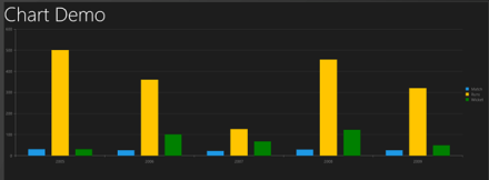
Let us add one more series to chart declaratively in HTML.


<h1>Chart Demo</h1>
 <div id="performancechart" data-win-control="Telerik.UI.RadChart"
 data-win-options="{
 series: [
 { type: 'column', name: 'Match', data: [30, 25,22,28,25]},
 { type: 'column', name: 'Runs', data: [500, 360,125,456,320]}

],

 }"
 />

&nbsp;

So far we have added three series to chart. At this point of we go ahead and run the application then we should get a chart as following

image

There are many other types of series. We will explore them one by one in further posts.

Step 4: Add Category Axis

Category Axis can also be added in two ways,

  1. Declaratively in HTML
  2. Programmatically in JavaScript

In HTML we can add Category Axis as following


<div id="performancechart" data-win-control="Telerik.UI.RadChart"
 data-win-options="{
 series: [
 { type: 'column', name: 'Match', data: [30, 25,22,28,25]},
 { type: 'column', name: 'Runs', data: [500, 360,125,456,320]}

],
 categoryAxis: {
 categories: [2008, 2009, 2010, 2011, 2012]
 }

 }"
 />

&nbsp;

In JavaScript we can add Category Axis as following code snippet,

image

On running we will find chart with Category Axis as following,

image

Step 5: Working with Tooltip

We can configure tooltip at two levels

  1. At the chart level
  2. At the series level

Chart level tooltip can be configured as following snippet,

<div id="performancechart" data-win-control="Telerik.UI.RadChart"
 data-win-options="{
 series: [
 { type: 'column', name: 'Match', data: [30, 25,22,28,25]},
 { type: 'column', name: 'Runs', data: [500, 360,125,456,320]}

],
 categoryAxis: {
 categories: [2008, 2009, 2010, 2011, 2012]
 },
 tooltip: {
 visible: true
 }

 }",

 />

&nbsp;

At the series level we can configure tooltip as following

image

Now on running of the application we will find that when we move mouse on the chart values of the series are displayed as tooltip.

Final chart should look like as following,

image

For your reference full source code is given below,


<!DOCTYPE html>
<html>
<head>
 <meta charset="utf-8" />
 <title>TestDemoJavaScript</title>

<!-- WinJS references -->
 <link href="//Microsoft.WinJS.1.0/css/ui-dark.css" rel="stylesheet" />
 <script src="//Microsoft.WinJS.1.0/js/base.js"></script>
 <script src="//Microsoft.WinJS.1.0/js/ui.js"></script>

<!--Telerik References -->
 <script src="/Telerik.UI/js/jquery.js"></script>
 <script src="/Telerik.UI/js/ui.js"></script>
 <link href="/Telerik.UI/css/dark.css" rel="stylesheet" />
 <link href="/Telerik.UI/css/common.css" rel="stylesheet" />

 <!-- TestDemoJavaScript references -->
 <link href="/css/default.css" rel="stylesheet" />
 <script src="/js/default.js"></script>
</head>
<body>

 <h1>Chart Demo</h1>
 <div id="performancechart" data-win-control="Telerik.UI.RadChart"
 data-win-options="{
 series: [
 {
 type: 'column',
 name: 'Match',
 data: [30, 25,22,28,25],
 tooltip: {
 visible: true

 }
 },
 { type: 'column', name: 'Runs', data: [500, 360,125,456,320],}

],
 categoryAxis: {
 categories: [2008, 2009, 2010, 2011, 2012]
 }

 }",

 />

&nbsp;

</body>
</html>

&nbsp;

Future Post

In this post we learnt basics of working with Rad Chart. We focused on only one type of series. In further posts we will explore various series type and working with remote data in the Rad Chart. I hope you find this post useful. Thanks for reading.

Working with RadAutoCompleteBox in JavaScript based Application for Windows Store

In this post we will take a look on working with RadAutoCompleteBox in JavaScript based Windows Store Application.

Getting Started with RadAutoCompleteBox

You can create RadAutoCompleteBox by setting data-win-control property of a div or span as Telerik.UI.RadAutoCompleteBox. See the code below,


<div id="sportsAutoComplete"
 data-win-control="Telerik.UI.RadAutoCompleteBox"
 data-win-options="{placeholder:'enter player...'}">
</div>

In above code

  • data-win-control attribute of div is set as Telerik.UI.RadAutoCompleteBox
  • In data-win-options attribute

You can set datasource of RadAutoCompleteBox in two ways. You can directly set datasource either in data-win-options attribute or in the JavaScript function. You can set datasource in code behind as following,


var sportsArray = ['Sachin Tendulkar', 'Saurabh Ganguli', 'MS Dhoni', 'Rahul Dravid', 'Kevin Pierson', 'Kalis'];
 var sportsAutoComplete = document.getElementById("sportsAutoComplete").winControl;
 sportsAutoComplete.dataSource.data = sportsArray;

In above code we are

  • Creating an array named sportsArray
  • Creating reference of RadAutoCompleteBox as winControl
  • Setting datasource of RadAutoCompleteBox with the sportsArray

At the point if you run application you should get Auto Complete Box as following,

image

Working with Template for RadAutoCompleteBox

There may be scenario when you need to set data source of RadAutoCompleteBox to array of complex objects. For example there is an array as following,

 var movieArray = [
 { title: "The Artist", picture: "images/TheArtist.jpg" },
 { title: "A Better Life", picture: "images/abetterlife.jpg" },
 { title: "Abduction", picture: "images/abduction.jpg" },
 { title: "African Cats", picture: "images/africancats.jpg" },
 { title: "Angel Crest", picture: "images/angelscrest.jpg" },
 { title: "Arthur", picture: "images/arthur.jpg" },
 { title: "Anonymous", picture: "images/anonymous.jpg" },
 { title: "A Dangerous Method", picture: "images/adangerousmethod.jpg" },
 { title: "A Good Old Fashioned Orgy ", picture: "images/agoodoldfashionedorgy.jpg" },
 { title: "A Seperation ", picture: "images/aseparation.jpg" },
 { title: "Another Earth ", picture: "images/anotherearth.jpg" },
 { title: "A Heartbeat Away ", picture: "images/aheartbeataway.jpg" },
 { title: "Bad Teacher ", picture: "images/badteacher.jpg" },
 { title: "Begineers ", picture: "images/beginners.jpg" },
 { title: "Brotherhood ", picture: "images/brotherhood.jpg" },
 { title: "Bridesmaids ", picture: "images/bridesmaids.jpg" },
 { title: "Born To Be Wild ", picture: "images/borntobewild.jpg" },
 { title: "Blackthorn ", picture: "images/blackthorn.jpg" },
 { title: "Bellflower ", picture: "images/bellflower.jpg" },
 { title: "Butter ", picture: "images/butter.jpg" },
 { title: "Bunraku ", picture: "images/bunraku.jpg" },
 { title: "Cars 2 ", picture: "images/cars2.jpg" },
 { title: "Cost Of A Soul", picture: "images/costofasoul.jpg" },
 { title: "Carnage ", picture: "images/carnage.jpg" },
 { title: "Crazy Stupid Love ", picture: "images/crazystupidlove.jpg" },
 { title: "Cracks ", picture: "images/cracks.jpg" },
 { title: "Colombiana ", picture: "images/colombiana.jpg" },
 { title: "Cedar Rapids ", picture: "images/cedarrapids.jpg" },
 { title: "Captain America ", picture: "images/captainamerica.jpg" },
 ];

You can set this array also, as data source of RadAutoComplte Box. This can be done as following,


var movieAutoComplete = document.getElementById("movieAutoComplete").winControl;
 movieAutoComplete.dataSource.data = movieArray;

On HTML RadAutoComplete with id movieAutoComplete is created as following

<div id="movieAutoComplete"
 data-win-control="Telerik.UI.RadAutoCompleteBox"
 data-win-options="{placeholder:'enter movie...',
 template:moviestemplate,
 dataTextField: 'title'}">
</div>

  • Placeholder is set as enter movie
  • dataTextField is set as title . title is one of the property in array.
  • template is set as moviestemplate. Template decides how data will be displayed in the control. Template can be created by setting data-win-control property of a div or span as WinJS.Binding.Template

We have created moviestemplate as following

<div id="moviestemplate" data-win-control="WinJS.Binding.Template">
 <div style="width: 100px;height: 100px;">
 <img src="#" style="width: 70px;height: 70px;" data-win-bind="src:picture" />
 <h4 data-win-bind="innerText:title" />
 </div>
 </div>

We are binding title of the array to h4 element and picture property of the array to image element. When you run the application, you should get RadAutoCompleteBox as following

image

Working with onSelect Event

You can read the selected item in RadAutoCompleteBox in onSelect event. You can attach select event and read the selected value as given in following,

movieAutoComplete.addEventListener("select", function (e) {
 document.getElementById("selectedmovie").src = movieAutoComplete.dataItem(e.item.index()).picture;
 });

In above code selectmovie is id of the image element. Image of the selected movie item will be displayed.

So in this way you can start using RadAutoCompleteBox in application. I hope you find this post useful. Thanks for reading.

Working with RadDropDownList in JavaScript based Windows Store Application

Read here to set up environment to use RadControls in your application.

In this post we will take a look on working with RadDropDownList in JavaScript based application for Windows 8. RadDropDownList allows you to select one item from list of items.

Getting Started with RadDropDownList

You can create a RadDropDownList by setting data-win-control property of a span or div element as Telerik.UI.RadDropDownList. You can do that as following,


<span id="sportsdropdown"
 data-win-control="Telerik.UI.RadDropDownList"
 data-win-options="{height: 250,
 dataSource:['Cricket','Soccer','Tennis']
 }"
 >
 </span>

RadDropDownList allows you to select an element from the list of elements displaying in drop down. RadDropDownList can display a local array or data returning from remote service as data. dataSource property of RadDropDown defines the data to be displayed . In above RadDropDown we have set the dataSource with inline array in the data-win-options. You can also bind dataSource of RadDropDownList from array defined in other files or JSON data returning from the remote services.

Let us say there is an array on default.js as following


var sportsArray = ['Cricket','FootBall','Hockey','Tennis','BaseBall'];

To set it as dataSource of RadDropDownList, first you need to create a Namespace. You can create that as following,

WinJS.Namespace.define("sportsdata", { sports: sportsArray }
 );

So far we have create array and namespace. Now you can set dataSource of RadDropDownList with array defined on default.js as following,

<div id="sportsdropdown"
 data-win-control="Telerik.UI.RadDropDownList"
 data-win-options="{height: 250,
 dataSource:sportsdata.sports
 }"
 >
 </div>

On running the application you should get RadDropDownList as populated with data from sportsArray as following,

image

Working with Remote Data

Above we used local data as dataSource of RadDropDownList. We can bind data from remote data source as well. For example if we want to display movies title from Netflix we can do that following below steps ,

  • Make a call to Netflix Odata serveice
  • Parse the resturned JSON
  • Construct array from parsed JSON data
  • Set array as datasource of RadDropDownList

WinJS.xhr({
 url: "http://odata.netflix.com/Catalog/Titles" + "?$format=json&$select=ShortName,BoxArt&$top=300"
 }).then(function (xhr) {
 var movies = JSON.parse(xhr.response).d;
 movies.forEach(function (i) {
 movieArray.push(i.ShortName);
 });
 var moviedropdown = document.getElementById("moviesdropdown").winControl;
 moviedropdown.dataSource.data = movieArray;
 });

In above code,

  • we are making call to Netflix OData feed using WinJS.xhr
  • Prasing returned JSON using JSON.parse
  • Iterting each element and pushing it to array
  • Taking reference of RadDropDownList using document.getElementbyID
  • Setting the datasource

And on HTML there is a div elment with id moviedropdown


<div id="moviesdropdown"
 data-win-control="Telerik.UI.RadDropDownList"
 data-win-options="{height: 250,

 }"
 >
 </div>

When you run the application you will get RadDropDownList populated with movies title from Netflix.

image

Attaching Change Event

You can attach change event to RadDropDownList and read the selected value . You can do that as following


moviedropdown.addEventListener("change", function (e) {
 document.getElementById("output").innerText = e.target.value;

});

In above code

  • Output is id of the span
  • Selected value will be displayed as text of the output span

In this way you can work with RadDropDownList in the application. In this post we learnt on getting started, working with remote data and about change event. I hope you find this post useful. Thanks for reading.

Reading NotficationTemplate controls value in RadHubTile for Windows 8

In this post we will take a look on how to read values NotificationTemplate controls in RadHubTile. Let us say, you are working with RadHubTile and you have set the NotificationTemplate as following,


<telerik:RadHubTile x:Name="rdRunsHubTiles"
 Title="Score"
 Message="India/Eng Score"
 ImageSource="/Assets/indengmatchlogo.JPG"
 BackContent="Score of India England first Test"
 Margin="93,209,0,388">
 <telerik:RadHubTile.NotificationTemplate>
 <DataTemplate>
 <StackPanel Orientation="Horizontal" >
 <TextBlock Text="{Binding Runs}" />
 <TextBlock Text="{Binding Country}" />
 </StackPanel>
 </DataTemplate>
 </telerik:RadHubTile.NotificationTemplate>
 </telerik:RadHubTile>

There are two TextBlock Controls inside the NotificationTemplate. Both TextBlock are data bind. RadHubTile DataCoontext is set as following


protected override void OnNavigatedTo(NavigationEventArgs e)
 {
 rdRunsHubTiles.DataContext = GetRun();

 }

Data GetRun()
 {
 return new Data ()
 {
 Runs = 200,
 Country = "India"
 };

 }

And Data class is defined as following,


public class Data
 {
 public int Runs { get; set; }
 public string Country { get; set; }
 }

Now when user tapd RadHubTile you need to read values of NotficationTemplate TextBlocks. To do this you need to handle tap event. Register tap event to RadHubTile as following ,


public MainPage()
 {
 this.InitializeComponent();
 rdRunsHubTiles.Tapped += rdRunsHubTiles_Tapped;

 }

Now in the Tap event we can read controls values as following,


void rdRunsHubTiles_Tapped(object sender, TappedRoutedEventArgs e)
 {

Data valueOfNotification = (sender as RadHubTile).DataContext as Data ;
 var runsettocontrol = valueOfNotification.Runs;
 var countrysettocontrol = valueOfNotification.Country;
 }

In above code we are

1. Typecasting sender as RadHubTile

2. Reading DataContext of RadHubTile as Data

3. Reading set values as property

So in this way we can read NotificationTemplate controls value. I hope you find this post useful. Thanks for reading.

Working with RadHubTile in XAML based Windows Store Application

In this post we will take a look on working with RadHubTile in XAML based Windows Store Application. RadHubTile gives you same immersive experience as you see on the home screen of Windows 8. You can display message, notification, title and message on flipping of tile using RadHubTiles. RadHubTile gives you experience like below image.

image

To start working with RadHubTile let us start with Creating Application for Windows Store. To create this choose Blank App from Windows Store project tab. After creating project you need to add reference Of Rad Control for Windows 8 in the project. To do that right click on the reference and select Add Reference. From the Reference Manager Dialog box select Rad Control for Windows8.

image

After adding reference in the project, you need to add namespace on the XAML page. You can do that as following,

image

You can create a HubTile on XAML as following ,

image

Since you have not set any propery of RadHubTile like Message , Title etc , so as output you will get a simple rectangular tile as below,

image

Some of the important properties of RadHubTiles are as following ,

image

Now let us go ahead and set properties of RadHubTiles ,

 <telerik:RadHubTile Title="Score"
 Message="India/Eng Score"
 ImageSource="/Assets/indengmatchlogo.JPG"
 Notification="100/0"
 BackContent="Score of India England first Test"
 >

 </telerik:RadHubTile>

Above we have set several properties of RadHubTiles . Now let us go ahead and run the application to see the output

image

Now let is go ahead and create template for BackContent. We crate template to show information in back of the RadHubTile as we want. Let us say , we want to display Image and Title in the back of the RadHubTile. We can do that by creating a DataTemplate and then setting that as value of BackContentTemplate. We can do that as following ,

image

You see that in above code we have created DataTemplate . There is StackPanel and one Image control along with TextBlock have put vertically in the StackPanel. When you run the application , you will get RadHubTile back content as following ,

image

For your reference full code with BackContent Template is given below,

 <telerik:RadHubTile Title="Score"
 Message="India/Eng Score"
 ImageSource="/Assets/indengmatchlogo.JPG"
 Notification="100/0"
 BackContent="Score of India England first Test"
 Margin="93,209,0,388">
 <telerik:RadHubTile.BackContentTemplate>
 <DataTemplate>
 <StackPanel Orientation="Vertical">
 <TextBlock Text="India England Test Series" />
 <Image Source="/Assets/indengmatchlogo.JPG" />
 </StackPanel>
 </DataTemplate>
 </telerik:RadHubTile.BackContentTemplate>

</telerik:RadHubTile>

As we set BackContentTemplate , we can set

  • NotificationTemplate
  • MessageTemplate

As well. Let us go ahead and create the NotificationTemplate. We will bind controls in NotificationTemplate with the data coming from the background. Let us say there is function returning Data. In this case I am hard coding the data value, however in real time scenario you will like to fetch data from a remote service.

 Data GetRun()
 {
 // Put code here to fetch data from remote service
 return new Data ()
 {
 Runs = 200,
 Country = "India"
 };

 }

Data class is defined as following,


namespace HubTilesXaml
{
 public class Data
 {
 public int Runs { get; set; }
 public string Country { get; set; }
 }
}

We need to set DataContext of RadHubTile as given below,


protected override void OnNavigatedTo(NavigationEventArgs e)
 {

rdRunsHubTiles.DataContext = GetRun();

}

Now let us go ahead and create NotificationTemplate . NotficationTemplate can be created as following.

image

We are creating a DataTemplate and setting it as value of NotificationTemplate property of RadHubTile. For your reference full code with BackContentTemplate and NotficationTemplate for RadHubTile is given below,

<telerik:RadHubTile x:Name="rdRunsHubTiles"
 Title="Score"
 Message="India/Eng Score"
 ImageSource="/Assets/indengmatchlogo.JPG"

 BackContent="Score of India England first Test"
 DataContext=""
 Margin="93,209,0,388">
 <telerik:RadHubTile.BackContentTemplate>
 <DataTemplate>
 <StackPanel Orientation="Vertical">
 <TextBlock Text="India England Test Series" />
 <Image Source="/Assets/indengmatchlogo.JPG" />
 </StackPanel>
 </DataTemplate>
 </telerik:RadHubTile.BackContentTemplate>
 <telerik:RadHubTile.NotificationTemplate>
 <DataTemplate>
 <StackPanel Orientation="Horizontal" >
 <TextBlock Text="{Binding Runs}" />
 <TextBlock Text="{Binding Country}" />
 </StackPanel>
 </DataTemplate>
 </telerik:RadHubTile.NotificationTemplate>

</telerik:RadHubTile>

At this point if you run the application you should get a RadHubTile with BackContentTemplate , NotficationTemplate , Message and Image.

image

We can get all the information from RadHubTile in code behind and can use them. For example let us say when user is tapping on the RadHubTile , we want to display the NotificationCount. We can do that as following,


void rdRunsHubTiles_Tapped(object sender, TappedRoutedEventArgs e)
 {

var runset = (sender as RadHubTile).Notification;
 }

In this way we can work with RadHubTile in Application for Windows Store. I hope you find this post useful. Thanks for reading.

Webinar on Telerik Tools for Ninja Developer: Windows 8 RadControls

Register for the Webinar here

Date: 21st November 2012

Time: 3PM to 4PM (IST)

Launch of Windows 8 has brought enormous enthusiasm among developers along with normal users. Developers are aspired to write fascinating killer apps and want to reach maximum Windows 8 users. If you are one of those aspired developer then this webinar is for you. In this webinar we will talk and learn about Rad Controls for Windows 8. Rad Controls for Windows 8 allows you to write fascinating touch enabled Windows 8 Application which your users will love. It helps you to shorten development time, quickly take application to market and get better ranking.  There are 15+ native controls available for you to use in your application.  You can use controls natively in your application regardless you are developing in XAML or HTML.

Read more about RadControls for Windows 8 here

This will be demo oriented webinar. In webinar we will write code from scratch and learn how different Rad Controls can be used in application.

Register for the Webniar here

For any query do send a mail to Dhananjay.kumar@telerik.com . Hope to see you in the webinar.

Working with RadNumericBox in JavaScript Windows 8 Application

In this post we will take a look on working with RadNumericBox. If first time you are working with RadControls in JavaScript based Windows 8 Application, I recommend you to read this post .

To work with RadNumericBox simply set data-win-control property of a div or span as Telerik.UI.RadNumericBox


You will get RadNumericBox configured with default values as following,

You can work with RadNumericBox from JavaScript as well.


Here agebox is id of span.

You can set different options for RadNumericBox. Some of those options are as following,

Options can be set as following,

Now when you run the application, you should get RadNumericBox configured with default value 40, minimum value 0, maximum value 255 and step as 10. While working with RadNumericBox there are two important events,

In code behind you can attach event to RadNumericBox as following,

You can work with spin event as following

And showmessage function is written as below,


For your reference code is given below,

Default.html

<!DOCTYPE html>
<html>
<head>
 <meta charset="utf-8" />
 <title>javascriptAutoComplete</title>

<!-- WinJS references -->
 <link href="//Microsoft.WinJS.1.0/css/ui-dark.css" rel="stylesheet" />
 <script src="//Microsoft.WinJS.1.0/js/base.js"></script>
 <script src="//Microsoft.WinJS.1.0/js/ui.js"></script>

<!--Telerik references -->
 <script src="///Telerik.UI/js/jquery.js"></script>
 <script src="/Telerik.UI/js/ui.js"></script>
 <link href="/Telerik.UI/css/dark.css" rel="stylesheet" />
 <link href="/Telerik.UI/css/common.css" rel="stylesheet" />

<!-- javascriptAutoComplete references -->
 <link href="/css/default.css" rel="stylesheet" />
 <script src="/js/default.js"></script>
</head>
<body>
 <h1>Numeric Box Demo</h1>
 <div id="agebox"
 data-win-control="Telerik.UI.RadNumericBox"
 data-win-options="{value: 40,
 min: 0,
 max: 255,
 step: 10,
 decimals: 2,
 format: 'n0',
 }">
 </div>
 <br />
 <span id="output" >

 </span>
</body>
</html>

&nbsp;

Default.js


if (args.detail.kind === activation.ActivationKind.launch) {
 if (args.detail.previousExecutionState !== activation.ApplicationExecutionState.terminated) {
 // TODO: This application has been newly launched. Initialize
 // your application here.
 } else {
 // TODO: This application has been reactivated from suspension.
 // Restore application state here.
 }
 args.setPromise(WinJS.UI.processAll());
 var nbage = document.getElementById("agebox").winControl;
 nbage.addEventListener("spin", showmessage);
 nbage.addEventListener("change", function (e) {
 document.getElementById("output").innerText = "You have selected" + nbage.value;
 });
 }
 };

 function showmessage(e) {

document.getElementById("output").innerText = "You have selected" + e.target.value;
 }

I hope you find this post useful. Thanks for reading.

New UI Controls as part of Telerik DevCraft Q3 2012 Release

On Oct 17 2012, we did a release of our Telerik DevCraft bundle known as Q3 2012 release. As part of the release our UI suites have got couple of new controls added to the bundle. In this blog post we will look at what new controls have been added to our UI suites namely – RadControls for ASP.NET AJAX, RadControls for Silverlight, RadControls for WPF, RadControls for WinForms, Windows 8 Controls and RadControls for Windows Phone. So lets go over them one by one.


RadControls for ASP.NET AJAX:

ASP.NET AJAX suite gets the following new controls added to the family of already existing 70+ controls. They are:

Gauge:

This is a high performing HTML5 based radial and linear gauge control which can be used to show certain values in a scale.


See demos of Gauge control here

PivotGrid (Beta):

PivotGrid is a control used to show pivoted data in a tabular or outline or in a compact layout. We bring the power of Pivot to Web with the introduction of this control. This control supports aggregates, drag and drop and a field list control panel.

See demos of PivotGrid here.

AutoCompleteBox:

As the name goes – this is a auto completion textbox. It auto suggests filtered list with options based on user input and supports multiple item selection. This was one of the highly requested control for ASP.NET AJAX

See demos of AutoCompleteBox here.

You can download a free trial of RadControls for ASP.NET AJAX and evaluate the controls for your needs.

image


RadControls for SilverLight:

Four new controls got added to the Silverlight controls family. They are:

PivotGrid (Beta):

RadPivotGrid is released as a Beta control in this release. This supports data summarizations and great data visualization capabilities.

image

See demos of RadPivotGrid here.

GanttView:

GanttView is a control designed for managing and visualizing complex planning data and tasks. Often used in project planning and management scenarios. Using this control it is easier to understand and analyze the data.

image

See demos of GanttView here.

AutoCompleteBox:

No need to explain this control. The auto suggestion control is now available in Silverlight suite also.

image

See demos of AutoCompleteBox here.

HeatMap:

HeatMap is a control which is matrix-like control, which uses color to encode the values along two axes.

image

See demos of RadHeatMap here.

Download free trial of RadControls for Silverlight and evaluate them for your needs.

image


RadControls for WPF:

New controls introduced for WPF suite are as follows:

PivotGrid (Beta):

image

GanttView:

image

AutoCompleteBox:

image

HeatMap:

image

Download free trial of RadControls for WPF and evaluate them for your projects.

image


RadControls for WinForms:

There was one control added to the WinForms family. That is RadPivitGrid and released as a Beta control in this release.

PivotGrid Filtering

You can download thirty day free trial of RadControls for WinForms with dedicated support during trial period.

image


RadControls for Windows Phone:

Five new controls got added to the Windows Phone controls family. They are as follows:

TimeSpanPicker:

TimeSpanPicker control provides full control over time and duration in any app where users set duration. This control allows users to define duration of certain action.

TimeSpanPicker

Expander:

Expander control allows users to expand or collapse conversations. Fits well in applications that rely on interaction and messaging.

Expander Control

PasswordBox:

As the name goes this is a ready made password input text box for Windows Phone scenario. Using this control in a registration form will automatically display the typical dots in place of the actual password being typed.

PasswordBox

DataForm:

DataForm control provides with out of the box data forms that can be simply configured to work with business logic of your application. It also provides out of the box validation, styling and other customization mechanisms.

DataForm

InputPrompt:

This control allows you to create prompts where you can ask users to enter important details such as Phone number, email, etc.

InputPrompt

You can download a free trial of RadControls for Windows Phone to evaluate the controls.

image


RadControls for Windows 8:

This is a brand new suite as far as the RadControls family is concerned. This suite contains some of the controls which are not found in the SDK of Windows 8 development like date and time pickers. These controls have been built from ground up and provide you with the same UI and UX as that of Windows 8 look and feel. Currently following 15+ controls are released and many more will be added to the suite over time. At this moment we are offering this suite at an introductory price of $99 and you will receive all the new components and updates that will be added to the suite in the next year.

image

image


Hope this blog post excites you in terms of the new control offerings from our UI control suites. If you feel like trying out them go ahead and download our free 20 day trials and evaluate them. Note that during the trial period you will get dedicated support meaning you can raise support tickets and a dedicated support team will be responding to you. Give it a try and let us know how you feel about our UI controls.

Till next time, Happy Coding.

Getting Started with Rad Controls for Windows 8

In this post, we will learn how we could start with Rad Controls for Windows 8.

Download Trial Version from here

As of now these controls are available, 

  • Chart
  • DatePicker
  • Pagination
  • Gauge
  • TimePicker
  • HubTile
  • BulletGraph
  • NumericBox
  • Slider
  • ComboBox
  • AutoCompleteBox
  • DropDownList

You can download Demo Applications exploring the controls from here

After downloading, follow the Telerik Installer Wizard.

 image

Make sure that Windows8 is selected. Click on OK.LET’S DO THIS. Configure installation folder , accept license terms and click on Go to Next Step

image

Provide credential and click on Install to start the installation.

image

After successful installation, you will get following message

 image

By this step, you have successfully installed Rad Controls for Windows 8. Now go ahead and launch Visual Studio and create an Application for Windows Store. Let us choose Blank Application from the XAML Windows Store template.

image

Once the project is created in Solution Explorer right click on the Reference and select Add Reference

image

In the dialog box make sure that you have selected Extension and select Rad Controls for Windows 8.

image

After adding rerefence in solution explorer verify that refence of Rad Controls has been added successfully.

image


By this step you have succesfully created the project and added the required refrence. Now you are all set to use Rad Controls for Windows 8 in your application. Let us go ahead and add RadDatePicker control on the MainePage.xaml. Before using any Rad Control , you need to add namespace. Add namespace as following

image

After adding namespace put RadDatePicker control as following

image

Now press F5 and run the application. You should able to get RadDatePicker control

image

In this way you can start working with Rad Controls for Windows 8. In further posts we will explore each controls individually. I hope you find this post useful. Thanks for reading.