If you know jQuery, and want to include data vizualization elements in your web page without all the hassle, you are at the right place. In this post, we are going to give you a quick view of how Kendo works with jQuery to create a pie chart.
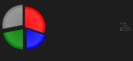
We will build a ratings pie chart, step by step. Final product is shown below.
1. API
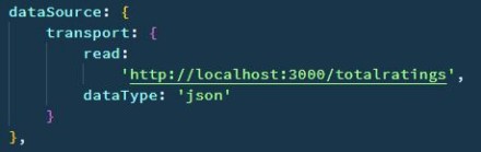
We need access to an API which we can call to get our remote data in the form of json. An API like this:
https://<some-url>/totalratings
which gives data in the form of json like this:
[
  {
    category: "Asia",
    value: 53.8,
    color: "#9de219"
  },
  {
    category: "Europe",
    value: 16.1,
    color: "#90cc38"
  },
  {
    category: "Latin America",
    value: 11.3,
    color: "#068c35"
  },
  {
    category: "Africa",
    value: 9.6,
    color: "#006634"
  },
  {
    category: "Middle East",
    value: 5.2,
    color: "#004d38"
  },
  {
    category: "North America",
    value: 3.6,
    color: "#033939"
  }
]
should do the work. The data must be a json or an array of json.
Note: If you’re the developer of the API, then make sure to modify the json to make it compatible with Kendo before sending it as response. Check out Kendo demos for more info.
2. Download
Now you need to download Kendo UI. There are several paid versions, and a free (trial) version. Trial is more than enough for trying it out.
Download Kendo UI for a trial period from here. You will have to sign up to download it.
3. Transport
Extract the downloaded ZIP archive to an easily accessible location. We are going to need it’s js and css folders.
4. Kickstart
Kickstart the project by creating a new folder, say kendo-pie. Copy the downloaded js and css folders in kendo-pie.
Now, create a new HTML file in kendo-pie, say index.html. This is our main webpage. The pie chart will reside here.
5. The HTML
Open index.html with your favourite text editor. Add some starter code.
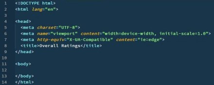
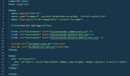
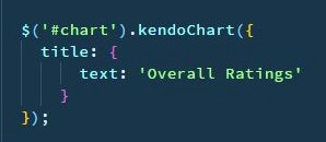
Give it a title, say Overall Ratings. Link all the necessary js and css files, inside head.

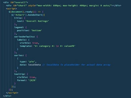
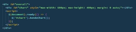
Time to populate the body. Create a wrapper (div), with id overall. The actual chart element and it’s script will reside in this wrapper. Create the chart div inside the wrapper, with id chart. Give it some style with a style attribute.

The above goes inside body, and the whole thing up-to this point looks something like this:
6. The jQuery
Create a script element inside the wrapper, and add some starter jQuery code.
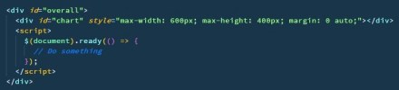
Inside the document-ready function, select the chart element with jQuery’s id selector, and apply kendoChart() method.
7. The Kendo
kendoChart() takes a configuration object as an argument. This configuration object is used to describe the chart and include data (local or remote) to be represented.
Let’s contsruct the configuration object:
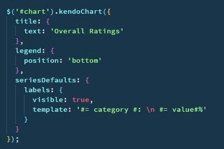
- Add title property.
2. Add dataSource property: read and dataType.
3. Add seriesDefaults property.

4. Add series property: field and categoryField.

5. Add tooltip property.

kendoChart() method is ready. So is the script. Coding part is complete.
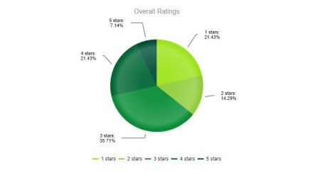
These were the basic steps to create a pie chart using jQuery and Kendo, mostly Kendo. Now, open index.html in browser, and you should see output as below.
I hope the above steps were helpful in giving you a basic idea about Kendo UI. It’s up to you now to tweak the chart however you want, or create a new element altogether.
Documentation on the customization options are available here, and demos here.
Authored by: Abhay Kumar.