Start working with RadRating control for Windows Phone in three simple steps

Read more here

As name suggests by using RadRating controls, you can allow your application user to rate something. RadRating control allows user to select a value from set of rating items. RadRating control may give immersive experience as given below.

image

In this post we will follow three steps to start working with RadRating control.

Step 1

Start with adding namespace on xaml

image

Step 2

You can add a RadRating control by declaring it on xaml as following. You need to set value of AutoGeneratedItemsCount property to set number of rating items.

image

Expected output of above declaration should be as following

image

If you want you can change geometrical shape of the rating items as well. You need to set value of ItemShapeStyle property.There are five geometric shapes are provided. They are as following

  1. Stars1
  2. Stars2
  3. Hearts1
  4. Hearts2
  5. Hearts3

You can set Height and Width of the Rating Item using ItemShapeHeight and ItemShapeWidth property respectively.

In below declaration we are setting shape style, shape height and shape width.

image

Expected output of above RadRating control declaration is as following

image

If you want you can customize individual rating item also. You can do that as following. You may have content for each individual rating item.

image

Expected output of above RadRating control declaration is as following

image

Step 3

In last step you may want to handle events to perform operation when user is changing the rating. Below two events are important to track when user is changing rating or rating has been changed already.

  • ValueChanged
  • ValueChanging

You can handle ValueChanged event as following. In this event you get both old value and new value from the RadRating control

image

Conclusion

These are three simple steps you required to start working with RadRating control. Below I am consolidating codes from above discussion

MainPage.xaml


<phone:PhoneApplicationPage
x:Class="processapp.MainPage"
xmlns="http://schemas.microsoft.com/winfx/2006/xaml/presentation"
xmlns:x="http://schemas.microsoft.com/winfx/2006/xaml"
xmlns:phone="clr-namespace:Microsoft.Phone.Controls;assembly=Microsoft.Phone"
xmlns:shell="clr-namespace:Microsoft.Phone.Shell;assembly=Microsoft.Phone"
xmlns:d="http://schemas.microsoft.com/expression/blend/2008"
xmlns:telerikPrimitives="clr-namespace:Telerik.Windows.Controls;assembly=Telerik.Windows.Controls.Primitives"
xmlns:telerikInput="clr-namespace:Telerik.Windows.Controls;assembly=Telerik.Windows.Controls.Input"
xmlns:mc="http://schemas.openxmlformats.org/markup-compatibility/2006"
mc:Ignorable="d" d:DesignWidth="480" d:DesignHeight="768"
FontFamily="{StaticResource PhoneFontFamilyNormal}"
FontSize="{StaticResource PhoneFontSizeNormal}"
Foreground="{StaticResource PhoneForegroundBrush}"
SupportedOrientations="Portrait"  Orientation="Portrait"
shell:SystemTray.IsVisible="True">

<!--LayoutRoot is the root grid where all page content is placed-->
<Grid x:Name="LayoutRoot" Background="Transparent">
<Grid.RowDefinitions>
<RowDefinition Height="Auto"/>
<RowDefinition Height="*"/>
</Grid.RowDefinitions>

<!--TitlePanel contains the name of the application and page title-->
<StackPanel x:Name="TitlePanel" Grid.Row="0" Margin="12,17,0,28">
<TextBlock x:Name="ApplicationTitle" Text="Demo App" Style="{StaticResource PhoneTextNormalStyle}"/>
<TextBlock x:Name="PageTitle" Text="rating control" Margin="9,-7,0,0" Style="{StaticResource PhoneTextTitle1Style}"/>
</StackPanel>

<!--ContentPanel - place additional content here-->
<Grid x:Name="ContentPanel" Grid.Row="1" Margin="12,0,12,0">
<Grid.RowDefinitions>
<RowDefinition Height="*"/>
</Grid.RowDefinitions>

<StackPanel Orientation="Vertical" Grid.Row="0">
<telerikInput:RadRating x:Name="rdRatingControl"
AutoGeneratedItemsCount="5" />
<TextBlock x:Name="txtrating1" Style="{StaticResource PhoneTextNormalStyle}" />
</StackPanel>

<StackPanel Orientation="Vertical" Grid.Row="1">

<telerikInput:RadRating x:Name="rdRatingControl1"
AutoGeneratedItemsCount="5"
ItemShapeStyle="Hearts1"
ItemShapeHeight="60"
ItemShapeWidth="70"
/>
<TextBlock x:Name="txtrating2" Style="{StaticResource PhoneTextNormalStyle}" />

</StackPanel>
<StackPanel Orientation="Vertical" Grid.Row="2" >
<telerikInput:RadRating  x:Name="rdRating" >
<telerikInput:RadRatingItem Content="poor "/>
<telerikInput:RadRatingItem Content="satisfied "/>
<telerikInput:RadRatingItem Content="good "/>
<telerikInput:RadRatingItem Content="verygood "/>
<telerikInput:RadRatingItem Content="excelent"/>
</telerikInput:RadRating>
<TextBlock x:Name="txtrating3" Style="{StaticResource PhoneTextNormalStyle}" />
</StackPanel>

</Grid>
</Grid>

</phone:PhoneApplicationPage>

MainPage.xaml.cs


using System;
using System.Collections.Generic;
using System.Linq;
using System.Net;
using System.Windows;
using System.Windows.Controls;
using System.Windows.Documents;
using System.Windows.Input;
using System.Windows.Media;
using System.Windows.Media.Animation;
using System.Windows.Shapes;
using Microsoft.Phone.Controls;
using Telerik.Windows.Controls;

namespace processapp
{
public partial class MainPage : PhoneApplicationPage
{
// Constructor
public MainPage()
{
InitializeComponent();
rdRating.ValueChanged += new EventHandler<ValueChangedEventArgs<object>>(rdRating_ValueChanged);
rdRatingControl.ValueChanged += new EventHandler<ValueChangedEventArgs<object>>(rdRatingControl_ValueChanged);
rdRatingControl1.ValueChanged += new EventHandler<ValueChangedEventArgs<object>>(rdRatingControl1_ValueChanged);

}

void rdRatingControl1_ValueChanged(object sender, ValueChangedEventArgs<object> e)
{
var oldValue = e.OldValue;
var newValue = e.NewValue;
string message = "you have changed value from " + oldValue + "to " + newValue;
txtrating2.Text = message;
}

void rdRating_ValueChanged(object sender, ValueChangedEventArgs<object> e)
{
var oldValue = e.OldValue;
var newValue = e.NewValue;
string message = "you have changed value from " + oldValue + "to " + newValue;
txtrating3.Text = message;
}

void rdRatingControl_ValueChanged(object sender, ValueChangedEventArgs<object> e)
{

var oldValue = e.OldValue;
var newValue = e.NewValue;
string message = "you have changed value from " + oldValue + "to " + newValue;
txtrating1.Text = message;
}

}
}

When you run application you should have application with RadRating control as following

clip_image002

I hope you find this post useful. Thanks for reading.

RadControls for Web – New controls in Q2 release

We at Telerik shipped our second release of the year which we call it as Q2 release, in June 2012. In this post we will look at what are the new controls available under RadControls for Web which includes ASP.NET AJAX, ASP.NET MVC and Silverlight.

RadControls for Web consists of the following suites:

  • RadControls for ASP.NET AJAX
  • RadControls for ASP.NET MVC
  • RadControls for Silverlight

So lets look at new controls added in Q2 release one by one.


RadControls for ASP.NET AJAX:

This suite is a complete ASP.NET AJAX development toolset. RadControls for ASP.NET AJAX contains over 70 controls and helps in rapid component based UI development. In Q2 2012 release we have added 3 new controls. They are:

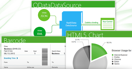
  • HTML5 Chart
  • BarCode
  • ODataDataSource

image

HTML Chart:

HTML5 Chart

HTML5 Chart control also known as RadHtmlChart provides a powerful charting mechanism. The charts are based on SVG format for modern browsers and VML for older browsers. Here are some of the salient features of HTML5 Chart control:

  • Client Side Rendering – Rendered entirely through JavaScript and hence reduces the amount of work to be done by Server. Only serialized data is sent to the client which boosts the performance of the application.
  • Control Data Loading – You have the full control over the data loading process. Load the data after page is loaded or invoke a callback via JavaScript.
  • Customize Appearance – The markup structure exposes all properties necessary to customize the appearance.

See Demos

Barcode:

Barcode control enables you to quickly and easily create industry standard barcode formats to your applications. Here again the barcode is generated in SVG format for modern browsers and VML format for older browsers.

See Demos

ODataDataSource:

ODataDataSource control enables you to codelessly bind your controls to OData Services.This control supports a Visual Studio design time wizard to query any Odata service supporting JSON and XML. So you can visualize the data even before you binding it. As said earlier this allows you to codelessly bind the odata services to controls like TreeView, Grid etc,

See Demos


RadControls for ASP.NET MVC:

With Q2 release we no longer promote the ASP.NET MVC extensions, rather we advice you to migrate to our new breed of UI framework known as Kendo UI which composes of Web, DataVisualization and Mobile contols. Kendo UI is the new platform for HTML5/JavaScript development. Kendo UI Web controls also comes with server side wrappers for ASP.NET MVC for easier development. You can know more about Kendo UI at www.kendoui.com.

In Q2 release 1 new widget was added to Kendo UI Web suite.

DateTimePicker:

As the name goes this is a UI widget which allows you to select Date as well as time within in one single widget/control. If your scenario requires for a Date and Time to be shown, this control can be used instead of two controls – one to show Date and another to show Time.

image image

See Demos


RadControls for Silverlight:

This suite is one of the industry’s leading suite of Silverlight controls for today’s Line Of Business (LOB) application development. RadControls for Silverlight helps you to create engaging and interactive user experiences for Web and Desktop. This suite contains over 65 controls which will surely cut your development time.

In Q2 release, there were 2 new controls added to the suite. They are:

  • RadHeatMap
  • RadGanttView

RadHeatMap:

Heat Map control is a matrix like control that uses color to encode values along two axes. Some of the features of this controls are:

  • Interactive tool tips – provides context aware detail on the heat map
  • Colorizers – allows you to use different colors to encode values
  • Super fast rendering – uses immediate mode bitmap based rendering and proprietary hit-testing and lay outing to render vast amount of visual detail without slowing down and sacrificing the interactivity

HeatMap

See Demos

RadGanttView:

This control as the name goes, allows you to visualize and manage hierarchical project data as a Gantt Chart. This has the capability to visualize different types of project data such as Tasks, Milestones, Summaries, and also the relations between them. You can highlight different types of important items like late or critical tasks. Another feature of the control is the ability to import data from your MS project and visualize it in a friendly way.

image

See Demos

Summary:

In this post we looked at new controls released as part of the Q2 Release under RadControls for Web suite. We looked at 3 core technologies under Web i.e. ASP.NET AJAX, ASP.NET MVC and Silverlight – and looked at the new controls available under each of those suites, Hope you are excited to try these new controls yourselves. Don’t forget that all these controls suites are available for free 30 Day trial downloads.

Three simple steps to start working with RadToggleSwitch for Windows Phone

In this post we will learn to use RadToggleSwitch in three simple steps. RadToggleSwitch controls gives you experience of on and off button. It is a binary state control and can be either in state of on or off. You may get experience of RadToggleSwitch as following

image

Follow the below steps to start working with RadToggleSwitch. This control is very much configurable and you can put button and header styling as per your application requirement.

Step1

Very first you need to add reference of Telerik.Windows.Controls.Primptive on xaml.

image

Step 2

After adding namespace add RadToggleSwitch on the application page. You can add that as following

image

While adding RadToggleSwitch we can configure value of header. If needed, you can define HeaderStyle and HeaderTemplate specific to your application. By default accent color of device get applied as background color of RadToggleSwitch. You can set IsChecked property to either true or false. If you do not set it then it takes default value false. One important property is ButtonStyle. You can configure this property to give different look to toggle button.

Below is the consolidated code. On the xaml we have put four RadToggleSwitch control.


<phone:PhoneApplicationPage
x:Class="processapp.MainPage"
xmlns="http://schemas.microsoft.com/winfx/2006/xaml/presentation"
xmlns:x="http://schemas.microsoft.com/winfx/2006/xaml"
xmlns:phone="clr-namespace:Microsoft.Phone.Controls;assembly=Microsoft.Phone"
xmlns:shell="clr-namespace:Microsoft.Phone.Shell;assembly=Microsoft.Phone"
xmlns:d="http://schemas.microsoft.com/expression/blend/2008"
xmlns:telerikPrimitives="clr-namespace:Telerik.Windows.Controls;assembly=Telerik.Windows.Controls.Primitives"
xmlns:mc="http://schemas.openxmlformats.org/markup-compatibility/2006"
mc:Ignorable="d" d:DesignWidth="480" d:DesignHeight="768"
FontFamily="{StaticResource PhoneFontFamilyNormal}"
FontSize="{StaticResource PhoneFontSizeNormal}"
Foreground="{StaticResource PhoneForegroundBrush}"
SupportedOrientations="Portrait"  Orientation="Portrait"
shell:SystemTray.IsVisible="True">

<!--LayoutRoot is the root grid where all page content is placed-->
<Grid x:Name="LayoutRoot" Background="Transparent">
<Grid.RowDefinitions>
<RowDefinition Height="Auto"/>
<RowDefinition Height="*"/>
</Grid.RowDefinitions>

<!--TitlePanel contains the name of the application and page title-->
<StackPanel x:Name="TitlePanel" Grid.Row="0" Margin="12,17,0,28">
<TextBlock x:Name="ApplicationTitle" Text="Demo App" Style="{StaticResource PhoneTextNormalStyle}"/>
<TextBlock x:Name="PageTitle" Text="toggle switch" Margin="9,-7,0,0" Style="{StaticResource PhoneTextTitle1Style}"/>
</StackPanel>

<!--ContentPanel - place additional content here-->
<Grid x:Name="ContentPanel" Grid.Row="1" Margin="12,0,12,0">
<Grid.RowDefinitions>
<RowDefinition Height="*" />
</Grid.RowDefinitions>

<telerikPrimitives:RadToggleSwitch
x:Name="tglWifi"
Header="WiFi"
Grid.Row="0"
/>
<telerikPrimitives:RadToggleSwitch
x:Name="tglBlueTooth"
Header="BlueTooth"
Grid.Row="1"
IsChecked="True"/>

<telerikPrimitives:RadToggleSwitch
x:Name="tglDataNetwrok"
Header="Cellular Data"
Grid.Row="2"
IsChecked="True"/>

<telerikPrimitives:RadToggleSwitch
x:Name="tglSharing"
Header="Sharing"
Grid.Row="3"
IsChecked="False"/>

</Grid>
</Grid>

</phone:PhoneApplicationPage>

Step 3

You can handle check and uncheck event on RadToggleSwitch. You can perform operation corresponding to on in check event and corresponding to off in uncheck event. For example in below code I am changing header of the RadToggleSwitch in check and uncheck event

image

And we have attached the event to RadToggleSwitch in constructor of the page as given below,

image

Output

When you run above application you should get expected output as following. When you toggle Data Sharing button, you will notice header is getting changed.

image

In this way you can work with RadToggleSwitch. I hope you find this post useful. Thanks for reading.

Working with RadSlideHubTile for Windows Phone

In this post we will learn working with RadSlideHubTile. This control allows you to have Windows Phone home screen tile experience inside your application. This tile is used to display information with image. You can associate tap or doubletap event with individual slide hub tile to perform specific operation. To have better immersive experience put RadSlideHubTile in a RadUniformGrid. At the end of this post we are going to have RadSlideHubTile in application as following image

image

To start with add Telerik.Windows.Controls.Primtives namespace on the xaml.

image

After adding namespace put a RadUniformGrid on the application page. We are creating uniform Grid of 3 rows and 3 columns.

image

Inside the Grid we will put RadSlideHubTiles. Since grid is of 3 rows and 3 columns, so we can put 9 RadSlideHubTiles.

We can create a RadSlideHubTiles as following

image

We need to provide Title and Picture values to create RadSlideHubTiles. We can see that Title property is set to India and Picture property is set an image url. We can put 9 RadSlideHubTiles in the grid. We can put that as following


<phone:PhoneApplicationPage
x:Class="processapp.MainPage"
xmlns="http://schemas.microsoft.com/winfx/2006/xaml/presentation"
xmlns:x="http://schemas.microsoft.com/winfx/2006/xaml"
xmlns:phone="clr-namespace:Microsoft.Phone.Controls;assembly=Microsoft.Phone"
xmlns:shell="clr-namespace:Microsoft.Phone.Shell;assembly=Microsoft.Phone"
xmlns:d="http://schemas.microsoft.com/expression/blend/2008"
xmlns:telerikPrimitives="clr-namespace:Telerik.Windows.Controls;assembly=Telerik.Windows.Controls.Primitives"
xmlns:mc="http://schemas.openxmlformats.org/markup-compatibility/2006"
mc:Ignorable="d" d:DesignWidth="480" d:DesignHeight="768"
FontFamily="{StaticResource PhoneFontFamilyNormal}"
FontSize="{StaticResource PhoneFontSizeNormal}"
Foreground="{StaticResource PhoneForegroundBrush}"
SupportedOrientations="Portrait"  Orientation="Portrait"
shell:SystemTray.IsVisible="True">

<!--LayoutRoot is the root grid where all page content is placed-->
<Grid x:Name="LayoutRoot" Background="Transparent">
<Grid.RowDefinitions>
<RowDefinition Height="Auto"/>
<RowDefinition Height="*"/>
</Grid.RowDefinitions>

<!--TitlePanel contains the name of the application and page title-->
<StackPanel x:Name="TitlePanel" Grid.Row="0" Margin="12,17,0,28">
<TextBlock x:Name="ApplicationTitle" Text="BROWSE COUNTRY APP" Style="{StaticResource PhoneTextNormalStyle}"/>
<TextBlock x:Name="PageTitle" Text="countries" Margin="9,-7,0,0" Style="{StaticResource PhoneTextTitle1Style}"/>
</StackPanel>

<!--ContentPanel - place additional content here-->
<Grid x:Name="ContentPanel" Grid.Row="1" Margin="12,0,12,0">

<telerikPrimitives:RadUniformGrid NumberOfColumns="3" NumberOfRows="3">
<telerikPrimitives:RadSlideHubTile x:Name="hbIndia"
Title="India"
>
<telerikPrimitives:RadSlideHubTile.Picture>
<Image Source="Images\indiaflag.jpg"
Stretch="Fill"/>
</telerikPrimitives:RadSlideHubTile.Picture>
</telerikPrimitives:RadSlideHubTile>
<telerikPrimitives:RadSlideHubTile x:Name="hbFrance"
Title="France"
>
<telerikPrimitives:RadSlideHubTile.Picture>
<Image Source="Images\franceflag.jpg"
Stretch="Fill"/>
</telerikPrimitives:RadSlideHubTile.Picture>
</telerikPrimitives:RadSlideHubTile>
<telerikPrimitives:RadSlideHubTile x:Name="hbEngland"
Title="England"
Tap="hbTextBox_Tap">
<telerikPrimitives:RadSlideHubTile.Picture>
<Image Source="Images\englandflag.jpg"
Stretch="Fill"/>
</telerikPrimitives:RadSlideHubTile.Picture>
</telerikPrimitives:RadSlideHubTile>
<telerikPrimitives:RadSlideHubTile x:Name="hbGermany"
Title="Germany">
<telerikPrimitives:RadSlideHubTile.Picture>
<Image Source="Images\germanyflag.jpg"
Stretch="Fill"/>
</telerikPrimitives:RadSlideHubTile.Picture>
</telerikPrimitives:RadSlideHubTile>
<telerikPrimitives:RadSlideHubTile x:Name="hbAustralia"
Title="Australia">
<telerikPrimitives:RadSlideHubTile.Picture>
<Image Source="Images\ausflag.jpg"
Stretch="Fill"/>
</telerikPrimitives:RadSlideHubTile.Picture>
</telerikPrimitives:RadSlideHubTile>
<telerikPrimitives:RadSlideHubTile x:Name="hbChina"
Title="China">
<telerikPrimitives:RadSlideHubTile.Picture>
<Image Source="Images\chinaflag.jpg"
Stretch="Fill"/>
</telerikPrimitives:RadSlideHubTile.Picture>
</telerikPrimitives:RadSlideHubTile>
<telerikPrimitives:RadSlideHubTile x:Name="hbJapana"
Title="Japan">
<telerikPrimitives:RadSlideHubTile.Picture>
<Image Source="Images\japanflag.jpg"
Stretch="Fill"/>
</telerikPrimitives:RadSlideHubTile.Picture>
</telerikPrimitives:RadSlideHubTile>
<telerikPrimitives:RadSlideHubTile x:Name="hbBrazil"
Title="Brazil">
<telerikPrimitives:RadSlideHubTile.Picture>
<Image Source="Images\brazilflag.jpg"
Stretch="Fill"/>
</telerikPrimitives:RadSlideHubTile.Picture>
</telerikPrimitives:RadSlideHubTile>
<telerikPrimitives:RadSlideHubTile x:Name="hbUSA"
Title="USA">
<telerikPrimitives:RadSlideHubTile.Picture>
<Image Source="Images\usaflag.jpg"
Stretch="Fill"/>
</telerikPrimitives:RadSlideHubTile.Picture>
</telerikPrimitives:RadSlideHubTile>

</telerikPrimitives:RadUniformGrid>
</Grid>
</Grid>

</phone:PhoneApplicationPage>

When you run the application you should get tiles inside your application and you can handle tap or doubletap event to perform specific task on the particular RadSlideHubTile. Expected output of your application is as following

image

In this way you can work with RadSlideHubTile. I hope you find this post useful. Thanks for reading.

How to work with RadTextBox for Windows Phone

Read documentation here

RadTextBox is adding below functionalities in usual TextBox. Those functionalities are

  • Watermark
  • Validation
  • Clear Button
  • Action Button
  • Headers

You may have immersive experience of a RadTextBox as following

image

To start working with RadTextBox very first you need to add namespace on XAML as following

image

After adding namespace you need to put RadTextBox on xaml. Explicitly you need to set ActionButtonVisibility property as visible.

image

Clear button will only be visible once you start typing the text. ActionButtonTap event gets called when action button gets tapped. You can set watermark as following

image

On running you should get RadTextBox as below

image

If you want you can change style of clear and action button. Header of the RadTextBox can bind to a data source as following

image

And in the code behind

image

And Data class is defined as following

image

You should be getting RadTextBox experience as following. You will notice that header has been data bind now.

image

One of the most important features of RadTextBox is validation capabilities. You may want to perform some validation on the lost focus. To start with validation you need to add namespace

image

ValidationState enum is used to specify validation state on RadTextBox. There are four possible value of ValidationState

image

You can validate as following

image

Validate is user defined function and you may defined it as per your business requirement. Validation message will be displayed as following

image

image

In this way you can work with RadTextBox. Below is the consolidated code of all discussion from this post

MainPage.xaml


<phone:PhoneApplicationPage
x:Class="Demo.MainPage"
xmlns="http://schemas.microsoft.com/winfx/2006/xaml/presentation"
xmlns:x="http://schemas.microsoft.com/winfx/2006/xaml"
xmlns:phone="clr-namespace:Microsoft.Phone.Controls;assembly=Microsoft.Phone"
xmlns:shell="clr-namespace:Microsoft.Phone.Shell;assembly=Microsoft.Phone"
xmlns:d="http://schemas.microsoft.com/expression/blend/2008"
xmlns:mc="http://schemas.openxmlformats.org/markup-compatibility/2006"
xmlns:telerikPrimitives="clr-namespace:Telerik.Windows.Controls;assembly=Telerik.Windows.Controls.Primitives"
xmlns:telerikSlideView="clr-namespace:Telerik.Windows.Controls.SlideView;assembly=Telerik.Windows.Controls.Primitives"
xmlns:telerikData="clr-namespace:Telerik.Windows.Controls;assembly=Telerik.Windows.Controls.Data"
xmlns:telerikInput="clr-namespace:Telerik.Windows.Controls;assembly=Telerik.Windows.Controls.Input"
xmlns:telerikDataVisualization="clr-namespace:Telerik.Windows.Controls;assembly=Telerik.Windows.Controls.DataVisualization"
mc:Ignorable="d" d:DesignWidth="480" d:DesignHeight="768"
FontFamily="{StaticResource PhoneFontFamilyNormal}"
FontSize="{StaticResource PhoneFontSizeNormal}"
Foreground="{StaticResource PhoneForegroundBrush}"
SupportedOrientations="Portrait"  Orientation="Portrait"
shell:SystemTray.IsVisible="True">

<!--LayoutRoot is the root grid where all page content is placed-->
<Grid x:Name="LayoutRoot" Background="Transparent">
<Grid.RowDefinitions>
<RowDefinition Height="Auto"/>
<RowDefinition Height="*"/>
</Grid.RowDefinitions>

<!--TitlePanel contains the name of the application and page title-->
<StackPanel x:Name="TitlePanel" Grid.Row="0" Margin="12,17,0,28">
<TextBlock x:Name="ApplicationTitle" Text="DEMO RAD CONTROLS" Style="{StaticResource PhoneTextNormalStyle}"/>
<TextBlock x:Name="PageTitle" Text="Autocomplete" Margin="9,-7,0,0" Style="{StaticResource PhoneTextTitle1Style}"/>
</StackPanel>

<!--ContentPanel - place additional content here-->
<Grid x:Name="ContentPanel" Grid.Row="1" Margin="12,0,12,0">

<telerikPrimitives:RadTextBox x:Name="rdTextBox" Height="110"
ActionButtonVisibility="Visible"
Header="{Binding Name}"
Watermark="Search"
ActionButtonTap="RadTextBox_ActionButtonTap"
/>

</Grid>
</Grid>

</phone:PhoneApplicationPage>

MainPage.xaml.cs


</pre>
using System;
 using System.Collections.Generic;
 using System.Linq;
 using System.Net;
 using System.Windows;
 using System.Windows.Controls;
 using System.Windows.Documents;
 using System.Windows.Input;
 using System.Windows.Media;
 using System.Windows.Media.Animation;
 using System.Windows.Shapes;
 using Microsoft.Phone.Controls;
 using System.Collections.ObjectModel;
 using Telerik.Windows.Controls;
 using System.Windows.Media.Imaging;
 using System.Xml.Linq;
 using Telerik.Windows.Controls.PhoneTextBox;

namespace Demo
 {
 public partial class MainPage : PhoneApplicationPage
 {

public MainPage()
 {
 InitializeComponent();
 this.rdTextBox.DataContext = new Data { Name = "I am  data bind Header" };
 rdTextBox.LostFocus += new RoutedEventHandler(rdTextBox_LostFocus);

}

void rdTextBox_LostFocus(object sender, RoutedEventArgs e)
 {

bool isValid = Validate(rdTextBox.Text);
 if (isValid)
 {
 rdTextBox.ChangeValidationState(ValidationState.Valid, "Wow valid input!");
 }
 else
 {
 rdTextBox.ChangeValidationState(ValidationState.Invalid, "Oops InValid input!");
 }

}

private bool Validate(string text)
 {
 //Your validation logic
 return false;
 }

private void RadTextBox_ActionButtonTap(object sender, EventArgs e)
 {

MessageBox.Show("Hello");

}

}
 public  class Data
 {
 public string Name { get; set; }
 }

}

&nbsp;
<pre>

I hope you find this post useful. Thanks for reading.

Complex object in RadAutoCompleteBox control for Windows Phone

Read documentation here

RadAutoCompleteBox control provides suggestion to user. It provides suggestion on basis of set criteria filtering data from a SuggestionSource. SuggestionSource is nothing but a Data Source.

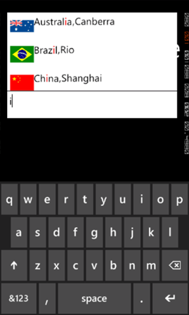
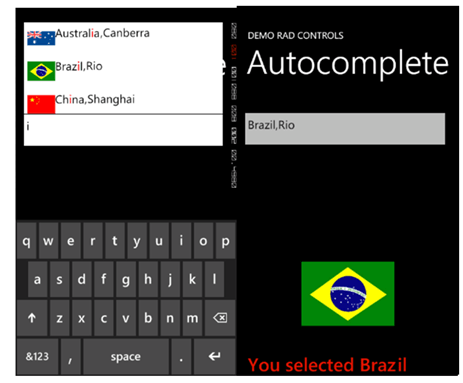
RadAutoCompleteBox control gives you immersive experience as following. It can be bind to data source as simple as collection of strings or collection of complex objects. In below RadAutoCompleteBox SuggestionSource is of complex objects.

image

To start working with RadAutoCompleteBox first you need to add following namespace on the XAML page.

clip_image002

You can create a simple RadAutoCompleteBox as following

image

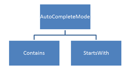
There are many properties exposed to configure RadAutoCompleteBox. You can set values of those properties as per your requirement. Two important properties are AutoCompleteMode and AutoCompletePopupDisplayMode. AutoCompleteMode property defines the way filtering should be done. Filtering criteria will be can be set to two values.

image

AutoCompletePopupDisplayMode defines the place of popup windows to open. This property can be set to four values. Those four values are as following

image

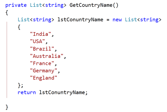
SuggestionSource can be created as following. It is a function returning List of Strings.

image

After creating SuggestionSource you can set that in code behind as given below.

image

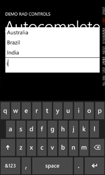
At this point on running the application, you should get experience of RadAutoCompleteBox as given in below image,

image

Now let us see how we can work with a complex object. For that go ahead and create a class called CountryData. There are three properties in the class.


public class CountryData
{

public string CountryName { get; set; }
public string  CountryCapital { get; set; }
public ImageSource CountryFlag { get; set; }

}

Next you need to create data source or suggestion source. For that I have created a function returning List of CountryData. I have put images in the Images folder. In below function using collection initializer we are creating List of object of CountryData and returning that.


private List<CountryData> GetCountryDetails()
{
List<CountryData> lstCountryData = new List<CountryData>
{
new CountryData
{
CountryName = "India" , CountryCapital ="New Delhi " , CountryFlag= GetImageSource("/Images/indiaflag.jpg")
},
new CountryData
{
CountryName = "USA" , CountryCapital ="Washington" , CountryFlag= GetImageSource("/Images/usaflag.jpg")
},
new CountryData
{
CountryName = "France" , CountryCapital ="Paris" , CountryFlag= GetImageSource("/Images/franceflag.jpg")
},
new CountryData
{
CountryName = "England" , CountryCapital ="London" , CountryFlag= GetImageSource("/Images/englandflag.jpg")
},
new CountryData
{
CountryName = "Germany" , CountryCapital ="Berlin" , CountryFlag= GetImageSource("/Images/germanyflag.jpg")
},
new CountryData
{
CountryName = "China" , CountryCapital ="Shanghai" , CountryFlag= GetImageSource("/Images/chinaflag.jpg")
},
new CountryData
{
CountryName = "Japan" , CountryCapital ="Tokyo" , CountryFlag= GetImageSource("/Images/japanflag.jpg")
},
new CountryData
{
CountryName = "Australia" , CountryCapital ="Canberra" , CountryFlag= GetImageSource("/Images/ausflag.jpg")
},
new CountryData
{
CountryName = "Brazil" , CountryCapital ="Rio" , CountryFlag= GetImageSource("/Images/brazilflag.jpg")
},

};
return lstCountryData;
}

GetImageSource function is defined as following. This function is taking image path as string and converting that to ImageSource such that directly can be bind to Image control.


private ImageSource GetImageSource(string fileName)
{
return new BitmapImage(new Uri(fileName, UriKind.Relative));
}

Finally you need to set SuggestionSource of radAutoCompleteBox. You can set that in page constructor as given below,


public MainPage()
{
InitializeComponent();
this.radAutoCompleteBox.SuggestionsSource = GetCountryDetails();

}

Now you need to put radAutoCompleteBox on xaml. We are filtering on a SuggestionSource consist of complex objects so you need to set the value of property FilterKeyPath. You can set value of this property to any property of the object. In this case we are filtering on CountryName. SuggestionSelected event gets fired when user selects an item from the popup.

image

By now you have created radAutoCompleteBox and bind to a SuggestionSource of complex objects. Next we need to create SuggestionTemplate. SuggetionTemplate defines the way data from complex object bind as SuggestionSource will be displayed in the suggestion popup. Since there are three properties in the object and one of them is an image. So simply we have put a StackPanel with horizontal orientation and binding properties value in controls inside the StackPanel.

image

Last but not least we want items highlighting on filtering. We want to highlight item on property set as FilterKeyPath. We set CountryName as FilterKeyPath. You can highlight item on filtering as following. You can set highlight style on background or foreground.

image

Consolidating codes from above discussion you will have XAML as following. There is one StackPanel in second row of Grid. On selection of an item, that item will get displayed in controls inside StackPanel.


<phone:PhoneApplicationPage
x:Class="Demo.MainPage"
xmlns="http://schemas.microsoft.com/winfx/2006/xaml/presentation"
xmlns:x="http://schemas.microsoft.com/winfx/2006/xaml"
xmlns:phone="clr-namespace:Microsoft.Phone.Controls;assembly=Microsoft.Phone"
xmlns:shell="clr-namespace:Microsoft.Phone.Shell;assembly=Microsoft.Phone"
xmlns:d="http://schemas.microsoft.com/expression/blend/2008"
xmlns:mc="http://schemas.openxmlformats.org/markup-compatibility/2006"
xmlns:telerikPrimitives="clr-namespace:Telerik.Windows.Controls;assembly=Telerik.Windows.Controls.Primitives"
xmlns:telerikData="clr-namespace:Telerik.Windows.Controls;assembly=Telerik.Windows.Controls.Data"
xmlns:telerikInput="clr-namespace:Telerik.Windows.Controls;assembly=Telerik.Windows.Controls.Input"
mc:Ignorable="d" d:DesignWidth="480" d:DesignHeight="768"
FontFamily="{StaticResource PhoneFontFamilyNormal}"
FontSize="{StaticResource PhoneFontSizeNormal}"
Foreground="{StaticResource PhoneForegroundBrush}"
SupportedOrientations="Portrait"  Orientation="Portrait"
shell:SystemTray.IsVisible="True">

<!--LayoutRoot is the root grid where all page content is placed-->
<Grid x:Name="LayoutRoot" Background="Transparent">
<Grid.RowDefinitions>
<RowDefinition Height="Auto"/>
<RowDefinition Height="*"/>
</Grid.RowDefinitions>

<!--TitlePanel contains the name of the application and page title-->
<StackPanel x:Name="TitlePanel" Grid.Row="0" Margin="12,17,0,28">
<TextBlock x:Name="ApplicationTitle" Text="DEMO RAD CONTROLS" Style="{StaticResource PhoneTextNormalStyle}"/>
<TextBlock x:Name="PageTitle" Text="Autocomplete" Margin="9,-7,0,0" Style="{StaticResource PhoneTextTitle1Style}"/>
</StackPanel>

<!--ContentPanel - place additional content here-->
<Grid x:Name="ContentPanel" Grid.Row="1" Margin="12,0,12,0">

<Grid.RowDefinitions>
<RowDefinition Height="*" />

</Grid.RowDefinitions>

<telerikInput:RadAutoCompleteBox x:Name="radAutoCompleteBox"
Height="100"
AutoCompleteMode="Contains"
FilterKeyPath="CountryName"
SuggestionSelected="radAutoCompleteBox_SuggestionSelected"
Margin="-6,19,6,185">

<telerikInput:RadAutoCompleteBox.SuggestionItemTemplate>
<DataTemplate>
<StackPanel Orientation="Horizontal">
<Image Source="{Binding CountryFlag}" Height="60" Width="60" />
<TextBlock Text="{Binding CountryName}"
telerikInput:RadAutoCompleteBox.IsElementHighlighted="True">
<telerikInput:RadAutoCompleteBox.HighlightStyle>
<telerikInput:HighlightStyle Foreground="Red" FontSize="26"/>
</telerikInput:RadAutoCompleteBox.HighlightStyle>
</TextBlock>
<TextBlock Text="," />
<TextBlock Text="{Binding CountryCapital}" />
</StackPanel>
</DataTemplate>
</telerikInput:RadAutoCompleteBox.SuggestionItemTemplate>

</telerikInput:RadAutoCompleteBox>

<StackPanel Grid.Row="1" Orientation="Vertical">
<Image x:Name="imgMessage" Height="250" Width="200" />
<TextBlock  x:Name="txtMessage"  FontSize="40" Style="{StaticResource PhoneTextAccentStyle }"/>
</StackPanel>

</Grid>
</Grid>

</phone:PhoneApplicationPage>

Last but not least you need to handle SuggestionSelected event. In this event we will bind selected item in controls inside StackPanel.


private void radAutoCompleteBox_SuggestionSelected(object sender, SuggestionSelectedEventArgs e)
{

CountryData data  = e.SelectedSuggestion as CountryData;
radAutoCompleteBox.Text = data.CountryName + "," + data.CountryCapital;
txtMessage.Text = "You selected " + data.CountryName;
imgMessage.Source = data.CountryFlag;
}

Now if you go ahead and run the application you should get experience of radAutoCompleteBox as following

image

In this way you can work with radAutoCompleteBox. I hope you find this post useful. Thanks for reading.

Working with RadConversationView Control for Windows Phone

In this post we will learn to work with control for Windows Phone. This control allows you to get exact immersive experience of native Messaging Application in your own application.

RadConversationView gives UI experience as following image. By default it takes accent color set on the device.

image

To start working with this control first thing you need to do is to add reference of Telerik.Windows.Controls.Data on the XAML page. You can add reference as following.

image

After adding reference, you can put control on XAML as following

image

You see that we are binding ItemSource property of RadConversationView in the same way we bind ListView control. After putting RadConversationView on the XAML, we need to create Conversation Message. ConversationViewMessage is used to create conversation message. However you can create custom message and bind to RadConversationView as well. You can create an incoming message as following,

image

You need to pass following parameter in the constructor of ConversationViewMessage to create a message.

  1. Message as string
  2. Time at message sent or receive as DateTime
  3. Type of the message that whether it is outgoing message or incoming message.

You can create an outgoing message as following

image

To show messages in RadConversationView control, you need to add all messages in an observable collection and bind the collection to the control. You can do that as following

image

After creating observable collection you need to bind the collection to itemsource property of RadConversationView. You can add new message by handling SendingMessage event

image

And in ConversationViewSendingMessage function a message can be added as given in below.

image

RadConversationView control is very flexible and you can also perform following tasks.

  • Change the outgoing message template
  • Change the incoming message template
  • Create and bind custom message
  • Create another message types than outgoing and incoming
  • Grouping of the message on an arbitrary criteria

In this way you can harness features of RadConversationView in creating killer Windows Phone application. For your reference full source code of above discussion is given below,

MainPage.xaml


<phone:PhoneApplicationPage
x:Class="Demo.MainPage"
xmlns="http://schemas.microsoft.com/winfx/2006/xaml/presentation"
xmlns:x="http://schemas.microsoft.com/winfx/2006/xaml"
xmlns:phone="clr-namespace:Microsoft.Phone.Controls;assembly=Microsoft.Phone"
xmlns:shell="clr-namespace:Microsoft.Phone.Shell;assembly=Microsoft.Phone"
xmlns:d="http://schemas.microsoft.com/expression/blend/2008"
xmlns:mc="http://schemas.openxmlformats.org/markup-compatibility/2006"
xmlns:telerikPrimitives="clr-namespace:Telerik.Windows.Controls;assembly=Telerik.Windows.Controls.Primitives"
xmlns:telerikData="clr-namespace:Telerik.Windows.Controls;assembly=Telerik.Windows.Controls.Data"
mc:Ignorable="d" d:DesignWidth="480" d:DesignHeight="768"
FontFamily="{StaticResource PhoneFontFamilyNormal}"
FontSize="{StaticResource PhoneFontSizeNormal}"
Foreground="{StaticResource PhoneForegroundBrush}"
SupportedOrientations="Portrait"  Orientation="Portrait"
shell:SystemTray.IsVisible="True">

<!--LayoutRoot is the root grid where all page content is placed-->
<Grid x:Name="LayoutRoot" Background="Transparent">
<Grid.RowDefinitions>
<RowDefinition Height="Auto"/>
<RowDefinition Height="*"/>
</Grid.RowDefinitions>

<!--TitlePanel contains the name of the application and page title-->
<StackPanel x:Name="TitlePanel" Grid.Row="0" Margin="12,17,0,28">
<TextBlock x:Name="ApplicationTitle" Text="DEMO RAD CONTROLS" Style="{StaticResource PhoneTextNormalStyle}"/>
<TextBlock x:Name="PageTitle" Text="Messages" Margin="9,-7,0,0" Style="{StaticResource PhoneTextTitle1Style}"/>
</StackPanel>

<!--ContentPanel - place additional content here-->
<Grid x:Name="ContentPanel" Grid.Row="1" Margin="12,0,12,0">

<telerikData:RadConversationView ItemsSource="{Binding}"
x:Name="conversationView"/>

</Grid>
</Grid>

</phone:PhoneApplicationPage>

MainPage.xaml.cs


using System;
using System.Collections.Generic;
using System.Linq;
using System.Net;
using System.Windows;
using System.Windows.Controls;
using System.Windows.Documents;
using System.Windows.Input;
using System.Windows.Media;
using System.Windows.Media.Animation;
using System.Windows.Shapes;
using Microsoft.Phone.Controls;
using System.Collections.ObjectModel;
using Telerik.Windows.Controls;

namespace Demo
{
public partial class MainPage : PhoneApplicationPage
{
// Constructor
ObservableCollection<ConversationViewMessage> messages =
new ObservableCollection<ConversationViewMessage>();
public MainPage()
{
InitializeComponent();
ConversationViewMessage msg = new ConversationViewMessage("Hello there",
DateTime.Now,
ConversationViewMessageType.Outgoing);
messages.Add(msg);

msg = new ConversationViewMessage("wow what's up?",
DateTime.Now.AddSeconds(5),
ConversationViewMessageType.Incoming);
messages.Add(msg);

msg = new ConversationViewMessage("Going good ... you say what about Coffee this Saturday ???.", DateTime.Now.AddSeconds(10), ConversationViewMessageType.Outgoing);
messages.Add(msg);

msg = new ConversationViewMessage("Hmmmmm !!!! le'm check my plans", DateTime.Now.AddSeconds(15), ConversationViewMessageType.Incoming);
messages.Add(msg);

this.DataContext = messages;
this.conversationView.SendingMessage +=
new EventHandler<ConversationViewMessageEventArgs>(ConversationViewSendingMessage);
}

void ConversationViewSendingMessage(object sender, ConversationViewMessageEventArgs e)
{

messages.Add((ConversationViewMessage) e.Message);
}

private object CreateMessage(string messageText, ConversationViewMessageType type)
{
return new ConversationViewMessage(messageText, DateTime.Now.AddSeconds(5), type);
}
}
}

When you run above application you should get output as following

image

I hope you find this post useful. Thanks for reading.

Webinar : Telerik Tools for Ninja Developer – Just Mock

Telerik India in a new initiative has started a series of webinars known as “Telerik tools for the Ninja Developer – The Series”. We have already completed 3 webinars as part of the series which includes Kendo UI, Just Code and Test Studio.

Continuing the series we are hosting a webinar on Aug 29 for Asia region. Here is the details of the webinar:

Title: Telerik Tools for Ninja Developer : Just Mock

Date: Aug 29 2012

Time: 3PM – 4PM IST

(Note: click on the title above to get to the registration link)

Do you avoid running your unit tests for fear they will never be complete? Do you wish for a better way? Well, look no further! With Telerik JustMock, you can make sure your code works as intended and be out of the office in time for happy hour. In this session, you will learn how to separate dependencies to make your tests run faster with JustMock Lite. You will then learn how the full edition of JustMock is used to tackle those hard-to-reach bits of code. Whether you’re new to unit testing, new to mocking, or just looking for a better way, this webinar is for you!

image

JustMock is an easy, fast, feature rich framework for creating unit tests. This complete mocking tool allows for mocking of non-virtual methods, non-public members, sealed classes and static methods and classes – all within one simple API. JustMock is the easy and fun way to test your code – anyone can mock with JustMock!

So join me as I take you through a tour of Just Mock and Unit Testing. Hope you will be there and will enjoy the ride. So what you waiting for – book a seat for yourself now. Register here.

See you at the webinar. Happy coding!

Slides and Projects to download from Test Studio webinar

image

Very first thank you very much for attending Test Studio webinar on 22nd September . We had great time presenting and hope you had great time learning about Test Studio as well. In this webinar we covered following topics

  • Benefits of Automation
  • Automated Web Testing
  • Data Driven Testing
  • Working with TestLists
  • Ajax Testing

We strongly recommend you to download 30 days free trial and start playing with it and learn more about Test Studio here

Download Test Projects and Slides Deck from here

Below are the some of the questions asked in webinar,

What is the difference between Creating a Folder and Creating a Test?

Folders are for organizing tests in; the test is the piece of automation

What’s Test Studio Express?

Express is a plug in for Visual Studio. You can create, execute, and maintain tests in it. It helps collaboration. Testers can work in Test Studio Standalone, then hand tests off to developers if they need to do things like check the database or use support infrastructure. Testers can use Test Studio Express, too, if they’re more comfortable there and like working in Visual Studio.

Is this a limitation of test studio that it allows recording in IE ONLY?

Recording is an extraordinarily difficult operation. We focus on IE so that we can make it powerful, smooth, and easy to use. You can play back in IE, Firefox, Safari, or Chrome

When we add multiple Tests inside a Test List, After finishing each test, will Test Studio close the window every time and re-launch it for the next test ?

By default, yes. You can also select to “Recycle Browser” in the web tab of the test list’s Settings. This will keep the same browser open; however, you have to be very careful about state, session, cookies, etc.

Where can we make custom code changes to any particular test step?

Yes! You can convert any test step to code by right clickign on it and selecting Convert to Code. You can also add custom code steps.

In case I don’t want to record and run the test but i want to do manual coding to create my own automation suite?

Yes, you can do fully manual coded tests or steps. You can write in C# or VB.NET

How TestStudio is helpful for Silverlight OOB applications?

Test Studio can be used to test the Silverlight OOB applications as well. Silverlight tests get recorded in exactly the same fashion as the web tests DJ has been showing. The experience is very similar. You can explore the visual tree, etc.

Which scripting language is supported by Test studio?

C# and VB.NET

Does it support SAP?

If the SAP application renders HTML, Silverlight or WPF then yes!

Does it work on other tools than .net?

Test Studio will test against any server technology. The demo application is written in Ruby!

Do we have any quick start guide on that?

Yes, please see tv.telerik.com for some great videos on testing Silverlight!

What about performance testing?

We have separate webinars on performance and load testing!

How to simulate multiple users?

You can use Load testing feature to simulate multiple users.

Will it work for software build using procedural language like Clarion?

If the system renders HTML, Silverlight or WPF then Test Studio will work fine with it.

If application is publish in citrix can we record and test it?

Possibly, there are sometimes difficulties depending on your environment.

I hope you had  worth of your time in this webinar. Looking forward  for your participation in further webinars ..

RadControls for Web – And you ask why?


Overview:

In this post, we will quickly look at the factors that will compel you to consider Telerik RadControls as the framework for all your User Interface layers in your projects. So buckle up and let’s go for a ride with Telerik RadControls.


RadControls Defined:

Rad or RAD – stands for Rapid Application Development and RadControls are nothing but controls which help you in Rapid Application Development. Telerik offers over 10 years of aggressive development which includes a set course of 3 releases per year & the Service Packs, has been able to come out with industry leading UI component suite for Microsoft ASP.NET technology which includes AJAX, MVC and Silverlight. There are nearly 175+ controls under the combined umbrella of   AJAX, MVC and Silverlight. The controls themselves, enhance the framework provided controls with a lot of out of the box features. For e.g. If you consider the RadGridView we complement the framework Grid with features such as Filtering, Grouping, Sorting, Paging and export capability. Imagine if you had the onus of writing the paging and export all by yourself. I have been a programmer for close to a decade and I would say it will be like reinventing the wheel. So, with RadControls you just have to worry about your business need and the control complements your requirement with out of the box features.

image     Telerik Extensions for ASP.NET MVC   image


RadControls Decision Factors:

Having known about RadControls and what they are, next question will be – Why should you choose RadControls? Lets quickly run through some of the check list before you decide:

  • You want to develop a professional web application.
  • You want to deliver your application fast to the Client/Market.
  • You want to build apps which adhere to certain standards like Accessibility standards.
  • You want to meet your deadlines and budgets.
  • You want to cut down your development cost and development time.
  • You want to rapidly provide custom software for ever changing needs of clients.
  • You want to quickly create working prototypes.

If you have answered Yes to the above checklist – then – RadControls is what you need. RadControls will help you to achieve all of the above mentioned points in the check list. So I highly recommend you to download a trial and test drive the following RadControls:


RadControls and Developers:

Developer friendliness is one of the important factors for any UI component vendor. Keeping the developers in mind helps Telerik adopt the highest degree of friendliness when it comes to the UI controls. There are three main factors which we think makes a developers life easy when working with our RadControls. They are:

  • Visual Studio Integration – All our suites extend Visual Studio by integrating seamlessly with the Visual Studio toolbox. This allows developers to use the controls quickly by simply dragging and dropping on the working area. Currently we have support for Visual Studio 2012 as well.


  • Design Time Wizards – When working with the controls in design time, RadControls provide wizard interfaces on all controls to easily configure the features you need.


  • Familiarity – Whole of the RadControls framework mirrors the Microsoft .NET framework. So as a developer if you understand the .NET framework, RadControls is no different. So the learning curve is very minimal and you will be able to get on with it in a jiffy.


RadControls and Themes:

One of the deciding factors we looked at earlier was that of developing a professional looking web application. What we needed to make our application look like a professional app is style sheets. Be it Web app or Silverlight app, styles play a pivotal role in the look and feel of any User Interface. Most of the developers are not designers – which includes me too :). So the RadControls suite comes to the rescue by way of packaging what we call as Themes i.e. a complete style sheet which adheres to one common color scheme across the controls. The Telerik RadControls suite comes bundled with close to 25+ themes under the combined umbrella of ASP.NET AJAX, MVC and Silverlight. So out of the box we ship 25+ themes to use in your production level application. If that is not enough you can always create your own theme and embed the same in your application. ASP.NET AJAX and MVC suites provide a Visual Theme Builder which can be used to create your custom themes. Here are the links for Visual Theme Builder:


Summary:

Telerik RadControls for Web provides a lot of benefit to enterprises in not only speeding up the development life-cycle but also cuts down on the cost and time of development. It also is developer friendly with seamless Visual Studio integration and design time wizard to help code faster. As said in the previous sections, there are nearly 175+ controls to play around in the area of AJAX, MVC and Silverlight. If that doesn’t excite you then I don’t know what will :). Download the 30 day trial we have and give it a try. I bet you will fall in love with the RadControls.

Till next time – Happy Coding !!!

Using SQL Server for Data Driven Web Testing in Test Studio


In this post we will follow step by step approach to bind data from a SQL Server table to perform data driven automated web testing.

Let us assume we have a SQL Server table and we want to use it as data source for automated web testing in Test Studio. Assume table schema is as following

image

And data in table is as below

image

Before using data from this table for automated web testing, we need to add database containing this table as data source and then we will have to bind the table to the test. Essentially we need to perform three steps,

  1. Add database as data source in test project
  2. Bind table to test
  3. Bind column to a particular Test step

Add database to project

To add database as data source to project click on Project tab and then click on Add Data Sources

image

Choose Database as type of data source

image

Select SqlClient Data Provider as Provider from then Provider drop down.

image

After selecting provider, we need to provide connection string of the database and a friendly name for the data source. Click on ok button to add SQL Server database as data source.

image

After adding data source you can see that added data source is being listed in the Data Source section.

image


Binding Table to a particular Test

Once data source is added to the test project, we can bind a particular table from data source to a test. To do that right clicks on test in which you want to do data binding. In below image we are binding to test named bingtest

image

You will be prompted to select data source. In drop down the entire data source added to the project would be listed.

image

From drop down select data source we added in previous step.

image

Once data source is selected one more drop down would get visible to select table. In this case there is only one table named BingSearch in the data source. Select the table from the drop down.

image

After selecting table all the records from table will be listed in Grid. Click on the Ok button to complete data binding task to a test.

image

You will notice a database icon next to test we done data binding.

image

Binding Columns to a Test Steps

To bind a column to a test step we need to select that particular test step in the Steps tab and from the properties tab select collection option

image

After selecting the step in the property tab navigate to Data Driven section

image

From the collection drop down, you need to select the column to bind to the step. Once column is selected, click on the Set button to complete the data binding.

image

You can verify in the test step that test property of that element is data driven now.

image

In this way you can perform data driven testing fetching data from a SQL Server table. I hope this post was useful. Thanks for reading.


Adding and Removing Data Binding in a Web Test


In this post we will learn the way to add and remove Data Binding from a Web Test in Test Studio. Before binding data on a test, we need to have DataSource added in the project. We can add DataSource as following.

Step 1:

Select the Project tab and from Data Sources group, click on the Add menu button

image

Step 2:

Choose the type of data source you are interested in adding. After choosing data source browse to file location to select the data source. Click on Ok button to add data source in the Test project.

image

Step 3:

After adding data source verify in Data Sources that data source being added. In this case we have added an Excel File as data source with name searchdata.

image

Once data source is added in the project we need to follow below steps to bind a data source to a test.

Step 1:

Right click on the Test and click on DataBind

image

Step 2:

Bind test to data source window will get prompted to you. Here you need to select the data source.

image

Step 3:

In drop down you will get the entire data source added to the project. You need to choose one to create data binding for the test.

image

Step 4:

After selecting data source you need to select the table or sheet in case of excel.

image

Step 5:

Once you select the sheet data will get displayed for the preview. Click on OK button to add the data binding.

image

In this way you can add a data binding to a test. Once data is bind to the test, you can see the database icon beside the test. In below image you can see bingtest has been bind with the test.

image

To remove data bind from the test, right click on the test and click on Remove Data Binding.

image

In this way you can add and remove data binding from a Test. I hope this post is useful. Thanks for reading.


Test Studio Webinar on 22nd Aug 2012

image

If you are enthusiastic about finding bugs in software and find solace in testing, we have a Ninja tool for you. Explore this chart buster software – Telerik Test Studio from the comfort of your seat. We are excited to invite you for a webinar on Telerik Test Studio. The details are as follows:
When: 22nd Aug 2012 at 3 pm (IST)

For Whom: Testers, Quality Professionals, Project Managers and Ninja’s

Register for Webinar here

In this webinar we will cover,

  • Automated Web Testing
  • Data Driven Testing
  • Working with Test Lists
  • Test Result Analysis and Reporting
  • Ajax Testing
  • Performance Testing

The webinar is demonstration lead and we hope to make it an interactive one with your participation.

See you all at the webinar.

You can learn more about Test Studio here and can start exploring by downloading the free trial