Join me for the webinar: Developing Applications for Nokia Lumia using Telerik Controls

We are conducting webinar for Windows Phone Developers on 7th March 2013 at 3PM to 4PM IST.

Register for the Webinar here

Learn more about Rad Controls for Windows Phone

clip_image002

Windows Phone application development or creating application for Nokia Lumia devices is keeping a lot of developers very busy. Developers have the envious task of creating quality Windows Phone Application in short span of time. Telerik RadControls for Windows Phone provide the set of controls that significantly speed up the Windows Phone App Development process.

In this webinar we will start with Rad Controls for Windows Phone. We will explore various Rad Controls. We will keep webinar demo oriented and we will more focus on writing and understanding codes. RadControls for Windows Phone provides you different controls and building blocks to cut your development time. These controls are designed to shorten your app development time.

Register for the Webinar here

Learn more about Rad Controls for Windows Phone

See you there in the webinar.

New UI Controls as part of Telerik DevCraft Q3 2012 Release

On Oct 17 2012, we did a release of our Telerik DevCraft bundle known as Q3 2012 release. As part of the release our UI suites have got couple of new controls added to the bundle. In this blog post we will look at what new controls have been added to our UI suites namely – RadControls for ASP.NET AJAX, RadControls for Silverlight, RadControls for WPF, RadControls for WinForms, Windows 8 Controls and RadControls for Windows Phone. So lets go over them one by one.


RadControls for ASP.NET AJAX:

ASP.NET AJAX suite gets the following new controls added to the family of already existing 70+ controls. They are:

Gauge:

This is a high performing HTML5 based radial and linear gauge control which can be used to show certain values in a scale.


See demos of Gauge control here

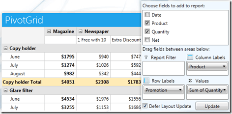
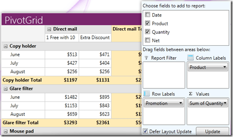
PivotGrid (Beta):

PivotGrid is a control used to show pivoted data in a tabular or outline or in a compact layout. We bring the power of Pivot to Web with the introduction of this control. This control supports aggregates, drag and drop and a field list control panel.

See demos of PivotGrid here.

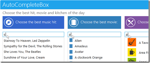
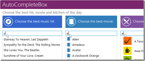
AutoCompleteBox:

As the name goes – this is a auto completion textbox. It auto suggests filtered list with options based on user input and supports multiple item selection. This was one of the highly requested control for ASP.NET AJAX

See demos of AutoCompleteBox here.

You can download a free trial of RadControls for ASP.NET AJAX and evaluate the controls for your needs.

image


RadControls for SilverLight:

Four new controls got added to the Silverlight controls family. They are:

PivotGrid (Beta):

RadPivotGrid is released as a Beta control in this release. This supports data summarizations and great data visualization capabilities.

image

See demos of RadPivotGrid here.

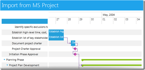
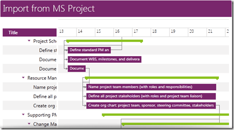
GanttView:

GanttView is a control designed for managing and visualizing complex planning data and tasks. Often used in project planning and management scenarios. Using this control it is easier to understand and analyze the data.

image

See demos of GanttView here.

AutoCompleteBox:

No need to explain this control. The auto suggestion control is now available in Silverlight suite also.

image

See demos of AutoCompleteBox here.

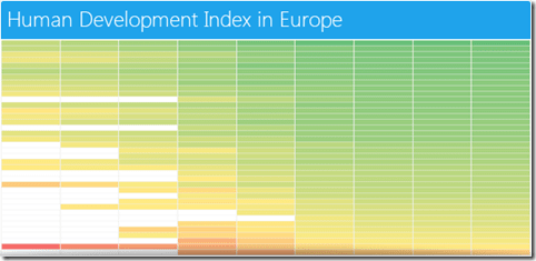
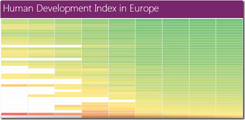
HeatMap:

HeatMap is a control which is matrix-like control, which uses color to encode the values along two axes.

image

See demos of RadHeatMap here.

Download free trial of RadControls for Silverlight and evaluate them for your needs.

image


RadControls for WPF:

New controls introduced for WPF suite are as follows:

PivotGrid (Beta):

image

GanttView:

image

AutoCompleteBox:

image

HeatMap:

image

Download free trial of RadControls for WPF and evaluate them for your projects.

image


RadControls for WinForms:

There was one control added to the WinForms family. That is RadPivitGrid and released as a Beta control in this release.

PivotGrid Filtering

You can download thirty day free trial of RadControls for WinForms with dedicated support during trial period.

image


RadControls for Windows Phone:

Five new controls got added to the Windows Phone controls family. They are as follows:

TimeSpanPicker:

TimeSpanPicker control provides full control over time and duration in any app where users set duration. This control allows users to define duration of certain action.

TimeSpanPicker

Expander:

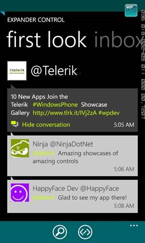
Expander control allows users to expand or collapse conversations. Fits well in applications that rely on interaction and messaging.

Expander Control

PasswordBox:

As the name goes this is a ready made password input text box for Windows Phone scenario. Using this control in a registration form will automatically display the typical dots in place of the actual password being typed.

PasswordBox

DataForm:

DataForm control provides with out of the box data forms that can be simply configured to work with business logic of your application. It also provides out of the box validation, styling and other customization mechanisms.

DataForm

InputPrompt:

This control allows you to create prompts where you can ask users to enter important details such as Phone number, email, etc.

InputPrompt

You can download a free trial of RadControls for Windows Phone to evaluate the controls.

image


RadControls for Windows 8:

This is a brand new suite as far as the RadControls family is concerned. This suite contains some of the controls which are not found in the SDK of Windows 8 development like date and time pickers. These controls have been built from ground up and provide you with the same UI and UX as that of Windows 8 look and feel. Currently following 15+ controls are released and many more will be added to the suite over time. At this moment we are offering this suite at an introductory price of $99 and you will receive all the new components and updates that will be added to the suite in the next year.

image

image


Hope this blog post excites you in terms of the new control offerings from our UI control suites. If you feel like trying out them go ahead and download our free 20 day trials and evaluate them. Note that during the trial period you will get dedicated support meaning you can raise support tickets and a dedicated support team will be responding to you. Give it a try and let us know how you feel about our UI controls.

Till next time, Happy Coding.

Download Slides and Source Codes from Rad Controls for Windows Phone Webinar

Download Resources of the webinar from here

Thank you so much for attending Webinar: Telerik Tools for Ninja Developers: RadControls fot Windows Phone . I hope it was useful. If you have not done it yet then I strongly recommend you to download free trial and start playing around Rad Controls for Windows Phone. You will find more resources at below given links

Download trial from here

Demos on Rad Controls

Resources on Rad Controls for Windows Phone

Documentation on Rad Controls for Windows Phone

Forum for Rad Controls for Windows Phone

In webinar we started from downloading and installing of Rad Controls. We did walkthrough of all popular Rad Controls and discussed in detail about

  • RadConversationView control
  • RadCalendar control
  • RadSlideView control
  • RadAutoComplete control

Download Resources of the webinar from here

If you need more information and any assistance then please feel free to get connected with me at @debug_mode or send me mail on Dhananjay.kumar@telerik.com . Thanks once again for attending the webinar.

Webinar: Telerik Tools for Ninja Developers: RadControls for Windows Phone


Date: 5th Sep 2012

Time: 3:00 pm to 4:00 pm (IST)

Register here to attend the webinar

Any query mail me @ Dhananjay.kumar@telerik.com

Telerik India has started a webinar series in India time zone to create more awareness about Telerik products. So far four webinars have been conducted and large numbers of developers, designers and testers got benefited by that.

Find full schedule of the webinars here

Continuing the series, on 5th September 2012, we are conducing webinar on Rad Controls for Windows Phone to help Windows Phone developer community.

image

Windows Phone application development is keeping a lot of developers very busy. Developers have the envious task of creating quality Windows Phone Application in short span of time. Telerik RadControls for Windows Phone provide the set of controls that significantly speed up the Windows Phone App Development process.

Find more about RadControls for Windows Phone here

Register here to attend the webinar

In this webinar we will start with Rad Controls for Windows Phone. We will explore various Rad Controls. We will keep webinar demo oriented and we will more focus on writing and understanding codes. I strongly recommend you to download and install trial before coming to webinar.

RadControls for Windows Phone provides you 41 different controls and building blocks to cut your development time. These controls are designed to shorten your app development time. We will explore some of the controls listed below in the webinar.

  • RadConversationView
  • RadAutoCompleteBox
  • RadTextBox
  • RadToggleSwitch
  • RadSlideHubTiles
  • RadRating
  • RadHubTiles etc .

Apart from above listed RadControls, we will explore many other controls as well. I request you to attend the webinar. Once again find the webinar details below,

Date: 5th Sep 2012

Time: 3:00 pm to 4:00 pm (IST)

Register here to attend the webinar

See you in the webinar. If you have any question or query , please feel free to send me mail at Dhananjay.kumar@telerik.com

Updating Count Value of RadHubTile in using BackGroundWorker

While working on one of the application, I came across a requirement to keep updating count value of RadHubTile in Windows Phone. I had RadHubTile declared on XAML as following


<telerikPrimitives:RadHubTile Title="News"
ImageSource="Images\news.png"
Count="11"
Message="News Update"
Width="400"
x:Name="newshubtile">
<telerikPrimitives:RadHubTile.BackContent>
<Border Background="{StaticResource PhoneAccentBrush}">
<TextBlock HorizontalAlignment="Center"
VerticalAlignment="Center"
Text="News mashup!!"/>
</Border>
</telerikPrimitives:RadHubTile.BackContent>
</telerikPrimitives:RadHubTile>

If you notice in above declaration, we have set value initial of Count Property to 11. Now we need to update value of count on different thread. We can do that using BackGroundWoker. Suppose we have function to update count value as following


private void increaseCountValue()
{

newshubtile.Count = newshubtile.Count + 2;

}

Now we need to execute this function in BackgroundWoker. In below function, we are passing two input parameters

  1. Function as Action
  2. Delay in msecond

We are creating instance of BackgroundWorker and calling the function asynchronously on different thread than UI thread.


private void UpdateUsingBackgroundWoker(Action updateMethod, int delayInMilliseconds)
{
BackgroundWorker worker = new BackgroundWorker();
worker.DoWork += (s, e) => Thread.Sleep(delayInMilliseconds);
worker.RunWorkerCompleted += (s, e) => updateMethod.Invoke();
worker.RunWorkerAsync();

}

Last but not least we need to call UpdateIUsingBackgroundEWorker as per our requirement. We can call this as following


this.UpdateUsingBackgroundWoker(() => increaseCountValue(), 1000);

This will update count value in delay of 1 second. In this way you can update count value. I hope you find this post useful. Thanks for reading!

Start working with RadRating control for Windows Phone in three simple steps

Read more here

As name suggests by using RadRating controls, you can allow your application user to rate something. RadRating control allows user to select a value from set of rating items. RadRating control may give immersive experience as given below.

image

In this post we will follow three steps to start working with RadRating control.

Step 1

Start with adding namespace on xaml

image

Step 2

You can add a RadRating control by declaring it on xaml as following. You need to set value of AutoGeneratedItemsCount property to set number of rating items.

image

Expected output of above declaration should be as following

image

If you want you can change geometrical shape of the rating items as well. You need to set value of ItemShapeStyle property.There are five geometric shapes are provided. They are as following

  1. Stars1
  2. Stars2
  3. Hearts1
  4. Hearts2
  5. Hearts3

You can set Height and Width of the Rating Item using ItemShapeHeight and ItemShapeWidth property respectively.

In below declaration we are setting shape style, shape height and shape width.

image

Expected output of above RadRating control declaration is as following

image

If you want you can customize individual rating item also. You can do that as following. You may have content for each individual rating item.

image

Expected output of above RadRating control declaration is as following

image

Step 3

In last step you may want to handle events to perform operation when user is changing the rating. Below two events are important to track when user is changing rating or rating has been changed already.

  • ValueChanged
  • ValueChanging

You can handle ValueChanged event as following. In this event you get both old value and new value from the RadRating control

image

Conclusion

These are three simple steps you required to start working with RadRating control. Below I am consolidating codes from above discussion

MainPage.xaml


<phone:PhoneApplicationPage
x:Class="processapp.MainPage"
xmlns="http://schemas.microsoft.com/winfx/2006/xaml/presentation"
xmlns:x="http://schemas.microsoft.com/winfx/2006/xaml"
xmlns:phone="clr-namespace:Microsoft.Phone.Controls;assembly=Microsoft.Phone"
xmlns:shell="clr-namespace:Microsoft.Phone.Shell;assembly=Microsoft.Phone"
xmlns:d="http://schemas.microsoft.com/expression/blend/2008"
xmlns:telerikPrimitives="clr-namespace:Telerik.Windows.Controls;assembly=Telerik.Windows.Controls.Primitives"
xmlns:telerikInput="clr-namespace:Telerik.Windows.Controls;assembly=Telerik.Windows.Controls.Input"
xmlns:mc="http://schemas.openxmlformats.org/markup-compatibility/2006"
mc:Ignorable="d" d:DesignWidth="480" d:DesignHeight="768"
FontFamily="{StaticResource PhoneFontFamilyNormal}"
FontSize="{StaticResource PhoneFontSizeNormal}"
Foreground="{StaticResource PhoneForegroundBrush}"
SupportedOrientations="Portrait"  Orientation="Portrait"
shell:SystemTray.IsVisible="True">

<!--LayoutRoot is the root grid where all page content is placed-->
<Grid x:Name="LayoutRoot" Background="Transparent">
<Grid.RowDefinitions>
<RowDefinition Height="Auto"/>
<RowDefinition Height="*"/>
</Grid.RowDefinitions>

<!--TitlePanel contains the name of the application and page title-->
<StackPanel x:Name="TitlePanel" Grid.Row="0" Margin="12,17,0,28">
<TextBlock x:Name="ApplicationTitle" Text="Demo App" Style="{StaticResource PhoneTextNormalStyle}"/>
<TextBlock x:Name="PageTitle" Text="rating control" Margin="9,-7,0,0" Style="{StaticResource PhoneTextTitle1Style}"/>
</StackPanel>

<!--ContentPanel - place additional content here-->
<Grid x:Name="ContentPanel" Grid.Row="1" Margin="12,0,12,0">
<Grid.RowDefinitions>
<RowDefinition Height="*"/>
</Grid.RowDefinitions>

<StackPanel Orientation="Vertical" Grid.Row="0">
<telerikInput:RadRating x:Name="rdRatingControl"
AutoGeneratedItemsCount="5" />
<TextBlock x:Name="txtrating1" Style="{StaticResource PhoneTextNormalStyle}" />
</StackPanel>

<StackPanel Orientation="Vertical" Grid.Row="1">

<telerikInput:RadRating x:Name="rdRatingControl1"
AutoGeneratedItemsCount="5"
ItemShapeStyle="Hearts1"
ItemShapeHeight="60"
ItemShapeWidth="70"
/>
<TextBlock x:Name="txtrating2" Style="{StaticResource PhoneTextNormalStyle}" />

</StackPanel>
<StackPanel Orientation="Vertical" Grid.Row="2" >
<telerikInput:RadRating  x:Name="rdRating" >
<telerikInput:RadRatingItem Content="poor "/>
<telerikInput:RadRatingItem Content="satisfied "/>
<telerikInput:RadRatingItem Content="good "/>
<telerikInput:RadRatingItem Content="verygood "/>
<telerikInput:RadRatingItem Content="excelent"/>
</telerikInput:RadRating>
<TextBlock x:Name="txtrating3" Style="{StaticResource PhoneTextNormalStyle}" />
</StackPanel>

</Grid>
</Grid>

</phone:PhoneApplicationPage>

MainPage.xaml.cs


using System;
using System.Collections.Generic;
using System.Linq;
using System.Net;
using System.Windows;
using System.Windows.Controls;
using System.Windows.Documents;
using System.Windows.Input;
using System.Windows.Media;
using System.Windows.Media.Animation;
using System.Windows.Shapes;
using Microsoft.Phone.Controls;
using Telerik.Windows.Controls;

namespace processapp
{
public partial class MainPage : PhoneApplicationPage
{
// Constructor
public MainPage()
{
InitializeComponent();
rdRating.ValueChanged += new EventHandler<ValueChangedEventArgs<object>>(rdRating_ValueChanged);
rdRatingControl.ValueChanged += new EventHandler<ValueChangedEventArgs<object>>(rdRatingControl_ValueChanged);
rdRatingControl1.ValueChanged += new EventHandler<ValueChangedEventArgs<object>>(rdRatingControl1_ValueChanged);

}

void rdRatingControl1_ValueChanged(object sender, ValueChangedEventArgs<object> e)
{
var oldValue = e.OldValue;
var newValue = e.NewValue;
string message = "you have changed value from " + oldValue + "to " + newValue;
txtrating2.Text = message;
}

void rdRating_ValueChanged(object sender, ValueChangedEventArgs<object> e)
{
var oldValue = e.OldValue;
var newValue = e.NewValue;
string message = "you have changed value from " + oldValue + "to " + newValue;
txtrating3.Text = message;
}

void rdRatingControl_ValueChanged(object sender, ValueChangedEventArgs<object> e)
{

var oldValue = e.OldValue;
var newValue = e.NewValue;
string message = "you have changed value from " + oldValue + "to " + newValue;
txtrating1.Text = message;
}

}
}

When you run application you should have application with RadRating control as following

clip_image002

I hope you find this post useful. Thanks for reading.

How to work with RadTextBox for Windows Phone

Read documentation here

RadTextBox is adding below functionalities in usual TextBox. Those functionalities are

  • Watermark
  • Validation
  • Clear Button
  • Action Button
  • Headers

You may have immersive experience of a RadTextBox as following

image

To start working with RadTextBox very first you need to add namespace on XAML as following

image

After adding namespace you need to put RadTextBox on xaml. Explicitly you need to set ActionButtonVisibility property as visible.

image

Clear button will only be visible once you start typing the text. ActionButtonTap event gets called when action button gets tapped. You can set watermark as following

image

On running you should get RadTextBox as below

image

If you want you can change style of clear and action button. Header of the RadTextBox can bind to a data source as following

image

And in the code behind

image

And Data class is defined as following

image

You should be getting RadTextBox experience as following. You will notice that header has been data bind now.

image

One of the most important features of RadTextBox is validation capabilities. You may want to perform some validation on the lost focus. To start with validation you need to add namespace

image

ValidationState enum is used to specify validation state on RadTextBox. There are four possible value of ValidationState

image

You can validate as following

image

Validate is user defined function and you may defined it as per your business requirement. Validation message will be displayed as following

image

image

In this way you can work with RadTextBox. Below is the consolidated code of all discussion from this post

MainPage.xaml


<phone:PhoneApplicationPage
x:Class="Demo.MainPage"
xmlns="http://schemas.microsoft.com/winfx/2006/xaml/presentation"
xmlns:x="http://schemas.microsoft.com/winfx/2006/xaml"
xmlns:phone="clr-namespace:Microsoft.Phone.Controls;assembly=Microsoft.Phone"
xmlns:shell="clr-namespace:Microsoft.Phone.Shell;assembly=Microsoft.Phone"
xmlns:d="http://schemas.microsoft.com/expression/blend/2008"
xmlns:mc="http://schemas.openxmlformats.org/markup-compatibility/2006"
xmlns:telerikPrimitives="clr-namespace:Telerik.Windows.Controls;assembly=Telerik.Windows.Controls.Primitives"
xmlns:telerikSlideView="clr-namespace:Telerik.Windows.Controls.SlideView;assembly=Telerik.Windows.Controls.Primitives"
xmlns:telerikData="clr-namespace:Telerik.Windows.Controls;assembly=Telerik.Windows.Controls.Data"
xmlns:telerikInput="clr-namespace:Telerik.Windows.Controls;assembly=Telerik.Windows.Controls.Input"
xmlns:telerikDataVisualization="clr-namespace:Telerik.Windows.Controls;assembly=Telerik.Windows.Controls.DataVisualization"
mc:Ignorable="d" d:DesignWidth="480" d:DesignHeight="768"
FontFamily="{StaticResource PhoneFontFamilyNormal}"
FontSize="{StaticResource PhoneFontSizeNormal}"
Foreground="{StaticResource PhoneForegroundBrush}"
SupportedOrientations="Portrait"  Orientation="Portrait"
shell:SystemTray.IsVisible="True">

<!--LayoutRoot is the root grid where all page content is placed-->
<Grid x:Name="LayoutRoot" Background="Transparent">
<Grid.RowDefinitions>
<RowDefinition Height="Auto"/>
<RowDefinition Height="*"/>
</Grid.RowDefinitions>

<!--TitlePanel contains the name of the application and page title-->
<StackPanel x:Name="TitlePanel" Grid.Row="0" Margin="12,17,0,28">
<TextBlock x:Name="ApplicationTitle" Text="DEMO RAD CONTROLS" Style="{StaticResource PhoneTextNormalStyle}"/>
<TextBlock x:Name="PageTitle" Text="Autocomplete" Margin="9,-7,0,0" Style="{StaticResource PhoneTextTitle1Style}"/>
</StackPanel>

<!--ContentPanel - place additional content here-->
<Grid x:Name="ContentPanel" Grid.Row="1" Margin="12,0,12,0">

<telerikPrimitives:RadTextBox x:Name="rdTextBox" Height="110"
ActionButtonVisibility="Visible"
Header="{Binding Name}"
Watermark="Search"
ActionButtonTap="RadTextBox_ActionButtonTap"
/>

</Grid>
</Grid>

</phone:PhoneApplicationPage>

MainPage.xaml.cs


</pre>
using System;
 using System.Collections.Generic;
 using System.Linq;
 using System.Net;
 using System.Windows;
 using System.Windows.Controls;
 using System.Windows.Documents;
 using System.Windows.Input;
 using System.Windows.Media;
 using System.Windows.Media.Animation;
 using System.Windows.Shapes;
 using Microsoft.Phone.Controls;
 using System.Collections.ObjectModel;
 using Telerik.Windows.Controls;
 using System.Windows.Media.Imaging;
 using System.Xml.Linq;
 using Telerik.Windows.Controls.PhoneTextBox;

namespace Demo
 {
 public partial class MainPage : PhoneApplicationPage
 {

public MainPage()
 {
 InitializeComponent();
 this.rdTextBox.DataContext = new Data { Name = "I am  data bind Header" };
 rdTextBox.LostFocus += new RoutedEventHandler(rdTextBox_LostFocus);

}

void rdTextBox_LostFocus(object sender, RoutedEventArgs e)
 {

bool isValid = Validate(rdTextBox.Text);
 if (isValid)
 {
 rdTextBox.ChangeValidationState(ValidationState.Valid, "Wow valid input!");
 }
 else
 {
 rdTextBox.ChangeValidationState(ValidationState.Invalid, "Oops InValid input!");
 }

}

private bool Validate(string text)
 {
 //Your validation logic
 return false;
 }

private void RadTextBox_ActionButtonTap(object sender, EventArgs e)
 {

MessageBox.Show("Hello");

}

}
 public  class Data
 {
 public string Name { get; set; }
 }

}

&nbsp;
<pre>

I hope you find this post useful. Thanks for reading.

Complex object in RadAutoCompleteBox control for Windows Phone

Read documentation here

RadAutoCompleteBox control provides suggestion to user. It provides suggestion on basis of set criteria filtering data from a SuggestionSource. SuggestionSource is nothing but a Data Source.

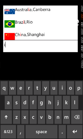
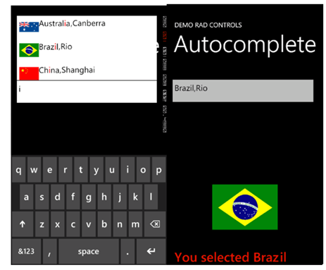
RadAutoCompleteBox control gives you immersive experience as following. It can be bind to data source as simple as collection of strings or collection of complex objects. In below RadAutoCompleteBox SuggestionSource is of complex objects.
image

To start working with RadAutoCompleteBox first you need to add following namespace on the XAML page.

clip_image002

You can create a simple RadAutoCompleteBox as following

image

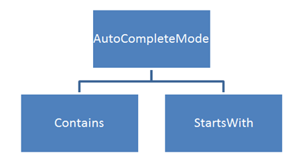
There are many properties exposed to configure RadAutoCompleteBox. You can set values of those properties as per your requirement. Two important properties are AutoCompleteMode and AutoCompletePopupDisplayMode. AutoCompleteMode property defines the way filtering should be done. Filtering criteria will be can be set to two values.
image

AutoCompletePopupDisplayMode defines the place of popup windows to open. This property can be set to four values. Those four values are as following

image

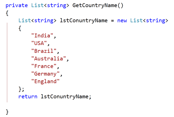
SuggestionSource can be created as following. It is a function returning List of Strings.
image

After creating SuggestionSource you can set that in code behind as given below.

image

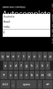
At this point on running the application, you should get experience of RadAutoCompleteBox as given in below image,
image

Now let us see how we can work with a complex object. For that go ahead and create a class called CountryData. There are three properties in the class.


public class CountryData
{

public string CountryName { get; set; }
public string  CountryCapital { get; set; }
public ImageSource CountryFlag { get; set; }

}

Next you need to create data source or suggestion source. For that I have created a function returning List of CountryData. I have put images in the Images folder. In below function using collection initializer we are creating List of object of CountryData and returning that.


private List<CountryData> GetCountryDetails()
{
List<CountryData> lstCountryData = new List<CountryData>
{
new CountryData
{
CountryName = "India" , CountryCapital ="New Delhi " , CountryFlag= GetImageSource("/Images/indiaflag.jpg")
},
new CountryData
{
CountryName = "USA" , CountryCapital ="Washington" , CountryFlag= GetImageSource("/Images/usaflag.jpg")
},
new CountryData
{
CountryName = "France" , CountryCapital ="Paris" , CountryFlag= GetImageSource("/Images/franceflag.jpg")
},
new CountryData
{
CountryName = "England" , CountryCapital ="London" , CountryFlag= GetImageSource("/Images/englandflag.jpg")
},
new CountryData
{
CountryName = "Germany" , CountryCapital ="Berlin" , CountryFlag= GetImageSource("/Images/germanyflag.jpg")
},
new CountryData
{
CountryName = "China" , CountryCapital ="Shanghai" , CountryFlag= GetImageSource("/Images/chinaflag.jpg")
},
new CountryData
{
CountryName = "Japan" , CountryCapital ="Tokyo" , CountryFlag= GetImageSource("/Images/japanflag.jpg")
},
new CountryData
{
CountryName = "Australia" , CountryCapital ="Canberra" , CountryFlag= GetImageSource("/Images/ausflag.jpg")
},
new CountryData
{
CountryName = "Brazil" , CountryCapital ="Rio" , CountryFlag= GetImageSource("/Images/brazilflag.jpg")
},

};
return lstCountryData;
}

GetImageSource function is defined as following. This function is taking image path as string and converting that to ImageSource such that directly can be bind to Image control.


private ImageSource GetImageSource(string fileName)
{
return new BitmapImage(new Uri(fileName, UriKind.Relative));
}

Finally you need to set SuggestionSource of radAutoCompleteBox. You can set that in page constructor as given below,


public MainPage()
{
InitializeComponent();
this.radAutoCompleteBox.SuggestionsSource = GetCountryDetails();

}

Now you need to put radAutoCompleteBox on xaml. We are filtering on a SuggestionSource consist of complex objects so you need to set the value of property FilterKeyPath. You can set value of this property to any property of the object. In this case we are filtering on CountryName. SuggestionSelected event gets fired when user selects an item from the popup.

image

By now you have created radAutoCompleteBox and bind to a SuggestionSource of complex objects. Next we need to create SuggestionTemplate. SuggetionTemplate defines the way data from complex object bind as SuggestionSource will be displayed in the suggestion popup. Since there are three properties in the object and one of them is an image. So simply we have put a StackPanel with horizontal orientation and binding properties value in controls inside the StackPanel.

image

Last but not least we want items highlighting on filtering. We want to highlight item on property set as FilterKeyPath. We set CountryName as FilterKeyPath. You can highlight item on filtering as following. You can set highlight style on background or foreground.

image

Consolidating codes from above discussion you will have XAML as following. There is one StackPanel in second row of Grid. On selection of an item, that item will get displayed in controls inside StackPanel.


<phone:PhoneApplicationPage
x:Class="Demo.MainPage"
xmlns="http://schemas.microsoft.com/winfx/2006/xaml/presentation"
xmlns:x="http://schemas.microsoft.com/winfx/2006/xaml"
xmlns:phone="clr-namespace:Microsoft.Phone.Controls;assembly=Microsoft.Phone"
xmlns:shell="clr-namespace:Microsoft.Phone.Shell;assembly=Microsoft.Phone"
xmlns:d="http://schemas.microsoft.com/expression/blend/2008"
xmlns:mc="http://schemas.openxmlformats.org/markup-compatibility/2006"
xmlns:telerikPrimitives="clr-namespace:Telerik.Windows.Controls;assembly=Telerik.Windows.Controls.Primitives"
xmlns:telerikData="clr-namespace:Telerik.Windows.Controls;assembly=Telerik.Windows.Controls.Data"
xmlns:telerikInput="clr-namespace:Telerik.Windows.Controls;assembly=Telerik.Windows.Controls.Input"
mc:Ignorable="d" d:DesignWidth="480" d:DesignHeight="768"
FontFamily="{StaticResource PhoneFontFamilyNormal}"
FontSize="{StaticResource PhoneFontSizeNormal}"
Foreground="{StaticResource PhoneForegroundBrush}"
SupportedOrientations="Portrait"  Orientation="Portrait"
shell:SystemTray.IsVisible="True">

<!--LayoutRoot is the root grid where all page content is placed-->
<Grid x:Name="LayoutRoot" Background="Transparent">
<Grid.RowDefinitions>
<RowDefinition Height="Auto"/>
<RowDefinition Height="*"/>
</Grid.RowDefinitions>

<!--TitlePanel contains the name of the application and page title-->
<StackPanel x:Name="TitlePanel" Grid.Row="0" Margin="12,17,0,28">
<TextBlock x:Name="ApplicationTitle" Text="DEMO RAD CONTROLS" Style="{StaticResource PhoneTextNormalStyle}"/>
<TextBlock x:Name="PageTitle" Text="Autocomplete" Margin="9,-7,0,0" Style="{StaticResource PhoneTextTitle1Style}"/>
</StackPanel>

<!--ContentPanel - place additional content here-->
<Grid x:Name="ContentPanel" Grid.Row="1" Margin="12,0,12,0">

<Grid.RowDefinitions>
<RowDefinition Height="*" />

</Grid.RowDefinitions>

<telerikInput:RadAutoCompleteBox x:Name="radAutoCompleteBox"
Height="100"
AutoCompleteMode="Contains"
FilterKeyPath="CountryName"
SuggestionSelected="radAutoCompleteBox_SuggestionSelected"
Margin="-6,19,6,185">

<telerikInput:RadAutoCompleteBox.SuggestionItemTemplate>
<DataTemplate>
<StackPanel Orientation="Horizontal">
<Image Source="{Binding CountryFlag}" Height="60" Width="60" />
<TextBlock Text="{Binding CountryName}"
telerikInput:RadAutoCompleteBox.IsElementHighlighted="True">
<telerikInput:RadAutoCompleteBox.HighlightStyle>
<telerikInput:HighlightStyle Foreground="Red" FontSize="26"/>
</telerikInput:RadAutoCompleteBox.HighlightStyle>
</TextBlock>
<TextBlock Text="," />
<TextBlock Text="{Binding CountryCapital}" />
</StackPanel>
</DataTemplate>
</telerikInput:RadAutoCompleteBox.SuggestionItemTemplate>

</telerikInput:RadAutoCompleteBox>

<StackPanel Grid.Row="1" Orientation="Vertical">
<Image x:Name="imgMessage" Height="250" Width="200" />
<TextBlock  x:Name="txtMessage"  FontSize="40" Style="{StaticResource PhoneTextAccentStyle }"/>
</StackPanel>

</Grid>
</Grid>

</phone:PhoneApplicationPage>

Last but not least you need to handle SuggestionSelected event. In this event we will bind selected item in controls inside StackPanel.


private void radAutoCompleteBox_SuggestionSelected(object sender, SuggestionSelectedEventArgs e)
{

CountryData data  = e.SelectedSuggestion as CountryData;
radAutoCompleteBox.Text = data.CountryName + "," + data.CountryCapital;
txtMessage.Text = "You selected " + data.CountryName;
imgMessage.Source = data.CountryFlag;
}

Now if you go ahead and run the application you should get experience of radAutoCompleteBox as following
image

In this way you can work with radAutoCompleteBox. I hope you find this post useful. Thanks for reading.

Working with RadConversationView Control for Windows Phone

In this post we will learn to work with control for Windows Phone. This control allows you to get exact immersive experience of native Messaging Application in your own application.

RadConversationView gives UI experience as following image. By default it takes accent color set on the device.

image

To start working with this control first thing you need to do is to add reference of Telerik.Windows.Controls.Data on the XAML page. You can add reference as following.

image

After adding reference, you can put control on XAML as following

image

You see that we are binding ItemSource property of RadConversationView in the same way we bind ListView control. After putting RadConversationView on the XAML, we need to create Conversation Message. ConversationViewMessage is used to create conversation message. However you can create custom message and bind to RadConversationView as well. You can create an incoming message as following,

image

You need to pass following parameter in the constructor of ConversationViewMessage to create a message.

  1. Message as string
  2. Time at message sent or receive as DateTime
  3. Type of the message that whether it is outgoing message or incoming message.

You can create an outgoing message as following

image

To show messages in RadConversationView control, you need to add all messages in an observable collection and bind the collection to the control. You can do that as following

image

After creating observable collection you need to bind the collection to itemsource property of RadConversationView. You can add new message by handling SendingMessage event

image

And in ConversationViewSendingMessage function a message can be added as given in below.

image

RadConversationView control is very flexible and you can also perform following tasks.

  • Change the outgoing message template
  • Change the incoming message template
  • Create and bind custom message
  • Create another message types than outgoing and incoming
  • Grouping of the message on an arbitrary criteria

In this way you can harness features of RadConversationView in creating killer Windows Phone application. For your reference full source code of above discussion is given below,

MainPage.xaml


<phone:PhoneApplicationPage
x:Class="Demo.MainPage"
xmlns="http://schemas.microsoft.com/winfx/2006/xaml/presentation"
xmlns:x="http://schemas.microsoft.com/winfx/2006/xaml"
xmlns:phone="clr-namespace:Microsoft.Phone.Controls;assembly=Microsoft.Phone"
xmlns:shell="clr-namespace:Microsoft.Phone.Shell;assembly=Microsoft.Phone"
xmlns:d="http://schemas.microsoft.com/expression/blend/2008"
xmlns:mc="http://schemas.openxmlformats.org/markup-compatibility/2006"
xmlns:telerikPrimitives="clr-namespace:Telerik.Windows.Controls;assembly=Telerik.Windows.Controls.Primitives"
xmlns:telerikData="clr-namespace:Telerik.Windows.Controls;assembly=Telerik.Windows.Controls.Data"
mc:Ignorable="d" d:DesignWidth="480" d:DesignHeight="768"
FontFamily="{StaticResource PhoneFontFamilyNormal}"
FontSize="{StaticResource PhoneFontSizeNormal}"
Foreground="{StaticResource PhoneForegroundBrush}"
SupportedOrientations="Portrait"  Orientation="Portrait"
shell:SystemTray.IsVisible="True">

<!--LayoutRoot is the root grid where all page content is placed-->
<Grid x:Name="LayoutRoot" Background="Transparent">
<Grid.RowDefinitions>
<RowDefinition Height="Auto"/>
<RowDefinition Height="*"/>
</Grid.RowDefinitions>

<!--TitlePanel contains the name of the application and page title-->
<StackPanel x:Name="TitlePanel" Grid.Row="0" Margin="12,17,0,28">
<TextBlock x:Name="ApplicationTitle" Text="DEMO RAD CONTROLS" Style="{StaticResource PhoneTextNormalStyle}"/>
<TextBlock x:Name="PageTitle" Text="Messages" Margin="9,-7,0,0" Style="{StaticResource PhoneTextTitle1Style}"/>
</StackPanel>

<!--ContentPanel - place additional content here-->
<Grid x:Name="ContentPanel" Grid.Row="1" Margin="12,0,12,0">

<telerikData:RadConversationView ItemsSource="{Binding}"
x:Name="conversationView"/>

</Grid>
</Grid>

</phone:PhoneApplicationPage>

MainPage.xaml.cs


using System;
using System.Collections.Generic;
using System.Linq;
using System.Net;
using System.Windows;
using System.Windows.Controls;
using System.Windows.Documents;
using System.Windows.Input;
using System.Windows.Media;
using System.Windows.Media.Animation;
using System.Windows.Shapes;
using Microsoft.Phone.Controls;
using System.Collections.ObjectModel;
using Telerik.Windows.Controls;

namespace Demo
{
public partial class MainPage : PhoneApplicationPage
{
// Constructor
ObservableCollection<ConversationViewMessage> messages =
new ObservableCollection<ConversationViewMessage>();
public MainPage()
{
InitializeComponent();
ConversationViewMessage msg = new ConversationViewMessage("Hello there",
DateTime.Now,
ConversationViewMessageType.Outgoing);
messages.Add(msg);

msg = new ConversationViewMessage("wow what's up?",
DateTime.Now.AddSeconds(5),
ConversationViewMessageType.Incoming);
messages.Add(msg);

msg = new ConversationViewMessage("Going good ... you say what about Coffee this Saturday ???.", DateTime.Now.AddSeconds(10), ConversationViewMessageType.Outgoing);
messages.Add(msg);

msg = new ConversationViewMessage("Hmmmmm !!!! le'm check my plans", DateTime.Now.AddSeconds(15), ConversationViewMessageType.Incoming);
messages.Add(msg);

this.DataContext = messages;
this.conversationView.SendingMessage +=
new EventHandler<ConversationViewMessageEventArgs>(ConversationViewSendingMessage);
}

void ConversationViewSendingMessage(object sender, ConversationViewMessageEventArgs e)
{

messages.Add((ConversationViewMessage) e.Message);
}

private object CreateMessage(string messageText, ConversationViewMessageType type)
{
return new ConversationViewMessage(messageText, DateTime.Now.AddSeconds(5), type);
}
}
}

When you run above application you should get output as following

image

I hope you find this post useful. Thanks for reading.

Getting Started With Rad Controls for Windows Phone

This post will help you to start working with Telerik Rad Controls for Windows Phone. You can download trial version from here

Learn more about Rad Controls for Windows Phone here

After downloading click on the exe file. You will get Telerik Control Panel as following . Select Windows Phone and click on proceed.

image

If you want you can change default installation folder on this screen or can leave the default. Accept the Terms and Conditions and click on Proceed.

image image

After successfully installation, go ahead and create new Windows Phone project in Visual Studio. In Silverlight for Windows Phone tab you will get Rad Control Windows Phone Application project template

image

As usual choose Target version of Windows Phone operating system

image

In next windows you need to select Telerik Rad Control for Windows Phone references. Select required reference for the Rad Control you are going to use in the application. I am going to use RadHubTile in the application and for that, we need following references.

image

After adding references, you need to choose type of Windows Phone Application from the drop down. I am choosing simple Windows Phone Application. You can check the checkbox to add Application Bar in the application.

image

Click on Finish to create Windows Phone Application project. After creation of project to work with Rad Controls you need to add references on the XAML page.

image

After adding reference you can work with any RadControl. For example you can add RadHubTile on the application page as following

image

At the point if you run the application, you should be getting application with RadHubTile as following.

image

Conclusion

In this way you can set up environment to start developing Windows Phone Applications using Telerik Rad Controls for Windows Phone. In further posts we will get deeper into capabilities of all the Rad Controls.