

In our quest to beautifying the web, we present more “cool” UI available for the humble Kendo UI button.
The Kendo UI DropDownButton is a component that is available in {ButtonsModule} from
‘@progress/kendo-angular-buttons’.
For using Kendo UI buttons, you need to install Kendo in your Angular application. To learn the process of installation, follow my previous article and make your Angular app ready.
Power up your Angular 5 Application with Kendo UI
You need to complete the Angular v5 app along with Kendo UI Buttons module before continuing with the following:
DropDownButton looks like the Button but when you click, it displays a popup list with items. DropDownButton also allows us binding a list or an array with multiple values from an Angular component.
If you have any Array like this in any Component and want to show this array’s values as a list of options in the DropDownButton, you can do that using the following code.
data: Array<any> = [{
text: ‘My Profile’
}, { text: ‘Friend Requests’ },
{ text: ‘Account Settings’ },
{ text: ‘Support’ },
{ text: ‘Log Out’ }];
Now, in app.component.html, add a Kendo DropDownButton.
<kendo-dropdownbutton></kendo-dropdownbutton>
Kendo DropDownButton has a property called “data” for binding the Options list with it.
<kendo-dropdownbutton [data]=“data”>
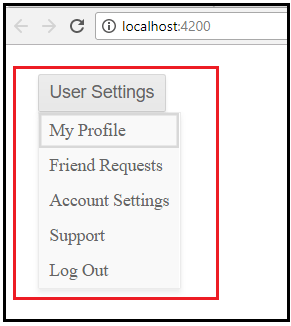
User Settings
</kendo-dropdownbutton>
Now, your DropDownButton must be something like the below image and when you click on it, it shows all options:
Events Binding with DropDownButton
DropDownButton provides Events like:
- Focus
- Blur
- Open
- Close
- itemClick
Let’s have a look at how you can use any of these step by step:
Step 1. Create an Event Handler function in your Component Class.
public onItemClick (): void {
console.log (‘item click’);
}
Step 2. Use Angular Event Binding with your DropDownButton in component HTML file.
<kendo-dropdownbutton [data]=“data” (itemClick)=“onItemClick ()”>
User Settings
</kendo-dropdownbutton>
Step 3. Serve your Angular app in the browser and click on any available option in the DropDownButton.

In a similar way, you can use more events of DropDownButton, as in the following code:
(focus)=“onFocus()”
(blur)=“onBlur()”
(close)=“onClose()”
(open)=“onOpen()”
DropDownButton With Icon
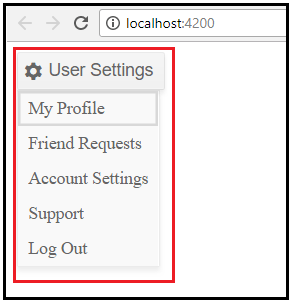
To beatify your DropDownButton, use Icon along with Text using [icon] property of Kendo UI DropDownButton.
<kendo-dropdownbutton [data]=“data” [icon]=“‘gear'” (itemClick)=“onItemClick ()”>
User Settings
</kendo-dropdownbutton>
And it’ll be more attractive for your Client.
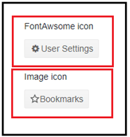
You can use other types of icons also like
FontAwsome or Image Icon, so as to make the buttons more eye-catching, For example:
- FontAwsome
Just use the CSS of FontAwsome in your Angular App.
<link
rel=“stylesheet”
href=“https://maxcdn.bootstrapcdn.com/font-awesome/4.5.0/css/font-awesome.min.css”>
<kendo-dropdownbutton [iconClass]=“iconClass”>
- Image Icon
Update the Component with Image URL in any variable, like:
imgIconURL:string=“http://demos.telerik.com/kendo-ui/content/shared/icons/16/star.png”;
Now, use [imageUrl] in DropDownButton,
<kendo-dropdownbutton [data]=“data” [imageUrl]=“imgIconURL”>
Must checkout the
built-in Kendo UI icons.
Popup Item Templates
This is really a best feature of DropDownButton. The Kendo UI DropDownButton provides options for setting the behavior of its popup and popup items with custom templates.
Step 1:
Add a new icon property and its value to your data array.
data: Array<any> = [{
text: ‘Cut’, icon: ‘cut’ },
{ text: ‘Paste’, icon: ‘paste’
}];
Now, use <ng-template></ng-template> for custom template and decorate it as you want.
<kendo-dropdownbutton [data]=“data”>
Edit
<ng-template
kendoDropDownButtonItemTemplate
let-dataItem>
<span
class=“k-icon k-i-{{ dataItem.icon }}”></span>
<span>{{ dataItem.text }}</span>
</ng-template>
</kendo-dropdownbutton>
Now, see the output. Well, it’s just awesome.

Data Binding with DropDownButton
The DropDownButton enables you to bind the data with DropDownButton in two ways:
-
Primitive (strings and numbers).
You can bind an array to the DropDownButton with string and numbers’ data called as Primitive, which we did in our previous examples.
data: Array<any> = [{
text: ‘Cut’
}, { text: ‘Paste’
}];
If the text field in the data objects is named text, the DropDownButton gets its value automatically.
-
Complex (data inside objects) type.
A Complex data type is just an object with multiple properties. The component extracts the text value from the data items and in this way, sets the text of the items in the popup. If the name of the property in data source is different from the text—for example, actionText — you have to set it as a [textField]. Here is an example –
data: Array<any> = [{
actionName: ‘Undo’, icon: ‘undo’ },
{ actionName: ‘Redo’, icon: ‘redo’ },
{ actionName: ‘Cut’, icon: ‘cut’ },
{ actionName: ‘Copy’, icon: ‘copy’ },
{ actionName: ‘Paste’, icon: ‘paste’
}];
Now, set [textField] to “‘actionName'”.
<kendo-dropdownbutton [data]=“data” [textField]=“‘actionName'”>
Edit
</kendo-dropdownbutton>
And Check the output:

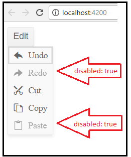
We can add more properties like disabled, click, and more.
To set the enabled or disabled state of the DropDownButton, use disabled property. To set the icon of each item, use the icon, iconClass, and imageUrl properties of data items. To attach a function that will be called when the user clicks an item, set the click property of the data item.
-
Disabled:
Just add a new property “disabled: true” in the data object that you want to be Disabled. For example:
data: Array<any> = [{
actionName: ‘Undo’, icon: ‘undo’ },
{ actionName: ‘Redo’, icon: ‘redo’, disabled: true },
{ actionName: ‘Cut’, icon: ‘cut’ },
{ actionName: ‘Copy’, icon: ‘copy’ },
{ actionName: ‘Paste’, icon: ‘paste’, disabled: true
}];
Now, your output must be something like the below image.
- Click:
Using Click Property of Data Items in DropDownButton, you can attach a function. Let us see how it’s work.
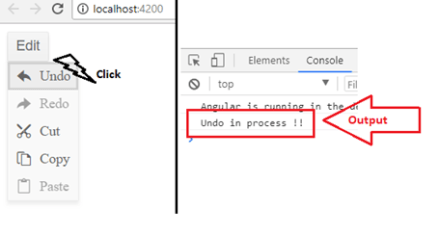
First, add a click property to the data object array.
{
actionName: ‘Undo’,
icon: ‘undo’,
click: (dataItem) => {
console.log(`Undo in process !!`);
}
}
And, serve your Angular app again.
Keyboard Shortcut/Navigation
Kendo UI DropDownButton supports many shortcuts to make it more user-friendly from keyboard only. The keyboard navigation of the DropDownButton is enabled by default.
DropDownButton supports the following keyboard shortcuts:
| SHORTCUT KEYS | DESCRIPTION |
| Enter & Space | Opens the popup, or activates the highlighted item and closes the popup. |
| Alt + Down Arrow | Opens the popup. |
| Alt + Up Arrow | Closes the popup. |
| Esc | Closes the popup. |
| Up Arrow & Left Arrow | Sets the focus on the previously available item. |
| Down Arrow & Right Arrow | Sets the focus on the next available item. |
Earlier articles on using Kendo UI with Angular:
ButtonGroup
Tell me more: Kendo UI ButtonGroup in Angular v5 App

 Helping Ninja Technologists