

You may have used CSS for styling your buttons. Here is an easy solution to make your application buttons more effective and user-friendly without the hassle of CSS, i.e., Kendo UI Buttons. These buttons provide a clickable UI functionality with arbitrary content.
For using Kendo UI buttons, you need to install Kendo in your Angular application. To learn the process of installation, follow my previous article and make your Angular app ready.
Power Up your Angular 5 Application with Kendo UI
Kendo provides four types of buttons:
- Button
- ButtonGroup
- DropDownButton
- SplitButton
Example:

To get all the package components, import the ‘ButtonsModule’ in your application root module, like in this code:
imports: [
BrowserModule,
FormsModule,
HttpModule,
// Register the modules
BrowserAnimationsModule,
ButtonsModule
]
The package also exports the following modules for individual components:
- ButtonModule
- ButtonGroupModule
- DropDownButtonModule
- SplitButtonModule
Button:
Button is an Angular directive which detects user interaction and triggers a corresponding event. In Kendo UI Button, we have some wonderful features:
- Default Button
For example, I need to use a button for selecting a file from my local computer, so I can use this button with only text (which is the default type), or with text and icon, or may be with only folder icon without text.

Then, select a button acording to your need :
-
Only Text : <button
kendoButton>Open</button>
-
Text with Icon: <button
kendoButton [icon]=“‘folder'”>Open</button>
-
Only Icon: <button
kendoButton [icon]=“‘folder'”></button>
- Bare Button
you just need to use [look] property of kendo UI Buttons and change it to ‘[look]=bare’.

Examples:
-
Only Text : <button
kendoButton [look]=“‘bare'”>Open</button>
-
Text with Icon: <button
kendoButton [icon]=“‘folder'” [look]=“‘bare'”>Open</button>
-
Only Icon: <button
kendoButton [icon]=“‘folder'” [look]=“‘bare'”></button>
- Flat Button
Again, just change the [look] property to ‘flat’ like ‘ [look]=”‘flat'” ‘. The bare and flat buttons look almost same but select or mouse hover styles are a little bit different.

Examples:
-
Only Text : <button
kendoButton [look]=“‘flat'”>Open</button>
-
Text with Icon: <button
kendoButton [icon]=“‘folder'” [look]=“‘flat'”>Open</button>
-
Only Icon: <button
kendoButton [icon]=“‘folder'” [look]=“‘flat'”></button>
- Outline Button
Outline Button is used to have a button with in-built border style. Change your [look] property to ‘outline’.

Examples:
-
Only Text : <button
kendoButton [look]=“‘outline'”>Open</button>
-
Text with Icon: <button
kendoButton [icon]=“‘folder'” [look]=” ‘outline'”>Open</button>
-
Only Icon: <button
kendoButton [icon]=“‘folder'” [look]=” ‘outline'”></button>
More Features and Functionalities of Kendo UI Buttons:
- Disabled Button
To make any button Disabled, set the disabled property to true only.
Examples:
<button
kendoButton [disabled]=“true”>Save</button>
You can use the same property with any type of buttons.

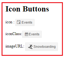
- Icon Button
You can create your buttons more user-friendly by adding image, predefined, or custom icons to it. The button provides three properties for it:
-
icon: For using the built-in Kendo UI icons, Like Folder, Open Folder, and more.
<button
kendoButton [icon]=“‘calendar'”>Events</button>
-
iconClass: Adding FontAwesome and other font icons from required third-party CSS classes, use iconClass property.
CSS URL
<link
rel=“stylesheet”
href=“https://maxcdn.bootstrapcdn.com/font-awesome/4.5.0/css/font-awesome.min.css”>
Using in Button
<button
kendoButton [iconClass]=“‘fa fa-calendar fa fw'”> Events</button>
-
imageURL: for using third-party images as icon from a specified URL.
<button
kendoButton [imageUrl]=“‘https://demos.telerik.com/kendo-ui/content/shared/icons/sports/snowboarding.png'”>Snowboarding</button>
Your buttons must be like this:
-
Primary Button
The Button enables you to highlight the actions to the user by enhancing its appearance.
For making any type of button as Primary, set the primary property to true. Like:
<button
kendoButton [primary]=“true”>Open</button>
And your output will be like:

-
Toggleable Button
Toggleable Button enables you to indicate whether it is active or inactive. To get this behavior, use the togglable property and set it to true.
<button
kendoButton [look]=“‘bare'” [togglable]=“true”>Submit</button>
See the output when it’s in Inactive mode:

Active:

Manage Events of Kendo UI Buttons:
If you need to manage your events in Kendo Button, just write your event name in small brackets (), with event name, like if you need to use Click event then write like this:
(click)=“functionName ()”
Use the bellow code for button:
<button
kendoButton [primary]=“true” (click)=“testClick()”
>Click Me</button>
“testClick” its function Name replace this with your function, need to be call. Now create a function in “aap.component.ts”, like:
public testClick(): void {
alert(“Kendo Button Click Event is Working !!”);
}
Now run your app in browser, check the page:

Now click to test your click event.

Now you can use any Events Click, focus or more.
 Helping Ninja Technologists
Pingback: Tell me more: Kendo UI ButtonGroup in Angular v5 App | Telerik Helper - Helping Ninja Technologists
Pingback: Angular + Kendo UI: DropDown Button | Telerik Helper - Helping Ninja Technologists