On May 28 2015 we conducted one more webinar as part of our Thursday Webinar Series for Asia Pacific. This blog post is a recap of the webinar. You will be able to check out the slide deck that i used in the webinar and also the video recording of the webinar if you missed it live. This webinar was all about understanding how to create Word/Excel/PDF documents without installing either MS Office software of any PDF related software on your web server. Rather use our UI for ASP.NET AJAX suite and perform the document processing task.
UI for ASP.NET AJAX:
UI for ASP.NET AJAX is our complete toolbox for your ASP.NET AJAX based web applications. You get 70+ controls in this suite. The controls cater to almost any needs of your project. You can know more about our ASP.NET AJAX controls suite here: http://www.telerik.com/aspnet-ajax.
UI for ASP.NET AJAX
Slide Deck:
Here is the slide deck used for the webinar:
Video Recording:
Here is the video recording of the webinar. If you missed live webinar, you now have on demand viewing through the below recording.
On Jul 12 2014, we conducted a webinar titled “Integrate Video and Photos in your ASP.NET applications with ease”. This is part of the monthly webinars we have been doing here in Telerik India. This blog post is a recap of that webinar.
RadImageGallery & RadMediaPlayer:
As the name goes, RadImageGallery can be used to create Image Gallery in your apps with minimal coding. Similarly, RadMediaPlayer can be used to create a YouTube like Media Player with minimal coding. Both of these controls are part of our “UI for ASP.NET AJAX” suite. If you are not familiar with our “UI for ASP.NET AJAX” suite of controls, head over to our product overview page here.
UI for ASP.NET AJAX
You can know more about RadImageGallery here and about RadMediaPlayer here.
Slidedeck:
Here is the slide deck that was used in the webinar:
Video Recording:
We record all our webinars and the videos are available for on demand viewing. So here is the video recording of this webinar:
Q & A:
Q: Is the library of these controls free to download or require any license?
A: A trial of 30 days is available. This is a paid product from Telerik
Q: Does it take Images from online services/providers like Flicker/OneDrive and stream here in control?
A: Both of these controls provide a feature of binding data from the client side. So you can get the data as JSON on page load and bind it to the control client side.
Q: Can we have this Image Gallery in MVC?
A: No. This is a ASP.NET AJAX control. Cannot be used in MVC.
Q: does RadImageGallery provides paging?
A: Yes. RadImageGallery supports the paging
Q: Can we specify how many thumbnails to show/ or customize thumbnail settings?
A: RadImageGallery provides a thumbnails settings where we can set Width, Height, Thumbnail Width, Thumbnail Height and Thumbnail spacing.
Q: How to get and integrate these controls to Visual studio?
A: Download the controls from http://www.telerik.com/products/aspnet-ajax.aspx. Run the Installer and that will integrate the controls in the control toolbox. Go ahead from there.
Q: Can we incrase the size of the preview display and keep the thumbnails in different dimensions?
A: Yes. RadImageGallery provide Image Area Settings and Thumbnails Area Settings.
Q: Can we give the source dynamically to the rad media player?
A: Yes. The data can be bound to RadMediaPlayer through code also.
Q: Does it require any media player to be installed at client side like Silverlight/Adobe media player?
A: No. RadMediaPlayer uses the build-in HTML5 <video> and <audio> element functionality to bring powerful media capabilities to your apps without the necessity of installing additional plug-ins. It provides a quick and easy to setup way to deliver rich media web experience for websites, blogs, online TV channels, e-commerce pages, etc. For older browsers which don’t support HTML5 natively, Internet Explorer 8 and 7 in particular, the player provides a Flash fallback method to play the video or audio file by rendering a Flash object.
In our webinars, we usually give away 2 t-shirts to 2 lucky attendees. We randomly pick from the webinar attendees and they get our .NET Ninja T-Shirt. In this webinar, the winners are:
Ashish Bhat
Surya Vinukonda
Don’t worry if you didn’t win the t-shirt. Try your luck in our next webinar.
Recently when talking to one of our clients, I had a question from them. They said your demos are great and covers most of the scenarios but when I take a particular control lets say Grid, how do I get started. Well that question prompted me to write this blog post. So if you are one of those who get the exact question in your mind about our controls, then do read on.
About Telerik’s ASP.NET AJAX Controls:
RadControls for ASP.NET AJAX is a complete development tool set for developing web sites or web apps based on ASP.NET AJAX technology. Our suite for ASP.NET AJAX contains nearly 70+ controls and helps you in rapid UI development. We also provide you with nearly 15 themes out of the box. If this excites you, check out the product page here: http://www.telerik.com/products/aspnet-ajax.aspx
ASP.NET AJAX Controls Help Documentation:
Almost all suites of Telerik have a very rich documentation support. Various formats of help is available. You can choose which mode you want to use the help documentation. If you navigate to page – http://telerik.com/help, it will list all suites help options. We will concentrate on ASP.NET AJAX controls for now. Here is the screen shot of the page with ASP.NET AJAX Controls Help Documentation Options:
Lets spend a moment here to understand the help options. For ASP.NET AJAX we have the following resources:
Online Help or you can download a copy of CHM format, MS Help 2 format or MS Help 3 format. Clicking on “Online Help” will give you the documentation online. Where as other options you can download the help documentation on to your hard disks.
Step-by-step tutorial – the name says it all
Knowledge Base – a vast base of knowledge articles for you to do a quick glance at
Code Library – a vast library of codes for specific scenarios or requirements
For this blog post I will consider the “Online Help” option and point you to resources there. This will be the same for other formats too.
Navigating Help Documentation:
If you are starting new on a specific control, first thing you should do is to head over to the help documentation and get to the section which deals with the control you want work with. II f you navigate to online help link which is at http://www.telerik.com/help/aspnet-ajax/introduction.html, you will see the following page:
If you notice the help documentation page, we have a tree on the left hand side. This tree lists down a lot options for you to get help on. I have highlighted 2 sections, namely – RadControls for ASP.NET AJAX Fundamentals and RadControls. The RadControls for ASP.NET AJAX Fundamentals will give you fundamental details about ASP.NET AJAX and about the RadControls itself. If you want to get to the documentation of controls you will need to expand the section “RadControls” which then will list all of our controls. As a shortcut, on the center section of the online help page, you will see links to controls directly and you can click on your control of interest. You will be navigated to that controls Documentation now.
Getting Started with a Control:
Now that you know how to navigate to the Help Documentation, the next step is to figure out getting started with a control. Remember the short cut I said that is available on the help documentation home page – well find the control you want to learn and click on it (the control name is a hyperlink which will take you to its documentation). For this exercise I will take our most popular control Grid and walk you through. Once I click on the RadGrid hyperlink, it will take me to RadGrid for ASP.NET AJAX Overview page. The left side tree on the page will now have the node RadGrid under RadControls be default selected and the sub nodes under it would have been expanded.
Now you will see a sub node called Getting Started. Click on it to expand the node. You will now see a child node which says “Getting Started with RadGrid for ASP.NET AJAX”. Click on the link and you will get a step by step guide on how to start working with our Grid.
And that’s it – now you can first go through the getting started, understand steps required to get a Grid on your page and start using the grid.
Looking at the Demos:
Now that you know how to get started with the Telerik RadGrid, next step would be to start looking at our demos to understand different features and how to work with those features. In our demos we try to provide you with all the scenarios in which a Grid will be used in real world applications. So take a look at the demos online here – http://demos.telerik.com/aspnet-ajax/. Note that, when you download our product, the same online demo is shipped and installed on your hard disk. So you can just open the local demos right from your hard disk and go through them.
Telerik TV:
Another great resource for anybody getting started with our Telerik Suites is to look at our Telerik TV. This is a public site available on the internet and you don’t need to be a licensee of Telerik to access the site. Telerik TV has videos on all of our products which are short in nature and very focused on a particular feature of a control. These videos are created by evangelists like me in Telerik. Personally I use this a lot to quickly understand how to work with a control. I highly recommend book marking this one in your browsers. Here is the Telerik TV URL: http://tv.telerik.com
Conclusion:
Whenever you are starting new, without knowing the right resources and guide its little tough to get started. Idea of this blog post was to hold your hand and walk you through various resources we here at Telerik have to make your experience of developing with Telerik controls an easy one. Personally as a developer at heart first place I go to is our documentation to understand the control and to go over its API exposed. Next stop would be Telerik TV and finally a look at the demos to understand different features and scenario in which the control can be used. Hope these simple steps will help you all with your evaluation of Telerik controls and make it much more easier and simpler to evaluate. Do feel free to get in touch with us in case you need further assistance.
This blog post is in response to one of the customer queries we received a couple of days back. One of our India customer called us up and said that they are seeing slowness in couple of pages where they are using RadGrid. Problem statement was – when they click on “Add New Row” button it takes nearly 1.5 minutes for the row to appear on the grid. This made it even scary for them as they had moved the code to production. Through this blog post I will try to outline what I found out and what could have been done better to resolve the problem.
Analysis:
I went in to a call with the customer and took a look at their code. There were couple of things they were doing. Let me list them down:
DataSource for the RadGrid was a SqlDataSource control defined in the .ASPX page
They were handling OnItemCommand and OnItemDataBound. They had some logic in this method which would execute on every data bound and every item command
The new item template had lot of drop down lists and each of them were bound to SqlDataSource control as their data source.
Now, next thing I did was to take look at the timing. We used IE Developer Tools and captured the network traffic when Add New button was clicked. What I found out was, server was taking close to 10 seconds to finish its server side processing. That’s a lot of time if you ask me. What was surprising for them was, they had paging enabled on the grid. So they were thinking that paging is happening correctly but still why is the add new row scenario slow.
So this made me to delve little bit deeper into what exactly is happening in this scenario. So rest of this blog post is all about my observation. Read on if you have faced a similar problem.
Observations:
Did two experiments to figure out what was happening. First I use a RadGrid and bind it to SqlDataSource control and look at the query executed at the DB side. Second was to use entity data source instead of SQL data source and look at the query executed at the DB.
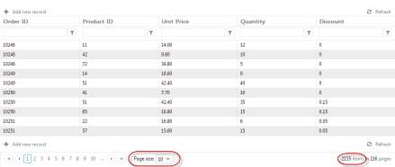
For my experiments I am using Northwind Database and in particular Order Details table. Order Details table contains nearly 2155 records. So this makes a good candidate to mimic a scenario where you are paging the RadGrid lets say 10 records per page.
I assume that you have RadControls for ASP.NET AJAX suite installed on your system. If not, you can always download from our products page – www.telerik.com/products/aspnet-ajax.aspx. You will need that if you want to follow along with this post. Also in order to trace the SQL Queries executed, I am making use of a open source tool called “Express Profiler” which is available at CodePlex here: http://expressprofiler.codeplex.com/. I had to use this as I have a SQL Server 2012 express edition and express edition does not come with Profiler option. You need a full blown SQL server to get the profiler.
I have created a RadControls Web Application for my experiments. When you install the RadControls for ASP.NET AJAX suite, you will get project templates in Visual Studio, using which you can create a web application.
Fig 1: RadControls Web Application Project Template
DataBinding with SqlDataSource control:
First experiment was placing a RadGrid and bind it to SqlDataSource control. I placed a RadGrid and set its basic properties. Then added a SqlDataSource control to the page and set its connection string and provided a select command. Here is the code snippet for grid and SQL data source control:
Now, before you run the application, lets get ready to trace the SQL queries that get executed. You should have downloaded the Express Profiler. Start the express profiler – Set the server details, select the authentication mechanism and finally select the events you want to trace. Here is the screen shot:
Fig 2: Express Profiler Settings
Run the web application. Notice that if we just set AllowPaging=true on RadGrid and do not provide a page size, by default RadGrid puts 10 as the PageSize. So in my case I should see only 10 rows on my first page of the RadGrid. Here is the Grid output:
Fig 3: RadGrid output
When I ran the app and looked at the trace, here is what I get:
Fig 4: SQL Query Trace for SQL Data Source Control bound to RadGrid
What you see here is a call to retrieve all the records from the table. You may be asking but the page size is set to 10. That is correct but what really happens is this: RadGrid will go ahead and ask SQL Data Source to get the data. SQL Data Source will blindly execute the query that has been set for the select command. RadGrid will not be able to do any tinkering with query because the SQL Data Source does not provide us a chance to put paging related statements.
Now lets do a page change on the grid. I will go ahead and click on Page 2. RadGrid will now navigate to Page 2. Here is the trace that is generated for this:
Fig 5: SQL Trace for Page Change Event
What you notice is, the SQL Data Source goes ahead and brings all the records from the table. RadGrid will then pick up only the second page rows and displays it.
Now lets go ahead and click on the Add New Row button and trace the query executed:
Fig 6: SQL Trace for Add New Record Event
As you can see it again retrieves all the records from the table.
What this tells us is the time taken is due to the fact that its going and getting all the table records no matter whatever is the situation we have. Now hitting DB and getting everything does call for some time although small but it till takes up time on the server.
Now lets do the same experiment but with Entity Data Source.
DataBinding with Entity Data Source:
I will use the same data grid but instead of SQL Data Source I will use a Entity Data Source. In order to work with Entity Data Source, you need a Entity Data Model. I will not get into how to create a Entity Data Model but assume that you know how to do it. Just create a ADO.NET Entity Data Model and generate the models from the database and use the same Northwind database. Once you have the ADO.NET Entity Data Model created, create a Entity Data Source on the page. Here is the Entity Data Source code snippet that I have:
I am making use of the OnContextCreating event to set the DbContext of ADO.NET Data Model to Entity Data Source ObjectContext. Here is the code for the event handler of OnContextCreating:
protected void EDS_ContextCreating(object sender, EntityDataSourceContextCreatingEventArgs e)
{
    var db = new NORTHWINDEntities();
    e.Context = (db as IObjectContextAdapter).ObjectContext;
}
Here NORTHWINDEntities is my Entity Data Model context. I am just casting it to ObjectContext since Entity Data Source works with ObjectContext. I set this entity data source as the data source of the RadGrid.
Analyzing the Queries:
Now lets run the app and trace SQL queries for the same set of actions we did with SQL Data Source control.
As you can see we have put in a “SELECT TOP 10” statement in the query. So its not bringing all 2155 records rather only 10 records. So time spent to do this will be very negligible. We also execute one additional query to get the total record count.
Now lets see what happens when we do a paging:
Fig 8: Entity Data Source – Paging – Query Trace
Now, lets trace the query when we do ‘’Add new record” scenario:
Fig 9: Entity Data Source – Add New Record – Query Trace
Notice that, in this scenario, we automatically page to the last row and add a blank record.
As you can see from the above experiments, RadGrid is intelligent enough to optimize the queries based on the scenario you are dealing with.
Conclusion:
It was very evident from the experiments that if you are using SQL Data Source as your data source choice, there is not much RadGrid can do to optimize the query before it gets executed. Where as with Entity Data Source, RadGrid is smart enough to optimize the query and always have a optimized data fetch. I personally recommend using an ORM in the project for the data access scenarios and use the Entity Data Source as your data source choice. We i.e at Telerik have a free ORM called OpenAccess. Its free for life so you can pretty much use this in your production without any hassle at all. Do give it a try and let us know how you feel about it.
I hope this blog post does give you information on things you need to take care while doing data binding to Grids. This is just not in particular to RadGrid, this is mostly about any data binding scenario. Trace your queries and be sure that write and optimized queries are getting executed in your apps.
On Aug 8 we conducted a webinar “Modern UI in ASP.NET Applications using RadTileList”. This is part of the ongoing webinar series we here at Telerik India are doing targeting the APAC region. We call this the Telerik .NET Ninja Developer Webinar series. You can take a look at the Jun-Jul schedule here: https://telerikhelper.net/2013/05/24/telerik-webcasts-june-july/.
About RadTileList:
Build modern, Windows-8-like navigation easier and faster. With its first version the TileList control supports out of the box:
Single and multiple selection
4 tile types: image, text, image and text, and template tiles
As with all the webinars, we too had a bunch of questions in this webinar too. We answered a few and we couldn’t answer many of them. So we will try to answer as much questions as possible here:
Q: Any size restriction for the Image and Text tile? A: The tiles are of 2 types – – Wide and Square. Wide tiles have a dimension of 350x150px and Square tiles are of 150x150px dimension.
Q: we can use any type of image? A: Yes. Any image types can be used in the Image tiles.
Q: Image and Text Tile, title will always be at bottom or we can arrange the position? A: The Title is always at the bottom. You cannot customize that.
Q: Can we format text in the image and text tile control? A: Yes. The content text of the tiles can be customized.
Q: Can the badge be mapped to any other page say a link? A: No. The linking is on the tile itself. The Modern UI philosophy is all about using the Tiles as a navigational item. The Badge is used as a additional information display.
Q: Whether Tile can be customized to various size? A: No. The tiles come in two dimension: Wide – 350x150px and Square – 150x150px.
Q: Can these tiles be resized? A: No. They come in standard dimension as per the Modern UI guidelines – Wide and Square.
Q: what all languages you support in RAD? A: C# and VB.NET
Q: We have Telerik license for developers. Do we need to install it on production server also ? A: No. the app build will contain all that is required for Telerik controls to work. No need to install it on production server.
Q: Can I change the positions of Title and Badge ? A: No. This is as per the Modern UI guidelines and it dictates that the Title and Badge have to be in the lower portion of the tile.
Q: I am curious about its interoperability along with several other controls in Telerik? A: You can work with this control programmatically too. You can wrap this control and create your sub classed controls too.
Q: Can I use RadTilelist control in sharepoint 2010/2013 applications? A: All of our ASP.NET AJAX controls suite is SharePoint compatible. You can use our AJAX controls in custom WebParts and host them in Sharepoint.
Q: If the content exceeds the height of the content tile how we have to control the text flow? A: As per the design principles, when using ContentTemplate Tile, the text or content you provide should be a short and informational text. You can use CSS to control the overflow – but then it will bring in the scroll bars and the whole tile concept wont look good.
Q: How it works in Desktop app UI design. We don’t deal much with Web app coding? A: We have Windows Presentation Foundation control suite and Windows Forms controls suite for desktop applications. WPF has TileList control and Windows Forms has RadPanirama control. Both of these controls help you build a Modern UI like navigation using Tiles in your windows applications.
Q: Once Tiles are re-arranged,, whether this can be persist or re-set after page refresh? A: Yes. The selections can be persisted. You can integrate with the RadPersistenceFramework.
Q: Is this also part of ASP.net MVC? A: No. This is part of ASP.NET Webforms.
Q: how to resize the tile as in windows 8 using rad controls? A; At the moment we don’t support resizing.
Q: Can we bind these values to some data source so that frequently that can be refreshed, like we have in Mail tile in Windows 8?
A: Yes absolutely. You can do that certainly.
Q: Am using Telerik controls version: 2013.1.403.40, but this doesn’t contain Rad tile List control in toolbox? A: This was released as part of our Q2 release. So upgrade yourself to 2013 Q2 release and you will see the control.
Q: Can Tile be created as dynamic as similar to number of rows in Grid? A: Yes. You can programmatically create the Tiles too. You don’t have to place them on designer like the way I did in the demo.
Q: Why is it called RADControls? A: RAD stands for Rapid Application Development. We help you build things faster. We help you improve your productivity through our controls. Our controls contains out of the box many features that otherwise you will need to build them by yourself.
Q: can we create a link on image to redirect to another page? A: All the tile types support NavigateUrl property which when set, clicking the tile will navigate to that page.
Telerik .NET Ninja T-Shirt Giveaway:
We select 2 persons from the audience in every webinar and give away a Telerik .NET Ninja T-Shirt. So from this webinar we have randomly selected the following 2 persons:
Himanshu Garg
Kothainayaki Krishnamoorthy
Congratulations to the winners. We will be contacting you shortly to get your postal address. We will ship you your T-Shirt soon. Rest of the folks, don’t worry we have a lot of webinars coming up. So try your luck in next webinars.
This is the 3rd blog post in the series on RadHtmlChart, our HTML5 based charting control for ASP.NET AJAX and its data binding options. So far we have seen data binding the RadHtmlChart control with SQLDataSource and LinqDataSource. In this blog post we will look at one more data binding option namely binding to EntityDataSource.
In this blog post we will focus on how to create a EDM or entity Data Model using Entity Framework, then adding the EntityDataSource control to the web page and finally binding it to the RadHtmlChart. For the rest of this post it is assumed that you have already installed our RadControls for ASP.NET AJAX suite and also our free ORM called OpenAccess.
About EntityDataSource:
EntityDataSource is a control that was made available during the days of Visual Studio 2008 SP1 i.e. .NET 3.5. According to MSDN EntityDataSource control is defines as:
A control which can be used together with a data-bound control to retrieve data from an EDM and to display, edit, and sort data on a Web page by using little or no code.
I wont be spending too much time on discussing EntityDataSource control in this blog post. I suggest you to go through the overview article from MSDN available here: http://msdn.microsoft.com/en-us/library/cc488502.aspx. The article will get you up to speed with the EntityDataSource control.
Getting Started:
To start with, lets create a “C# RadControls Web Application”. Open a Visual Studio and navigate to File > New Project > Telerik > Web and select “C# RadControls Web Application”. Give it a name & click finish so that VS can go ahead and create the project for us.
Figure 1: New Project Dialog
Adding ADO.NET Entity Data Model:
Entity Data Source control requires a ADO.NET Entity Data Model to work with. Entity Data Source can be configured to work with a Entity Data Context for reading, creating, updating and deleting data with little or no code from the web page. In order to create a EDM, we need to first add Entity Framework bits to our project. Use the Nuget Package Manager to add a package named EntityFramework.
Figure 2: Nuget Package Manager
One of the best practice is to create a Models folder at the root of the web application. So lets create a folder called Models. Right click on the Models folder and select Add > New Item. In the new item dialog, under Data category select “ADO.NET Entity Data Model”, give it a name and click Add.
Figure 3: Add New Item Dialog
Next we will be presented with a EDM Wizard. In the interest of the time, I will post my settings in the wizard as a serious of images below:
Figure 4: Entity Data Model Contents
Figure 5: Data Connection
Figure 6: Database objects
Once we finish with the wizard, NorthwindEntityDataModel.edmx is created in the Models folder. Double clicking that we will be presented with a visual designer with one object called Product placed. Remember we had selected only one Table for this demo called Product. Here is the screen shot of the EDMX designer:
Figure 7: EDMX Designer
Now that we have the EDM created, next is to add the Entity Data Source control to the page.
Adding Entity Data Source Control:
Open Default.aspx page and add EntityDataSource control to the page. You can either drag and drop the entity data source control from toolbar and you can write the declarative code by hand. I will drag and drop it from the toolbox onto the page. Use the Entity Data Source control smart tag (either from the ASPX page or from the designer) to configure data source settings. Here is my settings for the data source:
Figure 8: Object Context Configuration
Fig 9: Data Selection Configuration
When we finish the configuration wizard, following code will be generated by the Visual Studio
Note that we couldn’t add the top 10 keywords when configuring using the wizard and also there was no way to provide the orderby clause. In order to specify the top keyword just prepend “top(10)” to the Select text. EntityDataSource supports OrderBy property. So add the property and provide the value “it.UnitPrice DESC”. Here is the final code:
You can add a RadHtmlChart either by dragging and dropping from the toolbox onto the page or by writing the declarative code on the page. I will be dragging and dropping the control on to the page. Following 3 things need to be taken care while data binding to a EntityDataSource. They are:
DataSourceID: Set the DataSourceID property of the RadHtmlChart to the name of the Entity Data Source you want to bind to.
DataFieldY: Set the DataFieldY property of the data series to the column name from which the data points have to plotted on the Y axis. I am plotting the UnitPrice on the Y axis so I will set the DataFieldY property to “UnitPrice”
DataLabelsfield: Set the DataFieldsLabel property of the XAxis to the column name from which we need the X axis data points to be plotted. I am having the products name on the XAxis so I will set the DataLabelsField property to “ProductName”.
In this post we looked at one more data binding technique with RadHtmlChart. We looked at EntityDataSource, how to configure entity data source and finally how to bind it with RadHtmlChart. With just 3 things to take care its very easy to bind the chart with entity data source. Hope this makes you excited to start working with RadHtmlChart. Do let us know your experience with the RadHtmlChart.
RadHtmlChart which is a charting component in RadControls for ASP.NET AJAX suite supports binding to variety of data sources. In this post we will look at a scenario where we will see how to bind the RadHtmlChart to LinqDataSource. So the rest of this post is about how to achieve databinding linq data source to RadHtmlChatrt. So lets get started. First we will look at creating a new project in Visual Studio, then we will add a Data Context to the project, then add a LinqDataSource & use the data context to return top 10 products from Northwind database and finally add RadHtmlChart and see how to use LinqDataSource as the source of the chart.
Creating New Project:
To get started, let’s first create a new “C# RadControls Web Application”. Note you need to have our RadControls for ASP.NET suite installed before you can do this. Open a Visual Studio, select File > New Project > Telerik > Web and C# RadControls Web Application.
Figure 1: New Project Dialog
Visual Studio will go ahead and create a Web Application. It will have a single page named Default.aspx. For the rest of the demo, we will work with this page.
Add Northwind Data Context:
In order to work with Linq Data Source, I will create a Entity Data Context using our OpenAccess ORM. OpenAccess is a free tool to download and you can use this in your production too without any licensing involved. First Add New Item to your project of type “Telerik OpenAccess Domain Model”. Give it a name and click Ok.
Figure 2: Add New Item dialog
You will next be presented with a wizard. Here is the wizard dialog screen shots and the settings I have done:
Once you click finish, the wizard will create a .rlinq file in your project. If you double click the rlinq file, you will get a visual designer. For this post I have selected only Products table. So you will see the products table visually laid out:
Figure 8: OpenAccess Data Model
Next we will see how to add a LinqDataSource and hook that with our data model to return the products data.
Add LinqDataSource:
In order to add LinqDataSource to your page, you can either drag and drop from the tool box or directly code the tag in the source file. What we will do for this demo is, we will handle a specific event called OnSelecting. In the event handler we will instantiate our OpenAccess data model and return the top 10 products ordered by UnitPrice in descending order. Here is the code which defines LinqDataSource control on the page:
Now that we have the data model and the linq data source only thing left out is to add the RadHtmlChart and bind it to linq data source.
Add RadHtmlChart:
So now we are ready to add the chart. You can either drag & drop the chart from the toolbox on to the page or code the chart definition directly on the page. In this post I will just add the RadHtmlChart code and highlight the main points you need to take care while wiring it with LinqDataSource.
Here are the things you need to do for wiring up the chart with LinqDataSource:
On the chart set the DataSourceID property to the ID of the LinqDataSource
When you define a series, set the DataFieldY property to a value “UnitPrice”. Here UnitPrice is the column in my data source which I want to bind and plot the points on Y axis
On the XAxis definition, set the DataLabelsField property to a value “ProductName”. Here ProductName is the column to which I want to bind and plot the XAxis points.
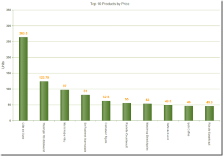
And that’s all its there to wiring up the RadHtmlChart to LinqDataSource. Now build the project and run to see the output. Here is a screenshot of the chart we just created:
Figure 9: RadHtmlChart output
Summary:
In this blog post I wanted to show one of the data binding option that RadHtmlChart supports – namely LinqDataSource. As we have seen it is very easy to create a LinqDataSource and bind it to RadHtmlChart. We just need to take care of 3 things to make the chart work with the LinqDataSource. I hope this blog post gives you a head start if you are working with LinqDataSource and the RadHtmlChart. Do let us know your feedback/comment you may have on this post.
RadControls for ASP.NET AJAX contains a HTML5 powered charting control known as RadHtmlChart. This charting component outputs SVG and is completely client side rendering of the chart. The charting component will output SVG on modern browsers and falls back to VML when running in older browsers. When it comes to data binding the chart, it supports a wide range of data binding mechanism starting from simple array to your custom object collection. In this blog post we will take a look at one of the data binding mechanism namely binding to SqlDataSource.
Pre-Requisites:
In order to follow this post, you will need our RadControls for ASP.NET AJAX suite. You can download a 30 day free trial from http://www.telerik.com/products/aspnet-ajax.aspx. So download the trial and install it on your system. If you already have a licensed version installed that’s even better. Following sections assume that you have done this.
Getting Started:
First lets create a “C# RadControls Web Application”. Fire up a Visual Studio and do the customary File > New Project action. In the new project dialog, you will see Telerik as one of the installed template. Expand Telerik and you will see Web as one of the nodes. Select Web and you will presented with different project templates. Select “C# RadControls Web Application”. Give your project a name and click Ok.
Fig 1: New Project Dialog
You will be presented with 2 more dialogs to select theme and web settings. Select appropriately and finish the wizard. Visual Studio will go ahead and create the project.
Adding SQL Data Source to the page:
The project template will add all references required for Telerik ASP.NET Ajax controls, necessary updates to Web.config and create a Default.aspx page. We will be working with Default.aspx for this blog post. Since we need to bind the chart to a SqlDataSource control, lets go ahead and add one to the page. You can configure the data source using the smart tag option in the ASPX page or just go to design and select the smart tag on the control.
Fig 2: Configuring SqlDataSource
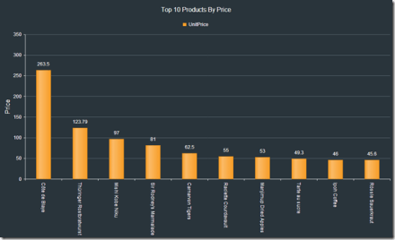
Clicking on Configure Data Source, will open “Choose Your Data Connection” dialog. So go ahead and set up your connection for the data source. For this example I will be using Northwind as the database and Products table. Once you pass the connection settings dialog, you will be required to configure the select statement. For this demo I will just do a select of top 10 products by their price in descending order. Here is how my test query looks like:
Fig 3: Test Query Dialog
Click Finish to finish configuring the SqlDataSource. Next we will see how to work with RadHtmlChart.
Adding RadHtmlChart to the page:
From the Toolbox, drag and drop a RadHtmlChart on the page. In the ASPX page, select the smart tag on the RadHtmlChart. It will open a configuration window. We will configure the RadHtmlChart now to work with SqlDataSource control.
Fig 4: RadHtmlChart Smart Tasks
Select the DataSource from the Choose Data Source drop down.Then click on the Open Configuration Wizard. You will see the following Configuration Wizard pop up:
Fig 5: RadHtmlChart Configuration Wizard
We will go through the configuration one by one.
Chart Type:
For this blog post I will be going with Column chart. So in the Type tab, select Column Chart.
Fig 6: Chart Type selection
Data:
Now to let the chart know where to read the data from, select the Data tab. The data source would have been defaulted to the sql data source we had added in previous section. Now we need to add a series to the chart. Click on the “+” button next to the Series section. Provide Name, AxisName, Type of the series and what field in the data source should the Y axis data point be read from. For this example UnitPrice will be my Y axis data point. I will be plotting the price on the Y axis. Here is how my settings look like:
Fig 7: Series configuration
X Axis:
Now we need to configure how our X axis will look like. If you want to customize the Min Value, Max Value, Step and Axis Crossing Value or you want to hard code the X axis items, you can do so in the XAxis tab.
Fig 8: XAxis Configuration
Once done with the settings click Apply. Now we need to show the product name as the X axis data point. For that we will need to get back to the code, add a property called “DataLabelsField” and value of this property will be the column name from the data source which will contain the data points. In our case this will be ProductName column. Here is the code:
<XAxis DataLabelsField="ProductName"></XAxis>
Y Axis:
Similar to XAxis you can customize how you want the YAxis to look. The YAxis tab provides you options to customize the axis and also allows you to add additional Y Axis to the chart.
Fig 9: YAxis Configuration
In our current example, we don’t have to do anything here. The Min and Max value and Step will be calculated automatically based on the data source.
Legend, Title:
Last but not the least, we can customize how the Legend and the Title of chart should look like. Click on the Legend/Title tab and provide the appropriate data. Here is my settings:
Fig 10: Legend, Title Configuration
Click Ok when done. This will generate the following code in the ASPX:
So we are now done with the RadHtmlChart configuration. We have configured it to work with the Sql Data Source we added in the previous section. We have set what chart we want and configured the series, XAxis, YAxis and Legend/Title. Its time now to look at the output.
Output:
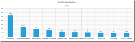
Build and run the project. It should open up a browser and show you the following chart output:
Fig 11: RadHtmlChart output
Conclusion:
In this post we saw how easy it is to configure RadHtmlChart to work with Sql Data Source. Also we looked at the RadHtmlChart configuration wizard which makes it super easy to configure the chart with various settings and best of all you don’t have to write any code. The configuration wizard gives you a GUI and when you are done with the settings, it will generate the code for you. I say this is a productivity gainer. Let us know how you are using RadHtmlChart in your projects. We will love to hear your feedback or suggestions. So do drop in a line in the comments.
We have a page that displays already registered sessions. Currently, we are using Asp:ListView to represent the data and , the inbuilt features, we have used include,
Removing the existing sessions,
Redirecting to the session details,
Navigate using the DataPager.
Now, we would represent the same data through the help of RadScheduler. The reason we have chosen Scheduler is because all the registered session/appointments would be visible in a calendar format. The timeline of this calendar, along with date view also provides the time view which provides a perfect solution for an end-user. Under Telerik AJAX Calendar and Scheduler Components (me using the 2013 Q1 for Net 45) select RadScheduler.
Programmatic
For the best explanation and indepth knowledge its better if we write code rather than using wizards. We open the code behind file and implement the following prerequisites:
Add the following headers:
using Telerik.Web.UI;
using EventNetworking.Data;
Under the class add NetworkingDataContext ndx = new NetworkingDataContext();
This creates a context for the data from our DAL (Data Access Layer).
Attach datasource to the RadScheduler first time the page is loaded.
if (!IsPostBack)
{
 // SECTION 1: Defining the data source
 var sessiontime = from st in ndx.SessionAttendees
 join ss in ndx.Sessions on st.SessionID equals ss.SessionID
 join sts in ndx.SessionTimeSlots on ss.TimeSlotID equals sts.TimeSlotID
 where st.UserID == Convert.ToInt32(userID.Value)
 orderby sts.FromTime
 select new
 {
 FromTime = sts.FromTime,
 Duration = sts.Durationinmins,
 EndTime = sts.FromTime.AddMinutes(Convert.ToDouble(sts.Durationinmins)),
 Title = ss.Title,
 SessionAttendeeUID = st.SessionAttendeeUID,
 SessionID = st.SessionID,
 UserID = st.UserID
 };

 // SECTION 2: Extracting the current user details
 int userid = (from m in ndx.UserProfiles
 where m.Username == User.Identity.Name
 select m.UserId).First();
 userID.Value = userid.ToString();

 // SECTION 3: Setting the RadScheduler Properties (necessary)
 sessionCartScheduler.DataKeyField = "SessionAttendeeUID";
 sessionCartScheduler.DataStartField = "FromTime";
 sessionCartScheduler.DataEndField = "EndTime";
 sessionCartScheduler.DataSubjectField = "Title";

// SECTION 3.1: Attach the newly created dataSource to the control
 sessionCartScheduler.DataSource = sessiontime.ToList();

// SECTION 4: Setting further properties of RadScheduler(optional)
 var minDate = from d in sessiontime
 orderby d.FromTime
 select d.FromTime;
 if (minDate.Count() != 0)
 sessionCartScheduler.SelectedDate = Convert.ToDateTime(minDate.FirstOrDefault());

// SECTION 5: Binding the control with the dataSource
 sessionCartScheduler.DataBind();
}
And your application is ready to run.
SECTION 1: We need an appropriate data to be represented in a Scheduler view. Hence, we have created a data source namely sessiontime. We plan to represent the user specified session. To do so, the join query is used to create a new view which includes the very important timing details, session title and session key.
SECTION 2: Detail of the current user is necessary because the cart functionality is specific to self.
SECTION 3: For RadScheduler to work we need to specify its DataKeyField, DataStartField, DataEndField, DataSubjectField and DataSource. DataSource property is where we attach the data to the control.
Property
Details
DataSourceID
Overridden. Gets or sets the ID property of the data source control that the RadScheduler should use to retrieve its data source.
DataKeyField
Gets or sets the key field for appointments in the data source specified by the DataSourceID property.
DataStartField
Gets or sets the start field for appointments in the data source specified by the DataSourceID property.
DataEndField
Gets or sets the end field for appointments in the data source specified by the DataSourceID property.
DataSubjectField
Gets or sets the subject field for appointments in the data source specified by the DataSourceID property.
Next, we tweak/explore some more features to improve our Scheduler. We don’t want our users to end up on a random date.
SECTION 4: We have set the date to the date when the first event takes place.
SECTION 5: We finally bind the data to the control.
Let us now add a click event to the session, such that the page is redirected to the session details once clicked.
protected void sessionCartScheduler_AppointmentClick(object sender, SchedulerEventArgs e)
 {
 int sessionIDvalue = (from sa in ndx.SessionAttendees
 where sa.SessionAttendeeUID == Convert.ToInt16(e.Appointment.ID)
 select sa.SessionID).FirstOrDefault();
 string sessionURL = "~/session/" + sessionIDvalue.ToString();
 Response.Redirect(sessionURL);
 }
Also, let us define what happens when a person clicks the cross symbol on the appointment.
protected void sessionCartScheduler_AppointmentDelete(object sender, AppointmentDeleteEventArgs e)
{
 //SECTION 1: Extracting the complete row of the selected tab and deleting it
 int uid = Convert.ToInt32(e.Appointment.ID);
 SessionAttendee sa = (from s in ndx.SessionAttendees
 where s.SessionAttendeeUID == uid
 select s).First() as SessionAttendee;
 ndx.Delete(sa);
 ndx.SaveChanges();

//SECTION 2: Refreshing the control
 var sessiontime = from st in ndx.SessionAttendees
 join ss in ndx.Sessions on st.SessionID equals ss.SessionID
 join sts in ndx.SessionTimeSlots on ss.TimeSlotID equals sts.TimeSlotID
 where st.UserID == Convert.ToInt32(userID.Value)
 orderby sts.FromTime
 select new
 {
 FromTime = sts.FromTime,
 Duration = sts.Durationinmins,
 EndTime = sts.FromTime.AddMinutes(Convert.ToDouble(sts.Durationinmins)),
 Title = ss.Title,
 SessionAttendeeUID = st.SessionAttendeeUID,
 SessionID = st.SessionID,
 UserID = st.UserID
 };

 sessionCartScheduler.DataSource = sessiontime.ToList();
 sessionCartScheduler.DataBind();

 e.Cancel = true;
}
SECTION 1: To delete the item from the table we first need to extract that row from the context. Once we have extracted the row we can easily remove the data using the CRUD Operations of OpenAccess ORM.
“e.Appointment.ID” is used to abstract the DataKeyField of the RadScheduler.
SECTION 2: Once the data is removed we need to rebind the data. To rebind the data, we need to refresh the data source. Hence, we create a data source and bind the control.
Until now we talked about how we can do things programmatically. Let us now focus on the wizard of the control.
Declarative
Click the smart tag and open Configuration Wizard.
A few which we have used are:
Under the Day View tab- Check “Enable exact time rendering”
The XAMl code for RadScheduler looks like the following:
We have finished the ORM deployment with our previous post. Now we are ready to start migrating the default controls to Telerik controls. In this post we will take a look at converting asp:ListView to telerik:RadListView and we would learn about telerik:RadDataPager which will replace the asp:DataPager.
Add RadListView
For this exercise we will take Directory page from our Event Networking application. Remove the existing ListView control and add a RadListView control from the Telerik AJAX Components.
Note: After adding the control rename the ID property same as your asp:ListView ID property. We might see an error because the underlying type has changed. The error occurs because initially the same id was linked to asp:ListView. The error will eventually disappear. Again, we need to first remove the already existing methods defined for the ListView from the aspx.cs i.e. codebehind page. Now copy the rest of the properties from ListView. We need to add the property DataKeyNames to our RadListView. Now we copy all the templates from asp:ListView.
If you run the application RadListView should have been populated by the data, as the data binding has already been handled at the Page_Load event (explained in our previous blog <Hyperlink>).
Your data is now populated but currently there is no paging option. To provide paging add the property AllowPaging=”true” to RadListView.
Add Event Handler to RadListView
To add an event, type the name of the event and click <Create New Event>. So add an event handler for OnItemCreated. We are using this event to populate the pictures of each attendee.
We had the following code under asp:ListView event:
Lets tweak the existing code for the RadListView:
NOTE: Do not forget to add “using Telerik.Web.UI;” in your aspx.cs
protected void directoryListView_ItemCreated(object sender, RadListViewItemEventArgs e)
 {
var item = e.Item as RadListViewDataItem;
if (item != null)
{
var userId = item.GetDataKeyValue("UserId").ToString();
var u = (from x in uu
where x.UserID == int.Parse(userId)
select x);
if (u.Count() != 0)
{
((Image)e.Item.FindControl("ProfileImage")).ImageUrl = u.First().URL;
}
 }
 }
Add RadDataPager
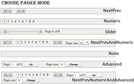
If you use ASP pager, you only have the numeric option. But using RadDataPager gives you lot more option.
The main aim is to get a better UX and hence we replace asp:DataPager with telerik:RadDataPager. We changed the following properties PagedControlID=”directoryListView” and PageSize=”15″. Next we add a field and within it we insert the <telerik:RadDataPagerSliderField /> . This provides us a natural gesture to slide through various pages.
To do it declaratively switch to Design view and select the RadDataPager. Then expand the smart-tag and change the PagedControlID and the Pager Mode to NextPrevNumericAndAdvanced. This would allow users to do more than just select the page numbers.
Error Explanation
But if we had copied the same code to our RadListView item created event it throws following error:
‘Telerik.Web.UI.RadListViewItem’ does not contain a definition for ‘DataItem’ and no extension method ‘DataItem’ accepting a first argument of type ‘Telerik.Web.UI.RadListViewItem’ could be found (are you missing a using directive or an assembly reference?)
This occurs because the “e” defines the event argument which at runtime has type RadListViewDataItem but has RadListViewItem at compile time. Hence we need to explicitly need to typecast it into RadListViewDataItem and then we can use it in a similar way.
Why Change it after all:
In case ofcustomisation RadListView gives us far better UX and functionality.
The dataPager is static for ASP control whereas we have many more features and modes in which we can operate while using RadDataPager varying from just numeric pagers to smooth sliders gesture.
The following image gives us an overview of how the ASP control looked. And in the following image we can the great UX and the additional features available with us.
After the Data Access Layer (DAL) has been implemented by moving the ORM into a new project, there would be further errors experienced in our web application. This happens because of two reasons:
Initially, LINQ data source was used which is now no longer used.
The ORM which we have implemented here is Open Access, and syntax to implement CRUD operations are different from that of LINQ.
Hence, we need to change all the LINQ CRUD operations, and the following snippets explains the same. The commented line was the LINQ operation and the non-commented part is the new Open Access syntax. For further knowledge on implementing Open Access CRUD operation click here. \
After replacing the LINQ commands we still might see few more errors such as:
Error 1
Then it has occurred because we have converted the Linq to SQL to Open Access ORM. Hence, the control LinqDataSource will not help us map it to the new ORM.
Since we have removed the Linq Data Source so we have to also remove the existing LinqDataSource and create a new DataSource.
Solution #1
We can use an OpenAccess DataSource control replacing the LINQ DataSource and keep the same ID. Hence, no more effort is needed.
Solution #2
More preferred practice in the industry is to remove the DataSource control and do the following:
We added the following code under the Page_Load event. We created a DataTable and then linked the DataSource property of the DropDownList with the newly created DataTables.
This helps in insulating the data. We also need to remove the DataSource property from the controls where we had linked to the Linq DataSource.
if (User.Identity.IsAuthenticated)
{
if (!IsPostBack)
{
int userid = (from uid in ndx.UserProfiles
where uid.Username == User.Identity.Name
select uid.UserId).First();
// Storing the value of the userid in a hidden variable
loggedUserId.Value = userid.ToString();
}

MasterData.getMasterData();
ds = Context.Cache["masterdata"] as DataSet;
if (ds != null)
{
DataTable dtcity = ds.Tables["CityMaster"];
DataTable dtcountry = ds.Tables["CountryMaster"];

if (!IsPostBack)
{
citySearchDropDown.DataSource = dtcity;
citySearchDropDown.DataTextField = dtcity.Columns["CityName"].ColumnName;
citySearchDropDown.DataValueField = dtcity.Columns["CityID"].ColumnName;
citySearchDropDown.DataBind();

countryDropDown.DataSource = dtcountry;
countryDropDown.DataTextField = dtcountry.Columns["CountryName"].ColumnName;
countryDropDown.DataValueField = dtcountry.Columns["CountryID"].ColumnName;
countryDropDown.DataBind();
}
}
How to Add telerik:OpenAccessDataSource
Drag the OpenAccessDataSource tool under the OpenAcces group.
You will have something like this in the design view.
Click on “Configure Data Source…”
Here we are asked to save changes to our items. Click Yes.
Choose the data context for your application and click next.
Choose the table you want to retrieve from the database and click finish.
We also rename the ID as same as the asp:LinqDataSource so that there is no name-conflict anywhere else in our application. Now your code will look like this.
Note: We have not used OpenAccessDataSource anywhere because it takes direct dependency from the OpenAccess.
Error 2
Another Runtime error you may encounter is over the DataBind property.
This occurs because LINQ sends the data as a list but now since we are using OpenAccess the data returned is in the form of iEnumerable and hence we need to convert it to a List explicitly.
Solution
It can be solved by simply adding the ToList() property to the DataSource.
On Oct 17 2012, we did a release of our Telerik DevCraft bundle known as Q3 2012 release. As part of the release our UI suites have got couple of new controls added to the bundle. In this blog post we will look at what new controls have been added to our UI suites namely – RadControls for ASP.NET AJAX, RadControls for Silverlight, RadControls for WPF, RadControls for WinForms, Windows 8 Controls and RadControls for Windows Phone. So lets go over them one by one.
RadControls for ASP.NET AJAX:
ASP.NET AJAX suite gets the following new controls added to the family of already existing 70+ controls. They are:
Gauge:
This is a high performing HTML5 based radial and linear gauge control which can be used to show certain values in a scale.
PivotGrid is a control used to show pivoted data in a tabular or outline or in a compact layout. We bring the power of Pivot to Web with the introduction of this control. This control supports aggregates, drag and drop and a field list control panel.
As the name goes – this is a auto completion textbox. It auto suggests filtered list with options based on user input and supports multiple item selection. This was one of the highly requested control for ASP.NET AJAX
GanttView is a control designed for managing and visualizing complex planning data and tasks. Often used in project planning and management scenarios. Using this control it is easier to understand and analyze the data.
Download free trial of RadControls for Silverlight and evaluate them for your needs.
RadControls for WPF:
New controls introduced for WPF suite are as follows:
PivotGrid (Beta):
GanttView:
AutoCompleteBox:
HeatMap:
Download free trial of RadControls for WPF and evaluate them for your projects.
RadControls for WinForms:
There was one control added to the WinForms family. That is RadPivitGrid and released as a Beta control in this release.
You can download thirty day free trial of RadControls for WinForms with dedicated support during trial period.
RadControls for Windows Phone:
Five new controls got added to the Windows Phone controls family. They are as follows:
TimeSpanPicker:
TimeSpanPicker control provides full control over time and duration in any app where users set duration. This control allows users to define duration of certain action.
Expander:
Expander control allows users to expand or collapse conversations. Fits well in applications that rely on interaction and messaging.
PasswordBox:
As the name goes this is a ready made password input text box for Windows Phone scenario. Using this control in a registration form will automatically display the typical dots in place of the actual password being typed.
DataForm:
DataForm control provides with out of the box data forms that can be simply configured to work with business logic of your application. It also provides out of the box validation, styling and other customization mechanisms.
InputPrompt:
This control allows you to create prompts where you can ask users to enter important details such as Phone number, email, etc.
You can download a free trial of RadControls for Windows Phone to evaluate the controls.
RadControls for Windows 8:
This is a brand new suite as far as the RadControls family is concerned. This suite contains some of the controls which are not found in the SDK of Windows 8 development like date and time pickers. These controls have been built from ground up and provide you with the same UI and UX as that of Windows 8 look and feel. Currently following 15+ controls are released and many more will be added to the suite over time. At this moment we are offering this suite at an introductory price of $99 and you will receive all the new components and updates that will be added to the suite in the next year.
Hope this blog post excites you in terms of the new control offerings from our UI control suites. If you feel like trying out them go ahead and download our free 20 day trials and evaluate them. Note that during the trial period you will get dedicated support meaning you can raise support tickets and a dedicated support team will be responding to you. Give it a try and let us know how you feel about our UI controls.
In this post we will try to see how to work with a RadHtmlChart. We will go step by step in creating and using the RadHtmlChart in a web page. I will try to outline each piece that make up an RadHtmlChart and how to work with them. So if you are in need of using a RadHtmlChart in your pages, read through the following sections and follow along.
Pre-Requisite:
In order to follow along this blog post, you will need to have downloaded the RadControls for ASP.NET AJAX suite and installed it on your development machine/laptop. Here is the download link to RadControls for ASP.NET AJAX Suite:
Create a Web Site Project:
First and foremost thing to do is to create a Web Site which will be our playground for this blog post. Once you install the RadControls for ASP.NET AJAX you will see Telerik project templates in Visual Studio New Project dialog. For this blog post I will be creating a “C# RadControls Web Site” project. Give it a name and keep the default settings in all of the dialog that comes up.
Adding RadHtmlChart to a page:
The RadControls Web Site project template when finishes the web site creation, will create a single web page namely Default.aspx. For the sake of simplicity I will just use this page to create the chart. There are two ways to add the chart on to the web page. First, you can drag it from the Toolbox on to the source. Secondly you can just type the tag on the source.
So I am going to type out the tag name and create the chart. Here is the code to instantiate the RadHtmlChart on a web page:
We can instantiate the RadHtmlChart from the telerik namespace. If you look at the web.config the telerik tagprefix is configured to be available on all the pages. Here is the code snippet:
So if you now view the web page, you will see the following output:
As you can see from the output, we get the a base for the chart. Now that we have a base, we will build up the chart one by one.
Chart Appearance:
Now that we have a chart coming up, lets give some facelift to the chart. We can control the appearance of the chart i.e. we can provide a background color to the chart. The RadHtmlChart provides Appearance property through which we can set the background color. The Appearance contains FillStyle property which exposes BackgroundColor attribute and we set the color to this attribute. Here is the code snippet:
I have set LightGray as the background color of the chart. If we now run the application and check the output, you will see the chart as below:
Chart Title:
Next thing to do is to set the chart title. For setting the title, chart exposes ChartTitle property. ChartTitle contains a text Property and you can provide the text you want to see on the chart. The appearance of the chart title can be configured through Appearance property of the chart title. Here is the code snippet:
<ChartTitle Text="Server CPU Load By Days">
    <Appearance Align="Center" BackgroundColor="White" Position="Top" />
</ChartTitle>
Here is the snapshot of the chart after setting the title:
As you can see we have set the text and appearance of the title. Next we will take care of the legend.
Legend Appearance Settings:
Legend is nothing but a way to let the end user know what series belong to what context. So the way to style a legend is through Appearance property of Legend object. The appearance allows us to set the background color and position of the legend. Here is the code snippet for the same:
After adding the legend tag we cant see its effect immediately on the chart. That is because this comes into effect only when we provide the Y Axis items i.e. the main data points of the chart.
Plotarea Settings:
The plot area as the name goes is the area where the chart actually gets plotted. So We have the following options to play with respect to the play area:
Plotarea Appearance Settings
Plotarea X Axis Settings
Plotarea Y Axis Settings
Plotarea Series Settings
Lets look at the above points one by one.
Plotarea Appearance Settings:
The appearance of the plot area can be changed with Appearance property. Appearance property supports FillStyle child property where we can set the background color of the plot area. Here is the code snippet for the same:
So far we have just prepared the chart area and the plot area. We haven’t yet defined any axis related information on the chart. The X Axis settings are set as a child element of Plotarea object. Let me show you the code snippet of the same and explain the different attributes that make up the X Axis setting. Here is the code snippet:
On the XAxis we can first set the Color of the X Axis line. I have set it to Black; this can be of any color. Then MajorTickType is the type of the ticks that mark the major grid lines and values can be None of Outside. Similarly MinorTickType is the type of the ticks that mark the minor grid lines and this can be either None or Outside. Reversed is a setting which is used to determine if the axis will be reversed i.e. low value in place of high value and vice versa. I have set it to false. Next I have given the items that make up the x axis. The Items collection takes a AxisItem object which conatins an attribute named Labeltext. So in my example I am setting the x axis to week day names.
Also notice that we have ability to configure the LabelsAppearance i.e. the x axis labels appearance. You can format the label text and also rotate the label using the RotationAngle attribute. The MajorGridLines allows us to configure the color and width of the major grid line and similarly the MinorGridLines property. We can also provide a title to the x axis and is done so by setting the TitleAppearance property. You can position the title through Position attribute or rotate the title using the RotationAngle and also the title text through Text attribute. In my example I have given the text as Days. Here is the output of the above code configuration:
Plotarea Y Axis Settings:
Similar to X axis setting the Y axis also can be configured and pretty much the same attribute structure is used. Here is the Y Axis setting I have done for my example. Take a look at the code snippet and I will explain the code in a moment:
First, the Y axis setting is done on YAxis object of the RadHtmlChart. Pretty similar to X axis, we have the Color attribute of the Y axis line which can be configured. Then we set the MajorTickSize and MajorTickType. Similarly the MinorTickSize and MinorTickType is also set. The Min and Max value to be represented on the the Y Axis is set. We also can tell the increments in which the ticks have to be drawn through the Step attribute.
We can configure the Y axis labels through LabelsAppearance property. The MajorGridLines and MinorGridLines properties let us configure the color and width of the grid lines. The title of the Y axis is set through TitleAppearance property. Here is the output of the chart with the settings done so far:
Plotarea Series Settings:
So far we have set up the X & Y axis and configured them with respect to the axis title, major and minor grid lines. The main heart of the chart is the Series collection that Plotarea contains. Series collection is the property on which we define what kind of chart series we would like to plot. It can be a BarSeries or ColumnSeries or LineSeries etc etc. In this example I will be considering a simple example of Bar chart so we will see how to define a BarSeries.
We will need to add BarSeries object to Series collection. The BarSeries can be given a name using attribute Name. Then the actual values of the data points can be added to Items collection of BarSeries. The type of item to add is SeriesItem and it contains a attribute named YValue which needs to be filled with the data value. This is the data point which will be plotted on the chart. We can customize the labels and the tool tip of the bar series. Here is the code snippet for the same:
with the above code here is how our chart looks like now:
Notice that the axis have been shifted automatically because the series we said to plot was a BarSeries and Bar is always plotted as a horizontal line. Also notice the appearance of the legend at the bottom. This is because as soon as we provided a series with a name, the name of the series becomes the legend text.
What if I want to add another series to the chart. Simple, just add another BarSeries to the Series collection and the chart will pick up the second series and plot it along with the first one. Here is the snapshot of the same chart after I added another series:
One of the cool features of RadHtmlChart is the fact that it will render the chart as a SVG on modern browsers and as a VML on older browser. So here is a screenshot of the same chart zoomed in at around 200%. Check out the clarity of the various chart details:
Here is the entire source code of the RadHtmlChart we have done so far:
This file contains hidden or bidirectional Unicode text that may be interpreted or compiled differently than what appears below. To review, open the file in an editor that reveals hidden Unicode characters.
Learn more about bidirectional Unicode characters
In this blog post I attempted to construct a RadHtmlChart piece by piece and show how easy it is to configure different aspects of the RadHtmlChart control. Things to take care are the Chart Appearance, Chart Title, Legend and Plotarea. Hope this gives you all a jump start in to working with the RadHtmlChart.
Note:
It is not necessary to hand code all of the above mentioned configuration settings. RadHtmlChart control has a rich visual designer support. Using that with couple of clicks you can easily set all the above talked configuration settings on a GUI. I will be writing a separate blog post on this.
The appearance of the chart and other aspects of the chart need not be set explicitly by choosing color which configuring rather RadHtmlChart ships with default 19 skins and you can just set the skin on the RadHtmlChart and that will take care of the color aspect in the chart. I will be covering this in a separate blog post.
The items for the series need not be hard coded as shown in this blog post. This was just an attempt to show that how things work. The RadHtmlChart supports 9 types of data sources and the chart can be bound to any of those data source. That way the items of the Y Axis will be bound at run time from the data source. I will be covering this in a future blog post
In previous blog post, we looked at the element structure that makes up a RadHtmlChart. Now that was more from a client side i.e. a visual structure of what makes the chart. In this blog post we will take a look at what makes up the RadHtmlChart API i.e. the server side hierarchy.
Server Side API:
Pretty much all the Telerik RadControls enable you to customize them according to your needs & wants and so does RadHtmlChart. RadHtmlChart allows you to perform detailed customizations when you use it. Being a Service Side control, it offers a large set of properties. A deep hierarchy exist among these properties and it is this hierarchy that makes it possible to organize the control.
Visual Hierarchy:
Below diagram depicts the visual hierarchy of properties that RadHtmlChart control supports. You can keep this diagram handy and keep it as a reference when you want to set a particular property in the markup.
When you want to customize something in the RadHtmlChart you should pay attention to the inner most tags and their properties. For e.g. in order to customize the Appearance of a RadHtmlChart – You will be customizing the Appearance property and specifically the FillStyle child property that Appearance contains.
Conclusion:
Knowing a controls hierarchy visually helps us to understand how it is organized. And also it becomes easy when we want to customize the control according to our needs and wants. Through this blog post I hope I was able to make you understand the RadHtmlChart control hierarchy.
In the blog post, we will take a look at the things which make up the RadHtmlChart pictorially. We will look at the different element which make up a chart and how they are placed visually.
Take a look at the following screenshot of a RadHtmlChart with all the elements tagged for better understanding:
As you can see above, all the elements which make up the RadHtmlChart is laid out and tagged very clearly so that you can make out what element goes where.
The elements are self explanatory in nature. I don’t think I need to explain anything more on this one
We will see the server side control hierarchy visually in next post.


![clip_image002[5]](https://telerikhelper.net/wp-content/uploads/2013/05/clip_image0025.jpg "clip_image002[5]")


 Helping Ninja Technologists