

Angular requires the use of the entire framework for it to work making it a takeover for the entire application being built. Web Components provide a specification by which we make these Angular components available for use with plain simple HTML. It is a web standard for defining new HTML elements in a framework-agnostic way.
Specifically, Angular elements are Angular components packaged as custom elements (also called Web Components).
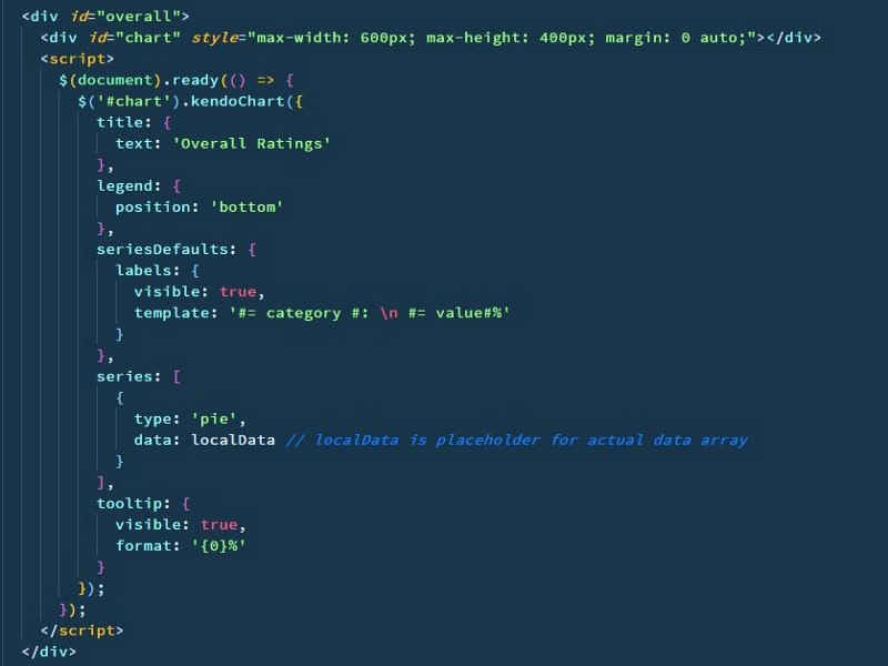
One of the questions that our customers ask us is when they use Kendo UI is Angular Elements supported? The answer is a resounding yes and we detail a simple step by step to showcase this capability by using Kendo UI charts control:
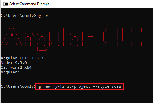
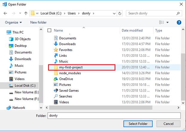
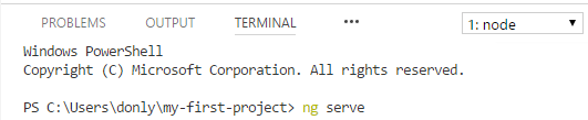
1. Install Angular CLI and create a new project
npm i -g @angular/cli
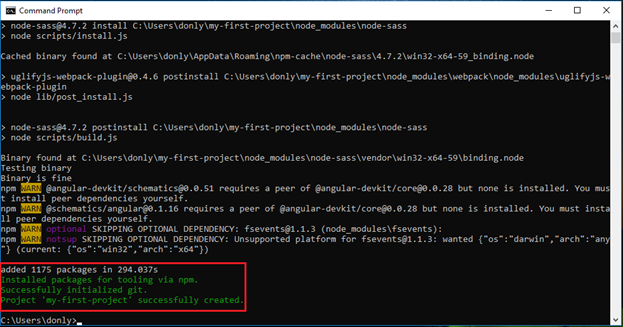
ng new angular-custom-elements2. Activate your Trial or commercial License
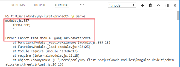
Kendo UI for Angular is a professionally developed library distributed under a commercial license. Starting from December 2020, using any of the UI components from the Kendo UI for Angular library requires either a commercial license key or an active trial license key.
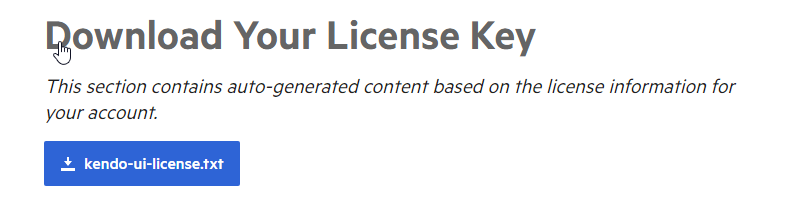
After login in your telerik account Download your Telerik license key and Save the kendo-ui-license.txt license key file in the project folder.
Install or Update a License Key
- Copy the license key file (
kendo-ui-license.txt) to the root folder of your project. Alternatively, copy the contents of the file to theKENDO_UI_LICENSEenvironment variable. - Install
@progress/kendo-licensingas a project dependency by runningnpm install --save @progress/kendo-licensingoryarn add @progress/kendo-licensing. - Run
npx kendo-ui-license activateoryarn run kendo-ui-license activatein the console.
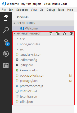
Adding the Kendo UI Components
Kendo UI for Angular is distributed as multiple NPM packages scoped to @progress. For example, the name of the Grid package is @progress/kendo-angular-grid. As of the Angular 6 release, Angular CLI introduces the ng add command which provides for a faster and more user-friendly package installation. For more information, refer to the article on using Kendo UI for Angular with Angular CLI.
3. Let’s start and add the Charts package:
Angular CLI supports the addition of packages through the ng add command which executes in one step the set of otherwise individually needed commands.
ng add @progress/kendo-angular-chartsThe command installs all necessary packages, sets up the default theme, and imports the component module. The full set of applied changes can be seen by running git diff at any time.
Manual Setup
All components that you reference during the installation will be present in the final bundle of your application. To avoid ending up with components you do not actually need, either:
- Import all Charts components at once by using the ChartsModule, or
- Import a specific Charts component by adding it as an individual NgModule.
Download and install the package.
npm install --save @progress/kendo-angular-charts @progress/kendo-angular-common @progress/kendo-angular-intl @progress/kendo-angular-l10n @progress/kendo-angular-popup @progress/kendo-drawing hammerjs @progress/kendo-licensingOnce installed, import Hammer.js and the NgModule of the components you need.
To get all package components, import the ChartsModule in your [application root]({{ site.data.url.angular[‘ngmodules’] }}#angular-modularity) or feature module in app.module.ts.
3. Add elements package
Custom elements are a Web Platform feature currently supported by Chrome, Edge (Chromium-based), Firefox, Opera, and Safari, and available in other browsers through polyfills
ng add @angular/elements4. Create a component
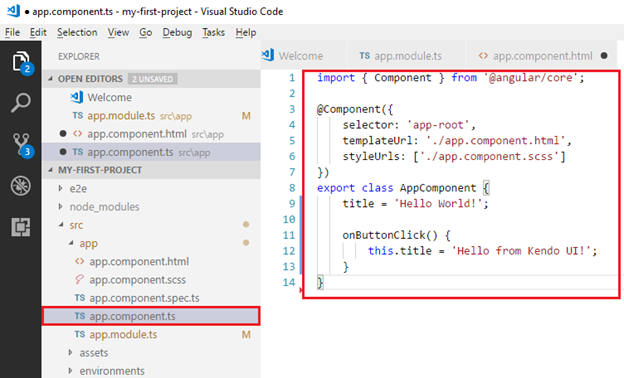
ng g component chart --inline-style --inline-template -v None5. Add properties to the component
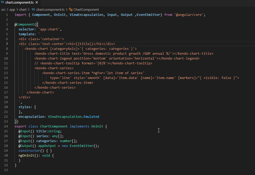
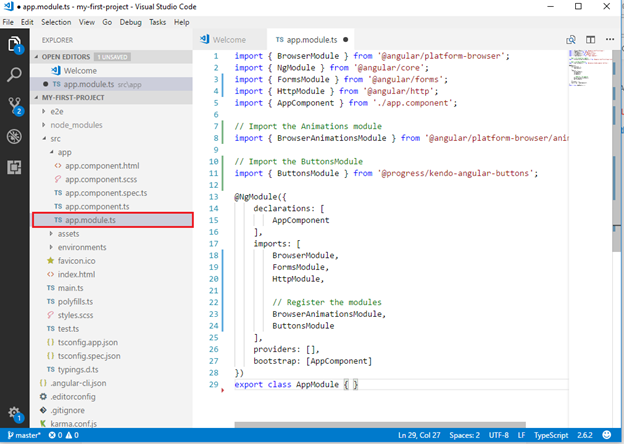
5. Update NgModule

6. Building the Angular Project for Production
ng build –prod –output-hashing=none
Now we need to create a build script(angular-elements-build.js) to produce only one JS file from the multiple files generated by the Angular CLI.
You need to install fs-extra and concat from npm using:
npm install fs-extra concat
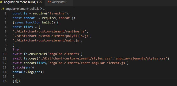
7. In your root application, create a build script file and add below code, angular-element-build.js
const fs = require('fs-extra');
const concat  = require('concat');
(async function build() {
const files = [
'./dist/chart-custom-element/runtime.js',
'./dist/chart-custom-element/polyfills.js',
'./dist/chart-custom-element/main.js',
]
try{
await fs.ensureDir('angular-elements')
await fs.copy('./dist/chart-custom-element/styles.css','angular-elements/styles.css')
await concat(files,'angular-elements/chart-angular-element.js')
}catch(err){
console.log(err);
}
})()
7. run the script using below command.
node angular-element-build.js
The above command will create an angular-elements folder and chat-angular-element.js and copy styles.css file inside in angular-elements folder
8. Use the Angular Element in simple HTML
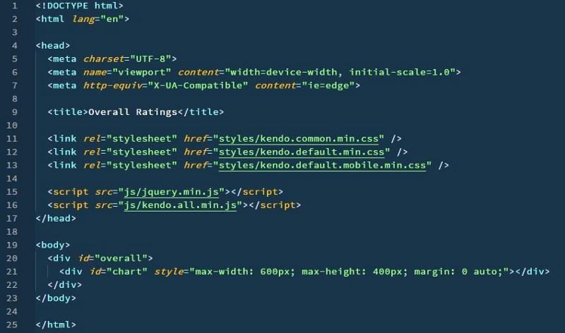
Add index.html file in angular-elements folder with below code:
<!DOCTYPE html>
<html lang="en">
<head>
<base href="/">
<meta charset="utf-8">
<meta name="viewport" content="width=device-width, initial-scale=1">
<link rel="icon" type="image/x-icon" href="favicon.ico">
<link rel="stylesheet" href="styles.css" />
<title>Testing our custom chart element</title>
</head>
<body>
<div class="container">
New component
<app-chart></app-chart>
<script type="text/javascript" src="chart-angular-element.js"></script>
<script>
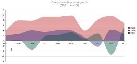
let arr = [2002, 2003, 2004, 2005, 2006, 2007, 2008, 2009, 2010, 2011];
let arrseries = [{
name: 'India',
data: [3.907, 7.943, 7.848, 9.284, 9.263, 9.801, 3.890, 8.238, 9.552, 6.855]
}, {
name: 'Russian Federation',
data: [4.743, 7.295, 7.175, 6.376, 8.153, 8.535, 5.247, -7.832, 4.3, 4.3]
}, {
name: 'Germany',
data: [0.010, -0.375, 1.161, 0.684, 3.7, 3.269, 1.083, -5.127, 3.690, 2.995]
}, {
name: 'World',
data: [1.988, 2.733, 3.994, 3.464, 4.001, 3.939, 1.333, -2.245, 4.339, 2.727]
}]
let title = "New Title"
let querySelect = document.querySelector('app-chart');
querySelect.categories = arr;
querySelect.series = arrseries;
querySelect.title = title;
</script>
</div>
</body>
</html>Install live-server using below command:
npm install -g live-serverNavigate to your angular-element folder and run below command:
cd angular-element
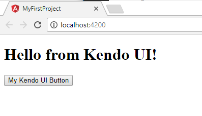
npx live-serverBrowser window will open with the URL http://localhost:8080/


 Helping Ninja Technologists