In this blog post i will take a look at one of the simplest API configuration we have for Kendo UI Data Visualization. When you use Kendo UI Data Viz to plot a chart have you ever wanted to provide your own custom colors for the series in the chart. If yes, well read on – i will show you how to achieve custom colors on series using Kendo UI Data Viz. Lets get started. Continue reading
dataviz
Drill Down Charts using Kendo UI DataViz
One of the fascinating things about being an evangelist is that, everyday I get to hear a new problem that people are trying to solve. It always keeps me on my toes as it gives me an opportunity to dig into our documentation once again and unearth the code necessary to solve the problem. In this blog post I will talk about one such problem a customer sent us. They wanted to know if Kendo UI DataViz charts support drill down or not. Out of the box Kendo UI DataViz does not have the capability in built but we provide events on the chart which will help you to achieve this functionality easily. So this blog post is all about achieving drill down functionality using Kendo UI DataViz chart. So if you have such a situation in your project, you may want to sit back and follow rest of the post.
Step 1 – Define the markup:
As you know in order to work with Kendo UI DataViz you will need to first add reference to Kendo UI DataViz CSS and then add reference to Kendo UI DataViz Theme CSS. Theme can be anything for e.g. black, metro, blue opal etc. Then add a reference to Jquery and Kendo UI DataViz JavaScript. Next define a div and give it a id of “chart”.
<link rel="stylesheet" href="http://cdn.kendostatic.com/2014.1.416/styles/kendo.dataviz.min.css"> <link rel="stylesheet" href="http://cdn.kendostatic.com/2014.1.416/styles/kendo.dataviz.black.min.css"> <body> <div id="chart" ></div> <script src="http://code.jquery.com/jquery-1.9.1.min.js"></script> <script src="http://cdn.kendostatic.com/2014.1.416/js/kendo.all.min.js"></script> <script> <!-- chart draw logic here --> </script> </body>
Step 2 – Prepare Data:
For the sake of this blog post i am going to fake some data about browsers market share. So initially i will show column chart for major browsers. Then on clicking each column i should be able to drill down into its specific data. I will create my data as a JavaScript array and use them for binding to chart. Here are my data array which i will use while binding to chart:
<script> var chartInitialData=[ {category:"MSIE",value:55.11}, {category:"Firefox",value:21.63}, {category:"Chrome",value:11.94}, {category:"Safari",value:7.15}, {category:"Opera",value:2.14}, ]; var msieData = [ {category:"MSIE 6.0",value:10.85}, {category:"MSIE 7.0",value:7.35}, {category:"MSIE 8.0",value:33.06}, {category:"MSIE 9.0",value:2.81}, ]; </script>
As you can see, I have an initial data to bind to the chart. And also the drill down data. For the sake of simplicity i have only shown drill down data for one of the columns. At the end of this post i will give link to the code which will have drill down data for all the columns of the chart.
Step 3 – Initialize the Chart:
Now we are ready to initialize the chart and bind the initial data to it. Here is the code snippet for initializing the chart:
$(document).ready(function(){ $("#chart").kendoChart({ theme:"Black", title: { text: "Browser market share, March, 2014"}, dataSource:{ data:chartInitialData }, series: [{ type:"column", field:"value", categoryField:"category", labels:{ visible:true, template:"${value}%" } }], tooltip:{ visible:true, template:"<center>${category}: <b>${value}% market share</b><br/>Click to see ${category} versions</center>" }, }); })
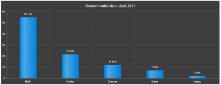
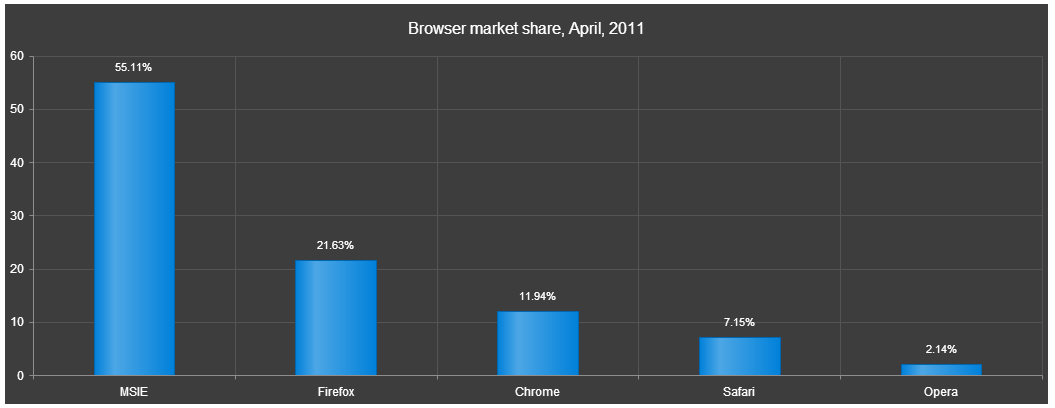
Let me go over the code once. I access an element with id “chart” and then initialize Kendo Chart on that element. I set the theme to Black. Then i provide a title to the chart. Next comes the data source and i create a Kendo.data.DataSource object and provide the value of chartInitialData to data property. Then I set the series as a column chart type. Next I set the value field and category field of the chart to corresponding column name from the data source. I also set the labels to be visible on top of each column. Lastly I set the tooltip to a custom template. Now if we run the code this is what we see:
Step 4 – Handle Series Click:
Now that we have our chart initialized and see that the data is getting bound correctly, next step is to handle the series click. Series Click is an event fired when the user clicks on any columns in the chart. Chart API exposes a method called setDataSource(). So in order to achieve a drill down, handle the series click event and set a new data source to the chart. What this does is, it will repaint the chart area and provides the drill down effect. So here is the code snippet for the seriesClick event:
seriesClick: function(e) { var categorySelected = e.category; var chart = $("#chart").data("kendoChart"); if(categorySelected === "MSIE") { chart.setDataSource(new kendo.data.DataSource({data:msieData})); } else if(categorySelected === "Firefox") { chart.setDataSource(new kendo.data.DataSource({data:ffData})); } else if(categorySelected === "Chrome") { chart.setDataSource(new kendo.data.DataSource({data:chromeData})); } else if(categorySelected === "Safari") { chart.setDataSource(new kendo.data.DataSource({data:safariData})); } else if(categorySelected === "Opera") { chart.setDataSource(new kendo.data.DataSource({data:operaData})); } else { //not handling the child level drill down - setting the chart back to original data source chart.setDataSource(new kendo.data.DataSource({data:chartInitialData})); } }
And thats all it is there to create a drill down with Kendo UI DataViz.
Here is a link to the source code of this demo: http://trykendoui.telerik.com/@kashyapa/eCEP/3.
The demo code is done using our Kendo UI Dojo. When you navigate to the demo page, left hand side will have the source code and right hand side will show the output. You will need to click on the Run button on the page to see the output.
Hope this demo helps somebody who want to achieve the same scenario.
Till next time – Happy Coding.
Webinar Recap: Easy HTML5 Data Visualization with Kendo UI DataViz
Apr – May 2013 will see a series of webinar from Telerik India pertaining to Data Visualization, Team Pulse, Windows 8, SiteFinity, Windows Phone 8 and Kendo UI. If you are interested in any of these webinars do take a look at the following post: https://telerikhelper.net/2013/03/19/ninja-enough-telerik-india-webcasts-april-may-2013/.
On Apr 11 we delivered a webinar on HTML5 Data Visualization titled – “Easy HTML5 Data Visualization with Kendo UI DataViz”. This post is a recap of the webinar. As part of the webinar we discussed the following things:
-
What is Data Visualization ?
-
Why do we need Data Visualization ?
-
How do we do Data Visualization ?
-
What does HTML5 technology define for Data Visualization ?
-
Introducing Kendo UI DataViz
-
Demo
Here is the slide deck used for the webinar:
Here is the video recording of the webinar:
Easy HTML5 Data Visualization with Kendo UI DataViz from Telerik Helper on Vimeo.
During this webinar we had a lot of questions and I am trying to address them here:
-
There are couple of free jquery plug-in available on the net. which do all these charts. how Kendo UI different from them?
Kendo UI aims at providing unified framework for HTML5 & JavaScript Apps/Sites. Kendo UI is all about HTML5 powered client side javascript frame work. The DataViz package of Kendo UI spits out the Charts/Graphs/Gauges using SVG technology on modern browsers and will render as VML on older browsers. So if you use Kendo UI DataViz to perform your data visualization rest assured that you are HTML5 complaint. -
Being a .Net developer why I should use HTML5 and not Silverlight for all this. same can be achieved with Silverlight as well?
The decision to use Silverlight or HTML5 will depend on the nature of the project. Silverlight is still a plugin based technology where as HTML5 is trying to standardize the web world with a common structure to be supported by all browsers. -
For running Silverlight applications , user has to download the runtime first. Is it the same for Kendo UI code?
Kendo UI is a pure client side JavaScript framework. Kendo UI relies on Stylesheet and JavaScript. We have only one dependency and that is of Jquery. Apart from this nothing else is needed. -
Why we need to choose separate chart product – when asp.net charting can give the charting option?
The charting option provided by ASP.NET as far as I know if not HTML5 based. Meaning the output of the chart/graph through ASP.NET charting is still Image based and does not use the HTML5 recommended SVG for output. Where as Kendo UI is a HTML5 compliant and outputs the charts/graphs as SVG on modern browsers and as VML on older browsers. -
Can we add Kendo UI references into the PHP project?
Absolutely. Kendo UI is serer agnostic. Meaning it does not care what server side technology has been used. This is because Kendo UI is a client side JavaScript framework. And to use Kendo UI you only reference a couple of style sheets and scripts and you are up and running. For data you will need to make sure that you create JSON end points as Kendo UI works well out of the box with JSON and XML. -
Can we change the styles according to us?
Yes very much. We provide an easy way to custom style all the Kendo UI widgets. We have an online theme builder for web and for mobile controls. For more information check out this page: http://demos.kendoui.com/ -
Can we use Kendo on Windows 8 metro & mobile apps ?
Kendo UI consists of 3 packages – Web, DataViz and Mobile. The Web can be used for Web Applications. Mobile controls can be used to develop Cross Platform Hybrid Mobile Apps. So Kendo UI Mobile Controls support Windows Phone. As of now we do not have support for Windows 8. -
can we use it for 3D, is there any support for that?
We do not support 3D charting at the moment. -
Will this work on mobile browsers ?
Since DataViz output SVG as the format for the chart/gauges, it can run on both desktop browsers and mobile browsers. -
Does the charts support Drill Down option?
Drill-down functionality is not supported out of the box yet. However the chart exposes a seriesClick event which can be used instead. You can find a live demo here. -
In the demo shown, was usage of valueAxis , categoryAxis, tooltip…. are these syntax to use kendo ui or some sort of data…??
These are the configuration settings you do on the Kendo UI DataViz objects and at runtime the chart is generated based on these settings. -
Can i use Kendo UI in my .net application instead of SSRS charts?
Absolutely. You just need to make sure you provide an endpoint which can return JSON payload and the Kendo UI DataViz widgets can consume data and plot it. -
How do we know Kendo Chart options ? as you are passing some options to it. is there any full fledged docs ?
The Kendo UI Documentation can be found at http://docs.kendoui.com. We have the API reference, Getting Started, Tutorials at the documentation site. -
Does this come with Samples?
Yes. whether you download the trial or licensed version of Kendo UI – we ship the demo source code with it. -
can we populate the data from database and bind this data to kendo charts?
Kendo UI is server side agnostic and does not care about what is the technology used for server side. Having said that the way Kendo UI works is – it can understand JSON or XML. So as long as data is passed as JSON/XML we don’t care about anything else. So you need to make sure that you create endpoint i.e. services which can return data in JSON or XML format. Kendo Widgets will be able to read data from those services out of the box.
Also, we had promised to attentive members from the audience will get our Telerik Ninja t-shirt. Well here are 2 winners we picked:
-
Ravi Gadag
-
Narendra Bisht
Congratulations to the winners and we will be getting in touch with you soon. Rest of you don’t loose heart. We have 5 more webinars in April and May and in each webinar we will be giving out 2 shirts each.
Hope you liked this webinar and we hope to see you back in our future webinars.