
In this blog post i will take a look at one of the simplest API configuration we have for Kendo UI Data Visualization. When you use Kendo UI Data Viz to plot a chart have you ever wanted to provide your own custom colors for the series in the chart. If yes, well read on – i will show you how to achieve custom colors on series using Kendo UI Data Viz. Lets get started.
About Kendo UI:
If you are hearing the word “Kendo UI” for the first time – no problem. I will give you a heads up on what is Kendo UI. Here is what our official wordings are on Kendo UI:
Kendo UI for jQuery by Progress delivers everything you need to build a modern web application under tight deadlines. Choose from more than 70 UI components and easily combine them to create beautiful and responsive apps, while speeding development time by up to 50 percent.
Kendo UI is nothing but a HTML5 based JavaScript UI framework which provides Web/Data Viz/Mobile widgets for you to do HTML5 based apps. You can know more about Kendo UI here. We have a 30 day trial available for you to download and evaluate. So what are you waiting for – go ahead and start a trial.
Creating a Chart:
In order to create a Kendo UI Chart you first start with a empty div in the markup.Here is the code snippet:
| <div id="chart"></div> |
Next we will go ahead and instantiate a Kendo UI Chart and use the div as the selector. Here is the code snippet for creating a Chart:
| <script> | |
| function createChart() { | |
| $("#chart").kendoChart({ | |
| title: { | |
| text: "Gross domestic product growth \n (GDP annual %)" | |
| }, | |
| seriesDefaults: { | |
| type: "area", | |
| area: { | |
| line: { | |
| style: "smooth" | |
| } | |
| } | |
| }, | |
| series: [{ | |
| name: "India", | |
| data: [3.907, 7.943, 7.848, 9.284, 9.263, 9.801, 3.890, 8.238, 9.552, 6.855] | |
| }, { | |
| name: "World", | |
| data: [1.988, 2.733, 3.994, 3.464, 4.001, 3.939, 1.333, -2.245, 4.339, 2.727] | |
| }, { | |
| name: "Haiti", | |
| data: [-0.253, 0.362, -3.519, 1.799, 2.252, 3.343, 0.843, 2.877, -5.416, 5.590] | |
| }], | |
| categoryAxis: { | |
| categories: [2002, 2003, 2004, 2005, 2006, 2007, 2008, 2009, 2010, 2011], | |
| majorGridLines: { | |
| visible: false | |
| }, | |
| labels: { | |
| rotation: "auto" | |
| } | |
| }, | |
| tooltip: { | |
| visible: true, | |
| format: "{0}%", | |
| template: "#= series.name #: #= value #" | |
| } | |
| }); | |
| } | |
| $(document).ready(createChart); | |
| </script> |
Lets take a closer look at the code:
- We have provided a title to the chart using the “title” setting
- We then set default things on the series. In this case we have said that the series is a area series with smooth lines. We use the “seriesDefaults” setting.
- We then provide 3 series to the chart. We use the “series” setting for this and this is an array.
- We then set the category axis or x axis related configuration. We provide the x axis data points using the “categories” setting available under “categoryAxis” setting.
- Finally, we customize the tooltip appearance using the “tooltip” setting
Next, lets run the page and view the output. Here is a screenshot of the Chart being rendered as per the code above:

Fig 1. Kendo UI Chart – Default Series Colors
The colors that are applied to the series are the default Kendo UI Theme colors. Kendo UI provides out of the box 15+ themes for you to use. Since we did not specify a theme specifically, Kendo UI DataViz has applied the default theme and hence the default theme colors for the series.
Custom Series Colors:
Now, lets see how we can provide a custom series colors to the chart. As part of the Chart API, we expose a specific property called “seriesColors” on the Chart object. This property/setting taken an array of your custom colors and uses that as the series colors. So in order to provide your custom colors you just need to provide the color codes to seriesColors property and chart will pick it up. You will need to provide the same amount of colors as that of your series. In my case, i have 3 series and hence i will provide 3 custom color codes. If you have more series and less colors provided, chart will cycle through the provided colors on the series. Here is the code snippet for the seriesColors setting:
| <script> | |
| function createChart() { | |
| $("#chart").kendoChart({ | |
| title: { | |
| text: "Gross domestic product growth \n (GDP annual %)" | |
| }, | |
| seriesColors:['#b71c1c','#1a237e','#004d40'], | |
| //ommitted for brevity... | |
| }); | |
| } | |
| $(document).ready(createChart); | |
| </script> |
If you take a look at the code, i just added “seriesColors” property and provided 3 color codes as an array. And here is how the chart looks like now:
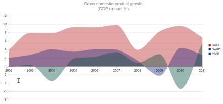
Fig 2. Kendo UI Chart – Custom Series Colors
Summary:
We saw how easy it is to provide a custom series colors to your Kendo UI Chart. “seriesColors” is a handy chart setting using which you can provide your custom color swatches for your charts.
You can find the source code for chart we created in the blog post here – http://dojo.telerik.com/@kashyapa/epoTA
This was a short post but i hope you found it informative. If you have any questions/feedback/suggestions – do drop a comments below and we will address it for sure.
Till next time – Happy Coding.

Hello! Thanks for the useful article! Is it possible our charts to use more than 6 series colors – to be precisely to have few shades of each series color. Is it possible to use color depending on what kind of data is provided? For example if the data has negative impact to use red color not just any color.