How to create Custom Theme for Kendo UI DataViz

Kendo UI DataViz is our Data Visualization package as part of the Kendo UI Framework. Kendo UI DataViz is HTML5 compliant and generates SVG (Scalable Vector Graphics) on HTMl5 supported browsers and falls back to VML (Vector Markup Language) on browsers that don’t support HTML5. VML is supported by pretty much all browser versions. If you are keen to know more about Kendo UI DataViz, head over to our DataViz demos online: http://demos.telerik.com/kendo-ui/area-charts/index

This blog post will walk you through how to create a custom theme for DataViz charts. Out of the box we ship the following 11 themes:

Default
image

Blue Opal
image

Bootstrap
image

Silver
image

Uniform
image

Metro
image

Black
image

Metro Black
image

High Contrast
image

Moonlight
image

Flat
image

I don’t know about you guys but I say those are pretty good themes for me. But we do understand that not all the times you will go with the default themes we ship. You may want to customize it to your organizational or even project color combination. So we will see how we can do the customization in the coming section.

Kendo UI Themebuilder:

The tool which will help you to customize Kendo UI themes is known as “Kendo UI ThemeBuilder”. It lets you modify themes so that they match the look and feel of our DataViz widgets to that of your site or app. It is an online tool and no we don’t charge you to use it. You can look at the ThemeBuilder tool here: http://demos.telerik.com/kendo-ui/themebuilder/

Steps to Customize DataViz Widgets:

  1. Navigate to ThemeBuilder tool online.
  2. To start customization, you are required to first select one of the default themes. This is like a foundation to start the customization. So select any default theme first.
    image 
  3. Next start the ThemeBuilder tool by clicking on the button named “Kendo UI ThemeBuilder”. This will launch the ThemeBuilder GUI tool and will appear on the right hand side of the page. Give it a couple seconds to load the GUI.
    image
  4. Since we want to customize the DataViz widgets, select the button labeled “DataViz” in the ThemeBuilder GUI tool. This will provide us with a UI which will help us to customize different aspects of the DataViz widgets.
    image 
  5. Things that can be customized on the DataViz Widgets are: Title, Legend, Charting Area, Axes, Tooltip, Series Colors and Gauge
  6. Scroll Down the page to see the DataViz widgets. Then change the appropriate widget property to your custom value. For e.g. I have changed the chart area color to a custom value and as soon as I do it – I get a instant update of how the widget will look like. Here is a snapshot of my changes:
    image
    Like this you can set your custom colors for all the customization points available for the widget.
  7. Once you are done with your changes, click on the “Get JSON” button available on top of the GUI tool. This will spit out a JSON structure of the changes you just did.
    image 
  8. The JSON code will look like below:
    image
    Notice that by default the custom code is named as “newTheme”. You can change that and provide your own custom name. Remember the name as this is the name you will use to set a theme on a DataViz widget. All we are doing is – we register this new theme with the DataViz ui and later when we set theme property of DataViz widgets to this custom theme name, Kendo UI will be able to apply your color schemes to the widgets.
  9. Copy the JSON code and add that into a new JavaScript file. Give JS file a meaningful name and include it in any page where you need the custom theme.

Using Custom Theme:

In the previous section, we saw how to create a custom theme. In order to use the custom theme, all you need to do is to set the “theme” property on DataViz widgets to the new custom theme name you have provided during registration. Here is a code snippet of setting the theme on a DataViz widget:

$("#area-chart").kendoChart({

        theme:"LohithTheme",

            transitions: false,

            title: {

                text: "Internet Users"

            },

            legend: {

                position: "bottom"

            },

            seriesDefaults: {

                type: "area"

            },

            series: [

                {

                    name: "United States",

                    data: [67.96, 68.93, 75, 74, 78]

                }, {

                    name: "World",

                    data: [15.7, 16.7, 20, 23.5, 26.6]

                }

            ],

            valueAxis: {

                labels: {

                    format: "{0}%"

                }

            },

            categoryAxis: {

                categories: [2005, 2006, 2007, 2008, 2009]

            },

            tooltip: {

                visible: true,

                format: "{0}%"

            }

        });

I have named my theme as “LohithTheme” and use that name while creating a chart.

I have put up a full fledged demo with a custom theme here: http://trykendoui.telerik.com/@kashyapa/icAJ. This is our new shiny playground for Keno UI called “Kenod UI Dojo”. In the code section you can review the JS code and when you click on Run button output will be shown on the right hand side. Here is snapshot of my custom theme in action:

image

And that’s as easy as it can get to customize a DataViz theme.

Hope this blog post helps you if you have a similar scenario of customizing our DataViz widgets. Do let us know your feedback on this blog post through the comments.

Till next time – Happy Coding.

Advertisement
Drill Down Chart

Drill Down Charts using Kendo UI DataViz

One of the fascinating things about being an evangelist is that, everyday I get to hear a new problem that people are trying to solve. It always keeps me on my toes as it gives me an opportunity to dig into our documentation once again and unearth the code necessary to solve the problem. In this blog post I will talk about one such problem a customer sent us. They wanted to know if Kendo UI DataViz charts support drill down or not. Out of the box Kendo UI DataViz does not have the capability in built but we provide events on the chart which will help you to achieve this functionality easily. So this blog post is all about achieving drill down functionality using Kendo UI DataViz chart. So if you have such a situation in your project, you may want to sit back and follow rest of the post.

Step 1 – Define the markup:

As you know in order to work with Kendo UI DataViz you will need to first add reference to Kendo UI DataViz CSS and then add reference to Kendo UI DataViz Theme CSS. Theme can be anything for e.g. black, metro, blue opal etc. Then add a reference to Jquery and Kendo UI DataViz JavaScript. Next define a div and give it a id of “chart”.

<link rel="stylesheet" href="http://cdn.kendostatic.com/2014.1.416/styles/kendo.dataviz.min.css">
<link rel="stylesheet" href="http://cdn.kendostatic.com/2014.1.416/styles/kendo.dataviz.black.min.css">
<body>
<div id="chart" ></div>
<script src="http://code.jquery.com/jquery-1.9.1.min.js"></script>
<script src="http://cdn.kendostatic.com/2014.1.416/js/kendo.all.min.js"></script>
<script>
<!-- chart draw logic here -->
</script>
</body>

Step 2 – Prepare Data:

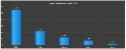
For the sake of this blog post i am going to fake some data about browsers market share. So initially i will show column chart for major browsers. Then on clicking each column i should be able to drill down into its specific data. I will create my data as a JavaScript array and use them for binding to chart. Here are my data array which i will use while binding to chart:

<script>
var chartInitialData=[
 {category:"MSIE",value:55.11},
 {category:"Firefox",value:21.63},
 {category:"Chrome",value:11.94},
 {category:"Safari",value:7.15},
 {category:"Opera",value:2.14},
 ];
 var msieData = [
 {category:"MSIE 6.0",value:10.85},
 {category:"MSIE 7.0",value:7.35},
 {category:"MSIE 8.0",value:33.06},
 {category:"MSIE 9.0",value:2.81},
 ];
</script>

As you can see, I have an initial data to bind to the chart. And also the drill down data. For the sake of simplicity i have only shown drill down data for one of the columns. At the end of this post i will give link to the code which will have drill down data for all the columns of the chart.

Step 3 – Initialize the Chart:

Now we are ready to initialize the chart and bind the initial data to it. Here is the code snippet for initializing the chart:

$(document).ready(function(){

 $("#chart").kendoChart({
 theme:"Black",
 title: { text: "Browser market share, March, 2014"},
 dataSource:{ data:chartInitialData },
 series: [{
 type:"column",
 field:"value",
 categoryField:"category",
 labels:{
 visible:true,
 template:"${value}%"
 }
 }],
 tooltip:{
 visible:true,
 template:"<center>${category}: <b>${value}% market share</b><br/>Click to see ${category} versions</center>"
 },
 });
 })

Let me go over the code once. I access an element with id “chart” and then initialize Kendo Chart on that element. I set the theme to Black. Then i provide a title to the chart. Next comes the data source and i create a Kendo.data.DataSource object and provide the value of chartInitialData to data property. Then I set the series as a column chart type. Next I set the value field and category field of the chart to corresponding column name from the data source. I also set the labels to be visible on top of each column. Lastly I set the tooltip to a custom template. Now if we run the code this is what we see:

Drill Down Chart

Drill Down Chart Initial Look


Step 4 – Handle Series Click:

Now that we have our chart initialized and see that the data is getting bound correctly, next step is to handle the series click. Series Click is an event fired when the user clicks on any columns in the chart. Chart API exposes a method called setDataSource(). So in order to achieve a drill down, handle the series click event and set a new data source to the chart. What this does is, it will repaint the chart area and provides the drill down effect. So here is the code snippet for the seriesClick event:

seriesClick: function(e)
 {
 var categorySelected = e.category;
 var chart = $("#chart").data("kendoChart");
 if(categorySelected === "MSIE")
 {
 chart.setDataSource(new kendo.data.DataSource({data:msieData}));
 }
 else if(categorySelected === "Firefox")
 {
 chart.setDataSource(new kendo.data.DataSource({data:ffData}));
 }
 else if(categorySelected === "Chrome")
 {
 chart.setDataSource(new kendo.data.DataSource({data:chromeData}));
 }
 else if(categorySelected === "Safari")
 {
 chart.setDataSource(new kendo.data.DataSource({data:safariData}));
 }
 else if(categorySelected === "Opera")
 {
 chart.setDataSource(new kendo.data.DataSource({data:operaData}));
 }
 else
 {
 //not handling the child level drill down - setting the chart back to original data source
 chart.setDataSource(new kendo.data.DataSource({data:chartInitialData}));
 }
 }

And thats all it is there to create a drill down with Kendo UI DataViz.

Here is a link to the source code of this demo: http://trykendoui.telerik.com/@kashyapa/eCEP/3.

The demo code is done using our Kendo UI Dojo. When you navigate to the demo page, left hand side will have the source code and right hand side will show the output. You will need to click on the Run button on the page to see the output.

Hope this demo helps somebody who want to achieve the same scenario.

Till next time – Happy Coding.