
Overview:
This is the fifth post in a series on Kendo UI wrappers for ASP.NET MVC. In this post we will look at one more wrapper named DateTimePicker. Before we get on with DateTimePicker Kendo wrapper, if you are new and want to learn more about Kendo Wrappers for ASP.NET MVC, I suggest you take a look at “Jumpstarting Development with Kendo UI for ASP.NET MVC” by Abhishek Kant. The jumpstarting blog post will give you the basics on how to get started with Kendo for ASP.NET MVC. Here is the post which has links to all other blog post of the series.
What is DateTimePicker control?
DateTimePicker is a control which allows end user to select a date & time from a calendar & time picker. It also supports to input the data directly. The DateTimePicker control supports customizing the month view by providing a custom template. The Minimum date, Maximum date, the view to start the calendar with and the time interval on the time picker, are all configurable through options.

Instantiating a DateTimePicker:
The first step in using a date time picker is to instantiate it on the page. To instantiate the control we make use of the DateTimePicker builder available as part of the Kendo Wrappers for ASP.NET MVC. Below is the code snippet which shows how to instantiate the control:
@(
Html.Kendo().DateTimePicker()
.Name("kdatetimepicker")
.HtmlAttributes(new { style = "width:230px"})
 )
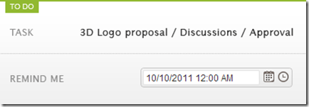
Here is the output of the above code:

What we just did was to instantiate a DateTimePicker control on the page and we gave it name. When it is rendered you will basically see a textbox to enter the date and time, a calendar button and the clock button. The calendar button when clicked will allow you to select a date and when you click the clock button will allow you to select the time interval.
Set default value to control:
As you can see from the previous section, when the control is instantiated the textbox is empty. That is expected as we never set a default value to the date time picker control. The calendar when opened will always show the current date highlighted but that is not a value until use clicks on it. In order to set the default value on the control, we will use the Value() method. The Value() method takes DateTime instance or a date in string format, which will be set as the controls value. Here is the code snippet to set the default value:
@(
Html.Kendo().DateTimePicker()
.Name("kdatetimepicker")
.Value("12/12/2012 14:30")
.HtmlAttributes(new { style = "width:230px"})
)
And here is the output of the above code snippet:

Formatting controls value:
Previous section we saw how to set the value of the control. The default format in which the date and time is displayed is “MM/dd/yyyy hh:mm tt” i.e. Month, Day, Year, Hour, Minutes and Meridian. Lets say we want to change the format in which the date and time is shown. The control provides the options to modify the format through Format() method. The Format() method takes a string which is nothing but your new format for date and time display. Here is a code snippet to set the format:
@(
Html.Kendo().DateTimePicker()
.Name("kdatetimepicker")
.Value("12/12/2012 14:33")
.Format("On MM/dd/yyyy @ hh:mm tt")
.HtmlAttributes(new { style = "width:240px"})
)
Here is the output of the above code change:

As you cane see I just provided a format “On MM/dd/yyyy @ hh:mm tt” and this translates the value to “On 12/12/2012 @ 02:33 PM”. So this is a handy setting to keep in mind.
Putting constraints on date selection:
With date picker, one of the common requirement that you will have to take care is to restrict the dates a user can select. You may want to set a minimum date and maximum date restriction on the calendar itself. The date time picker control provides this option through Min() and Max() methods. Both Min and Max methods support two overloads – one takes a string format of a date and another takes an instance of DateTime. Here is the code snippet to put restrictions on the calendar:
@(
Html.Kendo().DateTimePicker()
.Name("kdatetimepicker")
.Value("12/12/2012 14:33")
.Min("12/10/2012").Max("12/21/2012")
.Format("On MM/dd/yyyy @ hh:mm tt")
.HtmlAttributes(new { style = "width:240px"})
)

As you can see the dates are now restricted and the user can select from only the dates allowed to select.
Setting the Time interval:
The time picker component in this control, by default, sets the time interval between hours to 30 minutes. You have the flexibility to control the interval between the hours by using the Interval() method. The Interval() method takes a integer and will set the interval based on this value. Lets say I want to set the interval to 15 minutes, find below the code snippet to do that:
@(
Html.Kendo().DateTimePicker()
.Name("kdatetimepicker")
.Value("12/12/2012 14:30")
.Min("12/10/2012").Max("12/21/2012")
.Interval(15)
.Format("On MM/dd/yyyy @ hh:mm tt")
.HtmlAttributes(new { style = "width:240px"})
)
And here is the output of the above code snippet:

As you can see the interval between the hour is now set to 15 minute interval and this is through the Interval() setting we have in the code.
Handling Events:
The date time picker control supports client side event handling. The control exposes 3 events namely Open, Close and Change. Note that all these are client side events and the handlers will be client side event handlers. Here is the code snippet to listen to events and provide the event handlers to those events:
@(
Html.Kendo().DateTimePicker()
.Name("kdatetimepicker")
.Value("12/12/2012 14:30")
.Min("12/10/2012").Max("12/21/2012")
.Interval(15)
.Format("On MM/dd/yyyy @ hh:mm tt")
.HtmlAttributes(new { style = "width:240px"})
.Events(e => e
.Open("kdatetimepicker_open")
.Change("kdatetimepicker_change")
.Close("kdatetimepicker_close")
)
)

<script>
function kdatetimepicker_open() {
//Handle the open event
}

function kdatetimepicker_close() {
//Handle the close event
}

function kdatetimepicker_change() {
//Handle the change event
}
</script>
Access control from client side:
So far we have seen how to instantiate and configure settings on the control from server side. And the configuration was done using the Kendo ASP.NET MVC wrapper. Once the control is rendered on the client side what if you need to perform some operation on the DateTimePicker control itself. The Kendo UI JavaScript APIs allow us to grab the control on the client side and access its properties and methods. Let’s say on date change by user, we want to get the newly selected value and prompt it. Here is the code snippet to do that:
@(
Html.Kendo().DateTimePicker()
.Name("kdatetimepicker")
.Value("12/12/2012 14:30")
.Min("12/10/2012").Max("12/21/2012")
.Interval(15)
.Format("On MM/dd/yyyy @ hh:mm tt")
.HtmlAttributes(new { style = "width:240px"})
.Events(e => e
.Change("kdatetimepicker_change")
)
)
<script>
function kdatetimepicker_change() {
var dateTimePicker = $("#kdatetimepicker").data("kendoDateTimePicker");
alert(dateTimePicker.value());
}
</script>
As you can see, we first listen to on change event and in the event handler for change we use jquery selector to get the element by its id and use the jquery data() method to get the Kendo DateTimePicker control. Once we get hold of the control, it supports the value() method which will give us the current selected value. Here is the output of the above code:

Summary:
In this post we looked at one more Kendo Wrapper namely DateTimePicker. This control makes a perfect match for scenarios where you need to present both the date and time selection. We saw how easy it was to work with the control from the server side. With just a few settings we can get this control working according to our needs.


 Helping Ninja Technologists