
Overview:
This is the fourth post in a series on Kendo UI wrappers for ASP.NET MVC. In this post we will look at one more wrapper named DatePicker. Before we get on with DatePicker Kendo wrapper, if you are new and want to learn more about Kendo Wrappers for ASP.NET MVC, I suggest you take a look at “Jumpstarting Development with Kendo UI for ASP.NET MVC” by Abhishek Kant. The jumpstarting blog post will give you the basics on how to get started with Kendo for ASP.NET MVC. Here is the post which has links to all other blog post of the series.
What is DatePicker control?
DatePicker is a control which allows end user to select a date from a calendar or by inputting the data directly. The DatePicker control supports customizing the month view by providing a custom template. The Minimum date, Maximum date and the view to start out with are all configurable through options.

Instantiating a DatePicker:
to instantiate a DatePicker control on the page, we make use of the DatePicker builder available in as part of the Kendo wrapper helpers. Take a look at the below code to see how DatePicker is instantiated:
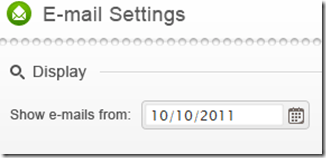
@( Html.Kendo().DatePicker().Name("kdatepicker") )
Here is the output of the above code:

As you can see we just instantiated the DatePicker control on the page. The control is made up of the textbox for manual input and a button (having calendar icon) which when clicked will bring up a calendar so that user can select any date.
Setting default value at instantiation:
In the previous section we saw how to instantiate a DatePicker control. But when it was rendered we did not see any default value i.e. a default date being displayed in the textbox. Well, that is because we never told the control what its default value was. DatePicker control exposes a method called Value() which can be used to set the default value. Here is a code to set the default value of the control to current day:
@(Html.Kendo().DatePicker().Name("kdatepicker")
      .Value(DateTime.Today)
)
Here is the output as a result of setting the default value to the control:

Formatting selected value:
We saw how to set the default value of the date picker control. The default format in which the date value is shown is MM/DD/YYYY. If you want to customize the format, the control provides the option to use the Format() method and provide any valid date time format that we are familiar with. So here is the code to set the format as “<Day Name>, <Month Name> <Date>, <Year>”:
@(Html.Kendo().DatePicker().Name("kdatepicker")
      .Value(DateTime.Today)
      .Format("dddd, MMMM dd, yyyy")
      .HtmlAttributes(new { style = "width:230px"})
)
I have used the Format() method and passed in a format “dddd, MMMM dd, yyyy” and below is the output of that code:

Putting constraints for selection:
When using date pickers in a real world applications, one of the common scenario is to restrict the dates a user can select. Usually we will have a minimum date and maximum date range and we would like the calendar to show only those dates and user can select only from those dates. DatePicker control provides Min() and Max() method which accept a DateTime value and use these two settings to restrict the values. Here is the code to use the Min & Max methods. I am setting the minimum date to be today and maximum date to be 4 days from today:
@(Html.Kendo().DatePicker().Name("kdatepicker")
      .Value(DateTime.Today)
      .Format("dddd, MMMM dd, yyyy")
      .Min(DateTime.Today)
      .Max(DateTime.Today.AddDays(4))
      .HtmlAttributes(new { style = "width:230px"})
)
Here is the output of the above code:

Customizing the Calendar Views:
So far we have seen that when the calendar is used for selecting a date, by default it shows the month view i.e. it shows current month and the days in that month. DatePicker control also has the provision to customize the calendar view and we can do that by using the Start() method. The Start() method accepts a enum of type CalendarView. CalendarView has options Century, Decade, Month and Year. You just set what view you would like to see and the calendar will show that particular view every time users open the calendar. Here is a code to set the start view of the calendar to Century:
@(Html.Kendo().DatePicker().Name("kdatepicker")
      .Value(DateTime.Today)
      .Format("dddd, MMMM dd, yyyy")
      .Start(CalendarView.Century)
      .HtmlAttributes(new { style = "width:230px"}) )
Here is the output for the same:

Here is an example of all the calendar views:

Customizing cell rendering:
Imagine a scenario where you want to customize how a particular day needs to be rendered on the calendar. For e.g. November 9 is my birthday. So whenever Nov 9 is rendered I want to be reminded that its my birthday and I want a cake icon to be shown on that day. For such a scenario, DatePicker control has the provision to customize each cell rendering. This is done by passing a template to a method named MonthTemplate(). You can pass any valid kendo template string to this method. Here is the code to show a birthday cake on Nov 9 of every year:
@(Html.Kendo().DatePicker().Name("kdatepicker")
.Value(DateTime.Today)
.Format("dddd, MMMM dd, yyyy")
.HtmlAttributes(new { style = "width:230px"})
.MonthTemplate(" # if (data.value == 9 && data.date.getMonth() == 10) { # " +
"<div class=birthday /> " +
"# } #  " +
"#= data.value #")
)
What I have done is to pass a template string. If you look at the template itself, I am just checking if the current rendered date is 9 and current rendering month is November (remember JavaScript month array is zero index based, so Nov = 10) and if yes I am showing a div with class birthday. The stylesheet for birthday just puts a cake image. We show the date value irrespective of the check we do. Here is the output of the above code:

Customizing the footer:
When the calendar is open, it usually shows the current day in “<Day Name>, <Month Name> <Date>, <Year>” format at the bottom. This is known as the footer. This footer can be customized by providing a custom template. Here is the code to customize the footer:
@(Html.Kendo().DatePicker().Name("kdatepicker")
.Value(DateTime.Today)
.Format("dddd, MMMM dd, yyyy")
.HtmlAttributes(new { style = "width:230px"})
.Footer("Today - #= kendo.toString(data,'ddd, MMM dd, yyyy') # ")
)
Here is the output of the same:

Summary:
In this post, we looked at one more Kendo Wrapper named DatePicker. We looked at how easy it is to instantiate the control. set a default value, formatting the selected value, restricting the dates that can be picked, customizing the calendar view, customizing the cell rendering and finally how to customize the footer of the calendar. Hope this gives you a jumpstart at developing with Kendo DatePicker wrapper for ASP.NET MVC.
Till next time – Happy Coding!


 Helping Ninja Technologists