

In this blog post, we will look at how easy it is to get started with Kendo UI Web using WebMatrix as a development tool. we will look at what is this WebMatrix in brief and how you can play with Kendo UI Web widgets within WebMatrix.

What is WebMatrix:
WebMatirx is a free and lightweight web development tool. You can create, publish and maintain your website with ease right within WebMatrix. You can know more about WebMatrix here: http://www.microsoft.com/web/webmatrix/

Installing WebMatrix:
WebMatrix can be installed by using the Web Platform Installer 4.0. Click the following button to install the WebMatrix. This will download an exe and launch the Web Platform Installer 4.0.

The Web Platform Installer will have an option to select WebMatrix 2 Release Candidate. Just select that and perform the installation.

Creating a Web Site using WebMatrix:
Once installed launch the WebMatrix from Start Menu. With WebMatrix we have 2 options to create a new web site.

We can use the Templates option to select from a pre defined 12 templates which includes ASP.NET, PHP, Node & HTML templates or we can use App gallery to download 61 open source application to start with.


For this blog post, I will be creating an empty site which can be found under Templates option. Give a name to the new site and hit Next button.

WebMatrix will go ahead and get the pre requisite for the template we have selected, install and configure the site for us.

Once configured the site dashboard will look like below:

As you can see, the site is created in user’s Documents folder.
Integrating Kendo UI:
One of the new features added to WebMatrix 2 is the support of NuGet packages. From the web site dashboard, select the Files workbench located in the left hand bottom corner. This will show the file structure of the project. Also notice the change in the ribbon in this view. On the far right hand top corner you will see a familiar NuGet Package icon. Similar to the package addition experience in Visual Studio here also within WebMatrix we can perform pretty much the the same steps to get a package. So lets see how to get Kendo UI Web.

Click on the NuGet Gallery button. You will be presented with NuGet Gallery window as below:

In the search string enter “Kendouiweb” and wait for the results to come back. NuGet will find one package with that search string and show you that in the results pane. Select the package and click Install.

Next screen it will show information of the package. Click Install again on this screen.

At this point, WebMatrix will retrieve the package information from NuGet server. It will get the End User License Agreement if any and show you that. You have option to Accept or Reject the EULA. If you accept the agreement package will be installed otherwise installation will be skipped.

Note: At this moment it is important for you to know that you are downloading Kendo UI Web trial version and I urge you to read the trial license without fail. This trial download allows you a free trial of Kendo UI Web framework for 30 days. You can click on the “View License Terms” to understand the EULA. Alternatively, you can visit the licensing FAQ here http://www.kendoui.com/faq/licensing.aspx and here http://www.kendoui.com/purchase/license-agreement/kendo-ui-trial.aspx
Once you click on Accept, the package will be retrieved and installed in our application. Here is the folder structure after package installation.

As you can see from the above screen shot, Kendo UI framework related files have been downloaded and added to our application. The stylesheet’s are placed in Content folder and java script files are placed in Scripts folder. Next we will see how to work with Kendo UI Web Widgets
Create UI with Kendo:
Working with Kendo UI Web framework is 3 steps – Stylesheet reference, JavaScript reference and defining the HTML. So we will see them one by one.
Open the Default.cshtml and start by placing reference to Kendo UI Web stylesheets. Kendo UI comes with the following themes out of the box:
Apart from the above theme stylesheets, we have a common stylesheet which is required for all other theme stylesheets to work. So here is the stylesheet reference code:
<link href="/Content/kendo/2012.2.710/kendo.common.min.css"
rel="stylesheet" />
<link href="/Content/kendo/2012.2.710/kendo.default.min.css"
rel="stylesheet" />
Next, we reference the javascript required to work with Kendo UI. Here is the script tag snippet:
<script src="~/Scripts/jquery-1.7.2.min.js"></script>
<script src="~/Scripts/kendo/2012.2.710/kendo.web.min.js"></script>
Next we defined the HTML. In this example I am going to create a UI Widget called DateTimePicker i.e. a widget which allows users to select Date and as well as Time in a single control. In the body of the page declare a input tag, give it an id and set a value to any date and time value. Here is the code snippet:
<input id="datetimepicker" value="10/12/2012 01:00 PM"
style="width:200px;" />
Next, on document ready we will refer the input tag by its id and ask kendo to transform that into an DateTimePicker widget with just one line of code as below:
<script>
    $(document).ready(function() {
        // create DateTimePicker from input HTML element
        $("#datetimepicker").kendoDateTimePicker();
    });
</script>
We use JQuery to get a reference to the input tag by its id and then invoke a kendo function kendoDateTimePicker() which does the magic under the hood to transform the input tag to a date time control like below:


Here is the complete HTML code snippet of Default.cshtml:
<!DOCTYPE html>

<html lang="en">
    <head>
        <meta charset="utf-8" />
        <title>My Site's Title</title>
        <!-- Step 1 : StyleSheet Reference -->
        <link href="/Content/kendo/2012.2.710/kendo.common.min.css"
            rel="stylesheet" />
        <link href="/Content/kendo/2012.2.710/kendo.default.min.css"
            rel="stylesheet" />

        <!-- Step 2 : JavaScript Reference -->
        <script src="~/Scripts/jquery-1.7.2.min.js"></script>
        <script src="~/Scripts/kendo/2012.2.710/kendo.web.min.js"></script>
    </head>
    <body>
        <div id="example" class="k-content">
            <div id="to-do">
                    <input id="datetimepicker" value="10/12/2012 01:00 PM"
                    style="width:200px;" />
            </div>
        </div>
         <script>
            $(document).ready(function() {
                // create DateTimePicker from input HTML element
                $("#datetimepicker").kendoDateTimePicker();
            });
        </script>
    </body>
</html>
Here is the output of the code we just wrote:

Well that’s how easy it is to work with Kendo.
Conclusion:
WebMatrix is a great tool which is free and is best suited for lightweight web development. Through this post we have now seen the webMatrix support for NuGet packages. We saw how easy it is to get going with Kendo UI Web controls right from the step of looking at the package to installing to coding our first example with Kendo – all done within WebMatrix.
More information about Kendo UI can be seen at www.kendoui.com. You can view more demos of Kendo UI Web at the site itself. Here is a direct link to launch the demos –
You can also download Kendo UI directly from the site for a 30 day free trial. Here is the direct link for the download:
Hope this excites you to start coding with Kendo UI. Looking forward to your experiences with Kendo. Till next time – Happy Coding !.
In the blog post, we will take a look at the things which make up the RadHtmlChart pictorially. We will look at the different element which make up a chart and how they are placed visually.
Take a look at the following screenshot of a RadHtmlChart with all the elements tagged for better understanding:

As you can see above, all the elements which make up the RadHtmlChart is laid out and tagged very clearly so that you can make out what element goes where.
The elements are self explanatory in nature. I don’t think I need to explain anything more on this one 
We will see the server side control hierarchy visually in next post.
Date: 5th Sep 2012
Time: 3:00 pm to 4:00 pm (IST)
Register here to attend the webinar
Any query mail me @ Dhananjay.kumar@telerik.com
Telerik India has started a webinar series in India time zone to create more awareness about Telerik products. So far four webinars have been conducted and large numbers of developers, designers and testers got benefited by that.
Find full schedule of the webinars here
Continuing the series, on 5th September 2012, we are conducing webinar on Rad Controls for Windows Phone to help Windows Phone developer community.

Windows Phone application development is keeping a lot of developers very busy. Developers have the envious task of creating quality Windows Phone Application in short span of time. Telerik RadControls for Windows Phone provide the set of controls that significantly speed up the Windows Phone App Development process.
Find more about RadControls for Windows Phone here
Register here to attend the webinar
In this webinar we will start with Rad Controls for Windows Phone. We will explore various Rad Controls. We will keep webinar demo oriented and we will more focus on writing and understanding codes. I strongly recommend you to download and install trial before coming to webinar.
RadControls for Windows Phone provides you 41 different controls and building blocks to cut your development time. These controls are designed to shorten your app development time. We will explore some of the controls listed below in the webinar.
Apart from above listed RadControls, we will explore many other controls as well. I request you to attend the webinar. Once again find the webinar details below,
Date: 5th Sep 2012
Time: 3:00 pm to 4:00 pm (IST)
Register here to attend the webinar
See you in the webinar. If you have any question or query , please feel free to send me mail at Dhananjay.kumar@telerik.com
While working on one of the application, I came across a requirement to keep updating count value of RadHubTile in Windows Phone. I had RadHubTile declared on XAML as following
<telerikPrimitives:RadHubTile Title="News"
ImageSource="Images\news.png"
Count="11"
Message="News Update"
Width="400"
x:Name="newshubtile">
<telerikPrimitives:RadHubTile.BackContent>
<Border Background="{StaticResource PhoneAccentBrush}">
<TextBlock HorizontalAlignment="Center"
VerticalAlignment="Center"
Text="News mashup!!"/>
</Border>
</telerikPrimitives:RadHubTile.BackContent>
</telerikPrimitives:RadHubTile>
If you notice in above declaration, we have set value initial of Count Property to 11. Now we need to update value of count on different thread. We can do that using BackGroundWoker. Suppose we have function to update count value as following
private void increaseCountValue()
{

newshubtile.Count = newshubtile.Count + 2;

}
Now we need to execute this function in BackgroundWoker. In below function, we are passing two input parameters
We are creating instance of BackgroundWorker and calling the function asynchronously on different thread than UI thread.
private void UpdateUsingBackgroundWoker(Action updateMethod, int delayInMilliseconds)
{
BackgroundWorker worker = new BackgroundWorker();
worker.DoWork += (s, e) => Thread.Sleep(delayInMilliseconds);
worker.RunWorkerCompleted += (s, e) => updateMethod.Invoke();
worker.RunWorkerAsync();

}
Last but not least we need to call UpdateIUsingBackgroundEWorker as per our requirement. We can call this as following
this.UpdateUsingBackgroundWoker(() => increaseCountValue(), 1000);
This will update count value in delay of 1 second. In this way you can update count value. I hope you find this post useful. Thanks for reading!
One of the new controls released as part of the Q2 2012 release for ASP.NET AJAX is RadHtmlChart. We at Telerik think that RadHtmlChart is a powerful Data Visualization tool out of the box for your applications.
RadHtmlChart is built on top of HTML5 and renders the chart as SVG when viewed on modern browsers and renders the chart as VML in older browsers. It provides a flexible data binding options and a remarkable performance.
In this post we will spend some time getting a first look at different chart types supported by this control. RadHtmlChart supports the following 6 chart types at the moment:
Let us take closer look at each of the above chart types.
Bar Chart:
The Bar Chart shows the data as horizontal bars whose lengths vary according to their value. These types of charts are useful for showing a comparison between several sets of data. Each series will be colored differently automatically for easier reading.

Bar Chart allows you as a developer to fully customize it according to your needs.
Column Chart:
Unlike Bar Chart, the Column Chart shows the data as vertical bars. The length of the bars vary according to their value. Similar to Bar Chart this chart is also useful for showing comparisons between several sets of data. Pretty much similar to Bar Chart and can be fully customized to your needs.

Line Chart:
Line Chart shows the data as a continuous line that pass through points defined by their item’s value. These types of charts are useful in showing trends over time and can be used to compare several sets of same data. Again this chart is also fully customizable to your needs.

Pie Chart:
The Pie Chart displays the data as sectors from a circle. These types of charts are useful for displaying data as parts of a whole. This chart displays a single series of data in a two dimensional circle.

Scatter Chart:
The Scatter Chart as the name goes scatters points on X and Y axis. It shows the data as points defined by their item’s value. The X axis in Scatter Chart is also numerical and does not require items. Scatter Charts are useful in showing relations between different sets of data for example scientific or experimental results. Again this can be fully customized according to your requirements.

Scatter Line Chart:
The Scatter Line Chart is very similar to Scatter Chart. This also shows data as points defined by their item’s values. X axis is also numerical and does not require any items. Difference between Scatter and Scatter Line chart is that the subsequent points are connected with lines. Thus it will account for any missing values in a series. A very useful chart when comparing two sets of data which are different in nature or can be used in scenarios where you have 2 numerical axes on a line type chart. Similar to all other charts this can be customized too.

In this post I just wanted to cover the different charting options that is provided by the new RadHtmlChart for ASP.NET AJAX. If you have a charting requirements I think this will play well due to the fact that this follows HTML5 standards and pretty much all the new modern browsers have embraced HTML5 quite well. Hope you have got an idea of the different options available as part of this control and you are ready to try them out. I will be covering another series of post on how to create each of these report in a future post. The RadControls for ASP.NET AJAX is available for a free 30 day trial. So what you waiting for – go ahead, download and play with it.

As name suggests by using RadRating controls, you can allow your application user to rate something. RadRating control allows user to select a value from set of rating items. RadRating control may give immersive experience as given below.

In this post we will follow three steps to start working with RadRating control.
Step 1
Start with adding namespace on xaml
Step 2
You can add a RadRating control by declaring it on xaml as following. You need to set value of AutoGeneratedItemsCount property to set number of rating items.

Expected output of above declaration should be as following

If you want you can change geometrical shape of the rating items as well. You need to set value of ItemShapeStyle property.There are five geometric shapes are provided. They are as following
You can set Height and Width of the Rating Item using ItemShapeHeight and ItemShapeWidth property respectively.
In below declaration we are setting shape style, shape height and shape width.

Expected output of above RadRating control declaration is as following

If you want you can customize individual rating item also. You can do that as following. You may have content for each individual rating item.

Expected output of above RadRating control declaration is as following

Step 3
In last step you may want to handle events to perform operation when user is changing the rating. Below two events are important to track when user is changing rating or rating has been changed already.
You can handle ValueChanged event as following. In this event you get both old value and new value from the RadRating control

Conclusion
These are three simple steps you required to start working with RadRating control. Below I am consolidating codes from above discussion
MainPage.xaml
<phone:PhoneApplicationPage
x:Class="processapp.MainPage"
xmlns="http://schemas.microsoft.com/winfx/2006/xaml/presentation"
xmlns:x="http://schemas.microsoft.com/winfx/2006/xaml"
xmlns:phone="clr-namespace:Microsoft.Phone.Controls;assembly=Microsoft.Phone"
xmlns:shell="clr-namespace:Microsoft.Phone.Shell;assembly=Microsoft.Phone"
xmlns:d="http://schemas.microsoft.com/expression/blend/2008"
xmlns:telerikPrimitives="clr-namespace:Telerik.Windows.Controls;assembly=Telerik.Windows.Controls.Primitives"
xmlns:telerikInput="clr-namespace:Telerik.Windows.Controls;assembly=Telerik.Windows.Controls.Input"
xmlns:mc="http://schemas.openxmlformats.org/markup-compatibility/2006"
mc:Ignorable="d" d:DesignWidth="480" d:DesignHeight="768"
FontFamily="{StaticResource PhoneFontFamilyNormal}"
FontSize="{StaticResource PhoneFontSizeNormal}"
Foreground="{StaticResource PhoneForegroundBrush}"
SupportedOrientations="Portrait"  Orientation="Portrait"
shell:SystemTray.IsVisible="True">

<!--LayoutRoot is the root grid where all page content is placed-->
<Grid x:Name="LayoutRoot" Background="Transparent">
<Grid.RowDefinitions>
<RowDefinition Height="Auto"/>
<RowDefinition Height="*"/>
</Grid.RowDefinitions>

<!--TitlePanel contains the name of the application and page title-->
<StackPanel x:Name="TitlePanel" Grid.Row="0" Margin="12,17,0,28">
<TextBlock x:Name="ApplicationTitle" Text="Demo App" Style="{StaticResource PhoneTextNormalStyle}"/>
<TextBlock x:Name="PageTitle" Text="rating control" Margin="9,-7,0,0" Style="{StaticResource PhoneTextTitle1Style}"/>
</StackPanel>

<!--ContentPanel - place additional content here-->
<Grid x:Name="ContentPanel" Grid.Row="1" Margin="12,0,12,0">
<Grid.RowDefinitions>
<RowDefinition Height="*"/>
<RowDefinition Height="*"/>
<RowDefinition Height="*"/>
</Grid.RowDefinitions>

<StackPanel Orientation="Vertical" Grid.Row="0">
<telerikInput:RadRating x:Name="rdRatingControl"
AutoGeneratedItemsCount="5" />
<TextBlock x:Name="txtrating1" Style="{StaticResource PhoneTextNormalStyle}" />
</StackPanel>

<StackPanel Orientation="Vertical" Grid.Row="1">

<telerikInput:RadRating x:Name="rdRatingControl1"
AutoGeneratedItemsCount="5"
ItemShapeStyle="Hearts1"
ItemShapeHeight="60"
ItemShapeWidth="70"
/>
<TextBlock x:Name="txtrating2" Style="{StaticResource PhoneTextNormalStyle}" />

</StackPanel>
<StackPanel Orientation="Vertical" Grid.Row="2" >
<telerikInput:RadRating  x:Name="rdRating" >
<telerikInput:RadRatingItem Content="poor "/>
<telerikInput:RadRatingItem Content="satisfied "/>
<telerikInput:RadRatingItem Content="good "/>
<telerikInput:RadRatingItem Content="verygood "/>
<telerikInput:RadRatingItem Content="excelent"/>
</telerikInput:RadRating>
<TextBlock x:Name="txtrating3" Style="{StaticResource PhoneTextNormalStyle}" />
</StackPanel>

</Grid>
</Grid>

</phone:PhoneApplicationPage>
MainPage.xaml.cs
using System;
using System.Collections.Generic;
using System.Linq;
using System.Net;
using System.Windows;
using System.Windows.Controls;
using System.Windows.Documents;
using System.Windows.Input;
using System.Windows.Media;
using System.Windows.Media.Animation;
using System.Windows.Shapes;
using Microsoft.Phone.Controls;
using Telerik.Windows.Controls;

namespace processapp
{
public partial class MainPage : PhoneApplicationPage
{
// Constructor
public MainPage()
{
InitializeComponent();
rdRating.ValueChanged += new EventHandler<ValueChangedEventArgs<object>>(rdRating_ValueChanged);
rdRatingControl.ValueChanged += new EventHandler<ValueChangedEventArgs<object>>(rdRatingControl_ValueChanged);
rdRatingControl1.ValueChanged += new EventHandler<ValueChangedEventArgs<object>>(rdRatingControl1_ValueChanged);

}

void rdRatingControl1_ValueChanged(object sender, ValueChangedEventArgs<object> e)
{
var oldValue = e.OldValue;
var newValue = e.NewValue;
string message = "you have changed value from " + oldValue + "to " + newValue;
txtrating2.Text = message;
}

void rdRating_ValueChanged(object sender, ValueChangedEventArgs<object> e)
{
var oldValue = e.OldValue;
var newValue = e.NewValue;
string message = "you have changed value from " + oldValue + "to " + newValue;
txtrating3.Text = message;
}

void rdRatingControl_ValueChanged(object sender, ValueChangedEventArgs<object> e)
{

var oldValue = e.OldValue;
var newValue = e.NewValue;
string message = "you have changed value from " + oldValue + "to " + newValue;
txtrating1.Text = message;
}

}
}
When you run application you should have application with RadRating control as following

I hope you find this post useful. Thanks for reading.
We at Telerik shipped our second release of the year which we call it as Q2 release, in June 2012. In this post we will look at what are the new controls available under RadControls for Web which includes ASP.NET AJAX, ASP.NET MVC and Silverlight.
RadControls for Web consists of the following suites:
So lets look at new controls added in Q2 release one by one.
RadControls for ASP.NET AJAX:
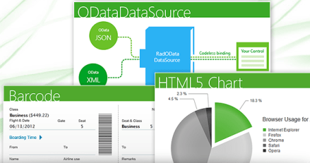
This suite is a complete ASP.NET AJAX development toolset. RadControls for ASP.NET AJAX contains over 70 controls and helps in rapid component based UI development. In Q2 2012 release we have added 3 new controls. They are:

HTML Chart:
HTML5 Chart control also known as RadHtmlChart provides a powerful charting mechanism. The charts are based on SVG format for modern browsers and VML for older browsers. Here are some of the salient features of HTML5 Chart control:
Barcode:
Barcode control enables you to quickly and easily create industry standard barcode formats to your applications. Here again the barcode is generated in SVG format for modern browsers and VML format for older browsers.
ODataDataSource:
ODataDataSource control enables you to codelessly bind your controls to OData Services.This control supports a Visual Studio design time wizard to query any Odata service supporting JSON and XML. So you can visualize the data even before you binding it. As said earlier this allows you to codelessly bind the odata services to controls like TreeView, Grid etc,
RadControls for ASP.NET MVC:
With Q2 release we no longer promote the ASP.NET MVC extensions, rather we advice you to migrate to our new breed of UI framework known as Kendo UI which composes of Web, DataVisualization and Mobile contols. Kendo UI is the new platform for HTML5/JavaScript development. Kendo UI Web controls also comes with server side wrappers for ASP.NET MVC for easier development. You can know more about Kendo UI at www.kendoui.com.
In Q2 release 1 new widget was added to Kendo UI Web suite.
DateTimePicker:
As the name goes this is a UI widget which allows you to select Date as well as time within in one single widget/control. If your scenario requires for a Date and Time to be shown, this control can be used instead of two controls – one to show Date and another to show Time.


RadControls for Silverlight:
This suite is one of the industry’s leading suite of Silverlight controls for today’s Line Of Business (LOB) application development. RadControls for Silverlight helps you to create engaging and interactive user experiences for Web and Desktop. This suite contains over 65 controls which will surely cut your development time.
In Q2 release, there were 2 new controls added to the suite. They are:
RadHeatMap:
Heat Map control is a matrix like control that uses color to encode values along two axes. Some of the features of this controls are:
RadGanttView:
This control as the name goes, allows you to visualize and manage hierarchical project data as a Gantt Chart. This has the capability to visualize different types of project data such as Tasks, Milestones, Summaries, and also the relations between them. You can highlight different types of important items like late or critical tasks. Another feature of the control is the ability to import data from your MS project and visualize it in a friendly way.

Summary:
In this post we looked at new controls released as part of the Q2 Release under RadControls for Web suite. We looked at 3 core technologies under Web i.e. ASP.NET AJAX, ASP.NET MVC and Silverlight – and looked at the new controls available under each of those suites, Hope you are excited to try these new controls yourselves. Don’t forget that all these controls suites are available for free 30 Day trial downloads.
In this post we will learn to use RadToggleSwitch in three simple steps. RadToggleSwitch controls gives you experience of on and off button. It is a binary state control and can be either in state of on or off. You may get experience of RadToggleSwitch as following

Follow the below steps to start working with RadToggleSwitch. This control is very much configurable and you can put button and header styling as per your application requirement.
Step1
Very first you need to add reference of Telerik.Windows.Controls.Primptive on xaml.
Step 2
After adding namespace add RadToggleSwitch on the application page. You can add that as following

While adding RadToggleSwitch we can configure value of header. If needed, you can define HeaderStyle and HeaderTemplate specific to your application. By default accent color of device get applied as background color of RadToggleSwitch. You can set IsChecked property to either true or false. If you do not set it then it takes default value false. One important property is ButtonStyle. You can configure this property to give different look to toggle button.
Below is the consolidated code. On the xaml we have put four RadToggleSwitch control.
<phone:PhoneApplicationPage
x:Class="processapp.MainPage"
xmlns="http://schemas.microsoft.com/winfx/2006/xaml/presentation"
xmlns:x="http://schemas.microsoft.com/winfx/2006/xaml"
xmlns:phone="clr-namespace:Microsoft.Phone.Controls;assembly=Microsoft.Phone"
xmlns:shell="clr-namespace:Microsoft.Phone.Shell;assembly=Microsoft.Phone"
xmlns:d="http://schemas.microsoft.com/expression/blend/2008"
xmlns:telerikPrimitives="clr-namespace:Telerik.Windows.Controls;assembly=Telerik.Windows.Controls.Primitives"
xmlns:mc="http://schemas.openxmlformats.org/markup-compatibility/2006"
mc:Ignorable="d" d:DesignWidth="480" d:DesignHeight="768"
FontFamily="{StaticResource PhoneFontFamilyNormal}"
FontSize="{StaticResource PhoneFontSizeNormal}"
Foreground="{StaticResource PhoneForegroundBrush}"
SupportedOrientations="Portrait"  Orientation="Portrait"
shell:SystemTray.IsVisible="True">

<!--LayoutRoot is the root grid where all page content is placed-->
<Grid x:Name="LayoutRoot" Background="Transparent">
<Grid.RowDefinitions>
<RowDefinition Height="Auto"/>
<RowDefinition Height="*"/>
</Grid.RowDefinitions>

<!--TitlePanel contains the name of the application and page title-->
<StackPanel x:Name="TitlePanel" Grid.Row="0" Margin="12,17,0,28">
<TextBlock x:Name="ApplicationTitle" Text="Demo App" Style="{StaticResource PhoneTextNormalStyle}"/>
<TextBlock x:Name="PageTitle" Text="toggle switch" Margin="9,-7,0,0" Style="{StaticResource PhoneTextTitle1Style}"/>
</StackPanel>

<!--ContentPanel - place additional content here-->
<Grid x:Name="ContentPanel" Grid.Row="1" Margin="12,0,12,0">
<Grid.RowDefinitions>
<RowDefinition Height="*" />
<RowDefinition Height="*" />
<RowDefinition Height="*" />
<RowDefinition Height="*" />
</Grid.RowDefinitions>

<telerikPrimitives:RadToggleSwitch
x:Name="tglWifi"
Header="WiFi"
Grid.Row="0"
/>
<telerikPrimitives:RadToggleSwitch
x:Name="tglBlueTooth"
Header="BlueTooth"
Grid.Row="1"
IsChecked="True"/>

<telerikPrimitives:RadToggleSwitch
x:Name="tglDataNetwrok"
Header="Cellular Data"
Grid.Row="2"
IsChecked="True"/>

<telerikPrimitives:RadToggleSwitch
x:Name="tglSharing"
Header="Sharing"
Grid.Row="3"
IsChecked="False"/>

</Grid>
</Grid>

</phone:PhoneApplicationPage>
Step 3
You can handle check and uncheck event on RadToggleSwitch. You can perform operation corresponding to on in check event and corresponding to off in uncheck event. For example in below code I am changing header of the RadToggleSwitch in check and uncheck event

And we have attached the event to RadToggleSwitch in constructor of the page as given below,

Output
When you run above application you should get expected output as following. When you toggle Data Sharing button, you will notice header is getting changed.

In this way you can work with RadToggleSwitch. I hope you find this post useful. Thanks for reading.
In this post we will learn working with RadSlideHubTile. This control allows you to have Windows Phone home screen tile experience inside your application. This tile is used to display information with image. You can associate tap or doubletap event with individual slide hub tile to perform specific operation. To have better immersive experience put RadSlideHubTile in a RadUniformGrid. At the end of this post we are going to have RadSlideHubTile in application as following image

To start with add Telerik.Windows.Controls.Primtives namespace on the xaml.
After adding namespace put a RadUniformGrid on the application page. We are creating uniform Grid of 3 rows and 3 columns.

Inside the Grid we will put RadSlideHubTiles. Since grid is of 3 rows and 3 columns, so we can put 9 RadSlideHubTiles.
We can create a RadSlideHubTiles as following

We need to provide Title and Picture values to create RadSlideHubTiles. We can see that Title property is set to India and Picture property is set an image url. We can put 9 RadSlideHubTiles in the grid. We can put that as following
<phone:PhoneApplicationPage
x:Class="processapp.MainPage"
xmlns="http://schemas.microsoft.com/winfx/2006/xaml/presentation"
xmlns:x="http://schemas.microsoft.com/winfx/2006/xaml"
xmlns:phone="clr-namespace:Microsoft.Phone.Controls;assembly=Microsoft.Phone"
xmlns:shell="clr-namespace:Microsoft.Phone.Shell;assembly=Microsoft.Phone"
xmlns:d="http://schemas.microsoft.com/expression/blend/2008"
xmlns:telerikPrimitives="clr-namespace:Telerik.Windows.Controls;assembly=Telerik.Windows.Controls.Primitives"
xmlns:mc="http://schemas.openxmlformats.org/markup-compatibility/2006"
mc:Ignorable="d" d:DesignWidth="480" d:DesignHeight="768"
FontFamily="{StaticResource PhoneFontFamilyNormal}"
FontSize="{StaticResource PhoneFontSizeNormal}"
Foreground="{StaticResource PhoneForegroundBrush}"
SupportedOrientations="Portrait"  Orientation="Portrait"
shell:SystemTray.IsVisible="True">

<!--LayoutRoot is the root grid where all page content is placed-->
<Grid x:Name="LayoutRoot" Background="Transparent">
<Grid.RowDefinitions>
<RowDefinition Height="Auto"/>
<RowDefinition Height="*"/>
</Grid.RowDefinitions>

<!--TitlePanel contains the name of the application and page title-->
<StackPanel x:Name="TitlePanel" Grid.Row="0" Margin="12,17,0,28">
<TextBlock x:Name="ApplicationTitle" Text="BROWSE COUNTRY APP" Style="{StaticResource PhoneTextNormalStyle}"/>
<TextBlock x:Name="PageTitle" Text="countries" Margin="9,-7,0,0" Style="{StaticResource PhoneTextTitle1Style}"/>
</StackPanel>

<!--ContentPanel - place additional content here-->
<Grid x:Name="ContentPanel" Grid.Row="1" Margin="12,0,12,0">

<telerikPrimitives:RadUniformGrid NumberOfColumns="3" NumberOfRows="3">
<telerikPrimitives:RadSlideHubTile x:Name="hbIndia"
Title="India"
>
<telerikPrimitives:RadSlideHubTile.Picture>
<Image Source="Images\indiaflag.jpg"
Stretch="Fill"/>
</telerikPrimitives:RadSlideHubTile.Picture>
</telerikPrimitives:RadSlideHubTile>
<telerikPrimitives:RadSlideHubTile x:Name="hbFrance"
Title="France"
>
<telerikPrimitives:RadSlideHubTile.Picture>
<Image Source="Images\franceflag.jpg"
Stretch="Fill"/>
</telerikPrimitives:RadSlideHubTile.Picture>
</telerikPrimitives:RadSlideHubTile>
<telerikPrimitives:RadSlideHubTile x:Name="hbEngland"
Title="England"
Tap="hbTextBox_Tap">
<telerikPrimitives:RadSlideHubTile.Picture>
<Image Source="Images\englandflag.jpg"
Stretch="Fill"/>
</telerikPrimitives:RadSlideHubTile.Picture>
</telerikPrimitives:RadSlideHubTile>
<telerikPrimitives:RadSlideHubTile x:Name="hbGermany"
Title="Germany">
<telerikPrimitives:RadSlideHubTile.Picture>
<Image Source="Images\germanyflag.jpg"
Stretch="Fill"/>
</telerikPrimitives:RadSlideHubTile.Picture>
</telerikPrimitives:RadSlideHubTile>
<telerikPrimitives:RadSlideHubTile x:Name="hbAustralia"
Title="Australia">
<telerikPrimitives:RadSlideHubTile.Picture>
<Image Source="Images\ausflag.jpg"
Stretch="Fill"/>
</telerikPrimitives:RadSlideHubTile.Picture>
</telerikPrimitives:RadSlideHubTile>
<telerikPrimitives:RadSlideHubTile x:Name="hbChina"
Title="China">
<telerikPrimitives:RadSlideHubTile.Picture>
<Image Source="Images\chinaflag.jpg"
Stretch="Fill"/>
</telerikPrimitives:RadSlideHubTile.Picture>
</telerikPrimitives:RadSlideHubTile>
<telerikPrimitives:RadSlideHubTile x:Name="hbJapana"
Title="Japan">
<telerikPrimitives:RadSlideHubTile.Picture>
<Image Source="Images\japanflag.jpg"
Stretch="Fill"/>
</telerikPrimitives:RadSlideHubTile.Picture>
</telerikPrimitives:RadSlideHubTile>
<telerikPrimitives:RadSlideHubTile x:Name="hbBrazil"
Title="Brazil">
<telerikPrimitives:RadSlideHubTile.Picture>
<Image Source="Images\brazilflag.jpg"
Stretch="Fill"/>
</telerikPrimitives:RadSlideHubTile.Picture>
</telerikPrimitives:RadSlideHubTile>
<telerikPrimitives:RadSlideHubTile x:Name="hbUSA"
Title="USA">
<telerikPrimitives:RadSlideHubTile.Picture>
<Image Source="Images\usaflag.jpg"
Stretch="Fill"/>
</telerikPrimitives:RadSlideHubTile.Picture>
</telerikPrimitives:RadSlideHubTile>

</telerikPrimitives:RadUniformGrid>
</Grid>
</Grid>

</phone:PhoneApplicationPage>
When you run the application you should get tiles inside your application and you can handle tap or doubletap event to perform specific task on the particular RadSlideHubTile. Expected output of your application is as following

In this way you can work with RadSlideHubTile. I hope you find this post useful. Thanks for reading.
RadTextBox is adding below functionalities in usual TextBox. Those functionalities are
You may have immersive experience of a RadTextBox as following

To start working with RadTextBox very first you need to add namespace on XAML as following
After adding namespace you need to put RadTextBox on xaml. Explicitly you need to set ActionButtonVisibility property as visible.

Clear button will only be visible once you start typing the text. ActionButtonTap event gets called when action button gets tapped. You can set watermark as following

On running you should get RadTextBox as below

If you want you can change style of clear and action button. Header of the RadTextBox can bind to a data source as following

And in the code behind

And Data class is defined as following

You should be getting RadTextBox experience as following. You will notice that header has been data bind now.

One of the most important features of RadTextBox is validation capabilities. You may want to perform some validation on the lost focus. To start with validation you need to add namespace
ValidationState enum is used to specify validation state on RadTextBox. There are four possible value of ValidationState

You can validate as following

Validate is user defined function and you may defined it as per your business requirement. Validation message will be displayed as following


In this way you can work with RadTextBox. Below is the consolidated code of all discussion from this post
MainPage.xaml
<phone:PhoneApplicationPage
x:Class="Demo.MainPage"
xmlns="http://schemas.microsoft.com/winfx/2006/xaml/presentation"
xmlns:x="http://schemas.microsoft.com/winfx/2006/xaml"
xmlns:phone="clr-namespace:Microsoft.Phone.Controls;assembly=Microsoft.Phone"
xmlns:shell="clr-namespace:Microsoft.Phone.Shell;assembly=Microsoft.Phone"
xmlns:d="http://schemas.microsoft.com/expression/blend/2008"
xmlns:mc="http://schemas.openxmlformats.org/markup-compatibility/2006"
xmlns:telerikPrimitives="clr-namespace:Telerik.Windows.Controls;assembly=Telerik.Windows.Controls.Primitives"
xmlns:telerikSlideView="clr-namespace:Telerik.Windows.Controls.SlideView;assembly=Telerik.Windows.Controls.Primitives"
xmlns:telerikData="clr-namespace:Telerik.Windows.Controls;assembly=Telerik.Windows.Controls.Data"
xmlns:telerikInput="clr-namespace:Telerik.Windows.Controls;assembly=Telerik.Windows.Controls.Input"
xmlns:telerikDataVisualization="clr-namespace:Telerik.Windows.Controls;assembly=Telerik.Windows.Controls.DataVisualization"
mc:Ignorable="d" d:DesignWidth="480" d:DesignHeight="768"
FontFamily="{StaticResource PhoneFontFamilyNormal}"
FontSize="{StaticResource PhoneFontSizeNormal}"
Foreground="{StaticResource PhoneForegroundBrush}"
SupportedOrientations="Portrait"  Orientation="Portrait"
shell:SystemTray.IsVisible="True">

<!--LayoutRoot is the root grid where all page content is placed-->
<Grid x:Name="LayoutRoot" Background="Transparent">
<Grid.RowDefinitions>
<RowDefinition Height="Auto"/>
<RowDefinition Height="*"/>
</Grid.RowDefinitions>

<!--TitlePanel contains the name of the application and page title-->
<StackPanel x:Name="TitlePanel" Grid.Row="0" Margin="12,17,0,28">
<TextBlock x:Name="ApplicationTitle" Text="DEMO RAD CONTROLS" Style="{StaticResource PhoneTextNormalStyle}"/>
<TextBlock x:Name="PageTitle" Text="Autocomplete" Margin="9,-7,0,0" Style="{StaticResource PhoneTextTitle1Style}"/>
</StackPanel>

<!--ContentPanel - place additional content here-->
<Grid x:Name="ContentPanel" Grid.Row="1" Margin="12,0,12,0">

<telerikPrimitives:RadTextBox x:Name="rdTextBox" Height="110"
ActionButtonVisibility="Visible"
Header="{Binding Name}"
Watermark="Search"
ActionButtonTap="RadTextBox_ActionButtonTap"
/>

</Grid>
</Grid>

</phone:PhoneApplicationPage>
MainPage.xaml.cs
</pre>
using System;
using System.Collections.Generic;
using System.Linq;
using System.Net;
using System.Windows;
using System.Windows.Controls;
using System.Windows.Documents;
using System.Windows.Input;
using System.Windows.Media;
using System.Windows.Media.Animation;
using System.Windows.Shapes;
using Microsoft.Phone.Controls;
using System.Collections.ObjectModel;
using Telerik.Windows.Controls;
using System.Windows.Media.Imaging;
using System.Xml.Linq;
using Telerik.Windows.Controls.PhoneTextBox;
namespace Demo
{
public partial class MainPage : PhoneApplicationPage
{
public MainPage()
{
InitializeComponent();
this.rdTextBox.DataContext = new Data { Name = "I am data bind Header" };
rdTextBox.LostFocus += new RoutedEventHandler(rdTextBox_LostFocus);
}
void rdTextBox_LostFocus(object sender, RoutedEventArgs e)
{
bool isValid = Validate(rdTextBox.Text);
if (isValid)
{
rdTextBox.ChangeValidationState(ValidationState.Valid, "Wow valid input!");
}
else
{
rdTextBox.ChangeValidationState(ValidationState.Invalid, "Oops InValid input!");
}
}
private bool Validate(string text)
{
//Your validation logic
return false;
}
private void RadTextBox_ActionButtonTap(object sender, EventArgs e)
{
MessageBox.Show("Hello");
}
}
public class Data
{
public string Name { get; set; }
}
}
<pre>
I hope you find this post useful. Thanks for reading.
RadAutoCompleteBox control provides suggestion to user. It provides suggestion on basis of set criteria filtering data from a SuggestionSource. SuggestionSource is nothing but a Data Source.
RadAutoCompleteBox control gives you immersive experience as following. It can be bind to data source as simple as collection of strings or collection of complex objects. In below RadAutoCompleteBox SuggestionSource is of complex objects.

To start working with RadAutoCompleteBox first you need to add following namespace on the XAML page.
You can create a simple RadAutoCompleteBox as following

There are many properties exposed to configure RadAutoCompleteBox. You can set values of those properties as per your requirement. Two important properties are AutoCompleteMode and AutoCompletePopupDisplayMode. AutoCompleteMode property defines the way filtering should be done. Filtering criteria will be can be set to two values.

AutoCompletePopupDisplayMode defines the place of popup windows to open. This property can be set to four values. Those four values are as following

SuggestionSource can be created as following. It is a function returning List of Strings.

After creating SuggestionSource you can set that in code behind as given below.
At this point on running the application, you should get experience of RadAutoCompleteBox as given in below image,

Now let us see how we can work with a complex object. For that go ahead and create a class called CountryData. There are three properties in the class.
public class CountryData
{

public string CountryName { get; set; }
public string  CountryCapital { get; set; }
public ImageSource CountryFlag { get; set; }

}
Next you need to create data source or suggestion source. For that I have created a function returning List of CountryData. I have put images in the Images folder. In below function using collection initializer we are creating List of object of CountryData and returning that.
private List<CountryData> GetCountryDetails()
{
List<CountryData> lstCountryData = new List<CountryData>
{
new CountryData
{
CountryName = "India" , CountryCapital ="New Delhi " , CountryFlag= GetImageSource("/Images/indiaflag.jpg")
},
new CountryData
{
CountryName = "USA" , CountryCapital ="Washington" , CountryFlag= GetImageSource("/Images/usaflag.jpg")
},
new CountryData
{
CountryName = "France" , CountryCapital ="Paris" , CountryFlag= GetImageSource("/Images/franceflag.jpg")
},
new CountryData
{
CountryName = "England" , CountryCapital ="London" , CountryFlag= GetImageSource("/Images/englandflag.jpg")
},
new CountryData
{
CountryName = "Germany" , CountryCapital ="Berlin" , CountryFlag= GetImageSource("/Images/germanyflag.jpg")
},
new CountryData
{
CountryName = "China" , CountryCapital ="Shanghai" , CountryFlag= GetImageSource("/Images/chinaflag.jpg")
},
new CountryData
{
CountryName = "Japan" , CountryCapital ="Tokyo" , CountryFlag= GetImageSource("/Images/japanflag.jpg")
},
new CountryData
{
CountryName = "Australia" , CountryCapital ="Canberra" , CountryFlag= GetImageSource("/Images/ausflag.jpg")
},
new CountryData
{
CountryName = "Brazil" , CountryCapital ="Rio" , CountryFlag= GetImageSource("/Images/brazilflag.jpg")
},

};
return lstCountryData;
}
GetImageSource function is defined as following. This function is taking image path as string and converting that to ImageSource such that directly can be bind to Image control.
private ImageSource GetImageSource(string fileName)
{
return new BitmapImage(new Uri(fileName, UriKind.Relative));
}
Finally you need to set SuggestionSource of radAutoCompleteBox. You can set that in page constructor as given below,
public MainPage()
{
InitializeComponent();
this.radAutoCompleteBox.SuggestionsSource = GetCountryDetails();

}
Now you need to put radAutoCompleteBox on xaml. We are filtering on a SuggestionSource consist of complex objects so you need to set the value of property FilterKeyPath. You can set value of this property to any property of the object. In this case we are filtering on CountryName. SuggestionSelected event gets fired when user selects an item from the popup.

By now you have created radAutoCompleteBox and bind to a SuggestionSource of complex objects. Next we need to create SuggestionTemplate. SuggetionTemplate defines the way data from complex object bind as SuggestionSource will be displayed in the suggestion popup. Since there are three properties in the object and one of them is an image. So simply we have put a StackPanel with horizontal orientation and binding properties value in controls inside the StackPanel.

Last but not least we want items highlighting on filtering. We want to highlight item on property set as FilterKeyPath. We set CountryName as FilterKeyPath. You can highlight item on filtering as following. You can set highlight style on background or foreground.

Consolidating codes from above discussion you will have XAML as following. There is one StackPanel in second row of Grid. On selection of an item, that item will get displayed in controls inside StackPanel.
<phone:PhoneApplicationPage
x:Class="Demo.MainPage"
xmlns="http://schemas.microsoft.com/winfx/2006/xaml/presentation"
xmlns:x="http://schemas.microsoft.com/winfx/2006/xaml"
xmlns:phone="clr-namespace:Microsoft.Phone.Controls;assembly=Microsoft.Phone"
xmlns:shell="clr-namespace:Microsoft.Phone.Shell;assembly=Microsoft.Phone"
xmlns:d="http://schemas.microsoft.com/expression/blend/2008"
xmlns:mc="http://schemas.openxmlformats.org/markup-compatibility/2006"
xmlns:telerikPrimitives="clr-namespace:Telerik.Windows.Controls;assembly=Telerik.Windows.Controls.Primitives"
xmlns:telerikData="clr-namespace:Telerik.Windows.Controls;assembly=Telerik.Windows.Controls.Data"
xmlns:telerikInput="clr-namespace:Telerik.Windows.Controls;assembly=Telerik.Windows.Controls.Input"
mc:Ignorable="d" d:DesignWidth="480" d:DesignHeight="768"
FontFamily="{StaticResource PhoneFontFamilyNormal}"
FontSize="{StaticResource PhoneFontSizeNormal}"
Foreground="{StaticResource PhoneForegroundBrush}"
SupportedOrientations="Portrait"  Orientation="Portrait"
shell:SystemTray.IsVisible="True">

<!--LayoutRoot is the root grid where all page content is placed-->
<Grid x:Name="LayoutRoot" Background="Transparent">
<Grid.RowDefinitions>
<RowDefinition Height="Auto"/>
<RowDefinition Height="*"/>
</Grid.RowDefinitions>

<!--TitlePanel contains the name of the application and page title-->
<StackPanel x:Name="TitlePanel" Grid.Row="0" Margin="12,17,0,28">
<TextBlock x:Name="ApplicationTitle" Text="DEMO RAD CONTROLS" Style="{StaticResource PhoneTextNormalStyle}"/>
<TextBlock x:Name="PageTitle" Text="Autocomplete" Margin="9,-7,0,0" Style="{StaticResource PhoneTextTitle1Style}"/>
</StackPanel>

<!--ContentPanel - place additional content here-->
<Grid x:Name="ContentPanel" Grid.Row="1" Margin="12,0,12,0">

<Grid.RowDefinitions>
<RowDefinition Height="*" />
<RowDefinition Height="*" />

</Grid.RowDefinitions>

<telerikInput:RadAutoCompleteBox x:Name="radAutoCompleteBox"
Height="100"
AutoCompleteMode="Contains"
FilterKeyPath="CountryName"
SuggestionSelected="radAutoCompleteBox_SuggestionSelected"
Margin="-6,19,6,185">

<telerikInput:RadAutoCompleteBox.SuggestionItemTemplate>
<DataTemplate>
<StackPanel Orientation="Horizontal">
<Image Source="{Binding CountryFlag}" Height="60" Width="60" />
<TextBlock Text="{Binding CountryName}"
telerikInput:RadAutoCompleteBox.IsElementHighlighted="True">
<telerikInput:RadAutoCompleteBox.HighlightStyle>
<telerikInput:HighlightStyle Foreground="Red" FontSize="26"/>
</telerikInput:RadAutoCompleteBox.HighlightStyle>
</TextBlock>
<TextBlock Text="," />
<TextBlock Text="{Binding CountryCapital}" />
</StackPanel>
</DataTemplate>
</telerikInput:RadAutoCompleteBox.SuggestionItemTemplate>

</telerikInput:RadAutoCompleteBox>

<StackPanel Grid.Row="1" Orientation="Vertical">
<Image x:Name="imgMessage" Height="250" Width="200" />
<TextBlock  x:Name="txtMessage"  FontSize="40" Style="{StaticResource PhoneTextAccentStyle }"/>
</StackPanel>

</Grid>
</Grid>

</phone:PhoneApplicationPage>
Last but not least you need to handle SuggestionSelected event. In this event we will bind selected item in controls inside StackPanel.
private void radAutoCompleteBox_SuggestionSelected(object sender, SuggestionSelectedEventArgs e)
{

CountryData data  = e.SelectedSuggestion as CountryData;
radAutoCompleteBox.Text = data.CountryName + "," + data.CountryCapital;
txtMessage.Text = "You selected " + data.CountryName;
imgMessage.Source = data.CountryFlag;
}
Now if you go ahead and run the application you should get experience of radAutoCompleteBox as following

In this way you can work with radAutoCompleteBox. I hope you find this post useful. Thanks for reading.
In this post we will learn to work with control for Windows Phone. This control allows you to get exact immersive experience of native Messaging Application in your own application.
RadConversationView gives UI experience as following image. By default it takes accent color set on the device.

To start working with this control first thing you need to do is to add reference of Telerik.Windows.Controls.Data on the XAML page. You can add reference as following.
After adding reference, you can put control on XAML as following

You see that we are binding ItemSource property of RadConversationView in the same way we bind ListView control. After putting RadConversationView on the XAML, we need to create Conversation Message. ConversationViewMessage is used to create conversation message. However you can create custom message and bind to RadConversationView as well. You can create an incoming message as following,

You need to pass following parameter in the constructor of ConversationViewMessage to create a message.
You can create an outgoing message as following

To show messages in RadConversationView control, you need to add all messages in an observable collection and bind the collection to the control. You can do that as following

After creating observable collection you need to bind the collection to itemsource property of RadConversationView. You can add new message by handling SendingMessage event

And in ConversationViewSendingMessage function a message can be added as given in below.

RadConversationView control is very flexible and you can also perform following tasks.
In this way you can harness features of RadConversationView in creating killer Windows Phone application. For your reference full source code of above discussion is given below,
MainPage.xaml
<phone:PhoneApplicationPage
x:Class="Demo.MainPage"
xmlns="http://schemas.microsoft.com/winfx/2006/xaml/presentation"
xmlns:x="http://schemas.microsoft.com/winfx/2006/xaml"
xmlns:phone="clr-namespace:Microsoft.Phone.Controls;assembly=Microsoft.Phone"
xmlns:shell="clr-namespace:Microsoft.Phone.Shell;assembly=Microsoft.Phone"
xmlns:d="http://schemas.microsoft.com/expression/blend/2008"
xmlns:mc="http://schemas.openxmlformats.org/markup-compatibility/2006"
xmlns:telerikPrimitives="clr-namespace:Telerik.Windows.Controls;assembly=Telerik.Windows.Controls.Primitives"
xmlns:telerikData="clr-namespace:Telerik.Windows.Controls;assembly=Telerik.Windows.Controls.Data"
mc:Ignorable="d" d:DesignWidth="480" d:DesignHeight="768"
FontFamily="{StaticResource PhoneFontFamilyNormal}"
FontSize="{StaticResource PhoneFontSizeNormal}"
Foreground="{StaticResource PhoneForegroundBrush}"
SupportedOrientations="Portrait"  Orientation="Portrait"
shell:SystemTray.IsVisible="True">

<!--LayoutRoot is the root grid where all page content is placed-->
<Grid x:Name="LayoutRoot" Background="Transparent">
<Grid.RowDefinitions>
<RowDefinition Height="Auto"/>
<RowDefinition Height="*"/>
</Grid.RowDefinitions>

<!--TitlePanel contains the name of the application and page title-->
<StackPanel x:Name="TitlePanel" Grid.Row="0" Margin="12,17,0,28">
<TextBlock x:Name="ApplicationTitle" Text="DEMO RAD CONTROLS" Style="{StaticResource PhoneTextNormalStyle}"/>
<TextBlock x:Name="PageTitle" Text="Messages" Margin="9,-7,0,0" Style="{StaticResource PhoneTextTitle1Style}"/>
</StackPanel>

<!--ContentPanel - place additional content here-->
<Grid x:Name="ContentPanel" Grid.Row="1" Margin="12,0,12,0">

<telerikData:RadConversationView ItemsSource="{Binding}"
x:Name="conversationView"/>

</Grid>
</Grid>

</phone:PhoneApplicationPage>
MainPage.xaml.cs
using System;
using System.Collections.Generic;
using System.Linq;
using System.Net;
using System.Windows;
using System.Windows.Controls;
using System.Windows.Documents;
using System.Windows.Input;
using System.Windows.Media;
using System.Windows.Media.Animation;
using System.Windows.Shapes;
using Microsoft.Phone.Controls;
using System.Collections.ObjectModel;
using Telerik.Windows.Controls;

namespace Demo
{
public partial class MainPage : PhoneApplicationPage
{
// Constructor
ObservableCollection<ConversationViewMessage> messages =
new ObservableCollection<ConversationViewMessage>();
public MainPage()
{
InitializeComponent();
ConversationViewMessage msg = new ConversationViewMessage("Hello there",
DateTime.Now,
ConversationViewMessageType.Outgoing);
messages.Add(msg);

msg = new ConversationViewMessage("wow what's up?",
DateTime.Now.AddSeconds(5),
ConversationViewMessageType.Incoming);
messages.Add(msg);

msg = new ConversationViewMessage("Going good ... you say what about Coffee this Saturday ???.", DateTime.Now.AddSeconds(10), ConversationViewMessageType.Outgoing);
messages.Add(msg);

msg = new ConversationViewMessage("Hmmmmm !!!! le'm check my plans", DateTime.Now.AddSeconds(15), ConversationViewMessageType.Incoming);
messages.Add(msg);

this.DataContext = messages;
this.conversationView.SendingMessage +=
new EventHandler<ConversationViewMessageEventArgs>(ConversationViewSendingMessage);
}

void ConversationViewSendingMessage(object sender, ConversationViewMessageEventArgs e)
{

messages.Add((ConversationViewMessage) e.Message);
}

private object CreateMessage(string messageText, ConversationViewMessageType type)
{
return new ConversationViewMessage(messageText, DateTime.Now.AddSeconds(5), type);
}
}
}
When you run above application you should get output as following

I hope you find this post useful. Thanks for reading.
 Helping Ninja Technologists