Webinars in India

Webinar Recap : ASP.NET MVC–Better User Experience with Kendo UI

On Feb 28 we at telerik India hosted a webinar for Asia Pacific Region titled “ASP.NET MVC – Better User Experience with Kendo UI”. This blog post will allow you to get a recap of the same in the form of presentation slide deck and video recording

The webinar was an aim at letting you the user know about Kendo UI Web framework and how Kendo UI can work with ASP.NET MVC and improve the user experience of ASP.NET MVC applications. As you know ASP.NET MVC is a pattern based web application development stack from Microsoft and allows complete control over the mark up that gets generated. This means that there is no server control or control state or view state to maintain. You are left with plain HTML markup to play with.

Kendo UI is a HTML5 based client side JavaScript framework. Kendo UI  control supports around 20+ controls which can be instantiated using pure JavaScript coding or using the ASP.NET MVC server side wrappers. With the Server Side wrappers you get the power of JavaScript with productivity of the server. The wrappers make it easy for you and you need not know JavaScript coding at all. The wrapper code makes it easy for you to work with Razor or Webforms engine as it supports both.

Through this webinar – I showcased the use cases of how ASP.NET MVC Wrappers allow you to integrate Kendo UI Web controls with your existing ASP.NET MVC applications and improve the user experience of your apps.

Here is the presentation slide deck used in the webinar:

Here is the video recording of the webinar:

Hope you find this webinar useful and try our Kendo UI ASP.NET MVC Wrappers in your application too.

Till next time – Happy Coding.

Kendo DropDownList Wrapper for ASP.NET MVC

Overview:

This is the sixth post in the series on Kendo UI wrappers for ASP.NET MVC. We will look at one more wrapper in this post namely DropDownList. This post is part of a getting started with Kendo UI wrappers for ASP.NET MVC and you can find the index post here.

What is DropDownList Wrapper?

First lets understand what is a DropDownList control. A DropDownList displays a list of values and allows the selection of a single value from the list. Custom values are not allowed i.e. user cannot type in a custom value rather he can only select from the list.

image

The DropDownList Wrapper for ASP.NET MVC is a server side wrapper for Kendo UI DropDownList which is a JavaScript based widget.

Basic Usage:

In order to instantiate a DropDownList wrapper on any webpage, we make use of the DropDownList extension available within the Kendo helpers. Here is the code which will create a DropDownList control:

 
@( Html.Kendo().DropDownList().Name("kdropdownlist") ) 

Here is the output of the above code:

image

The Name is a required setting on the control. Without that setting we will get error, so provide a unique name every time you instantiate the drop down list control.

Data Binding Scenarios:

The data binding options available for drop down list wrapper are Server binding and Ajax binding. We will look at them one by one.

Server Data Binding:

Lets start by creating an action method. We will build a static list of SelectListItem and pass it as the Model to the view. Here is the code to illustrate that:

 
public ActionResult DropDownList() 
{ 
var items = new List() 
{ 
new SelectListItem { Value="1", Text="Beverages" }, 
new SelectListItem { Value="2", Text="Condiments" }, 
new SelectListItem { Value="3", Text="Confectionries" }, 
new SelectListItem { Value="4", Text="Dairy" }
}; 
return View(items); 
} 

Next we will see how we bind the model data to the drop down list wrapper. Here is the Razor view code:

 
@model List<SelectListItem> 
@( 
   Html.Kendo().DropDownList().Name("kdropdownlist") 
               .DataTextField("Text") 
               .DataValueField("Value") 
               .BindTo(Model) 
               .OptionLabel("Select a category") 
) 

As you can see we first let the view know what is the model type it will be working with i.e. the view is now strongly typed. In this case we have a List<SelecteListItem>. Then we use the BindTo() method of the drop down list helper to bind the control with data. We also need to set what is the Text field and Value field to bind too within the model. Now if we run this code, following is result we get:

image

Notice the use of OptionsLabel() method. This lets you add a empty item before any of the data items from the model. So this is like a placeholder or a cue to the user as to what he needs to do.

Ajax Data Binding:

In this section we will see how to bind the drop down list using an Ajax call. First lets create an action method which returns JsonResult instead of ActionResult. The action method will convert the category list which we saw in the server binding as a Json object and return it. Here is the code to illustrate the action method:

 
public JsonResult GetCategories() 
{ 
   var items = new List() 
   { 
      new SelectListItem { Value="1", Text="Beverages" }, 
      new SelectListItem { Value="2", Text="Condiments" }, 
      new SelectListItem { Value="3", Text="Confectionries" }, 
      new SelectListItem { Value="4", Text="Dairy" } 
   }; 
    return Json(items, JsonRequestBehavior.AllowGet); 
} 

We just create the data as we would prepare and then use the Json() method to convert the objects to Json format and return that. Now we will see how to make AJAX call to bind the drop down list with data. Here is the code for the same:

 
@( 
   Html.Kendo().DropDownList() 
               .Name("kdropdownlistajax") 
               .DataTextField("Text") 
               .DataValueField("Value") 
               .DataSource(source => 
               { 
                 source.Read(read => { read.Action("GetCategoriesAjax", "Home"); }); 
               }) 
               .OptionLabel("Select a category") 
) 

Instead of using the BindTo() method, we make use of DataSource() method. Within the datasource method we set the read action i.e. what is the action on a controller which will provide us the Json data. With this setting we are not binding the data at the server side, rather the data is bound on the client side.

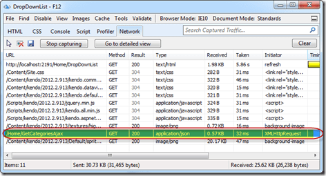
You will not find any difference when you run the application. But when you do the network sniffing you will see that the control issues a AJAX call to the action method configured for read purpose. Here is a screen shot of the network activity of the page:

SNAGHTML3df1d34a

So we saw how we can use either the server side data binding or client side data binding through AJAX. Depending on your scenario you can take any of the approaches.

Customizing Item Templates:

In the above sections we saw that the Items of the drop down list were just shown as text. With Kendo DropDownList it is possible to customize item templates. The item templates will be visible when the drop down list is in open state. When it is in collapsed state the drop down list will just show the  text field that is bound to the data object. In our example lets say we have images for each of the category and when the drop down list is open we would like to show image next to each of the category name. We can do that easily my making use of the Template() method. You can provide any HTML template and customize each item appearance. Since the templates are pure HTML, Kendo provides a special syntax to access the properties on the bound data object. The syntax is ${<PropertyName>}. That’s it and you can refer the properties of the data item within your custom templates. Here is the code which illustrates the custom teamplate implementation:

 
@( 
   Html.Kendo().DropDownList() 
               .Name("kdropdownlist") 
               .DataTextField("Text") 
               .DataValueField("Value") 
               .BindTo(Model) 
               .Template("<img alt='' src='" + Url.Content("~/Images/") + "${Text}.gif' width='40' height='40' />" + 
                         "<span style='padding: 10px;'>${Text}</span>") 
) 

The template is self explanatory. We have image tag whose source is set to an image url formed by using the text of the item itself and then we are showing the text as is. This is a simple template, but the power of template allows you to customize the UI to your needs.

Cascading DropDownList:

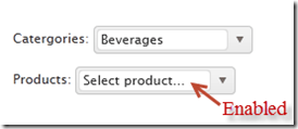
One of the common scenarios on web is to cascade a dropdownlist based on a value selected in another dropdownlist. For e.g. I want to show categories dropdown and products dropdowb but the products dropdown should not be enabled until user selects a value in category dropdown. Once a category is selected the products dropdown should get enabled and display all products belonging to that category. With Kendo DropDownList this can be achieved very easily. For the purpose of this example, we will created one more action method GetProductsAjax() which accepts a categoryid and will return products based on the category selected from this action. Here is the code for the same:

 
public JsonResult GetProductsAjax(string categoryId) 
{ 
   var items = new List() 
   { 
      new SelectListItem { Value=categoryId + "1", Text="Product 1" + categoryId }, 
      new SelectListItem { Value=categoryId + "2", Text="Product 2" + categoryId }, 
      new SelectListItem { Value=categoryId + "3", Text="Product 3" + categoryId }, 
      new SelectListItem { Value=categoryId + "4", Text="Product 4" + categoryId } 
   }; 
   return Json(items, JsonRequestBehavior.AllowGet); 
} 

I am just building a static list of products for the demo purpose.

next we will see how we can cascade a product dropdownlist based on category dropdownlist. We will place 2 dropdownlist on the screen – one for category and another for product. Here is the view code:

Category DropDownList:

 
@(
   Html.Kendo().DropDownList() 
               .Name("categories") 
               .OptionLabel("Select category...") 
               .DataTextField("Text") 
               .DataValueField("Value") 
               .DataSource(source => 
                          { source.Read(read => { read.Action("GetCategoriesAjax", "Home"); }); }
                          ) 
) 

Products DropDownList:

 
@(
   Html.Kendo().DropDownList() 
               .Name("products") 
               .OptionLabel("Select product...") 
               .DataTextField("Text") 
               .DataValueField("Value") 
               .DataSource(source => 
                          { 
                             source.Read(read => { read.Action("GetProductsAjax", "Home") 
                                   .Data("filterProducts"); 
                          }) 
               .ServerFiltering(true); }) 
               .Enable(false) 
               .AutoBind(false) 
               .CascadeFrom("categories") 
)
<script>
   function filterProducts() 
   {
      return {categoryId: $("#categories").val()};
   }
</script>

Notice couple of things in products drop down list. Firstly, in the data source read, we use a Data() method to pass additional data for the request. In this case, we invoke a javascript function which extracts the value of the selected category and pass it to the request. Then we set a property on the drop down list called AutoBind() which controls if the control should fetch the data on load of the control. In our case since we need to wait till a category is selected, we set auto bind to false. Lastly we set a property called CascadeFrom() and pass the parent drop down list id. This property takes care of keeping the products drop down in sync with the category selected. This will also control the enabling and disabling of product drop down based on whether a value is selected in category drop down or not. Here is the out put of the above code:

image

Handling Events:

DropDownList exposes 4 main events on the client side. You can subscribe to those events and perform your business logic if any. The event exposed are as follows:

  • Select – When a item is selected
  • Change – When the value of the drop down is changed
  • Open – When the drop down list is opened
  • Close – When the drop down list is closed

Here is the code to subscribe to these events:

 
@( 
    Html.Kendo().DropDownList() 
                .Name("kdropdownlist") 
                .DataTextField("Text") 
                .DataValueField("Value") 
                .BindTo(Model) 
                .Events(e => { e.Change("change") .Select("select") .Open("open") .Close("close"); })) 
) 

In the above code we use the Events() method to subscribe to different events. The events like Select, Open, Close, Change receive the names of the JavaScript function and when the event occurs the function will be invoked. Here is the JavaScript functions which log the event as it occurs to a div.


<div class="console"></div>

function open() {
        $(".console").html("<p>event: open</p>");
};

function close() 
{
        $(".console").append("<p>event: close</p>");
};

function change() 
{
        $(".console").append("<p>event: change</p>");
};

function dataBound() 
{
        $(".console").append("<p>event: dataBound</p>");
};

function select(e) 
{
        var dataItem = this.dataItem(e.item.index());
        $(".console").append("event :: select (" + dataItem.Text + " : " + dataItem.Value + ")");
};

DropDownList API:

So far we have seen how to get the drop down list instantiated on the screen, bind data and react to events. What if we need to access the drop down list control on the client side, at run time. All Kendo controls provide a very rich client side API. Using these api’s we can access a control which is already instantiated on the screen using JavaScript. Here is the code to access a drop down list control from JavaScript:

 
$(document).ready(function()
{ 
   var dropdownlist = $("#kdropdownlist").data("kendoDropDownList") 
}); 

On document ready, we use the jquery selector syntax to grab a element with id kdropdownlist and then use the jquery’s data() method to get the kendo drop down object. After this we can perform many of the operation exposed by the object. The methods supported by the drop down list is as follows:

close() closes the drop down list
dataItem() returns raw data record at the specified index
destroy() prepare for safe removal from DOM
enable(bool) enables/disables drop down list
open() opens the drop down list
refresh re-renders items in the list
search(string) selects item which starts with provided parameter
select(jquery|Number|function) selects item and sets the value & text
setDataSource(datasource) sets datasource and rebinds the drop down list
text(string) gets/sets the text of the drop down
toggle(bool) toggles between open & closed states
value(string) gets/sets the value of the drop down

Summary:

In this post we looked at one more commonly used controls – DropDownList. With the ASP.NET wrappers we saw how easy it is to instantiate a control, perform server side or ajax data binding and then how to work with the client side API. Hope you find this useful. Do give it a try i.e. download Kendo Complete and get started with Kendo Wrappers for ASP.NET MVC.

Kendo DateTimePicker Wrapper for ASP.NET MVC

Overview:

This is the fifth post in a series on Kendo UI wrappers for ASP.NET MVC. In this post we will look at one more wrapper named DateTimePicker. Before we get on with DateTimePicker Kendo wrapper, if you are new and want to learn more about Kendo Wrappers for ASP.NET MVC, I suggest you take a look at “Jumpstarting Development with Kendo UI for ASP.NET MVC” by Abhishek Kant. The jumpstarting blog post will give you the basics on how to get started with Kendo for ASP.NET MVC. Here is the post which has links to all other blog post of the series.

What is DateTimePicker control?

DateTimePicker is a control which allows end user to select a date & time from a calendar & time picker. It also supports to input the data directly. The DateTimePicker control supports customizing the month view by providing a custom template. The Minimum date, Maximum date, the view to start the calendar with and the time interval on the time picker, are all configurable through options.

image

Instantiating a DateTimePicker:

The first step in using a date time picker is to instantiate it on the page. To instantiate the control we make use of the DateTimePicker builder available as part of the Kendo Wrappers for ASP.NET MVC. Below is the code snippet which shows how to instantiate the control:


@(
Html.Kendo().DateTimePicker()
.Name("kdatetimepicker")
.HtmlAttributes(new { style = "width:230px"})
 )

Here is the output of the above code:

image

What we just did was to instantiate a DateTimePicker control on the page and we gave it name. When it is rendered you will basically see a textbox to enter the date and time, a calendar button and the clock button. The calendar button when clicked will allow you to select a date and when you click the clock button will allow you to select the time interval.

Set default value to control:

As you can see from the previous section, when the control is instantiated the textbox is empty. That is expected as we never set a default value to the date time picker control. The calendar when opened will always show the current date highlighted but that is not a value until use clicks on it. In order to set the default value on the control, we will use the Value() method. The Value() method takes DateTime instance or a date in string format, which will be set as the controls value. Here is the code snippet to set the default value:


@(
Html.Kendo().DateTimePicker()
.Name("kdatetimepicker")
.Value("12/12/2012 14:30")
.HtmlAttributes(new { style = "width:230px"})
)

And here is the output of the above code snippet:

image

Formatting controls value:

Previous section we saw how to set the value of the control. The default format in which the date and time is displayed is “MM/dd/yyyy hh:mm tt” i.e. Month, Day, Year, Hour, Minutes and Meridian. Lets say we want to change the format in which the date and time is shown. The control provides the options to modify the format through Format() method. The Format() method takes a string which is nothing but your new format for date and time display. Here is a code snippet to set the format:


@(
Html.Kendo().DateTimePicker()
.Name("kdatetimepicker")
.Value("12/12/2012 14:33")
.Format("On MM/dd/yyyy @ hh:mm tt")
.HtmlAttributes(new { style = "width:240px"})
)

Here is the output of the above code change:

image

As you cane see I just provided a format “On MM/dd/yyyy @ hh:mm tt” and this translates the value to “On 12/12/2012 @ 02:33 PM”. So this is a handy setting to keep in mind.

Putting constraints on date selection:

With date picker, one of the common requirement that you will have to take care is to restrict the dates a user can select. You may want to set a minimum date and maximum date restriction on the calendar itself. The date time picker control provides this option through Min() and Max() methods. Both Min and Max methods support two overloads – one takes a string format of a date and another takes an instance of DateTime. Here is the code snippet to put restrictions on the calendar:


@(
Html.Kendo().DateTimePicker()
.Name("kdatetimepicker")
.Value("12/12/2012 14:33")
.Min("12/10/2012").Max("12/21/2012")
.Format("On MM/dd/yyyy @ hh:mm tt")
.HtmlAttributes(new { style = "width:240px"})
)

image

As you can see the dates are now restricted and the user can select from only the dates allowed to select.

Setting the Time interval:

The time picker component in this control, by default, sets the time interval between hours to 30 minutes. You have the flexibility to control the interval between the hours by using the Interval() method. The Interval() method takes a integer and will set the interval based on this value. Lets say I want to set the interval to 15 minutes, find below the code snippet to do that:


@(
Html.Kendo().DateTimePicker()
.Name("kdatetimepicker")
.Value("12/12/2012 14:30")
.Min("12/10/2012").Max("12/21/2012")
.Interval(15)
.Format("On MM/dd/yyyy @ hh:mm tt")
.HtmlAttributes(new { style = "width:240px"})
)

And here is the output of the above code snippet:

image

As you can see the interval between the hour is now set to 15 minute interval and this is through the Interval() setting we have in the code.

Handling Events:

The date time picker control supports client side event handling. The control exposes 3 events namely Open, Close and Change. Note that all these are client side events and the handlers will be client side event handlers. Here is the code snippet to listen to events and provide the event handlers to those events:


@(
Html.Kendo().DateTimePicker()
.Name("kdatetimepicker")
.Value("12/12/2012 14:30")
.Min("12/10/2012").Max("12/21/2012")
.Interval(15)
.Format("On MM/dd/yyyy @ hh:mm tt")
.HtmlAttributes(new { style = "width:240px"})
.Events(e => e
.Open("kdatetimepicker_open")
.Change("kdatetimepicker_change")
.Close("kdatetimepicker_close")
)
)

<script>
function kdatetimepicker_open() {
//Handle the open event
}

function kdatetimepicker_close() {
//Handle the close event
}

function kdatetimepicker_change() {
//Handle the change event
}
</script>

Access control from client side:

So far we have seen how to instantiate and configure settings on the control from server side. And the configuration was done using the Kendo ASP.NET MVC wrapper. Once the control is rendered on the client side what if you need to perform some operation on the DateTimePicker control itself. The Kendo UI JavaScript APIs allow us to grab the control on the client side and access its properties and methods. Let’s say on date change by user, we want to get the newly selected value and prompt it. Here is the code snippet to do that:


@(
Html.Kendo().DateTimePicker()
.Name("kdatetimepicker")
.Value("12/12/2012 14:30")
.Min("12/10/2012").Max("12/21/2012")
.Interval(15)
.Format("On MM/dd/yyyy @ hh:mm tt")
.HtmlAttributes(new { style = "width:240px"})
.Events(e => e
.Change("kdatetimepicker_change")
)
)
<script>
function kdatetimepicker_change() {
var dateTimePicker = $("#kdatetimepicker").data("kendoDateTimePicker");
alert(dateTimePicker.value());
}
</script>

As you can see, we first listen to on change event and in the event handler for change we use jquery selector to get the element by its id and use the jquery data() method to get the Kendo DateTimePicker control. Once we get hold of the control, it supports the value() method which will give us the current selected value. Here is the output of the above code:

image

Summary:

In this post we looked at one more Kendo Wrapper namely DateTimePicker. This control makes a perfect match for scenarios where you need to present both the date and time selection. We saw how easy it was to work with the control from the server side. With just a few settings we can get this control working according to our needs.

Kendo DatePicker Wrapper for ASP.NET MVC

Overview:

This is the fourth post in a series on Kendo UI wrappers for ASP.NET MVC. In this post we will look at one more wrapper named DatePicker. Before we get on with DatePicker Kendo wrapper, if you are new and want to learn more about Kendo Wrappers for ASP.NET MVC, I suggest you take a look at “Jumpstarting Development with Kendo UI for ASP.NET MVC” by Abhishek Kant. The jumpstarting blog post will give you the basics on how to get started with Kendo for ASP.NET MVC. Here is the post which has links to all other blog post of the series.

What is DatePicker control?

DatePicker is a control which allows end user to select a date from a calendar or by inputting the data directly. The DatePicker control supports customizing the month view by providing a custom template. The Minimum date, Maximum date and the view to start out with are all configurable through options.

image

Instantiating a DatePicker:

to instantiate a DatePicker control on the page, we make use of the DatePicker builder available in as part of the Kendo wrapper helpers. Take a look at the below code to see how DatePicker is instantiated:

@( Html.Kendo().DatePicker().Name("kdatepicker") )

Here is the output of the above code:

image

As you can see we just instantiated the DatePicker control on the page. The control is made up of the textbox for manual input and a button (having calendar icon) which when clicked will bring up a calendar so that user can select any date.

Setting default value at instantiation:

In the previous section we saw how to instantiate a DatePicker control. But when it was rendered we did not see any default value i.e. a default date being displayed in the textbox. Well, that is because we never told the control what its default value was. DatePicker control exposes a method called Value() which can be used to set the default value. Here is a code to set the default value of the control to current day:

@(Html.Kendo().DatePicker().Name("kdatepicker")
      .Value(DateTime.Today)
)

Here is the output as a result of setting the default value to the control:

image

Formatting selected value:

We saw how to set the default value of the date picker control. The default format in which the date value is shown is MM/DD/YYYY. If you want to customize the format, the control provides the option to use the Format() method and provide any valid date time format that we are familiar with. So here is the code to set the format as “<Day Name>, <Month Name> <Date>, <Year>”:

@(Html.Kendo().DatePicker().Name("kdatepicker")
      .Value(DateTime.Today)
      .Format("dddd, MMMM dd, yyyy")
      .HtmlAttributes(new { style = "width:230px"})
)

I have used the Format() method and passed in a format “dddd, MMMM dd, yyyy” and below is the output of that code:

image

Putting constraints for selection:

When using date pickers in a real world applications, one of the common scenario is to restrict the dates a user can select. Usually we will have a minimum date and maximum date range and we would like the calendar to show only those dates and user can select only from those dates. DatePicker control provides Min() and Max() method which accept a DateTime value and use these two settings to restrict the values. Here is the code to use the Min & Max methods. I am setting the minimum date to be today and maximum date to be 4 days from today:

@(Html.Kendo().DatePicker().Name("kdatepicker")
      .Value(DateTime.Today)
      .Format("dddd, MMMM dd, yyyy")
      .Min(DateTime.Today)
      .Max(DateTime.Today.AddDays(4))
      .HtmlAttributes(new { style = "width:230px"})
)

Here is the output of the above code:

image

Customizing the Calendar Views:

So far we have seen that when the calendar is used for selecting a date, by default it shows the month view i.e. it shows current month and the days in that month. DatePicker control also has the provision to customize the calendar view and we can do that by using the Start() method. The Start() method accepts a enum of type CalendarView. CalendarView has options Century, Decade, Month and Year. You just set what view you would like to see and the calendar will show that particular view every time users open the calendar.  Here is a code to set the start view of the calendar to Century:

@(Html.Kendo().DatePicker().Name("kdatepicker")
      .Value(DateTime.Today)
      .Format("dddd, MMMM dd, yyyy")
      .Start(CalendarView.Century)
      .HtmlAttributes(new { style = "width:230px"}) )

Here is the output for the same:

image

Here is an example of all the calendar views:

image

Customizing cell rendering:

Imagine a scenario where you want to customize how a particular day needs to be rendered on the calendar. For e.g. November 9 is my birthday. So whenever Nov 9 is rendered I want to be reminded that its my birthday and I want a cake icon to be shown on that day. For such a scenario, DatePicker control has the provision to customize each cell rendering. This is done by passing a template to a method named MonthTemplate(). You can pass any valid kendo template string to this method. Here is the code to show a birthday cake on Nov 9 of every year:

@(Html.Kendo().DatePicker().Name("kdatepicker")
.Value(DateTime.Today)
.Format("dddd, MMMM dd, yyyy")
.HtmlAttributes(new { style = "width:230px"})
.MonthTemplate(" # if (data.value == 9 && data.date.getMonth() == 10) { # " +
"<div class=birthday /> " +
"# } #  " +
"#= data.value #")
)

What I have done is to pass a template string. If you look at the template itself, I am just checking if the current rendered date is 9 and current rendering month is November (remember JavaScript month array is zero index based, so Nov = 10) and if yes I am showing a div with class birthday. The stylesheet for birthday just puts a cake image. We show the date value irrespective of the check we do. Here is the output of the above code:

image

Customizing the footer:

When the calendar is open, it usually shows the current day in “<Day Name>, <Month Name> <Date>, <Year>” format at the bottom. This is known as the footer. This footer can be customized by providing a custom template. Here is the code to customize the footer:

@(Html.Kendo().DatePicker().Name("kdatepicker")
.Value(DateTime.Today)
.Format("dddd, MMMM dd, yyyy")
.HtmlAttributes(new { style = "width:230px"})
.Footer("Today - #= kendo.toString(data,'ddd, MMM dd, yyyy') # ")
)

Here is the output of the same:

image

Summary:

In this post, we looked at one more Kendo Wrapper named DatePicker. We looked at how easy it is to instantiate the control. set a default value, formatting the selected value, restricting the dates that can be picked, customizing the calendar view, customizing the cell rendering and finally how to customize the footer of the calendar. Hope this gives you a jumpstart at developing with Kendo DatePicker wrapper for ASP.NET MVC.

Till next time – Happy Coding!

Kendo ComboBox Wrapper for ASP.NET MVC

Overview:

In this third post on Kendo UI Wrapper for ASP.NET MVC, we will look at one more wrapper named ComboBox. If you are new to Kendo UI Wrappers for ASP.NET MVC, I suggest that you go through “Jumpstarting Development with Kendo UI for ASP.NET MVC” by Abhishek Kant. This post, as the name suggests will give you a jumpstart on Kendo UI Wrappers for ASP.NET MVC. Lets go ahead and look at the ComboBox Wrapper in detail. If you are looking for the index post on this getting started series, click here.

What is The ComboBox control?

The ComboBox control displays a list of values and allows the selection of a single value from this list. Custom values may also be entered via keyboard input. If you do not wish permit keyboard input – that is, custom values are not permitted – use the DropDownList.

The ComboBox represents a richer version of a <select>element, providing support for local and remote data binding, item templates, and configurable options for controlling the list behavior.

image

Instantiating a ComboBox:

To instantiate a ComboBox on any page, we make use of the ComboBox builder available within the Kendo helper. See below the code snippet to instantiate a combobox:

   1: @(

   2:     Html.Kendo().ComboBox().Name("kcombobox")

   3: )

That’s it to get a combobox control on the page. Note that the Name is mandatory to be set on the wrapper. This makes the ID of the combobox when rendered on the client side. Here is the output of our code:
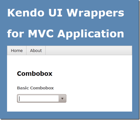
image

As you can see the combobox control is created on the page. But we don’t see anything happening yet because we haven’t bound any data to the control. we will see data binding option in a minute.

Providing a Placeholder:

ComboBox wrapper, similar to that of AutoComplete wrapper provides an option to put a placeholder text in the control when there is no value selected by the user. The placeholder will be displayed only when user has not made any choice; once he  makes a choice the placeholder text will not be shown instead the text of the selected item will be shown. We set placeholder using the Placeholder() method which accepts the string to be displayed as placeholder. Here is the code snippet:

   1: @(

   2:     Html.Kendo().ComboBox().Name("kcombobox")

   3:     .Placeholder("Select a value...")

   4: )

And here is the output of the above code:
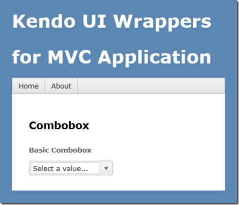
image

Providing Data Source:

So far we have been able to get the combobo on to the page with the instantiation code. Now we will see how to provide data to the combobox. The data source can be provided in three ways and they are:

  • BindTo – using BindTo() method, any IEnumerable data can be bound
  • Items – using Items() method, define items
  • DataSource – using the DataSource() method, define action method and controller to fetch data

Using BindTo() for data binding:

BindTo() method allows you to provide data to the Combobox control right at the time of instantiating the control. BindTo() method accepts any data items which is of type IEnumerable. Lets say we have a string of text to show in the combobox, we can write the code as below:

   1: @(

   2:             Html.Kendo().ComboBox().Name("kcombobox")

   3:             .Placeholder("Select a value...")

   4:             .BindTo(new string[] {"Bulgaria",

   5:                                   "United States",

   6:                                   "India","Australia",

   7:                                   "United Kingdom"}

   8:                    )

   9:  )

As you can see, we just create a string array and bind it to the control. Here is the output of the above code:

image

Normally a combobox is used to show a lookup list where in the text inside the control is usually for the end user readability, where as the value stored in the database is usually an integer. So if your data source is a complex object and you want to show text and maintain value in the backend, you would need to set 2 extra properties for this to work correctly. They are DataTextField & DataValueField. Here is the code snippet to achieve this:

   1: @(

   2:             Html.Kendo().ComboBox().Name("kcombobox")

   3:             .HtmlAttributes(new { style = "width:250px"})

   4:             .Placeholder("Select a value...")

   5:             .DataTextField("Text")

   6:             .DataValueField("Value")

   7:             .BindTo(new List<SelectListItem>() {

   8:                           new SelectListItem() {

   9:                             Text = "Bulgaria", Value = "1"

  10:                           },

  11:                           new SelectListItem() {

  12:                             Text = "Unites States of America", Value = "2"

  13:                           },

  14:                           new SelectListItem() {

  15:                             Text = "India", Value = "3"

  16:                           },

  17:                           new SelectListItem() {

  18:                             Text = "Australia", Value = "4"

  19:                           },

  20:                           new SelectListItem() {

  21:                             Text = "United Kingdom", Value = "5"

  22:                           }

  23:                       }

  24:                  )

  25:         )

In the above code snippet we create a new list of SelectListItem, bind it to the control and let the control know which property should be used to show the text & which property should be used to store the value of the selected item. The output will have no change as compared to previous example.

Using Items() for data binding:

Items() method allows you to define the items of the combobox control at the time of instantiating the control. If you ever have a scenario where the data to be bound to the control is static but you still need the flexibility of displaying text/value pair, you can use the Items() method. Here is the code snippet to use the Items() method:

   1: @(

   2:             Html.Kendo().ComboBox().Name("kcombobox")

   3:             .HtmlAttributes(new { style = "width:250px" })

   4:             .Placeholder("Select a value...")

   5:             .DataTextField("Text")

   6:             .DataValueField("Value")

   7:             .Items(item =>

   8:                     {

   9:                         item.Add().Text("Bulgaria").Value("1");

  10:                         item.Add().Text("United States Of America").Value("2");

  11:                         item.Add().Text("India").Value("3");

  12:                         item.Add().Text("Australia").Value("4");

  13:                         item.Add().Text("United Kindom").Value("5");

  14:                     }

  15:             )

  16:         )

The output again will be the same as previous output.

Using DataSource() for data binding:

If you want to get the data for combobox from a controllers action method, you will need to use DataSource() method. This allows you to set the controller name and the action name from which the data will be retrieved at runtime by issuing an AJAX request. First lets look at the controller action method:

   1: public JsonResult GetCountries()

   2:         {

   3:             var countries = new List<SelectListItem>

   4:                             {

   5:                                 new SelectListItem{Text ="Bulgaria",

   6:                                                    Value="1"},

   7:                                 new SelectListItem{Text ="United States of America",

   8:                                                    Value="2"},

   9:                                 new SelectListItem{Text ="India",

  10:                                                    Value="3"},

  11:                                 new SelectListItem{Text ="Australia",

  12:                                                    Value="4"},

  13:                                 new SelectListItem{Text ="United Kingdom",

  14:                                                    Value="5"},

  15:                             };

  16:             return Json(countries, JsonRequestBehavior.AllowGet);

  17:         }

The action method is a standard action method and the only difference is that it is returning a JsonResult. This is because the control will issue a AJAX request on loading on the client side to fetch the data. Now here is the code snippet to instantiate the control:

   1: @(

   2:             Html.Kendo().ComboBox().Name("kcombobox")

   3:             .HtmlAttributes(new { style = "width:250px" })

   4:             .Placeholder("Select a value...")

   5:             .DataTextField("Text")

   6:             .DataValueField("Value")

   7:             .DataSource(source =>

   8:             {

   9:                 source.Read(read =>

  10:                 {

  11:                     read.Action("GetCountries", "Home");

  12:                 });

  13:             })

  14:         )

Pay attention to the DataSource() method declaration. We are providing it a configurator which knows what is the read URL to fetch the data. We are just providing the controller

& action name. The control will automatically issue a AJAX request to get the data as a JSON payload.

Serverside Filtering:

If we don’t specify any filter strategy i.e. server or client, the combobox control will use the client side filtering by default. If we have huge list then it is wise to filter the data on the server instead of sending everything to client and then filter on the client side. For the server side filtering to work, we should first set the filter type and then enable the ServerSideFiltering flag on the data source itself.  We can set the filter options with valid values equal to “StartsWith” or “Contains”. Here is the action method which depicts the server side filtering:

   1: public JsonResult GetCountries(string text)

   2:         {

   3:             var countries = new List<SelectListItem>

   4:                             {

   5:                                 new SelectListItem{Text ="Bulgaria",

   6:                                                    Value="1"},

   7:                                 new SelectListItem{Text ="United States of America",

   8:                                                    Value="2"},

   9:                                 new SelectListItem{Text ="India",

  10:                                                    Value="3"},

  11:                                 new SelectListItem{Text ="Australia",

  12:                                                    Value="4"},

  13:                                 new SelectListItem{Text ="United Kingdom",

  14:                                                    Value="5"},

  15:                             };

  16:             if (!string.IsNullOrEmpty(text))

  17:             {

  18:                 countries = (from item in countries

  19:                              where item.Text.StartsWith(text)

  20:                              select item).ToList();

  21:             }

  22:             return Json(countries, JsonRequestBehavior.AllowGet);

  23:         }

Here is the combobox definition:

   1: @(

   2:             Html.Kendo().ComboBox().Name("kcombobox")

   3:             .HtmlAttributes(new { style = "width:250px" })

   4:             .Placeholder("Select a value...")

   5:             .DataTextField("Text")

   6:             .DataValueField("Value")

   7:             .Filter(FilterType.StartsWith)

   8:             .DataSource(source =>

   9:             {

  10:                 source.Read(read =>

  11:                 {

  12:                     read.Action("GetCountries", "Home");

  13:                 }).ServerFiltering(true);

  14:             })

  15:             .Template("<span><img src='/Content/Images/${data.Value}.jpg' " +

  16:                             "width='20' height='20' />&nbsp;${data.Text}</span>")

  17:         )


Controlling the data binding:

The items of the combobox control will be queries as soon as the control is instantiated on the client side. If you do not wish to go with this behavior, the control provides a mechanism to control when to load the items. You can set the control to load the items either user types in the combobox or when he open the options list. This is possible due to a method called AutoBind(). This takes a boolean value to indicate whether to load data on instantiation or wait for the user interaction with the control. Here is the code snippet to set this behavior:

   1: @(

   2:             Html.Kendo().ComboBox().Name("kcombobox")

   3:             .HtmlAttributes(new { style = "width:250px" })

   4:             .Placeholder("Select a value...")

   5:             .DataTextField("Text")

   6:             .DataValueField("Value")

   7:             .Filter(FilterType.StartsWith)

   8:             .DataSource(source =>

   9:             {

  10:                 source.Read(read =>

  11:                 {

  12:                     read.Action("GetCountries", "Home");

  13:                 }).ServerFiltering(true);

  14:             })

  15:             .Template("<span><img src='/Content/Images/${data.Value}.jpg' " +

  16:                             "width='20' height='20' />&nbsp;${data.Text}</span>")

  17:             .AutoBind(false)

  18:         )

Custom templates for combobox item display:

Consider a scenario where in you want to customize the combobox item display on the client side. i.e. let us say we want to show the country flag before the country name which is displayed as a text of the combobox item. Well, the control provides a way to provide our custom template which will be used for display on the client side. The Template() method accepts a HTML markup which will be used to display the item instead of the default template the control uses. You access data item using the {data.<property name>} syntax inside the custom template markup. Here is the code snippet to work with Template() method:

   1: @(

   2:             Html.Kendo().ComboBox().Name("kcombobox")

   3:             .HtmlAttributes(new { style = "width:250px" })

   4:             .Placeholder("Select a value...")

   5:             .DataTextField("Text")

   6:             .DataValueField("Value")

   7:             .DataSource(source =>

   8:             {

   9:                 source.Read(read =>

  10:                 {

  11:                     read.Action("GetCountries", "Home");

  12:                 });

  13:             })

  14:             .Template("<span><img src='/Content/Images/${data.Value}.jpg' " +

  15:                             "width='20' height='20' />&nbsp;${data.Text}</span>")

  16:         )

Notice the Template() method and the markup inside it. We use {data.Value} to access the value of the bound data item and {data.Text} to access the text of the bound data item. Using this method you can pretty much customize the UI if the comboxbox item.


Cascading Comboboxes:

One of the typical scenarios of web is to cascade a child combobox based on the item selected in a parent combobox. for e.g. consider a categories combobox and a products combobox. We want the categories combobox to filled with items first, user should select a category and then the products belonging to that category to be shown. With Kendo Combobox this is fairly simple as it allows a method called CascadeFrom(). As the name goes we just need to pass the parent combobox based on which we need to cascade. To illustrate this, consider that we have 2 action methods named GetCategories() and GetProducts(). For getting the products we need to know the category id. So here is the code snippet for this:

   1: public JsonResult GetCascadeCategories()

   2: {

   3:     var northwind = new NorthwindDataContext();

   4:

   5:     return Json(northwind.Categories.Select(

   6:                 c => new { CategoryId = c.CategoryID,

   7:                 CategoryName = c.CategoryName }),

   8:                 JsonRequestBehavior.AllowGet);

   9: }

   1: public JsonResult GetCascadeProducts(string categories)

   2: {

   3:     var northwind = new NorthwindDataContext();

   4:     var products = northwind.Products.AsQueryable();

   5:

   6:     if (!string.IsNullOrEmpty(categories))

   7:     {

   8:         products = products.Where(p => p.CategoryID.ToString() == categories);

   9:     }

  10:

  11:     return Json(products.Select(p => new {

  12:                 ProductID = p.ProductID,

  13:                 ProductName = p.ProductName}),

  14:                 JsonRequestBehavior.AllowGet);

  15: }

Here is the combobox definition for categories:

   1: @(Html.Kendo().ComboBox()

   2:           .Name("categories")

   3:           .Placeholder("Select category...")

   4:           .DataTextField("CategoryName")

   5:           .DataValueField("CategoryId")

   6:           .DataSource(source => {

   7:                source.Read(read => {

   8:                    read.Action("GetCascadeCategories", "Home");

   9:                });

  10:           })

  11:     )

Here is the combobox definition for Products:

   1: @(Html.Kendo().ComboBox()

   2:           .Name("products")

   3:           .Placeholder("Select product...")

   4:           .DataTextField("ProductName")

   5:           .DataValueField("ProductID")

   6:           .DataSource(source => {

   7:               source.Read(read =>

   8:               {

   9:                   read.Action("GetCascadeProducts", "ComboBox")

  10:                       .Data("filterProducts");

  11:               })

  12:               .ServerFiltering(true);

  13:           })

  14:           .Enable(false)

  15:           .AutoBind(false)

  16:           .CascadeFrom("categories")

  17:     )

  18:     <script>

  19:         function filterProducts() {

  20:             return {

  21:                 categories: $("#categories").val()

  22:             };

  23:         }

  24:     </script>

Note the usage of CascadeFrom() method. We pass in the name of the categories combobox. The AutoBind() is set to false. So these two settings make sure that products combobox is not loaded when no categories is selected. When user selects a category, that’s when products combobox will issue the AJAX request for getting list of products. Since we need to know what category is selected, we make use of the additional data concept on the data source read and pass in the selected categories value. This is done using the filterProducts() javascript method.

Here is the output of the same:
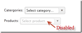
imageimage

Client side access to combobox:

Using the Jquery data() method we can access the Keno Combobox from the client side. You may have a scenario where in you want to load the combobox based on a button click. Here is the code to achieve that:

   1: <script>

   2:     var kendoComboBox = null;

   3:     $(document).ready(function () {

   4:

   5:         kendoComboBox = $("#kcombobox").data("kendoComboBox");

   6:

   7:         $("#button").click(function () {

   8:             kcb.dataSource.read();

   9:         });

  10:     })

  11: </script>

First we declare a global variable which will hold the reference of the combobox. Then on page load we make use of the data() method to get access to the control. On a button click, we just access the dataSource property and issue a read() method on it.

For a complete list of client side API, have a look at this help documentation.

Summary:

In this post, we looked at how easy it is to instantiate a combobox control and set it up for data binding. We also looked at some of the features such as auto bind i.e. control when the data is bound to the control, different ways of data binding the control, cascading based on a item selection of another combobox and last but not the least how to access the combobox from the client side. Hope this gives you a jumpstart at using the Kendo Combobox Wrapper for ASP.NET MVC .

Till next time – Happy Coding!

Kendo Calendar Wrapper for ASP.NET MVC

Overview:

In this post we will learn about one more wrapper from Kendo UI library called Calendar. If you are starting new on Kendo UI, make sure to go through the blog post – Jump starting Development with Kendo UI for ASP.NET MVC. We will look at the usage of the Calendar widget and how to program the Calendar widget. If you are looking for the index post on this getting started series, click here.

To follow this blog post, just create a “C# Kendo UI for MVC Web Application” project type and work along.

What is Calendar Widget:

The Calendar Widget renders a graphical calendar that supports navigation and selection. It supports custom templates for its “month” view, configurable options for a minimum and maximum date, start view and the depth of the navigation.

image

Instantiating a Calendar:

To instantiate a Calendar widget on any page, we just make use of the Calendar builder available within the Kendo helper. Here is the code snippet to instantiate a  Calendar:

   1: @(Html.Kendo().Calendar()

   2:               .Name("kcalendar")

   3: )

Note that the “Name” is mandatory setting. This defines the ID of the control on the client side. So here is the output of the code we wrote:

image

That’s it – with just one line of code we have a Calendar on our page. Next lets see how we can control the Calendar View.

Calendar View Settings:

Be default if nothing is said about the view we need to see on the Calendar, it is going to use Month view i.e. the current month is shown in the calendar. The Calendar widget has the following view options to choose from:

  • Century – When selected, Calendar will show decades of the current century
  • Decade – When selected, Calendar will show years of the the current decade
  • Month – When selected, Calendar will show days of the current month
  • Year – When selected, Calendar will show months of the current year

The way we set the view is through a method called Start(). The different view settings are available as a CalendarView enum. Here is the code snippet to set the view of the calendar:

   1: @(Html.Kendo().Calendar()

   2:               .Name("kcalendarCentury")

   3:               .Start(CalendarView.Century)

   4:             )

Here is the output of the above code:

image

Setting Calendar Value:

So far we have been able to instantiate a calendar on the page. But if you notice clearly the current date is not highlighted by default. The current date is displayed at the footer of the calendar but the day is not highlighted. That is because, calendar has a property called Value() and to have a date highlighted this property needs to provided with a DateTime instance. It can be current day or any other day. Here is the code snippet to set the value of the calendar:

   1: @(Html.Kendo().Calendar()

   2:               .Name("kcalendarvalue")

   3:               .Value(DateTime.Today)

   4:  )

All we are doing is setting the Value of the calenda to DateTime.Today instance. Here is output of that code:
image

Setting Calendar Value:
Many a times when using calendar we will have scenarios where we need to restrict the dates that the user can select. For e.g. lets assume that we want to user to select the dates between 19 Nov and 23 Nov only. That means the minimum date that can be selected is 19 Nov and maximum date that can be selected is 23 Nov. Well to achieve this scenario, the calendar provides Min() and Max() property and both of this method accept either a string representing a date  or an instance of DateTime. Here is the code snippet for setting Min & Max property:
   1: @(Html.Kendo().Calendar()

   2:               .Name("kcalendarrestriction")

   3:               .Min("2012/11/19")

   4:               .Max("2012/11/23")

   5:  )

And here is the output of the changes we made:
image
As you can see it does not show the dates outside of the allowed Min and Max date settings.
Accessing Calendar from client side:
You may have a scenario where you want to get hold of the calendar widget from JavaScript. This can be achieved by using the jquery.data() method. Assume that we had named our calendar as “kcalendar”, here is the code snippet to access that from JavaScript:
   1: var calendar = $("#kcalendar").data("kendoCalendar");

As you can see, we just use jquery’s data() syntax to get the Kendo Calendar object. The Kendo controls all have very rich client side API that you can work with. For e.g. if we have to set the value of the calendar from client side you can use the value() method on the control. Here is the code snippet for the same:
   1: var calendar = $("#kcalendar").data("kendoCalendar");

   2: calendar.value(new Date(2012, 0, 1));

Configuring client side events:
Kendo Calendar exposes two client side events which can be hooked into while instantiating the control. The event exposed are:
  • Change – occurs when the value is changed
  • Navigate – occurs when any navigation is performed by the user i.e. month change, year change etc.
When we hook into the events exposed, we just configure the JavaScript function which will handle the event on the client side. Here is the code snippet to handle the value change event of the calendar:
   1: @(Html.Kendo().Calendar()

   2:               .Name("kcalendarevents")

   3:               .Events(evnt => evnt.Change("onValueChange"))

   4:  )

   5: <script>

   6:     function onValueChange(e)

   7:     {

   8:         var kcal = $("#kcalendarevents").data("kendoCalendar");

   9:         alert(kcal.value());

  10:     }

  11: </script>

Similarly you can handle the Navigate event also.
Summary:
Kendo Calendar is yet another wrapper available in the Kendo UI library – which lets you create a graphical calendar on a web page. We saw how simple it is to instantiate on any page. We also saw some of the properties supported by the control. We also saw how to work with the control from client side i.e. from JavaScript. Hope this provides you with a kind of quick start to work with Kendo UI Wrappers. Stay tuned for many more of these posts on Kendo UI Wrapper usage.
Till next time – Happy coding!

Kendo AutoComplete Wrapper for ASP.NET MVC

Overview:

This is the first post in the series “Getting Started Series on Kendo UI Wrappers for ASP.NET MVC”. In this post we will look at Kendo AutoComplete wrapper. If you are new to Kendo UI Wrappers for ASP.NET MVC, I suggest that you go through “Jumpstarting Development with Kendo UI for ASP.NET MVC” by Abhishek Kant . This post, as the name suggests will give you a jumpstart on Kendo UI Wrappers for ASP.NET MVC.

image

Lets go ahead and look at the AutoComplete Wrapper in detail.

What is The AutoComplete control?

The AutoComplete control provides suggestions depending on the typed text. It also allows multiple value entries. As the user types, the autocomplete control will suggest items from source that the control is bound to. The user can then select one or many items depending on the configuration. Multiple values will be separated by a delimiter.

image

Creating ASP.NET MVC Project:

If you have installed the Kendo UI Complete using the installer, you will find project templates to create a new ASP.NET MVC project with Kendo UI Wrappers. This template makes it easy to work with wrappers as it sets up all the right references to the assemblies. If you select File > New Project, select Telerik > Web from the installed template and select “C# Kendo UI for MVC Web Application” from the project template and select Ok.

SNAGHTML1af6f00

If you have the extensions but not the installer, then make sure you follow the instructions here to add the assembly’s and correct js/css references.

Instantiating Kendo AutoComplete:

Now that we have created an ASP.NET MVC project, lets see how we can use the Kendo AutoComplete control. For this post, I will be using the Razor syntax and all code will be written in Home/Index view. Now lets instantiate a Kendo AutoComplete control on the page. Here is the code snippet of how that can be done:

@(Html.Kendo().AutoComplete().Name("kautocomplete"))

As you can see we support the Fluent interface so you can chain the calls. All we have done here is to use the Kendo helper and instantiate an AutoComplete. Technically the AutoComplete() is actually a builder which knows how to spit out the Kendo AutoComplete UI js/css on the client side. One more thing that is necessary is to name the control. So we use the Name() method to provide a name to the control. With the above lines placed, we see the following output:

SNAGHTML218a5ab

Providing a Place Holder:

Placeholder is nothing but a default text that will be shown on the control when no value is selected by the user. The AutoComplete supports a PlaceHolder() method which takes a text as input. Here is a code snippet of how to use the Placeholder:

   1: @(

   2:     Html.Kendo().AutoComplete()

   3:                 .Name("kautocomplete")

   4:                 .Placeholder("Select contry...")

   5: )

The output will be as below’:

SNAGHTML2206ea5

Providing Data Source to AutoComplete control:

Now that we have the auto complete on the page lets do some data binding to the control. Currently it does nothing as it does not have a data source to work with. We can provide data in two ways.

  • Provide a data at the time of instantiating the control using the BindTo() method
  • Hooking up a controller action method which will provide data using DataSource() option.

Data binding using BindTo() method:

The signature of BindTo() method is as below:

image

The input to BindTo() method is an IEnumerable, which means you can just pass any IEnumerable data you may have during the instantiation itself and the control will be bound to that. For instance say we want to bind the auto complete control to list of country names which are held in string array. Here is the code snippet to do that:

   1: @(

   2:     Html.Kendo().AutoComplete()

   3:                 .Name("kautocomplete")

   4:                 .Placeholder("Select contry...")

   5:                 .BindTo(new string[] {"Bulgaria","USA","India","Australia","UK"})

   6: )

As you can see I have just bound a simple string array to the auto complete control and this will be the data source now. Here is the output of the above changes:

SNAGHTML22f7d64

The autocomplete control filtered the data source based on what the user has typed and presented only those items which matched the input. We will look at the filtering mechanism in a minute.

Data Binding using DataSource() option:

Another way to provide data to autocomplete control is using the DataSource() method. The DataSource method accepts a read only data source provider. We just need to configure which action method on which controller is responsible to provide the data for the control. Autocomplete will automatically issue an AJAX request to the configured action method and retrieve the data, then bind it to autocomplete. Note that the action method should return a JsonResult as autocomplete will make AJAX request to retrieve the data. Here are the code snippets to achieve this:

Controller Action Method:

   1: public JsonResult GetCountries()

   2: {

   3:     var countries = new string[] { "Bulgaria", "USA", "India", "Australia", "UK" };

   4:     return Json(countries, JsonRequestBehavior.AllowGet);

   5: }

View:

   1: @(

   2:     Html.Kendo().AutoComplete()

   3:                 .Name("kautocomplete")

   4:                 .Placeholder("Select contry...")

   5:                 .DataSource(source  => {

   6:                     source.Read(read =>

   7:                         { read.Action("GetCountries", "Home"); });

   8:                 })

   9: )

As you can see we just set the action method name & the controller name on the data source. Here is how the JSON data looks like at runtime. I have used Developer Tools inside IE to look at the payload. Just press F12 on the page, get to Network tab and start capturing the network traffic:

image

Custom Templates:

AutoComplete also has a flexibility to style the suggestion that is shown by providing your own template. For e.g. in our demo code we have written so far, we have bound the autocomplete to country names. What if we want to show the country flag before the country name when the suggestion is made. Well we can do that by providing an HTML template. We can access the data with a ${data} pattern. Here is the code snippet for providing the custom template:

   1: @(

   2:     Html.Kendo().AutoComplete()

   3:                 .Name("kautocomplete1")

   4:                 .Placeholder("Select contry...")

   5:                 .BindTo(new string[] { "Bulgaria", "USA", "India", "Australia", "UK" })

   6:                 .Template("<span><img src='/Content/Images/${data}.jpg' " +

   7:                             "width='20' height='20' />&nbsp;${data}</span>")

   8: )

Here is the output of the same:
SNAGHTML32a02fd

Filtering the results:

By default the autocomplete filters the suggestions based on a logic “Starts With” i.e. it searches for the items which starts with the user typed text. Autocomplete provides a way to control this filtering by means of Filter() method. The Filter method has 2 overloads – one accepts the string “StartsWith” & “Contains” and another accepts a enum of type FilterType. So here is the code snippet to set the filter type to be “Contains”:

   1: @(

   2:  Html.Kendo().AutoComplete()

   3:                 .Name("kautocomplete1")

   4:                 .Placeholder("Select contry...")

   5:                 .BindTo(new string[] { "Bulgaria", "USA", "India", "Australia", "UK" })

   6:                 .Template("<span><img src='/Content/Images/${data}.jpg' " +

   7:                             "width='20' height='20' />&nbsp;${data}</span>")

   8:                 .Filter(FilterType.Contains)

   9: )

I have the filter logic to be Contains. So here is the output of above code change:

SNAGHTML3371c85

Filtering data on Server:

By default the AutoComplete will do the filtering of items based on user typed text on the client side. This may work fine for small list of data. But if you have very huge list of  data items, this pattern may be a hit on performance because everything needs to be downloaded to the client side and then do the filter. If you ask if there is any better way, well answer is yes and the solution is server side filtering. Instead of filtering the data on the client side, autocomplete control provides a way to send the user typed text to server side. The server side code can then filter the data based on the text passed and return only the matching items. Lets look at the code to achieve this:

For the same of the demo, assume we have a EF context created for Northwind database and we want to list the products in an autocomplete control based on user typed text. We will have a GetProducts action method which accepts a single parameter of type string and lets call it as queryText. Here is the controller action method code snippet:

   1: public JsonResult GetProducts(string text)

   2: {

   3:     var northwind = new NorthwindDataContext();

   4:     var products = northwind.Products.Select(product =>

   5:                                     new ProductViewModel

   6:     {

   7:         ProductID = product.ProductID,

   8:         ProductName = product.ProductName,

   9:         UnitPrice = product.UnitPrice ?? 0,

  10:         UnitsInStock = product.UnitsInStock ?? 0,

  11:         UnitsOnOrder = product.UnitsOnOrder ?? 0,

  12:         Discontinued = product.Discontinued

  13:     });

  14:     if (!string.IsNullOrEmpty(text))

  15:     {

  16:         products = products.Where(p => p.ProductName.Contains(text));

  17:     }

  18:     return Json(products, JsonRequestBehavior.AllowGet);

  19: }

We first instantiate the EF context and get the products. We then check if any text has been passed and if passed, filter the products based on the text and return only the matching list.

Now we will see how to configure the autocomplete to support this. Here is the code snippet for this change:

   1: @(Html.Kendo().AutoComplete()

   2:           .Name("products")

   3:           .DataTextField("ProductName")

   4:           .Filter("contains")

   5:           .DataSource(source => {

   6:               source.Read(read =>

   7:               {

   8:                   read.Action("GetProducts", "Home")

   9:                       .Data("onAdditionalData");

  10:               })

  11:               .ServerFiltering(true);

  12:           })

  13:     )

  14:

  15: <script>

  16: function onAdditionalData()

  17: {

  18:     return {

  19:             text: $("#products").val()

  20:            };

  21: }

  22: </script>

First we have created autocomplete control with name “products”. Then for the read action we have given the action method name and the controller name. One addition to the read method is the Data() method. This in-fact is a hook to the read action of autocomplete and allows us to stick any additional data we want to pass on to the action. Take a look at the action method GetProducts, it has a parameter by name text. We are passing whatever user types as a parameter to the method and get back a filtered list. That’s all there it is to achieve a server side filtering.

Accessing AutoComplete control on the client side:

All Kendo wrappers have a very rich client side API. Using the client side API’s we can access the kendo control on the client side and access a rich set of properties, methods and events. Kendo wrappers are built on the latest and greatest HTML5 standards, so the client side code generated makes use of the new “data-“ (data dash) attributes. We can use the jquery data() method and retrieve them. Here is the code to access a autocomplete control on page load:

   1: var autocomplete = $("#kautocomplete").data("kendoAutoComplete"),

Here “kautocomplete” is the id of the control and we use the jquery data() method to retrieve the kendo control by passing the string “kendoAutoComplete”. This is pretty much a pattern we use to get access to any kendo wrapper from JavaScript.

This comes in handy for instance, when we want to refresh the auto complete on page load. As you saw in the example of data source binding, an AJAX request is issued to get the items the first time a user types in the textbox. What if you want to load the items on page load and keep the autocomplete ready for filtering. This can be done with the following code snippet:

   1: var kac = $("#kautocomplete").data("kendoAutoComplete");

   2: kac.refresh();

You can find the complete list of client side API supported by Kendo AutoComplete widget here.

Summary:

In the first of the many posts to come on Kendo Wrappers for ASP.NET MVC, in this post, we looked at AutoComplete control. We looked at the basics of the using the control and various features like Data Binding, Filtering, Custom Templates and accessing the control from the client side. Hope this excites you to take a dig at the Kendo Wrappers for ASP.NET MVC. Download the free 30 day trial and kick start your kendo adventure.

Till next time – Happy Coding.

Getting Started Series on Kendo UI Wrappers for ASP.NET MVC

Kendo UI is a flag ship product from Telerik. Kendo UI is everything you need to build super-fast HTML5 web apps. It is a JavaScript UI library and has only one dependency and that is JQuery. With Kendo UI, gone are the days of slow and server heavy web UI page creations. Using Kendo UI you can build web apps in one compact easy-to-use package which includes: UI Widgets, Data Source, Validation and MVVM Framework. As you can see Kendo UI is one package you need and nothing else to cater to your UI needs.

image

Kendo UI doesn’t just stop at being a client side UI framework. If you are one of those many who love server side programming, we do have Kendo UI Server Side Wrappers for ASP.NET MVC development. These wrappers help you produce Awesome HTML5 apps powered by Kendo UI without forcing you to write javaScript. Simply program on the server and the Kendo UI wrappers will handle the HTML and JavsScript.

Here is a example of Kendo UI JavaScript Widgets Vs Kendo UI Server Side Wrappers code:

JavaScript:

   1: <div id="calendar"></div>

   2: <script>
   1:

   2:     $(document).ready(function() {

   3:         // create Calendar from div HTML element

   4:         $("#calendar").kendoCalendar();

   5:     });

</script>

Kendo UI Wrapper for ASP.NET MVC:

   1: @(Html.Kendo().Calendar().Name("kcal"))

As you can see the wrappers makes it easy for you to write code in Razor or ASP.NET syntax and without forcing you to write JavaScript.

So with this blog post we are starting what we call “Getting Started Series on Kendo UI Wrappers for ASP.NET MVC”. Following is the list of blog post that we will be covering in next 4 weeks time. They are:

AutoComplete Wrapper NumericTextBox Wrapper
Calendar Wrapper PanelBar Wrapper
ComboBox Wrapper Slider Wrapper
DatePicker Wrapper Splitter Wrapper
DateTimePicker Wrapper TabStrip Wrapper
DropDownList Wrapper TimePicker Wrapper
Editor Wrapper TreeView Wrapper
Grid Wrapper Upload Wrapper
ListView Wrapper Window Wrapper
Menu Wrapper

As and when the post for individual wrappers are ready we will be updating the above table with the links. So if you are starting on ASP.NET MVC with Kendo UI Wrappers, you may want to book mark this post. This will become an index post for the wrappers.

Hope this series will give you a jump start on using kendo UI Wrappers in ASP.NET MVC development.

Till next – Happy Coding!

Rendering Report Designed in Standalone End User Report Designer

Overview:

In this post we will take a look at how a report designed in Standalone End User Report Designer, can be rendered from your applications – be it WPF, WinForms, SilverLight or ASP.NET. One of the customer I was working with had this requirement of end users to design the report and that report should be rendered within the application. The end users who design the report will have the flexibility to upload the designed report to the application. The application had to render the uploaded report in a reporting module. So we will see how to achieve this. If this requirement has excited you, then read through rest of this post.

Pre Requisites:

In order to design reports using the standalone end user report designer, you will need to first download the Telerik Reporting solution. This is available as a free 30 day trial download. Here is the download link:

in order to mimic the scenario of End User connecting to a staging DB and designing the report on their desktop – I will be making use of 2 Databases. So you will need a RDBMS product of your choice. In my example I will be using SQL Server 2012.

Creating Staging and Production DB:

For the sake of the demo, I will create 2 database and name them as StagingDB and ProductionDB respectively. The database will have only one table named Contacts. It will have 2 columns an Id and Name. Here is the code snippet for the table:

CREATE TABLE [dbo].[contacts]
(
[Id] [int] IDENTITY(1,1) NOT NULL,
[Name] [varchar](50) NOT NULL,
CONSTRAINT [PK_contacts] PRIMARY KEY CLUSTERED
(
[Id] ASC
)WITH (PAD_INDEX = OFF, STATISTICS_NORECOMPUTE = OFF, IGNORE_DUP_KEY = OFF, ALLOW_ROW_LOCKS = ON, ALLOW_PAGE_LOCKS = ON) ON [PRIMARY]
) ON [PRIMARY]
GO

So at his time, if you are following along, you should have created 2 databases – StagingDB and ProductionDB and in both the DB you should have 1 table named Contacts. In staging DB contacts table I will fill some dummy data and it looks like below:

image

Similarly in the Contacts table of production DB, I have inserted the following data:

image

We will mimic a scenario where in the end users will connect to the StagingDB->Contacts table and design the report using the Standalone Report Designer. After designing it they will upload to the application. And application will connect to production DB and render the report.

Designing the report:

when you install the Telerik Reporting suite, we will also install the Standalone report designer for end users. This is an executable which can be run on any system. It can be in a folder named Report Designer at the root of Telerik Reporting installation folder. When you launch the ReportDesigner,exe, you will see the following interface:

SNAGHTML11b7d9

Click on New Report, give a name for the report and select a path to save the report.

image

Next, we will be presented with a Report Wizard. In the “Choose Data Source” dialog, create a new data source and connect to the Staging DB we have created earlier. In order to connect to our SQL Server database, select SQL Data Source in the data source selection dialog and give it a name.

SNAGHTML16b193

In the data connection selection page, configure the connection settings to your Staging DB.

SNAGHTML183745SNAGHTML19189e

Next we configure the command i.e. the select query to fetch the report data. For this demo it’s a simple statement – “Select * from Contacts”.  Next you can preview the results of the query

SNAGHTML1aa821SNAGHTML1b276d

Click on finish to finish the connection settings configuration.

Now you will see that we have set up a data source for the report and following dialog shows the details:

SNAGHTML1cebe4

Click next to select the report type. I have select a standard report typeSNAGHTML1d87e4

Next we will configure the data layout of the report, In this example, we have only two columns in the table and I will show both the column in the body of the report.

SNAGHTML1ef7b7

Next select the report layout i.e. is the report a stepped report or outline or left aligned. I have selected Stepped report i.e. items are arranges in columns and they don’t overlap vertically.

SNAGHTML20e87b

Next you can select a report style and finish the wizard.

SNAGHTML258555

At this point we have successfully designed a report using the report designer. In order to preview the report, click the Preview button on the Home tab. The report will be executed and shown as below:

SNAGHTML2706d3

As you can see we have connected to our staging db and pulling data from the contacts table.I have named the report as DemoReport and is saved as DemoReport.trdx. The TRDX is a custom file format that Telerik Reporting uses. It stands for Telerik Reporting Definition XML. Next we will see how we can upload this file to a application and render the report inside the application.

Building a WPF client:

In order to mimic a production application, I have built the following WPF app.

SNAGHTML3c5c82

Although I have selected WPF app for this demo, it can be anything in real world – ASP.NET Web App, WinForms or SL. Here is the work flow of this app:

  • An end user uploads the .TRDX report file he designed using the Standalone Report Designer, in the app.
  • The app saves the file in the application folder.
  • App will list the uploaded report file in a list box.
  • When the report is selected in the list box, the report will be rendered in the report viewer.

For the sake of the time, I will not be describing the portion of the app which allows us to browse and select a .TRDX file, Saves the uploaded .TRDX file in one of the application folder and listing of the uploaded report in list box. Those are pretty straight forward code that you will be familiar with. We will pay our attention to how do we render the .TRDX file inside the Report Viewer in the coming sections.

TRDX Report Rendering using URI:

The report viewer has the capability to just take a URI of a .TRDX file and render it. The ReportViewer exposes a property called ReportSource. One of the supported report source is UriReportSource. As the name goes, we are supposed to create an instance of UriReportSource and set the URI to the .TRDX file. Be it a WPF app as the one we are dealing with now or a web scenario – you just need to get the complete URI of the .TRDX file. Here is the code snippet to achieve this:

var uriReportSource = new UriReportSource();
uriReportSource.Uri = "<URI of .TRDX file>";
reportViewer.ReportSource = uriReportSource;
reportViewer.RefreshReport();
view raw gistfile1.cs hosted with ❤ by GitHub

TRDX Report Rendering Using XML Source:

In previous section we saw UriReportSource as the report source for the report viewer. The report viewer also supports XML as a report source. We can pretty much give a XML literal string which confronts to Teelrik Reporting Definition XML schema and the report viewer will be able to parse and render the same. The .TRDX report file is nothing but a XML in itself. Here is the content of the DemoReport we designed in its XML form:

<?xml version="1.0" encoding="utf-8"?>
<Report DataSourceName="ReportDataSource" Width="6.45833333333333in" Name="DemoReport" xmlns="http://schemas.telerik.com/reporting/2012/2"&gt;
<DataSources>
<SqlDataSource ConnectionString="stagingdb1" SelectCommand="select * from contacts" Name="ReportDataSource" />
</DataSources>
<Items>
<PageHeaderSection Height="0.28125in" Name="pageHeader">
<Items>
<TextBox Value="DemoReport" Size="6.41666666666667in, 0.200000027815501in" Location="0.0208333333333333in, 0.0208333333333333in" Name="reportNameTextBox" StyleName="PageInfo" />
</Items>
</PageHeaderSection>
<PageFooterSection Height="0.28125in" Name="pageFooter">
<Items>
<TextBox Value="=NOW()" Size="3.19791666666667in, 0.200000027815501in" Location="0.0208333333333333in, 0.0208333333333333in" Name="currentTimeTextBox" StyleName="PageInfo" />
<TextBox Value="=PageNumber" Size="3.19791666666667in, 0.200000027815501in" Location="3.23958333333333in, 0.0208333333333333in" Name="pageInfoTextBox" StyleName="PageInfo">
<Style TextAlign="Right" />
</TextBox>
</Items>
</PageFooterSection>
<ReportHeaderSection Height="0.808234930038452in" Name="reportHeader">
<Items>
<TextBox Value="DemoReport" Size="6.45833333333333in, 0.787401596705119in" Location="0in, 0in" Name="titleTextBox" StyleName="Title" />
</Items>
</ReportHeaderSection>
<ReportFooterSection Height="0.28125in" Name="reportFooter" />
<DetailSection Height="0.28125in" Name="detail">
<Items>
<TextBox Value="=Fields.Id" CanGrow="True" Size="3.19791666666667in, 0.200000027815501in" Location="0.0208333333333333in, 0.0208333333333333in" Name="idDataTextBox" StyleName="Data" />
<TextBox Value="=Fields.Name" CanGrow="True" Size="3.19791666666667in, 0.200000027815501in" Location="3.23958333333333in, 0.0208333333333333in" Name="nameDataTextBox" StyleName="Data" />
</Items>
</DetailSection>
</Items>
<StyleSheet>
<StyleRule>
<Style Color="Black">
<Font Name="Tahoma" Size="18pt" Bold="True" Italic="False" Underline="False" Strikeout="False" />
</Style>
<Selectors>
<StyleSelector Type="ReportItemBase" StyleName="Title" />
</Selectors>
</StyleRule>
<StyleRule>
<Style Color="Black" VerticalAlign="Middle">
<Font Name="Tahoma" Size="10pt" />
</Style>
<Selectors>
<StyleSelector Type="ReportItemBase" StyleName="Caption" />
</Selectors>
</StyleRule>
<StyleRule>
<Style VerticalAlign="Middle">
<Font Name="Tahoma" Size="9pt" />
</Style>
<Selectors>
<StyleSelector Type="ReportItemBase" StyleName="Data" />
</Selectors>
</StyleRule>
<StyleRule>
<Style VerticalAlign="Middle">
<Font Name="Tahoma" Size="8pt" />
</Style>
<Selectors>
<StyleSelector Type="ReportItemBase" StyleName="PageInfo" />
</Selectors>
</StyleRule>
</StyleSheet>
<PageSettings>
<PageSettings PaperKind="Letter">
<Margins>
<MarginsU Left="1in" Right="1in" Top="1in" Bottom="1in" />
</Margins>
</PageSettings>
</PageSettings>
<Groups>
<Group Name="labelsGroup">
<GroupHeader>
<GroupHeaderSection PrintOnEveryPage="True" Height="0.28125in" Name="labelsGroupHeader">
<Items>
<TextBox Value="Id" CanGrow="True" Size="3.19791666666667in, 0.200000027815501in" Location="0.0208333333333333in, 0.0208333333333333in" Name="idCaptionTextBox" StyleName="Caption" />
<TextBox Value="Name" CanGrow="True" Size="3.19791666666667in, 0.200000027815501in" Location="3.23958333333333in, 0.0208333333333333in" Name="nameCaptionTextBox" StyleName="Caption" />
</Items>
</GroupHeaderSection>
</GroupHeader>
<GroupFooter>
<GroupFooterSection Height="0.28125in" Name="labelsGroupFooter">
<Style Visible="False" />
</GroupFooterSection>
</GroupFooter>
</Group>
</Groups>
</Report>
view raw gistfile1.xml hosted with ❤ by GitHub

Here is the code snippet to prepare the XmlReportSource and bind that to ReportViewer ReportSource.

XmlReportSource xmlReportSource = new XmlReportSource();
xmlReportSource.Xml = "<Contents of .TRDX file>";
reportViewer.ReportSource = xmlReportSource;
reportViewer.RefreshReport();
view raw gistfile1.cs hosted with ❤ by GitHub

Wait, What about the data source?

Well, if you followed the post so far, you will probably be getting this question for sure. Well remember that when we designed the report using Standalone Report Designer we did set up a data source and a connection string. But that points to our staging database. Meaning the schema of the staging db and the production db are the same but they will be two different environments when it comes to reality. You will never allow somebody to work with a production environment for design. Instead you will allow people to play around in the staging or local setup and finally deploy the code to production. So when we rendered the report using the URI Report Source or XML Report Source – the report does contain the data source object embed within the report and will use that when executing in the production. Remember that the connection string set up during design points to our staging or local setup. So when the report is rendered in the production, report viewer will search for the connection string name given during the design. It may be there or may not be there – whatever it is, this is not ideal scenario to support. So how can we overcome this. In the next section, we will see what is the solution for this.

Report Xml Serializer:

when we looked at XmlReportSource, we understood the .TRDX file is nothing but a XML content. It is nothing but the report definition. The Telerik Reporting solution comes with a ready made XmlSerializer which can read this XML definition and gives us an instance of Telerik.Reporting.Report – an object representation of the Report we designed. The Report class exposes the Data Source we set up and the Connection String on that data source. So the solution to render a .TRDX file in production environment will be as follows:

  • Read the content of the .TRDX file as XML string
  • Use ReportXmlSerializer to serialize the XML to Report object
  • On the report object, get the SqlDataSource and change the connection string of the data source to match your production. You can either provide the complete connection string itself or the name of the connection string element from your configuration file.

Here is the code snippet on how to use the Report Xml Serializer:

XmlReaderSettings settings = new XmlReaderSettings();
settings.IgnoreWhitespace = true;
using (XmlReader xmlReader = XmlReader.Create(<.TRDX URI or .TRDX XML Content>, settings))
{
Telerik.Reporting.XmlSerialization.ReportXmlSerializer xmlSerializer =
new Telerik.Reporting.XmlSerialization.ReportXmlSerializer();
Telerik.Reporting.Report report = (Telerik.Reporting.Report)xmlSerializer.Deserialize(xmlReader);
(report.DataSource as SqlDataSource).ConnectionString = "<Connection String OR Connection String Name>";
reportViewer.Report = report;
reportViewer.RefreshReport();
}
view raw gistfile1.cs hosted with ❤ by GitHub

Summary:

Standalone Report Designer is a great tool for end users who just create reports and are not technical people. Telerik Reporting Solution has provisions to use the designed report i.e. .TRDX file and render that inside the report viewer. Since it supports both URI Report Source and XML Report Source, you can decide the way you want to store the report i.e. either store it as a physical file in your app in a separate folder or store the content of the .TRDX file in a database column. In both the cases you will be able to use the Report XML Serializer to serialize the XML as a Report instance, update the connection  string to match your production and set it to the report viewer.

With Telerik Reporting Solution, you now have the power in your apps to let the end user design adhoc reports, upload it in your app and render the same in a report viewer. Hope this post gave you some insights into Telerik Reporting capabilities.

Till next time – Happy Coding!
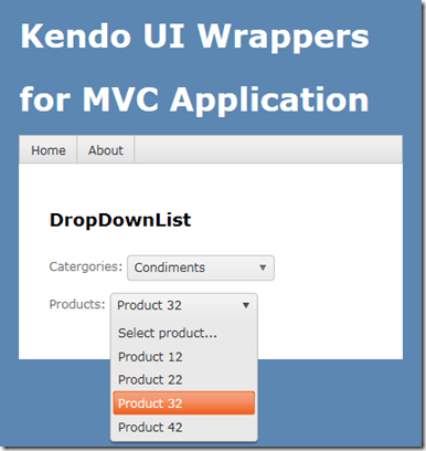
New UI Controls as part of Telerik DevCraft Q3 2012 Release

On Oct 17 2012, we did a release of our Telerik DevCraft bundle known as Q3 2012 release. As part of the release our UI suites have got couple of new controls added to the bundle. In this blog post we will look at what new controls have been added to our UI suites namely – RadControls for ASP.NET AJAX, RadControls for Silverlight, RadControls for WPF, RadControls for WinForms, Windows 8 Controls and RadControls for Windows Phone. So lets go over them one by one.


RadControls for ASP.NET AJAX:

ASP.NET AJAX suite gets the following new controls added to the family of already existing 70+ controls. They are:

Gauge:

This is a high performing HTML5 based radial and linear gauge control which can be used to show certain values in a scale.


See demos of Gauge control here

PivotGrid (Beta):

PivotGrid is a control used to show pivoted data in a tabular or outline or in a compact layout. We bring the power of Pivot to Web with the introduction of this control. This control supports aggregates, drag and drop and a field list control panel.

See demos of PivotGrid here.

AutoCompleteBox:

As the name goes – this is a auto completion textbox. It auto suggests filtered list with options based on user input and supports multiple item selection. This was one of the highly requested control for ASP.NET AJAX

See demos of AutoCompleteBox here.

You can download a free trial of RadControls for ASP.NET AJAX and evaluate the controls for your needs.

image


RadControls for SilverLight:

Four new controls got added to the Silverlight controls family. They are:

PivotGrid (Beta):

RadPivotGrid is released as a Beta control in this release. This supports data summarizations and great data visualization capabilities.

image

See demos of RadPivotGrid here.

GanttView:

GanttView is a control designed for managing and visualizing complex planning data and tasks. Often used in project planning and management scenarios. Using this control it is easier to understand and analyze the data.

image

See demos of GanttView here.

AutoCompleteBox:

No need to explain this control. The auto suggestion control is now available in Silverlight suite also.

image

See demos of AutoCompleteBox here.

HeatMap:

HeatMap is a control which is matrix-like control, which uses color to encode the values along two axes.

image

See demos of RadHeatMap here.

Download free trial of RadControls for Silverlight and evaluate them for your needs.

image


RadControls for WPF:

New controls introduced for WPF suite are as follows:

PivotGrid (Beta):

image

GanttView:

image

AutoCompleteBox:

image

HeatMap:

image

Download free trial of RadControls for WPF and evaluate them for your projects.

image


RadControls for WinForms:

There was one control added to the WinForms family. That is RadPivitGrid and released as a Beta control in this release.

PivotGrid Filtering

You can download thirty day free trial of RadControls for WinForms with dedicated support during trial period.

image


RadControls for Windows Phone:

Five new controls got added to the Windows Phone controls family. They are as follows:

TimeSpanPicker:

TimeSpanPicker control provides full control over time and duration in any app where users set duration. This control allows users to define duration of certain action.

TimeSpanPicker

Expander:

Expander control allows users to expand or collapse conversations. Fits well in applications that rely on interaction and messaging.

Expander Control

PasswordBox:

As the name goes this is a ready made password input text box for Windows Phone scenario. Using this control in a registration form will automatically display the typical dots in place of the actual password being typed.

PasswordBox

DataForm:

DataForm control provides with out of the box data forms that can be simply configured to work with business logic of your application. It also provides out of the box validation, styling and other customization mechanisms.

DataForm

InputPrompt:

This control allows you to create prompts where you can ask users to enter important details such as Phone number, email, etc.

InputPrompt

You can download a free trial of RadControls for Windows Phone to evaluate the controls.

image


RadControls for Windows 8:

This is a brand new suite as far as the RadControls family is concerned. This suite contains some of the controls which are not found in the SDK of Windows 8 development like date and time pickers. These controls have been built from ground up and provide you with the same UI and UX as that of Windows 8 look and feel. Currently following 15+ controls are released and many more will be added to the suite over time. At this moment we are offering this suite at an introductory price of $99 and you will receive all the new components and updates that will be added to the suite in the next year.

image

image


Hope this blog post excites you in terms of the new control offerings from our UI control suites. If you feel like trying out them go ahead and download our free 20 day trials and evaluate them. Note that during the trial period you will get dedicated support meaning you can raise support tickets and a dedicated support team will be responding to you. Give it a try and let us know how you feel about our UI controls.

Till next time, Happy Coding.

Step by Step Guide to work with RadHtmlChart for ASP.NET AJAX

Introduction:

In this post we will try to see how to work with a RadHtmlChart. We will go step by step in creating and using the RadHtmlChart in a web page. I will try to outline each piece that make up an RadHtmlChart and how to work with them. So if you are in need of using a RadHtmlChart in your pages, read through the following sections and follow along.

image

Pre-Requisite:

In order to follow along this blog post, you will need to have downloaded the RadControls for ASP.NET AJAX suite and installed it on your development machine/laptop. Here is the download link  to RadControls for ASP.NET AJAX Suite:

image

Create a Web Site Project:

First and foremost thing to do is to create a Web Site which will be our playground for this blog post. Once you install the RadControls for ASP.NET AJAX you will see Telerik project templates in Visual Studio New Project dialog. For this blog post I will be creating a “C# RadControls Web Site” project. Give it a name and keep the default settings in all of the dialog that comes up.

image

Adding RadHtmlChart to a page:

The RadControls Web Site project template when finishes the web site creation, will create a single web page namely Default.aspx. For the sake of simplicity I will just use this page to create the chart. There are two ways to add the chart on to the web page. First, you can drag it from the Toolbox on to the source. Secondly you can just type the tag on the source.

image

So I am going to type out the tag name and create the chart. Here is the code to instantiate the RadHtmlChart on a web page:

<telerik:RadHtmlChart runat="server" Width="800px" Height="500px" >
</telerik:RadHtmlChart>

We can instantiate the RadHtmlChart from the telerik namespace. If you look at the web.config the telerik tagprefix is configured to be available on all the pages. Here is the code snippet:

<pages>
  <controls>
    <add tagPrefix="telerik" namespace="Telerik.Web.UI" 
             assembly="Telerik.Web.UI"/>
  </controls>
</pages>

So if you now view the web page, you will see the following output:image

As you can see from the output, we get the a base for the chart. Now that we have a base, we will build up the chart one by one.

Chart Appearance:

Now that we have a chart coming up, lets give some facelift to the chart. We can control the appearance of the chart i.e. we can provide a background color to the chart. The RadHtmlChart provides Appearance property through which we can set the background color. The Appearance contains FillStyle property which exposes BackgroundColor attribute and we set the color to this attribute. Here is the code snippet:

<Appearance>
    <FillStyle BackgroundColor="LightGray" />
</Appearance>

I have set LightGray as the background color of the chart. If we now run the application and check the output, you will see the chart as below:

image

Chart Title:

Next thing to do is to set the chart title. For setting the title, chart exposes ChartTitle property. ChartTitle contains a text Property and you can provide the text you want to see on the chart. The appearance of the chart title can be configured through Appearance property of the chart title. Here is the code snippet:

<ChartTitle Text="Server CPU Load By Days">
    <Appearance Align="Center" BackgroundColor="White" Position="Top" />
</ChartTitle>

Here is the snapshot of the chart after setting the title:

image

As you can see we have set the text and appearance of the title. Next we will take care of the legend.

Legend Appearance Settings:

Legend is nothing but a way to let the end user know what series belong to what context. So the way to style a legend is through Appearance property of Legend object. The appearance allows us to set the background color and position of the legend. Here is the code snippet for the same:

<Legend>
    <Appearance BackgroundColor="White" Position="Bottom" />
</Legend>

After adding the legend tag we cant see its effect immediately on the chart. That is because this comes into effect only when we provide the Y Axis items i.e. the main data points of the chart.

Plotarea Settings:

The plot area as the name goes is the area where the chart actually gets plotted. So We have the following options to play with respect to the play area:

  • Plotarea Appearance Settings
  • Plotarea X Axis Settings
  • Plotarea Y Axis Settings
  • Plotarea Series Settings

Lets look at the above points one by one.

Plotarea Appearance Settings:

The appearance of the plot area can be changed with Appearance property. Appearance property supports FillStyle child property where we can set the background color of the plot area. Here is the code snippet for the same:

<PlotArea>
  <Appearance>
      <FillStyle BackgroundColor="YellowGreen" />
  </Appearance>
</PlotArea>

Here is output after the plot area settings:

image

Plotarea X Axis Settings:

So far we have just prepared the chart area and the plot area. We haven’t yet defined any axis related information on the chart. The X Axis settings are set as a child element of Plotarea object. Let me show you the code snippet of the same and explain the different attributes that make up the X Axis setting. Here is the code snippet:

<XAxis AxisCrossingValue="0" Color="Black" MajorTickType="Outside" 
MinorTickType="Outside" Reversed="false">
    <Items>
        <telerik:AxisItem LabelText="Monday" />
        <telerik:AxisItem LabelText="Tuesday" />
        <telerik:AxisItem LabelText="Wednesday" />
        <telerik:AxisItem LabelText="Thursday" />
        <telerik:AxisItem LabelText="Friday" />
        <telerik:AxisItem LabelText="Saturday" />
        <telerik:AxisItem LabelText="Sunday" />
    </Items>
    <LabelsAppearance DataFormatString="{0}" RotationAngle="0" />
    <MajorGridLines Color="#EFEFEF" Width="1" />
    <MinorGridLines Color="#F7F7F7" Width="1" />
    <TitleAppearance Position="Center" RotationAngle="0" Text="Days"/>
</XAxis>

On the XAxis we can first set the Color of the X Axis line. I have set it to Black; this can be of any color. Then MajorTickType is the type of the ticks that mark the major grid lines and values can be None of Outside. Similarly MinorTickType is the type of the ticks that mark the minor grid lines and this can be either None or Outside. Reversed is a setting which is used to determine if the axis will be reversed i.e. low value in place of high value and vice versa. I have set it to false. Next I have given the items that make up the x axis. The Items collection takes a AxisItem object which conatins an attribute named Labeltext. So in my example I am setting the x axis to week day names.

Also notice that we have ability to configure the LabelsAppearance i.e. the x axis labels appearance. You can format the label text and also rotate the label using the RotationAngle attribute. The MajorGridLines allows us to configure the color and width of the major grid line and similarly the MinorGridLines property. We can also provide a title to the x axis and is done so by setting the TitleAppearance property. You can position the title through Position attribute or rotate the title using the RotationAngle and also the title text through Text attribute. In my example I have given the text as Days. Here is the output of the above code configuration:

image

Plotarea Y Axis Settings:

Similar to X axis setting the Y axis also can be configured and pretty much the same attribute structure is used. Here is the Y Axis setting I have done for my example. Take a look at the code snippet and I will explain the code in a moment:

<YAxis  Color="Black" MajorTickSize="1" MajorTickType="Outside"
        MinorTickSize="1" MinorTickType="Outside"
        MaxValue="100"  MinValue="0" Step="25">
    <LabelsAppearance DataFormatString="{0}%" RotationAngle="0" />
    <MajorGridLines Color="#EFEFEF" Width="1" />
    <MinorGridLines Color="#F7F7F7" Width="1" />
    <TitleAppearance Position="Center" RotationAngle="0" 
                     Text="CPU Load" />
</YAxis>

First, the Y axis setting is done on YAxis object of the RadHtmlChart. Pretty similar to X axis, we have the Color attribute of the Y axis line which can be configured. Then we set the MajorTickSize and MajorTickType. Similarly the MinorTickSize and MinorTickType is also set. The Min and Max value to be represented on the the Y Axis is set. We also can tell the increments in which the ticks have to be drawn through the Step attribute.

We can configure the Y axis labels through LabelsAppearance property. The MajorGridLines and MinorGridLines properties let us configure the color and width of the grid lines. The title of the Y axis is set through TitleAppearance property. Here is the output of the chart with the settings done so far:

image

Plotarea Series Settings:

So far we have set up the X & Y axis and configured them with respect to the axis title, major and minor grid lines. The main heart of the chart is the Series collection that Plotarea contains. Series collection is the property on which we define what kind of chart series we would like to plot. It can be a BarSeries or ColumnSeries or LineSeries etc etc. In this example I will be considering a simple example of Bar chart so we will see how to define a BarSeries.

We will need to add BarSeries object to Series collection. The BarSeries can be given a name using attribute Name. Then the actual values of the data points can be added to Items collection of BarSeries. The type of item to add is SeriesItem and it contains a attribute named YValue which needs to be filled with the data value. This is the data point which will be plotted on the chart. We can customize the labels and the tool tip of the bar series. Here is the code snippet for the same:

<Series>
    <telerik:BarSeries Name="Week 1">
        <Items>
            <telerik:SeriesItem YValue="35" />
            <telerik:SeriesItem YValue="52" />
            <telerik:SeriesItem YValue="18" />
            <telerik:SeriesItem YValue="39" />
            <telerik:SeriesItem />
            <telerik:SeriesItem YValue="10" />
            <telerik:SeriesItem YValue="6" />
        </Items>
        <Appearance>
            <FillStyle BackgroundColor="Red" />
        </Appearance>
        <LabelsAppearance DataFormatString="{0}%" 
                          Position="OutsideEnd" />
        <TooltipsAppearance BackgroundColor="White" 
                            DataFormatString="{0}%" />
    </telerik:BarSeries>
</Series>

with the above code here is how our chart looks like now:

image

Notice that the axis have been shifted automatically because the series we said to plot was a BarSeries and Bar is always plotted as a horizontal line. Also notice the appearance of the legend at the bottom. This is because as soon as we provided a series with a name, the name of the series becomes the legend text.

What if I want to add another series to the chart. Simple, just add another BarSeries to the Series collection and the chart will pick up the second series and plot it along with the first one. Here is the snapshot of the same chart after I added another series:

image

One of the cool features of RadHtmlChart is the fact that it will render the chart as a SVG on modern browsers and as a VML on older browser. So here is a screenshot of the same chart zoomed in at around 200%. Check out the clarity of the various chart details:

image

Here is the entire source code of the RadHtmlChart we have done so far:

<telerik:RadHtmlChart runat="server" Width="800px" Height="500px">
<Appearance>
<FillStyle BackgroundColor="LightGray" />
</Appearance>
<ChartTitle Text="Server CPU Load By Days">
<Appearance Align="Center" BackgroundColor="White"
Position="Top" />
</ChartTitle>
<Legend>
<Appearance BackgroundColor="White" Position="Bottom" />
</Legend>
<PlotArea>
<Appearance>
<FillStyle BackgroundColor="YellowGreen" />
</Appearance>
<XAxis AxisCrossingValue="0" Color="Black"
MajorTickType="Outside" MinorTickType="None"
Reversed="false">
<Items>
<telerik:AxisItem LabelText="Monday" />
<telerik:AxisItem LabelText="Tuesday" />
<telerik:AxisItem LabelText="Wednesday" />
<telerik:AxisItem LabelText="Thursday" />
<telerik:AxisItem LabelText="Friday" />
<telerik:AxisItem LabelText="Saturday" />
<telerik:AxisItem LabelText="Sunday" />
</Items>
<LabelsAppearance DataFormatString="{0}"
RotationAngle="0" />
<MajorGridLines Color="#EFEFEF" Width="1" />
<MinorGridLines Color="#F7F7F7" Width="1" />
<TitleAppearance Position="Center" RotationAngle="0"
Text="Days" />
</XAxis>
<YAxis Color="Black" MajorTickSize="1" MajorTickType="Outside"
MinorTickSize="1" MinorTickType="Outside"
MaxValue="100" MinValue="0" Step="25">
<LabelsAppearance DataFormatString="{0}%"
RotationAngle="0" />
<MajorGridLines Color="#EFEFEF" Width="1" />
<MinorGridLines Color="#F7F7F7" Width="1" />
<TitleAppearance Position="Center" RotationAngle="0"
Text="CPU Load" />
</YAxis>
<Series>
<telerik:BarSeries Name="Week 1">
<Items>
<telerik:SeriesItem YValue="35" />
<telerik:SeriesItem YValue="52" />
<telerik:SeriesItem YValue="18" />
<telerik:SeriesItem YValue="39" />
<telerik:SeriesItem />
<telerik:SeriesItem YValue="10" />
<telerik:SeriesItem YValue="6" />
</Items>
<Appearance>
<FillStyle BackgroundColor="Red" />
</Appearance>
<LabelsAppearance DataFormatString="{0}%"
Position="OutsideEnd" />
<TooltipsAppearance BackgroundColor="White"
DataFormatString="{0}%" />
</telerik:BarSeries>
<telerik:BarSeries Name="Week 2">
<Appearance>
<FillStyle BackgroundColor="Blue" />
</Appearance>
<LabelsAppearance DataFormatString="{0}%"
Position="OutsideEnd" />
<TooltipsAppearance BackgroundColor="Gray"
DataFormatString="{0}%" />
<Items>
<telerik:SeriesItem YValue="15" />
<telerik:SeriesItem YValue="23" />
<telerik:SeriesItem YValue="50" />
<telerik:SeriesItem YValue="20" />
<telerik:SeriesItem YValue="93" />
<telerik:SeriesItem YValue="43" />
<telerik:SeriesItem YValue="23" />
</Items>
</telerik:BarSeries>
</Series>
</PlotArea>
</telerik:RadHtmlChart>

Summary:

In this blog post I attempted to construct a RadHtmlChart piece by piece and show how easy it is to configure different aspects of the RadHtmlChart control. Things to take care are the Chart Appearance, Chart Title, Legend and Plotarea. Hope this gives you all a jump start in to working with the RadHtmlChart.

Note:

It is not necessary to hand code all of the above mentioned configuration settings. RadHtmlChart control has a rich visual designer support. Using that with couple of clicks you can easily set all the above talked configuration settings on a GUI. I will be writing a separate blog post on this.

The appearance of the chart and other aspects of the chart need not be set explicitly by choosing color which configuring rather RadHtmlChart ships with default 19 skins and you can just set the skin on the RadHtmlChart and that will take care of the color aspect in the chart. I will be covering this in a separate blog post.

The items for the series need not be hard coded as shown in this blog post. This was just an attempt to show that how things work. The RadHtmlChart supports 9 types of data sources and the chart can be bound to any of those data source. That way the items of the Y Axis will be bound at run time from the data source. I will be covering this in a future blog post

Till next time – Happy Coding !

image

RadHtmlChart for ASP.NET AJAX – Server Side Hierarchy

Introduction:

In previous blog post, we looked at the element structure that makes up a RadHtmlChart. Now that was more from a client side i.e. a visual structure of what makes the chart. In this blog post we will take a look at what makes up the RadHtmlChart API i.e. the server side hierarchy.

image

Server Side API:

Pretty much all the Telerik RadControls enable you to customize them according to your needs & wants and so does RadHtmlChart. RadHtmlChart allows you to perform detailed customizations when you use it. Being a Service Side control, it offers a large set of properties. A deep hierarchy exist among these properties and it is this hierarchy that makes it possible to organize the control.

Visual Hierarchy:

Below diagram depicts the visual hierarchy of properties that RadHtmlChart control supports. You can keep this diagram handy and keep it as a reference when you want to set a particular property in the markup.

image

When you want to customize something in the RadHtmlChart you should pay attention to the inner most tags and their properties. For e.g. in order to customize the Appearance of a RadHtmlChart – You will be customizing the Appearance property and specifically the FillStyle child property that Appearance contains.

Conclusion:

Knowing a controls hierarchy visually helps us to understand how it is organized. And also it becomes easy when we want to customize the control according to our needs and wants. Through this blog post I hope I was able to make you understand the RadHtmlChart control hierarchy.

WebMatrix 2, NuGet, Kendo UI Web = Awesome combination

In this blog post, we will look at how easy it is to get started with Kendo UI Web using WebMatrix as a development tool. we will look at what is this WebMatrix in brief and how you can play with Kendo UI Web widgets within WebMatrix.

image Kendo logo

What is WebMatrix:

WebMatirx is a free and lightweight web development tool. You can create, publish and maintain your website with ease right within WebMatrix. You can know more about WebMatrix here: http://www.microsoft.com/web/webmatrix/

image

Installing WebMatrix:

WebMatrix can be installed by using the Web Platform Installer 4.0. Click the following button to install the WebMatrix. This will download an exe and launch the Web Platform Installer 4.0.

image

The Web Platform Installer will have an option to select WebMatrix 2 Release Candidate. Just select that and perform the installation.

SNAGHTML1d262f33

Creating a Web Site using WebMatrix:

Once installed launch the WebMatrix from Start Menu. With WebMatrix we have 2 options to create a new web site.

SNAGHTML1d2a1cbc

We can use the Templates option to select from a pre defined 12 templates which includes ASP.NET, PHP, Node & HTML templates or we can use App gallery to download 61 open source application to start with.

SNAGHTML1d2bc8f2 SNAGHTML1d317d72

For this blog post, I will be creating an empty site which can be found under Templates option. Give a name to the new site and hit Next button.

SNAGHTML1d330650

WebMatrix will go ahead and get the pre requisite for the template we have selected, install and configure the site for us.

SNAGHTML1d33f30e

Once configured the site dashboard will look like below:

SNAGHTML1d34f5bc

As you can see, the site is created in user’s Documents folder.

Integrating Kendo UI:

One of the new features added to WebMatrix 2 is the support of NuGet packages. From the web site dashboard, select the Files workbench located in the left hand bottom corner. This will show the file structure of the project. Also notice the change in the ribbon in this view. On the far right hand top corner you will see a familiar NuGet Package icon. Similar to the package addition experience in Visual Studio here also within WebMatrix we can perform pretty much the the same steps to get a package. So lets see how to get Kendo UI Web.

SNAGHTML1d8c52bc

Click on the NuGet Gallery button. You will be presented with NuGet Gallery window as below:

image

In the search string enter “Kendouiweb” and wait for the results to come back. NuGet will find one package with that search string and show you that in the results pane. Select the package and click Install.

image

Next screen it will show information of the package. Click Install again on this screen.

image

At this point, WebMatrix will retrieve the package information from NuGet server. It will get the End User License Agreement if any and show you that. You have option to Accept or Reject the EULA. If you accept the agreement package will be installed otherwise installation will be skipped.

image

Note: At this moment it is important for you to know that you are downloading Kendo UI Web trial version and I urge you to read the trial license without fail. This trial download allows you a free trial of Kendo UI Web framework for 30 days.  You can click on the “View License Terms” to understand the EULA. Alternatively, you can visit the licensing FAQ here http://www.kendoui.com/faq/licensing.aspx and here http://www.kendoui.com/purchase/license-agreement/kendo-ui-trial.aspx

Once you click on Accept, the package will be retrieved and installed in our application. Here is the folder structure after package installation.

SNAGHTML1d9ac29e

As you can see from the above screen shot, Kendo UI framework related files have been downloaded and added to our application. The stylesheet’s are placed in Content folder and java script files are placed in Scripts folder. Next we will see how to work with Kendo UI Web Widgets

Create UI with Kendo:

Working with Kendo UI Web framework is 3 steps – Stylesheet reference, JavaScript reference and defining the HTML. So we will see them one by one.

Open the Default.cshtml and start by placing reference to Kendo UI Web stylesheets. Kendo UI comes with the following themes out of the box:

  • Black
  • Blue Opal
  • Default
  • Metro
  • Silver

Apart from the above theme stylesheets, we have a common stylesheet which is required for all other theme stylesheets to work. So here is the stylesheet reference code:

<link href="/Content/kendo/2012.2.710/kendo.common.min.css" 
rel="stylesheet" />
<link href="/Content/kendo/2012.2.710/kendo.default.min.css" 
rel="stylesheet" />

Next, we reference the javascript required to work with Kendo UI. Here is the script tag snippet:

<script src="~/Scripts/jquery-1.7.2.min.js"></script>
<script src="~/Scripts/kendo/2012.2.710/kendo.web.min.js"></script>

Next we defined the HTML. In this example I am going to create a UI Widget called DateTimePicker i.e. a widget which allows users to select Date and as well as Time in a single control. In the body of the page declare a input tag, give it an id and set a value to any date and time value. Here is the code snippet:

<input id="datetimepicker" value="10/12/2012 01:00 PM"
style="width:200px;" />

Next, on document ready we will refer the input tag by its id and ask kendo to transform that into an DateTimePicker widget with just one line of code as below:

<script>
    $(document).ready(function() {
        // create DateTimePicker from input HTML element
        $("#datetimepicker").kendoDateTimePicker();
    });
</script>

We use JQuery to get a reference to the input tag by its id and then invoke a kendo function kendoDateTimePicker() which does the magic under the hood to transform the input tag to a date time control like below:

image image

Here is the complete HTML code snippet of Default.cshtml:

<!DOCTYPE html>

<html lang="en">
    <head>
        <meta charset="utf-8" />
        <title>My Site's Title</title>
        <!-- Step 1 : StyleSheet Reference -->
        <link href="/Content/kendo/2012.2.710/kendo.common.min.css" 
            rel="stylesheet" />
        <link href="/Content/kendo/2012.2.710/kendo.default.min.css" 
            rel="stylesheet" />

        <!-- Step 2 : JavaScript Reference -->
        <script src="~/Scripts/jquery-1.7.2.min.js"></script>
        <script src="~/Scripts/kendo/2012.2.710/kendo.web.min.js"></script>
    </head>
    <body>
        <div id="example" class="k-content">
            <div id="to-do">
                    <input id="datetimepicker" value="10/12/2012 01:00 PM" 
                    style="width:200px;" />
            </div>
        </div>
         <script>
            $(document).ready(function() {
                // create DateTimePicker from input HTML element
                $("#datetimepicker").kendoDateTimePicker();
            });
        </script>
    </body>
</html>

Here is the output of the code we just wrote:

image

Well that’s how easy it is to work with Kendo.

Conclusion:

WebMatrix is a great tool which is free and is best suited for lightweight web development. Through this post we have now seen the webMatrix support for NuGet packages. We saw how easy it is to get going with Kendo UI Web controls right from the step of looking at the package to installing to coding our first example with Kendo – all done within WebMatrix.

More information about Kendo UI can be seen at www.kendoui.com. You can view more demos of Kendo UI Web at the site itself. Here is a direct link to launch the demos –

image

You can also download Kendo UI directly from the site for a 30 day free trial. Here is the direct link for the download:

image

Hope this excites you to start coding with Kendo UI. Looking forward to your experiences with Kendo. Till next time – Happy Coding !.

Element Structure of RadHtmlChart for ASP.NET AJAX

In the blog post, we will take a look at the things which make up the RadHtmlChart pictorially. We will look at the different element which make up a chart and how they are placed visually.

Take a look at the following screenshot of a RadHtmlChart with all the elements tagged for better understanding:

htmlchart-elements-structure

As you can see above, all the elements which make up the RadHtmlChart is laid out and tagged very clearly so that you can make out what element goes where.

The elements are self explanatory in nature. I don’t think I need to explain anything more on this one Smile

We will see the server side control hierarchy visually in next post.

Chart Types supported by RadHtmlChart for ASP.NET AJAX

One of the new controls released as part of the Q2 2012 release for ASP.NET AJAX is RadHtmlChart. We at Telerik think that RadHtmlChart is a powerful Data Visualization tool out of the box for your applications.

Charts overview

RadHtmlChart is built on top of HTML5 and renders the chart as SVG when viewed on modern browsers and  renders the chart as VML in older browsers. It provides a flexible data binding options and a remarkable performance.

In this post we will spend some time getting a first look at different chart types supported by this control. RadHtmlChart supports the following 6 chart types at the moment:

  • Bar Chart
  • Column Chart
  • Line Chart
  • Pie Chart
  • Scatter Chart
  • Scatter Line Chart

Let us take closer look at each of the above chart types.

Bar Chart:

The Bar Chart shows the data as horizontal bars whose lengths vary according to their value. These types of charts are useful for showing a comparison between several sets of data. Each series will be colored differently automatically for easier reading.

htmlchart-barchart-simple-example

Bar Chart allows you as a developer to fully customize it according to your needs.

Column Chart:

Unlike Bar Chart, the Column Chart shows the data as vertical bars. The length of the bars vary according to their value. Similar to Bar Chart this chart is also useful for showing comparisons between several sets of data. Pretty much similar to Bar Chart and can be fully customized to your needs.

htmlchart-columnchart-simple-example

Line Chart:

Line Chart shows the data as a continuous line that pass through points defined by their item’s value. These types of charts are useful in showing trends over time and can be used to compare several sets of same data. Again this chart is also fully customizable to your needs.

htmlchart-linechart-simple-example

Pie Chart:

The Pie Chart displays the data  as sectors from a circle. These types of charts are useful for displaying data as parts of a whole. This chart displays a single series of data in a two dimensional circle.

htmlchart-piechart-simple-example

Scatter Chart:

The Scatter Chart as the name goes scatters points on X and Y axis. It shows the data as points defined by their item’s value. The X axis in Scatter Chart is also numerical and does not require items. Scatter Charts are useful in showing relations between different sets of data for example scientific or experimental results. Again this can be fully customized according to your requirements.

htmlchart-scatterchart-simple-example

Scatter Line Chart:

The Scatter Line Chart is very similar to Scatter Chart. This also shows data as points defined by their item’s values. X axis is also numerical and does not require any items. Difference between Scatter and Scatter Line chart is that the subsequent points are connected with lines. Thus it will account for any missing values in a series. A very useful chart when comparing two sets of data which are different in nature or can be used in scenarios where you have 2 numerical axes on a line type chart. Similar to all other charts this can be customized too.

htmlchart-scatterlinechart-simple-example

In this post I just wanted to cover the different charting options that is provided by the new RadHtmlChart for ASP.NET AJAX. If you have a charting requirements I think this will play well due to the fact that this follows HTML5 standards and pretty much all the new modern browsers have embraced HTML5 quite well. Hope you have got an idea of the different options available as part of this control and you are ready to try them out. I will be covering another series of post on how to create each of these report in a future post. The RadControls for ASP.NET AJAX is available for a free 30 day trial. So what you waiting for – go ahead, download and play with it.

image