How to fix ButtonGroup at the top in KendoUI Mobile View

Learn more about Kendo UI here

Recently, I was working on one of the requirement in which I had following widgets in same mobile view.

  1. Kendo UI Mobile ListView
  2. Kendo UI Mobile ButtonGroup

I had to fix position of ButtonGroup always on the top. To explain it more let us suppose there are a ListView and ButtonGroup as given in below image,

image

I have created above view with following code


<div data-role="view" data-title="Sessions" id="sessionview" data-show="getSessions">

 <ul data-role="buttongroup" data-index="1" data-select="onSelect">
 <li>Day 1</li>
 <li>Day 2</li>
 <li>Day 3</li>
 </ul>

 <ul id="sessionList"
 data-source="sessionDataSource"
 data-endlessscroll="true"
 data-template="sessionTemplate"
 data-role="listview"
 data-style="inset">
 </ul>

</div>

Only problem in above implementation is that, ButtonGroup is not fixed and when you scroll ListView it will scroll with ListView.

Fixing this or rather achieving this is quite simpler, what all you need to do is to put ButtonGroup inside a header. Essentially you need to do following,

image

Now I have modified implementation as below to achieve ButtonGroup at fixed position


<div data-role="view" data-title="Sessions" id="sessionview" data-show="getSessions">

 <div data-role="header">
 <ul data-role="buttongroup" data-index="1" data-select="onSelect">
 <li>Day 1</li>
 <li>Day 2</li>
 <li>Day 3</li>
 </ul>
 </div>
 <ul id="sessionList"
 data-source="sessionDataSource"
 data-endlessscroll="true"
 data-template="sessionTemplate"
 data-role="listview"
 data-style="inset">
 </ul>

</div>

On running application ButtonGroup is fixed at the top.

clip_image002

I hope you find this post useful. Thanks for reading.

How to fetch data from Icenium Everlive using KendoUI DataSource

Read about Icenium here

Icenium Everlive is Backend as a Service offering from Telerik. In this post we will take a look on how easily KendoUI DataSource can be used to fetch data from Icenium Everlive.

Read more about Kendo UI DataSource here

To start with, in Everlive I have created a content type with name Session. In Everlive Content type represents a data type or loosely I can say a table. I have created content type with name Sessions. Now we need to fetch all the items from Sessions content type using Kendo UI DataSource.

Very first we need to add reference of Everlive as below,


<script src="scripts/everlive.all.min.js"></script>

After adding reference create instance of Everlive as below. You need to pass Everlive application key as parameter while creating instance of Everlive. You will find application key on Everlive portal.


var el = new Everlive('W1286lVOH0DXYZ');

Now you will be amazed seeing how easily you can fetch all the items from Session content type using Kendo UI DataSource. Only you need to provide type as everlive and in transport typeName as name of Everlive Content type.


var sessionDataSource = new kendo.data.DataSource({
 type: 'everlive',
 transport: {
 typeName: 'Sessions'
 },
 schema: {
 model: { id: Everlive.idField }
 }

});

While fetching data from Everlive using Kendo UI Data Source, we need to set following

  • type as everlive
  • In transport typeName as content type name. You need to provide name of the content type which data items you want to fetch. In this case we want items of Sessions content type so typeName is Sessions

You can verify in any debugger console that data is fetched from Everlive in Kendo UI DataSource.

clip_image002

Now once you have data at the client side you can use them as of your requirement. You can bind that ListView , GridView etc. I hope you find this post useful. Thanks for reading.

MVVM using Kendo UI in three simple steps

Learn more about Kendo UI here

Find sample used in this blog on JSFiddle

Yes I know you love Kendo UI and you love MVVM as well. There are many libraries out there like Knockouts to help you creating HTML5 Apps adhering to MVVM pattern. In this post we will learn to create a simple application using MVVM.

Step 1: Create View Model

ViewModel can be created using Kendo.observable. Object of Kendo.observable will notify any changes to view. Let us create a studentViewModel as below.


var studentViewModel = kendo.observable({
                          name: "Dhananjay Kumar",
                          age : 30 ,
                          sayHello: function () {
                              var name = this.get("name");
                              var age = this.get("age");
                              alert("Hello, " + name + "You are" + age + "Years Old") ;
                                               }
                             });

studentViewModel contains two properties and one method sayHello.

Step 2: Create View

In second step let us go ahead and create View. You need to bind ViewModel to view.


<div id="studentview">
          <input data-bind="value: name" />
          <input data-bind="value: age" />
          <button data-bind="click: sayHello">Say Hello</button>
 </div>

Above in studentview , we are binding value of input types and click of button. There are many other HTML properties can be bind using Kendo UI MVVM like Text , Value , Visible , Html etc.

As you see we are using data-bind property to perform binding.

Step 3: Binding View and ViewModel

Third and final step you need to do is to bind View and ViewModel. Either you can bind ViewModel to a particular view (in this case div with id studentview) or you can bind ViewModel to any DOM element using body. Binding can be done as follows,

 kendo.bind($("#studentview"), studentViewModel);

This is all what you need to do to start creating HTML 5 Apps adhering MVVM pattern using Kendo UI. When you run app, you shall get expected output as below,

clip_image002

Last but not least do not forget to add references of KendoUI library in your project.

Find sample used in this blog on JSFiddle

I hope you find this post useful. Thanks for reading.

Learn more about Kendo UI here

JavaScript Objects and Inheritance using Kendo UI

Learn more about Kendo UI here

In this post we will take a look on JavaScript Inheritance using Kendo UI. To start with you create JavaScript object using Literals as following,


var Vehicle = {

model: "car",
 color: "red",
 sayGreeting: function () {

alert(this.model + this.color);
 }

};

There are other two ways to create JavaScript object also exists

  1. Using new operator
  2. Using Object.Create() static method.

Learn more about Objects in JavaScript here

Kendo UI gives you different syntax to create object and for inheritance.

image

Kendo UI gives you different syntax to create a JavaScript Object. You can create same Vehicle object using Kendo UI as below,

 var Vehicle = kendo.Class.extend({

model: "car",
 color: "red",
 sayGreeting: function () {

alert(this.model + this.color);
 }

});

You can use object created using Kendo UI as below,

var v = new Vehicle();
 v.sayGreeting();

You will get output as below,

clip_image001

In kendo UI , you can create object with Constructor as well. Using init method you can add a constructor to object. In below code snippet we are creating object with constructor.


var Vehicle = kendo.Class.extend({

model: "car",
 color: "red",
 init: function (model, color)
 {
 if(model) this.model = model;
 if(color) this.color = color;

},
 sayGreeting: function () {

alert(this.model +" "+this.color);
 }

});

Now you can create object passing with constructor as below,

 var v = new Vehicle("truck", "black");
 v.sayGreeting();

Above we are creating object passing argument to constructor and then calling sayGreeting() function as well. As output you will get alert message.

clip_image001[6]

Now we can extend object using extend method.


var luxuryVehicle = Vehicle.extend(
 {
 brand: "bmw",
 price : "23560$"

});

As you see that we added two more properties in child object. Let us go ahead and create a new instance of this object.


var a = new luxuryVehicle();
 a.color = "dark grey"
 a.sayGreeting();

Above we are overriding color property of parent class and calling method of parent class. As a output you will get overridden value of color and parents value for model.

clip_image001[8]

In this way you can work with object and inheritance in JavaScript using Kendo UI. I hope you find this post useful. Thanks for reading.

Learn more about Kendo UI here

Radcontrols for ASP.NET AJAX

Resources for Webinar “HTML5 Charting with RadControls for ASP.NET AJAX”

On Jul 25 we conducted a webinar titled “HTML5 Charting with RadControls for ASP.NET AJAX”. This is part of the ongoing webinar series we here at Telerik India are doing targeting the APAC region. We call this the Telerik .NET Ninja Developer Webinar series.

RadControls for ASP.NET AJAX is one of our most sought out suite of controls. With over 70+ controls on ASP.NET AJAX platform, this gives you a complete development toolset and also a rapid UI development suite for your project needs. You can know more about our RadControls for ASP.NET AJAX suite at: http://www.telerik.com/products/aspnet-ajax.aspx

Slide Decks:

Here is the slide deck used in the webinar:

Webinar Video:

Many of you had asked whether the webinar will be available as a recorded video for later viewing. We record all our webinars and here is the video of this webinar:

Q & A:

A lot of questions were asked in the webinar. We were able to answer some of the them. So I will be trying to collate all the questions asked during the webinar and put them here in this blog post. So here are the questions from the webinar and their answers:

Q: Can we add series items dynamically and show legend with this dynamic name?
A: Yes this is supported. You can use data source for dynamically creating a chart based on the data in the DB.

Q: Can these charts be exported?
A: Yes you can. Take a look at the following example: http://www.telerik.com/community/code-library/aspnet-ajax/html-chart/exporting-radhtmlchart-to-png-and-pdf.aspx

Q: Is there a version available for MVC?
A: Yes we do. Please look at http://www.kendoui.com/server-wrappers/mvc.aspx

Q: is there a option for additional x-axis?
A: No. We support additional Y axis

Q: How many Additional Y Axis we can add?
A: Unlimited.

Q: Do we need to install SVG viewer?
A: No. All browsers support SVG. So no need to install anything. Older browsers support VML. So we fallback to VML when we see that its an older browser.

Q: We already have Telerik controls, do we have chart control there?
A: Yes you have. RadHtmlChart is supported from Q2 2012 onwards.

Q: Can we zoom or pan this chart or lines?
A: RadHtmlChart at the moment does not support the Zoom or Pan feature.

Q: Are these printer freindly?
A: While the charts can be printed, we have a reporting suite more suitable for printing requirements that supports charts, barcodes etc. http://www.telerik.com/products/reporting.aspx

Q: Does this supports mobile development also?
A: We have another suite more suitable for mobile development called Kendo DataViz. http://www.kendoui.com/dataviz.aspx

Q: What is the benefit of HTML 5 charts than Visual Studio .net , i mean asp.net chart?
A: ASP.NET charting controls generate the charts on the server side as IMAGE and then send it to the client. Where as RadHtmlChart does client side rendering of the chart. RadHtmlChart outputs SVG which is a HTML5 standard where as ASP.NET chart is still a IMAGE.

Q: Can we create speedometer dials using the html5 instead of dojo tool kit
A: http://demos.kendoui.com/dataviz/radial-gauge/index.html

Q: Chart drill down is also possible?
A: No. Drill down is not supported at the moment. But you can implement this easily by listening to OnSeriesClicked client side event.

Q: Is there an option to update the controls periodically to fetch data from db?
A: You will need to implement this by writing some code. Since RadHtmlChart supports client side binding, you can ping a JSON end point, get the data and bind it to the RadHtmlChart on the client side. You can have a window timer and get the data periodicaly.

Q: What is the difference between HTML 5 Application Cache and regular HTML Browser Cache?
A: App Cache is a feature introduced by HTML 5 spec that is available for developers. Browser Cache is a location where browser caches all data e.g. images, HTML etc.

Q: Are more than 5 colors available in pie chart?
A: With the release of Q2 2013, RadHtmlChart now has 10 built-in colors for the series for each skin.

Webinar Giveaway – .NET Ninja T-Shirt:

We normally giveaway 2 .NET Ninja t-shirts as part of the webinar. So we have selected the following two persons to receive out t-shirts:

  • Lavanya Koduru
  • Namrata Dhanak

Congratulations to the winners. Others don’t worry, make sure you attend our next webinar and who knows you could be the winner of the t-shirt.

Thanks to one and all who made it to the webinar. We hope it was useful and looking forward to you joining us in future webinars.

Till next time – Happy Coding!

Kendo ColorPicker Wrapper for ASP.NET MVC

Overview:

This is the eight post in the series on Kendo UI wrappers for ASP.NET MVC. We will look at one more wrapper in this post namely Color Picker. This post is part of a getting started with Kendo UI wrappers for ASP.NET MVC and you can find the index post here.

What is ColorPicker Wrapper?

The ColorPicker is a drop-down widget for selecting colors. It’s designed to replace a HTML5 <input type="color"> field, which is not yet widely supported in browsers. ColorPicker widget provides a user-friendly interface for picking colors.

image

Fig 1: ColorPicker Widget

ColorPicker wrapper is just a kendo helper for ASP.NET MVC.

Basic Usage:

In order to use the ColorPicker widget on any page, we will use the ColorPicker wrapper or helper available as part of the kendo wrappers. Following is the code to create a color picker on any page. Note that Name() is a mandatory setting for the color picker. Without setting the name we will get an exception which will tell that name is not set.

@(
Html.Kendo().ColorPicker()
.Name("picker")
)

Here is the output of the above code:

image

Fig 2: Color Picker Basic Usage

Color Palette:

We can customize the color palette that is displayed in the color picker drop down. The wrapper provides Palette() configuration method which accepts the palette. There 2 ways of providing the palette. They are:

1. ColorPickerPalette Enumeration:

We can pass enum called ColorPickerPalette to Palette() method of the widget. The enum supports Basic, None and WebSafe palette. Here is the code for setting the palette:

@(
Html.Kendo().ColorPicker()
.Name("kPickerBasic")
.Palette(ColorPickerPalette.Basic)
)

Here is the output of setting palette to Basic, WebSafe and None:

image

Fig 3: Basic Color Palette

image

Fig 4: Web Safe Palette

image

Fig 5: No Palette

2. Provide Palette as Array

We can pass a string array to Palette() method which should contain the hex codes of the colors we want to show in the palette. Here is the code to do this:

@(
Html.Kendo().ColorPicker()
.Name("kPickerBasic")
.Palette(new string[] {
"#f0d0c9", "#e2a293", "#d4735e", "#65281a",
"#eddfda", "#dcc0b6", "#cba092", "#7b4b3a",
"#fcecd5", "#f9d9ab", "#f6c781", "#c87d0e",
"#e1dca5", "#d0c974", "#a29a36", "#514d1b",
"#c6d9f0", "#8db3e2", "#548dd4", "#17365d"
})
)

And here is the output of the code changes:

image

Fig 6: Custom Palette

Custom Color Tile Size:

So far we have seen how the color picker works and what palettes it supports. One thing to notice in palettes is the size of the individual color tiles. It looks small. What if we wanted a bigger tile? The wrapper supports a TileSize() configuration method which takes in an integer. Here is a code set the tile sizes of the color palette:

@(
Html.Kendo().ColorPalette()
.Name("color-chooser")
.Palette(new string[] { "#ddd1c3", "#d2d2d2",
"#746153", "#3a4c8b",
"#ffcc33", "#fb455f",
"#ac120f" })
.Value("#ffcc33")
.TileSize(30)
)

Here is the output of above code changes:

image

Fig 7: Custom Color Tile Size

Accessing control on client:

So far we have seen how to instantiate a control with the helpers. And since the Kendo controls are all client side, lets take a look at how to get the control using JavaScript code. Kendo controls are HTML5 compliant so we make use of HTML5 attributes like “data-“ and construct our controls. You can use the jquery data() method to get to an already instantiated control. Here is the code snippet for the same:

<p>
@(Html.Kendo().ColorPalette()
.Name("color-chooser")
.Palette(new string[] { "#ddd1c3", "#d2d2d2",
"#746153", "#3a4c8b",
"#ffcc33", "#fb455f",
"#ac120f" })
.Value("#ffcc33")
.TileSize(30)
)
</p>
<script>
$(document).ready(function () {
var colorPicker = $("#color-chooser").data("kendoColorPalette");
var selectedColor = colorPicker.value();
});
</script>

Accessing & Setting Value from client side:

All kendo controls have rich client side API support. One of the api method is value() which lets you read the selected value and also set new value of the color picker. Here is the code:

<p>
@(Html.Kendo().ColorPalette()
.Name("color-chooser")
.Palette(new string[] { "#ddd1c3", "#d2d2d2",
"#746153", "#3a4c8b",
"#ffcc33", "#fb455f",
"#ac120f" })
.TileSize(30)
)
</p>
<script>
$(document).ready(function () {
var colorPicker = $("#color-chooser").data("kendoColorPalette");
colorPicker.value("#ffcc33");
var selectedColor = colorPicker.value();
});
</script>

In the above code – we just created the color picker using the server side helpers. On client side, after document has loaded, we grab the control, use the value() method to set a new value. And then use the same method to read back the selected value.

Handling Events:

Color Picker supports four events which can be handled on the client side. They are:

  • change: Fires when a color was selected
  • select: Fires when a new color is displayed in the drop-down picker
  • open: Fires when the picker popup is opening
  • close: Fire when the picker popup is closing

Here is the code wire up the events and JavaScript code for the handlers:

<p>
@(Html.Kendo().ColorPicker()
.Name("palette-picker")
.Value("#cc2222")
.Palette(ColorPickerPalette.Basic)
.Events(events => events
.Select("pickerSelect")
.Change("pickerChange")
.Open("pickerOpen")
.Close("pickerClose")
)
)
</p>
<script>
function pickerSelect(e) {
var selectedValue = e.value;
}
function pickerChange(e) {
var selectedValue = e.value;
}
function pickerOpen(e) {
//custom code
}
function pickerClose(e) {
//custom code
}
</script>

Summary:

Through this post we looked at yet another kendo wrapper for MVC namely Color Picker. Using color picker is as easy as settings some configuration methods and the rest is done by the helper for you. Hope this excites you to test out Kendo UI in your projects.

Till next time, Happy Coding.

How to place TabStrip at bottom of Android in Kendo UI Mobile

Recently I was in one of the event and while doing demo one question came up. Question was How to place tabstrip at bottom of Android.

Let me first explain you question in detail. While creating a Cross-Platform Mobile Application using Kendo UI Mobile and Icenium you will notice following default behavior of tabstrip and Mobile View Title.

By default in IOS, View Title will be displayed at the top and tabstrip at bottom

image

By default in Android, View Title would not be visible and tabstrip will be displayed at the top.

image

Above Layout being created with View Title, tabstrip as following,

 <div data-role="layout" data-id="applayout">
 <header data-role="header">
 <div data-role="navbar">
 <span data-role="view-title"></span>
 <a data-role="backbutton" data-align="left">Back</a>
 </div>
 </header>

<div data-role="footer">
 <div data-role="tabstrip">
 <a href="#dataview" data-icon="home">Audience</a>
 <a href="#createview" data-icon="action">Add Audience</a>
 <a href="#movieview" data-icon="download">Movies</a>
 </div>
 </div>
 </div>

Now question was how to achieve same behavior of tabstrip and view title for both IOS and Android? They wanted to achieve same behavior in Android also as of IOS. This can be very easily done by modifying some CSS. In CSS we will override default design.

.km-root .km-android .km-view {
 -webkit-box-direction: normal;
 -webkit-flex-direction: column;
}

.km-android .km-view-title
{
 visibility: visible;
}

&nbsp;

Above we are changing default tabstrip behavior for Android and forcing it to be in bottom. To display view-title we are setting visibility of view-title for android as true. Now on running application you will find tab-strip in bottom and view-title visible for android.

image

In this way you can place tabstrip at the bottom of Android. I hope you find this post useful. Thanks for reading.

Kendo Editor

Kendo Editor Wrapper for ASP.NET MVC

Overview:

This is the seventh post in the series on Kendo UI wrappers for ASP.NET MVC. We will look at one more wrapper in this post namely Editor. This post is part of a getting started with Kendo UI wrappers for ASP.NET MVC and you can find the index post here.

What is Editor Wrapper?

First lets understand what is a Editor control all about. The Editor allows users to create rich text content by means of a WYSIWYG interface. The generated widget value is comprise of XHTML markup.

imageFig 1: Kendo Editor

The Editor Wrapper for ASP.NET MVC is a server side wrapper for Kendo UI Editor which is a JavaScript based widget.

Basic Usage:

In order to use the kendo editor on any web page, we will use the Editor wrapper available as part part of the Kendo Wrappers for ASP.NET MVC. Following is the code for the basic usage where in we just instantiate the kendo editor and give it a name while setting the width & height.

@(
Html.Kendo().Editor()
.Name("kEditor")
.HtmlAttributes(new {style="width:740px;height:440px"})
)

Note that you need to set the Name for the editor. Other wise we will be issued a InvalidOperation exception at runtime which will say “Name cannot be blank”. Following is the screen shot of the output:

image

Fig 2: Kendo Editor Basic Usage

Tools Bar:

The top bar on the editor is known as Tools bar. By default the editor will display the basic necessary tools without we explicitly specifying them. The editor supports the following tool options:

1. Bold 13. InsertUnorderedList
2. Italic 14. InsertOrderedList
3. Underline 15. Indent
4. Strikethrough 16. Outdent
5. FontName 17. FormatBlock
6. FontSize 18. CreateLink
7. FontColor 19. Unlink
8. BackColor 20. InsertImage
9. JustifyLeft 21. SubScript
10. JustifyCenter 22. SuperScript
11. JustifyRight
12. JustifyFull

Table 1: Tool Bar Configuration Option

So here is the code to get all the tools on the tool bar:

@(
Html.Kendo().Editor()
.Name("kEditor")
.Tools(tools => tools
.SubScript()
.SuperScript()
)
.HtmlAttributes(new {style="width:740px;height:240px"})
)

Here is the output of the above code changes:

image

Fig 3: All Tools on the Tool Bar

Note: In order to get all the tools we just added Subscript() and Superscript() options. That is because, editor control will default add tools from 1 to 20 in the above table. So we just added missing tools. If you want to keep only some tools on the tool bar, you will need to first clear the tools and then add the tool option you want. Following code will add only FontName, FontSize, ForeColor and BackColor to the tool bar:

@(
Html.Kendo().Editor()
.Name("kEditor")
.Tools(tools => tools
.Clear()
.FontName()
.FontSize()
.FontColor()
.BackColor()
)
.HtmlAttributes(new {style="width:740px;height:240px"})
)

Here is the output of the above code changes:

image

Fig 4: Custom Options in Tool Bar

Custom Tool Bar Options:

So far we saw the default tool bar options available in Kendo. What if we want to have a custom tool bar option. Lets say we want to provide a button to draw a horizontal rule in the editor – it can be done by making use of the CustomButton() support in the editor. Here is the code to do that:

@(
Html.Kendo().Editor()
.Name("kEditor")
.Tools(tools => tools
.Clear()
.FontName()
.FontSize()
.FontColor()
.BackColor()
.CustomButton(cb => cb
.Name("HorizontalRule")
.ToolTip("Insert a horizontal rule")
.Exec(@<text>
function(e)
{
var editor = $(this).data("kendoEditor");
editor.exec("inserthtml",{value:"<hr />"});
}
</text>)
)
)
.HtmlAttributes(new {style="width:740px;height:240px"})
)

Here is the output of the above code changes:

image

Fig 5: Custom Button in Tool Bar

Adding Snippets:

Snippets are short piece of text and can be anything. For e.g. an email signature is a text snippet we normally create and store in our mail programs. The mail programs inserts the signature whenever we compose new mail. Similarly Kendo Editor provides ability to create snippets and enable end users to pick the snippet to insert as text. Following is the code:

@(
Html.Kendo().Editor()
.Name("kEditor")
.Tools(tools => tools
.Clear()
.Snippets(snippets => snippets
.Add("Signature","<p>Regards,<br /> Lohith G N,<br /><a href='mailto:lohith.nagaraj@telerik.com'>lohith.nagaraj@telerik.com </a></p>")
.Add("Kendo Online Demos"," <a href='http://demos.kendoui.com'>Kendo online demos</a> ")
)
)
.Value(@<text>
Put the cursor after this text and use the "Insert HTML" tool.
</text>)
.HtmlAttributes(new {style="width:740px;height:240px"})
)

Here is the output of the above code changes:

image

Fig 6: Snippets Feature

Custom Styling of content:

So far we have seen some of the core functionality of the editor. Another awesome feature of editor is the support for custom styling to the content. You can pretty much define your own style classes and within the editor provide it like a drop down option. Editor supports Styles() option to provide the custom style. Here is the code to achieve this:

<!--Editor Styles-->
.hlError
{
background-color:#fea;
color:#f33;
}
.hlOK
{
background-color:#aef;
color:#060;
}
.inlineCode
{
font:bold 12px monospace;
}
@* Code *@
@(
Html.Kendo().Editor()
.Name("kEditor")
.Tools(tools => tools
.Clear()
.Styles(styles => styles
.Add("Highlight Error", "hlError")
.Add("Highlight OK", "hlOK")
.Add("Inline Code", "inlineCode")
)
)
.StyleSheets(styles => styles.Add(Url.Content("~/Content/EditorStyles.css")))
.Value(@<text>
Kendo UI Editor allows your users to edit HTML in a familiar, user-friendly way.<br />
In this version, the Editor provides the core HTML editing engine, which includes basic
text formatting, hyperlinks, lists,
and image handling. The widget <strong>outputs identical HTML</strong> across all major
browsers, follows
accessibility standards and provides API for content manipulation.
</text>)
.HtmlAttributes(new {style="width:740px;height:240px"})
)

If you look at the code what we have done is, created 3 styles for the demo sake and created a new stylesheet named editorStyles.css. We use the Styles() options to add the custom styles and use the Stylesheets() option to add reference to EditorStyles.css. Note the styling Kendo has added to Styles drop down. while setting it up – we just had given a text value pair for a style. Kendo applies the style for the drop down item – neat I say. Here is the output of the above code changes:

image

Fig 7: Custom Styling of content

Handling client side events:

Kendo widgets being client side controls, we have very rich API support on the client side. One of the API feature is that of client side event handling. Editor supports the following events:

  • change – Fires when Editor is blurred and its content has changed
  • execute – Fires when an Editor command is executed
  • paste – Fires before when content is pasted in the Editor
  • select – Fires when the Editor selection has changed

Here is the code to hook on to the client events for the editor:

@(
Html.Kendo().Editor()
.Name("kEditor")
.Events(events => events
.Change("change")
.Execute("execute")
.Select("select")
.Paste("paste")
)
.Value(@<text>
Kendo UI Editor allows your users to edit HTML in a familiar, user-friendly way.<br />
In this version, the Editor provides the core HTML editing engine, which includes basic text
formatting, hyperlinks, lists,
and image handling. The widget <strong>outputs identical HTML</strong> across all major browsers,
follows
accessibility standards and provides API for content manipulation.
</text>)
.HtmlAttributes(new {style="width:740px;height:240px"})
)
</p>
<div class="console"></div>
<script>
function change(e) {
$(".console").append("change <br />");
}
function execute(e) {
$(".console").append("execute command :: " + e.name + "<br />");
}
function select(e) {
$(".console").append("selection change <br />");
}
function paste(e) {
$(".console").append("paste <br />");
}
function contentLoad(e) {
$(".console").append("Content loaded in <b>" + $(e.item).find("> .k-link").text() +
"</b> and starts with <b>" + $(e.contentElement).text().substr(0, 20) + "...</b> <br />");
}
function error(e) {
$(".console").append("Loading failed with " + e.xhr.statusText + " " + e.xhr.status + "<br />");
}
</script>

Here is the output of the above code changes:

image

Fig 8: JavaScript Event Handling

Accessing Editor from client side:

As mentioned in the previous section all Kendo widgets support a rich API and once instantiated we can grab the control at runtime. Here is the JavaScript code do that:

<p>
@(
Html.Kendo().Editor()
.Name("kEditor")
.HtmlAttributes(new {style="width:740px;height:240px"})
)
</p>
<script>
$(document).ready(function () {
var editor = $("#kEditor").data("kendoEditor")
editor.value("Text added at runtime")
});
</script>

As you can see, on document ready we grab the element which has the id kEditor and then use jquery’s data() method to get the Kendo Editor component. After that we set the content of the editor using the value() method. The client side API support a rich set of methods, properties and events. For a complete API listing, check out our docs page: Kendo Editor API.

Summary:

In this post we looked at one more wrapper namely Editor. It is very easy to work with Editor ASP.NET MVC wrapper and with just couple of lines we have a fully working editor set up. Also we saw how the control supports a rich set of client side API to work with. Hope this post helps you with your endeavor on Kendo Editor.

How to iterate all the data in Kendo UI Data Source

In this post we will take a look on how could we iterate all the data of Kendo UI Data Source? Let us say we have a JavaScript array as given below,


var speakers = [
 {
 SpeakerName: "Chris Sells",
 SpeakerTitle: "Author, Ex- Microsoft and ardent community contributor"

},
 {

SpeakerName: "Steve Smith",
 SpeakerTitle: "Speaker, Author, Microsoft Regional Director and MVP"

},
 {

SpeakerName: "Dr.Michelle Smith",
 SpeakerTitle: "Enterprise Consultant"

},
 {

SpeakerName: "Gaurav Mantri",
 SpeakerTitle: "Founder Cerebrata & Windows Azure MVP"
 }

];

We will create a Kendo Datasource reading speakers array. Very simply we can create data source as following,


var yourdatasource = new kendo.data.DataSource({

data: speakers
 });

Now we will see how we could iterate each data of data source. We can do that by calling data() function on Kendo UI Data source. data() function is used to get and set data of the Kendo data source.

image

So we can read data from data source as following. We are alerting length of data source below.


var datasourcedata = yourdatasource.data()
alert(datasourcedata.length);

Finally we can iterate through data source as following,

yourdatasource.fetch();
 var datasourcedata = yourdatasource.data()

 for (var i = 0; i < datasourcedata.length; i++) {
 var dataitem = datasourcedata[i].SpeakerName;
 alert(dataitem);
 }

As output in alert we will get entire speakername. In this way you can iterate through data of Kendo datasource. I hope you find this post useful. Thanks for reading.

Inserting Record in Database from Kendo UI DataSource using OData

While creating hybrid mobile application or a web application, we always come across requirement when we need to insert a record or create a record in the database. In this post we will take a look on creating a record from Kendo UI DataSource. Kendo DataSource will make a call to OData Service to insert a record. Essentially structure we are assuming in the post is as given in below diagram,

image

Let us follow step by step approach to perform insertion. Very first let us make variables to holding URLS to create and read data from OData service. In your case these URL values will be as per your service

image

Now we need to create Kendo DataSource. While creating Kendo data source we can configure it for reading and creating records.

To read values in the transport of data source set the value of read property with READ_URL. In below image you will notice that we are setting type of data source as odata because we are interacting with database via OData service. To read data you need to set following attribute of Kendo datasource.

image

We want to configure Kendo datasource for creating record also. For that we need to configure create property of Kendo datasource. In create property is a JSON object and essentially it takes following parameters

  1. url: OData url to created record.
  2. type : to create a record type should be POST
  3. datatype : this should be set to json or xml.
  4. contentType : This attribute is set for the content type

image

For OData version 2.0 contentType should be set to application/json .However in case of OData version 3.0 it should be set to application/json;odata=verbose.

image

After configuring Kendo datasource to create record, we need to set the schema of the kendo datasource. We must set schema of data source to successfully perform create record operation. In the schema, we need to create model defining different fields or columns. We need to provide type of the columns. Other types can be number, date, and string. Make sure you are setting total property of schema with count.

image

After setting all the required properties code to create Kendo data source is as following,


var READ_URL = "http://localhost:62272/SudentModelService.svc/Peoples";
var CREATE_URL = "http://localhost:62272/SudentModelService.svc/Peoples";
var dataSource = new kendo.data.DataSource({
type: "odata",
transport: {
read: {
url: READ_URL
},
create: {
url: CREATE_URL,
type: "POST",
dataType: "json",
contentType: "application/json;odata=verbose"

}
},
schema: {
total: "count",
model: {
id: "PersonID",
fields: {
PersonID: {

type: "number"
},
LastName: {
type: "string"
},
FirstName: {
type: "string"
}

}
}
}

});

As of now we have created data source to perform read and create operation. Now to create a record we need to create an item. Item can be created from reading values from the view. After creating item call add function on data source. Last step is to sync data with the server. This can be done by callinf sync function on the datasource.


var item = {
FirstName: $("#txtFirstName").val(),
LastName: $("#txtLastName").val()
}

dataSource.add(item);
dataSource.sync();
console.log("done");

In this way we can create or insert a record in database from Kendo UI data source using OData service. I hope you find this post useful. Thanks for reading.

Kendo DropDownList Wrapper for ASP.NET MVC

Overview:

This is the sixth post in the series on Kendo UI wrappers for ASP.NET MVC. We will look at one more wrapper in this post namely DropDownList. This post is part of a getting started with Kendo UI wrappers for ASP.NET MVC and you can find the index post here.

What is DropDownList Wrapper?

First lets understand what is a DropDownList control. A DropDownList displays a list of values and allows the selection of a single value from the list. Custom values are not allowed i.e. user cannot type in a custom value rather he can only select from the list.

image

The DropDownList Wrapper for ASP.NET MVC is a server side wrapper for Kendo UI DropDownList which is a JavaScript based widget.

Basic Usage:

In order to instantiate a DropDownList wrapper on any webpage, we make use of the DropDownList extension available within the Kendo helpers. Here is the code which will create a DropDownList control:

 
@( Html.Kendo().DropDownList().Name("kdropdownlist") ) 

Here is the output of the above code:

image

The Name is a required setting on the control. Without that setting we will get error, so provide a unique name every time you instantiate the drop down list control.

Data Binding Scenarios:

The data binding options available for drop down list wrapper are Server binding and Ajax binding. We will look at them one by one.

Server Data Binding:

Lets start by creating an action method. We will build a static list of SelectListItem and pass it as the Model to the view. Here is the code to illustrate that:

 
public ActionResult DropDownList() 
{ 
var items = new List() 
{ 
new SelectListItem { Value="1", Text="Beverages" }, 
new SelectListItem { Value="2", Text="Condiments" }, 
new SelectListItem { Value="3", Text="Confectionries" }, 
new SelectListItem { Value="4", Text="Dairy" }
}; 
return View(items); 
} 

Next we will see how we bind the model data to the drop down list wrapper. Here is the Razor view code:

 
@model List<SelectListItem> 
@( 
   Html.Kendo().DropDownList().Name("kdropdownlist") 
               .DataTextField("Text") 
               .DataValueField("Value") 
               .BindTo(Model) 
               .OptionLabel("Select a category") 
) 

As you can see we first let the view know what is the model type it will be working with i.e. the view is now strongly typed. In this case we have a List<SelecteListItem>. Then we use the BindTo() method of the drop down list helper to bind the control with data. We also need to set what is the Text field and Value field to bind too within the model. Now if we run this code, following is result we get:

image

Notice the use of OptionsLabel() method. This lets you add a empty item before any of the data items from the model. So this is like a placeholder or a cue to the user as to what he needs to do.

Ajax Data Binding:

In this section we will see how to bind the drop down list using an Ajax call. First lets create an action method which returns JsonResult instead of ActionResult. The action method will convert the category list which we saw in the server binding as a Json object and return it. Here is the code to illustrate the action method:

 
public JsonResult GetCategories() 
{ 
   var items = new List() 
   { 
      new SelectListItem { Value="1", Text="Beverages" }, 
      new SelectListItem { Value="2", Text="Condiments" }, 
      new SelectListItem { Value="3", Text="Confectionries" }, 
      new SelectListItem { Value="4", Text="Dairy" } 
   }; 
    return Json(items, JsonRequestBehavior.AllowGet); 
} 

We just create the data as we would prepare and then use the Json() method to convert the objects to Json format and return that. Now we will see how to make AJAX call to bind the drop down list with data. Here is the code for the same:

 
@( 
   Html.Kendo().DropDownList() 
               .Name("kdropdownlistajax") 
               .DataTextField("Text") 
               .DataValueField("Value") 
               .DataSource(source => 
               { 
                 source.Read(read => { read.Action("GetCategoriesAjax", "Home"); }); 
               }) 
               .OptionLabel("Select a category") 
) 

Instead of using the BindTo() method, we make use of DataSource() method. Within the datasource method we set the read action i.e. what is the action on a controller which will provide us the Json data. With this setting we are not binding the data at the server side, rather the data is bound on the client side.

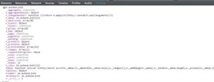
You will not find any difference when you run the application. But when you do the network sniffing you will see that the control issues a AJAX call to the action method configured for read purpose. Here is a screen shot of the network activity of the page:

SNAGHTML3df1d34a

So we saw how we can use either the server side data binding or client side data binding through AJAX. Depending on your scenario you can take any of the approaches.

Customizing Item Templates:

In the above sections we saw that the Items of the drop down list were just shown as text. With Kendo DropDownList it is possible to customize item templates. The item templates will be visible when the drop down list is in open state. When it is in collapsed state the drop down list will just show the  text field that is bound to the data object. In our example lets say we have images for each of the category and when the drop down list is open we would like to show image next to each of the category name. We can do that easily my making use of the Template() method. You can provide any HTML template and customize each item appearance. Since the templates are pure HTML, Kendo provides a special syntax to access the properties on the bound data object. The syntax is ${<PropertyName>}. That’s it and you can refer the properties of the data item within your custom templates. Here is the code which illustrates the custom teamplate implementation:

 
@( 
   Html.Kendo().DropDownList() 
               .Name("kdropdownlist") 
               .DataTextField("Text") 
               .DataValueField("Value") 
               .BindTo(Model) 
               .Template("<img alt='' src='" + Url.Content("~/Images/") + "${Text}.gif' width='40' height='40' />" + 
                         "<span style='padding: 10px;'>${Text}</span>") 
) 

The template is self explanatory. We have image tag whose source is set to an image url formed by using the text of the item itself and then we are showing the text as is. This is a simple template, but the power of template allows you to customize the UI to your needs.

Cascading DropDownList:

One of the common scenarios on web is to cascade a dropdownlist based on a value selected in another dropdownlist. For e.g. I want to show categories dropdown and products dropdowb but the products dropdown should not be enabled until user selects a value in category dropdown. Once a category is selected the products dropdown should get enabled and display all products belonging to that category. With Kendo DropDownList this can be achieved very easily. For the purpose of this example, we will created one more action method GetProductsAjax() which accepts a categoryid and will return products based on the category selected from this action. Here is the code for the same:

 
public JsonResult GetProductsAjax(string categoryId) 
{ 
   var items = new List() 
   { 
      new SelectListItem { Value=categoryId + "1", Text="Product 1" + categoryId }, 
      new SelectListItem { Value=categoryId + "2", Text="Product 2" + categoryId }, 
      new SelectListItem { Value=categoryId + "3", Text="Product 3" + categoryId }, 
      new SelectListItem { Value=categoryId + "4", Text="Product 4" + categoryId } 
   }; 
   return Json(items, JsonRequestBehavior.AllowGet); 
} 

I am just building a static list of products for the demo purpose.

next we will see how we can cascade a product dropdownlist based on category dropdownlist. We will place 2 dropdownlist on the screen – one for category and another for product. Here is the view code:

Category DropDownList:

 
@(
   Html.Kendo().DropDownList() 
               .Name("categories") 
               .OptionLabel("Select category...") 
               .DataTextField("Text") 
               .DataValueField("Value") 
               .DataSource(source => 
                          { source.Read(read => { read.Action("GetCategoriesAjax", "Home"); }); }
                          ) 
) 

Products DropDownList:

 
@(
   Html.Kendo().DropDownList() 
               .Name("products") 
               .OptionLabel("Select product...") 
               .DataTextField("Text") 
               .DataValueField("Value") 
               .DataSource(source => 
                          { 
                             source.Read(read => { read.Action("GetProductsAjax", "Home") 
                                   .Data("filterProducts"); 
                          }) 
               .ServerFiltering(true); }) 
               .Enable(false) 
               .AutoBind(false) 
               .CascadeFrom("categories") 
)
<script>
   function filterProducts() 
   {
      return {categoryId: $("#categories").val()};
   }
</script>

Notice couple of things in products drop down list. Firstly, in the data source read, we use a Data() method to pass additional data for the request. In this case, we invoke a javascript function which extracts the value of the selected category and pass it to the request. Then we set a property on the drop down list called AutoBind() which controls if the control should fetch the data on load of the control. In our case since we need to wait till a category is selected, we set auto bind to false. Lastly we set a property called CascadeFrom() and pass the parent drop down list id. This property takes care of keeping the products drop down in sync with the category selected. This will also control the enabling and disabling of product drop down based on whether a value is selected in category drop down or not. Here is the out put of the above code:

image

Handling Events:

DropDownList exposes 4 main events on the client side. You can subscribe to those events and perform your business logic if any. The event exposed are as follows:

  • Select – When a item is selected
  • Change – When the value of the drop down is changed
  • Open – When the drop down list is opened
  • Close – When the drop down list is closed

Here is the code to subscribe to these events:

 
@( 
    Html.Kendo().DropDownList() 
                .Name("kdropdownlist") 
                .DataTextField("Text") 
                .DataValueField("Value") 
                .BindTo(Model) 
                .Events(e => { e.Change("change") .Select("select") .Open("open") .Close("close"); })) 
) 

In the above code we use the Events() method to subscribe to different events. The events like Select, Open, Close, Change receive the names of the JavaScript function and when the event occurs the function will be invoked. Here is the JavaScript functions which log the event as it occurs to a div.


<div class="console"></div>

function open() {
        $(".console").html("<p>event: open</p>");
};

function close() 
{
        $(".console").append("<p>event: close</p>");
};

function change() 
{
        $(".console").append("<p>event: change</p>");
};

function dataBound() 
{
        $(".console").append("<p>event: dataBound</p>");
};

function select(e) 
{
        var dataItem = this.dataItem(e.item.index());
        $(".console").append("event :: select (" + dataItem.Text + " : " + dataItem.Value + ")");
};

DropDownList API:

So far we have seen how to get the drop down list instantiated on the screen, bind data and react to events. What if we need to access the drop down list control on the client side, at run time. All Kendo controls provide a very rich client side API. Using these api’s we can access a control which is already instantiated on the screen using JavaScript. Here is the code to access a drop down list control from JavaScript:

 
$(document).ready(function()
{ 
   var dropdownlist = $("#kdropdownlist").data("kendoDropDownList") 
}); 

On document ready, we use the jquery selector syntax to grab a element with id kdropdownlist and then use the jquery’s data() method to get the kendo drop down object. After this we can perform many of the operation exposed by the object. The methods supported by the drop down list is as follows:

close() closes the drop down list
dataItem() returns raw data record at the specified index
destroy() prepare for safe removal from DOM
enable(bool) enables/disables drop down list
open() opens the drop down list
refresh re-renders items in the list
search(string) selects item which starts with provided parameter
select(jquery|Number|function) selects item and sets the value & text
setDataSource(datasource) sets datasource and rebinds the drop down list
text(string) gets/sets the text of the drop down
toggle(bool) toggles between open & closed states
value(string) gets/sets the value of the drop down

Summary:

In this post we looked at one more commonly used controls – DropDownList. With the ASP.NET wrappers we saw how easy it is to instantiate a control, perform server side or ajax data binding and then how to work with the client side API. Hope you find this useful. Do give it a try i.e. download Kendo Complete and get started with Kendo Wrappers for ASP.NET MVC.

How to apply filter in creating Kendo UI Data Source from OData

I was working on an application and there was a requirement in which I had to apply filter while fetching data from the server using ODATA. I had two choice to achieve this

  1. Construct ODATA URL with filter applied
  2. Apply filter in Kendo UI Data Source

In this post we will discuss how we could apply filter while creating Kendo UI DataSource reading OData feed.

We can create data source reading ODATA feed as following. Below we are creating data source reading ODATA feed of Netflix


var movieTitleData;
movieTitleData = new kendo.data.DataSource(
{
type: "odata",
endlessScroll: true,
batch: false,
transport: {
read: {
url: "http://odata.netflix.com/Catalog/Titles?$select=Id,ShortName,BoxArt&$top=10",
dataType: "jsonp",

data: {
Accept: "application/json"
}
}
}

});

On inspecting request URL you will find that URL to fetch data is getting constructed as following. We are fetching top 10 movies title from Netflix

image

Now assume there is a requirement to fetch information of a particular movie with given Id. We can do that by applying filter while creating the KendoUI DataSource. We can apply filter to fetch movie of particular id as given below.

image

While applying filter we need to make sure that serverFiltering is set to true.

image

In Filter,

  1. Id is the column on which filter is being applied
  2. eq is operator to apply filter
  3. value is filter value

Kendo UI data source with filter applied can be created as following.


var moviedetailData = new kendo.data.DataSource(
{
type: "odata",
endlessScroll: true,
serverFiltering: true,
transport: {
read: {
url: "http://odata.netflix.com/Catalog/Titles?$select=Id,ShortName,BoxArt,AverageRating,ReleaseYear,Synopsis",
dataType: "jsonp",

data: {
Accept: "application/json"
}

}
},
filter: { filters: [{ field: "Id", operator: "eq", value: query }] }

});

While creating above KendoUI data source

  1. Data is fetched from Odata feed of Netflix
  2. Filter is applied on Id column of Netflix data source
  3. To apply filter at server side serverFiltering attribute is set to true

On inspecting request URL you will find that URL to fetch selected movie is getting constructed as following. We are fetching a particular movie on given id of the movie.

image

You will find that URL being constructed to fetch Odata feed is containing the filter query. In this way we can apply filter while creating Kendo UI DataSource reading an OData feed. I hope you find this post useful. Thanks for reading.

How to show current location on Google Map in Icenium

In this post we will take a look on working with Google map in Icenium. We will display Google map pinned with current location in a mobile view.

image

On creating Cross-Platform mobile application (Kendo UI Mobile) in Icenium, you will find by default references to work with Google map added in the project.

clip_image002

Next we need to create a view. In this view map will be rendered,


<div data-role="view" id="map" data-title="Map" data-show="showMap" data-stretch="true">
<div>
<div id="map_canvas" style="width: 100%; height: 100%; position: absolute;">
</div>

</div>
</div>

There are certain points worth discussing about the view.

  • showMap function will be called whenever user is navigating to view.
  • Style of map-canvas div is set to 100% width and height such that map will be displayed in whole view.

Now we need to write showMap function. In this function we will call PhoneGap navigatior.geolocation.getCurrentPosition function to get the longitude and latitude of current location of the user.


function showMap() {

navigator.geolocation.getCurrentPosition(
onSuccessShowMap,
onErrorShowMap
);

}

navigatior.geolocation.getCurrentPosition will call onSuccessShowMap function on success and onErrorShowMap on any exception in finding users current location. In onSuccessShowMap function we will render Google map in the view created previously.

Rendering of Google map can be done in three steps,

Very first we need to find longitude and latitude of the current location and that can be done as following,

image

Once longitude and latitude has been determined next we want to create the map option. You can read more about Google map options in Google map API documentation. So we are creating map option as following,

image

After creating map option we need to create the map. It takes two parameters. First HTML element on which you want to render the map and then map options. We have created a div with id map-canvas in map mobile view to render the map and in previous step, we created the map option.

image

At the last step we need to set the marker on the map with the current location. That can be done as following,

image

To render map you need to consolidate all the steps discussed above in onSuccessShowMap(position) function. After consolidating function should look like below,


function onSuccessShowMap(position) {

var latlng = new google.maps.LatLng(
position.coords.latitude,
position.coords.longitude);

var mapOptions = {

sensor: true,
center: latlng,
panControl: false,
zoomControl: true,
zoom: 16,
mapTypeId: google.maps.MapTypeId.ROADMAP,
streetViewControl: false,
mapTypeControl: true,

};

var map = new google.maps.Map(
document.getElementById('map_canvas'),
mapOptions
);

var marker = new google.maps.Marker({
position: latlng,
map: map
});
console.log(marker);
console.log("map rendering");
}
</script>

In last we need to write onErrorShowMap function. In this function handle all the errors may encounter while reading current location of the user. I am leaving function like following


function onErrorShowMap(error) {

alert("error");
}

Now when you run application you should get map with user current location in the map view.

image

I hope you find this post useful. Thank for reading.

Three steps of working with JavaScript Array and Kendo UI Mobile ListView

In this post we will learn working with JavaScript array and KendoUI Mobile ListView in three simple steps.

Step 1: Create Data Source

Very first you need to create data source. Application can read data from various sources. Some of the source can be as following

  • Reading data from remote data source
  • Reading data from local memory
  • Reading static data from local array.

Let us create a data source by reading data from local array.


var speakers = [
{

SpeakerName: "Chris Sells",
SpeakerTitle: "Author, Ex- Microsoft and ardent community contributor",
SpeakerPhoto: "speakerimages/cs.jpg"

},
{

SpeakerName: "Steve Smith",
SpeakerTitle: "Speaker, Author, Microsoft Regional Director and MVP",
SpeakerPhoto: "speakerimages/ss.JPG"

},
{

SpeakerName: "Dr.Michelle Smith",
SpeakerTitle: "Enterprise Consultant",
SpeakerPhoto: "speakerimages/ms.jpg"

},
{

SpeakerName: "Gaurav Mantri",
SpeakerTitle: "Founder Cerebrata & Windows Azure MVP",
SpeakerPhoto: "speakerimages/gm.JPG"

}

];

Step 2: Create Template

Template is the way to tell the platform the way you want to display data. You already have data and next you need to decide the way you want to display or render data. In Kendo UI Mobile you can create template as following,


<script type= "text/x-kendo-template" id="speakersTemplate">
<div>
<img src=#=SpeakerPhoto# alt="#= SpeakerName #" />
#= SpeakerName #</br>
<span>
#=SpeakerTitle#
</span>
</div>
</script>

To create Kendo Template, You need to create a script with type text/x-kendo-template. Values from data source will be rendered by putting property name as following

image

In above case source of an image can be set as following. SpeakerPhoto and SpeakerName are properties of data array.

image

To make data rendering more immersive you need to set the style of data in CSS. You will notice in above template that we are setting class attribute of img and span tag. These classes are defines in CSS as following,


.pullImage {
width: 64px;
height: 64px;
border-radius: 3px;
float: left;
margin-right: 10px;
}

.listTime
{
font-size: .8em;
font-weight: 100;
}

Step 3: Create ListView

By step 2 you have created data source and template. Next you need to create ListView. Creating ListView is very simple and can be created as following,


<div data-role="view" id="dataview" data-title="Data">

<div>
<ul id="speakerslist"
data-template="speakersTemplate"
data-source="speakers"
data-endlessScroll="true"
data-role="listview"
data-style="inset">
</ul>
</div>

</div>

To create ListView you need to set data-role attribute of <ul> element as listview. To define how data should be displayed in the ListView set data-template attribute and data source can defined by setting data-source attribute.

Note: if we have put speaker’s photos locally in spakerimages folder. Since we are setting speaker photo attribute in Speaker JavaScript array.

Running the Application

On running of the application you should get ListView with speaker’s details as following

image

In this way you can work with data from JavaScript array and Kendo UI mobile ListView. I hope you find this post useful. Thanks for reading.

How to set background image of Kendo UI Mobile View

In this post we will take a look on how to set background image of Kendo UI Mobile view. Let us say we have a view as following,

image

This Kendo UI Mobile View is created as following,


<div data-role="view" id="tabstrip-home" data-title="Hello World!">
<h1>Welcome!</h1>
<p>
This is View
</p>
</div>

Now you have a requirement to put a background image in this view and set the colors of the texts on the view. You can do it by setting style of div in the CSS. This can be done as following


#tabstrip-home .km-content{

background-image: url('../appimages/backgroundimage.jpg');
background-size: auto 100%;
background-repeat: repeat;
color : white;

}

In above code snippet ,

  1. Tabstrip-home is id of the view. Background image of this particular view will be set to an image.
  2. Background image is inside the folder appimages. We are setting backgroundimage.jpg as the background of the view.
  3. Image will repeat itself as background of the view.
  4. Text of the view content has been set to white.

After setting style view should look like as following image,

image

In this way you can set an image as background of KendoUI Mobile View. I hope you find this post useful. Thanks for reading.