Icenium Cloud based IDE got launched and I found this “one stop solution” to create Hybrid applications or Cross-platform application very impressive. While playing around Icenium, I liked almost every features in this Cloud based IDE. However below I am listing my favorite 5 features. In further post, I will discuss more features and step by step explanation to work with them.
Code Editor
Being a hybrid application developer, we need to write lot of HTML, JavaScript and CSS. Code Editor in Icenium is clean and elegant editor. It allows us to write codes without much distraction.
Just Code is integrated with Code Editor. In Code Editor, we can perform tasks like
Refactoring
Navigation
Code Commands
We can perform Code Commands like
Formatting of Code
Expand selection
Duplicate a text
Put a block comment
The best part is, there is short cut for all the operation. In Navigation we can perform tasks like
Go To File
Go To Member
Go to Symbol
So my one of my favorite feature in Icenium is its elegant Code Editor.
Certificate Management
If you have created any Android application then you may be knowing that you need to have a certificate to create apk file. Icenium allows us to create and mange certificate right from the IDE.
Icenium provides two options to create a certificate,
Request for a certificate
Create self-signed certificate
Creating certificate right from the IDE is one of the cool feature.
Version Control
Icenuim provides complete version control solution for application development. We can work locally and can perform following tasks in Icenium
Compare the changes in between local and latest versions from the server
Commit the changes
Revert the changes
View the history log in the repository
We can compare changes, navigate from one change to another as shown in the below image.
We can view the
history
change sets
Conflict etc. as shown in the following image,
Icenium allows us to commit or revert the changes. While committing we need to provide comment for that particular change. We can commit as shown in below image,
Version control is one of the cool feature I got impressed while playing with Icenium.
Integration with github Repository
Yes you read it corectly , right from the IDE you can push and pull yor project to github repository. Icenium allows us to
Configure the repository
Pull from the repository
Push into the repository
Invite the Collaborators
The best part is that right from the IDE we can Invite Collaboratoes . Before pushing to github we need to commit the changes to resposiory . Commit comment will be displayed next in the github respository comment
Code sign ,Permissions and Publish of application
Right from Icenium IDE ,we can sign the code , configure the permissions and set the icons of the application.
In Icenium with a right click on the project , we can publish the application.
I hope you like these fetaure and you are all set to play around Icenium. Thanks for reading this post and I am looking very forward to share more learning on Icenium with you in furher post.
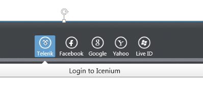
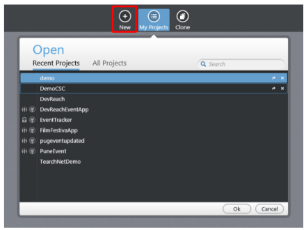
In this post we are going to use Icenium Graphite to create our first Cross-platform application. To start with launch Icenium Graphite IDE. You will be asked to Login to Icenium. You can login using any of the following as given in the image below.
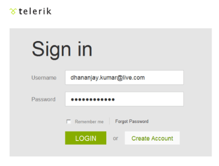
Let us choose Telerik ID to login into Icenium IDE.
After successful login you will get a Project dashboard. On project dashboard you can perform following three tasks
Create New Project Browse existing Projects Clone a project
In below image you can see list of existing projects. To create new project click on New.
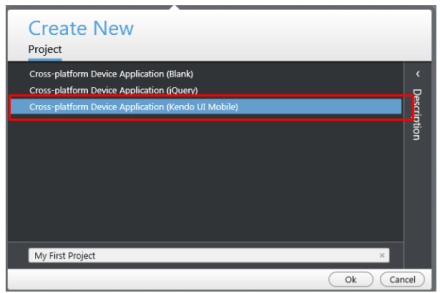
There are three project templates as following
Blank
Using jQuery
Using Kendo UI Mobile
Let us go ahead and create a cross-platform device application using Kendo UI Mobile.
Give name of the project. You will notice that you are not asked to select a location to save the project. Since Icenium is a cloud IDE, it saves the project in the cloud rather than saving it locally. Click ok to create the application.
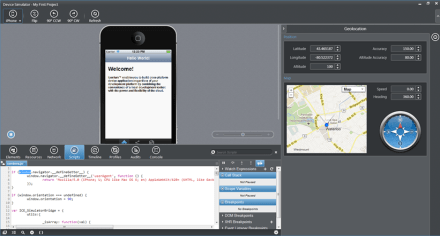
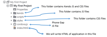
Let us go ahead and explore Project Navigator. You will find project structure as given in following image,
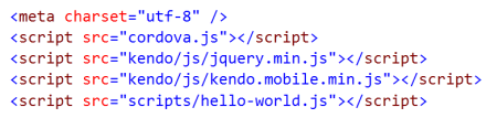
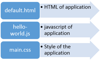
On opening of index.html, you will find some prior code there for reference. As you see in below image that to create Hybrid application using Kendo UI Mobile, you need minimum following references.
There are three default files you will be working on. However you are free to give any name to files.
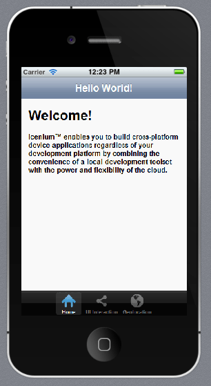
Let us go ahead and run the default application got created by choosing Kendo project template.
There are two ways you can run the application. You can run application either
On Device
In Simulator
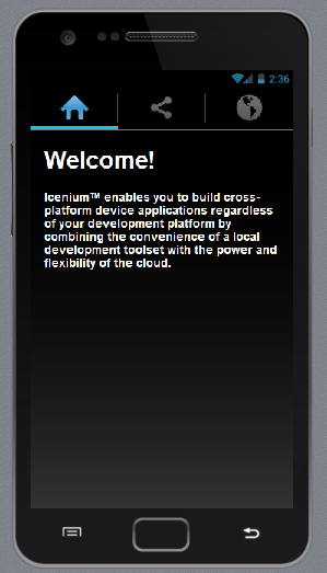
On running you get application running in iPhone simulator.
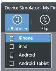
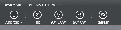
There are four simulator supported in Icenium.
If you want to run the application in Android Simulator change the Device simulator and you are done
There are many other options available in Device Simulator. We will discuss them in detail in further blog posts.
In this way you can create, test and deploy a truly cross-platform application using Kendo UI Mobile and Icenium. I hope you find this post useful. Looking forward to share more learning on Icxenium and Kendo UI Mobile with you in further blog posts.
Launch visual studio and create a new MVC 4 Web Application.
Choose Internet Application as type of application and Razor engine as the View Engine.
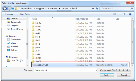
To test whether we have created application correctly or not press F5 and run the application. If application is successfully running then you are all set to start using Kendo UI MVC Wrapper in your application. Very first you need to add reference of Kendo.Mvc.dll. You will find this file in location \wrappers\aspnetmvc\Binaries\Mvc3. Right click on the reference in project and browse to add Kendo.Mvc.dll in the project.
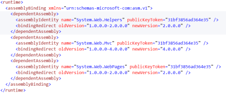
After adding the reference open Web.config file
You need to make sure that following entry is present in the Web.config file.
If above entry is not present then make sure to add them in Web.config file.
Now you add Kendo JS files and CSS files in the project. To add Kendo JS files right click on Script folder and select add existing item
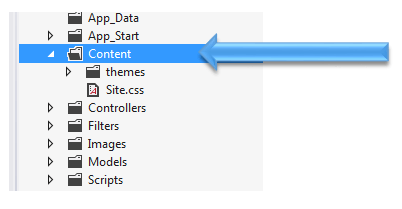
Browse to JS folder in Kendo UI installation directory and add all the JS files in the Scripts folder. After adding JS files add CSS files in the project. To add that right click on Content folder in the project and choose option to add existing items
Browse to Styles folder in Kendo UI installation directory and all the CSS files in the Content folder. If you are going to use some specfic style like Metro or Silver then make sure you add texture folder in the Content directory as well. Make sure you have added Texture folder and Default folder also in the Contnet folder of the project.
After adding all the css files and folder , Content folder in the project should look like as following
By this step , you have added all the required dll, js files and css files in the project. Next open Web.config from the Views
Here you need to add following namespace
You need to add this namespace in root level Web.config as well. So open root level Web.config and add the name space.
And add the namespace as following
last step you need to add references of CSS and JS file in _layout.cshtml file. You will find this file in Shared folder.
Open this file and scroll down. Comment the like referring to jquery file. You will find that reference just before closing body tag.
And at the beginning of the file add the following references ,
Above we have referred Metro CSS for metro styled UI experience. So go ahead and following references in _layout.cshtml file
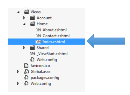
Now you are all set to use Kendo UI MVC Wrappers in the project. Let us go ahead and put a Kendo Calendar widget on index.cshtml . You can put that as following
Now press F5 to run the application. You should get the Kendo UI Calendar on the index view as following,
In this way you can start working with Kendo UI MVC Wrapper in ASP.Net MVC 4.0 Application. I hope you find this post useful. Thanks for reading!
Today in the ASP.NET world, MVC is the talk of the town. Every enterprise and every developer is looking to adopt it at some time. Even the architecture guidance from Telerik recommends ASP.NET MVC liberally.
While MVC does have its benefits, it still is not as close to the ease of development that ASP.NET Web Forms provides. The default controls with ASP.NET MVC in Visual Studio are very limited. Telerik fills this productivity gap by providing the toolset that adds many powerful HTML Helpers that aid in faster development. Kendo UI Complete for ASP.NET MVC is the toolset that has the server wrappers that you can use in your ASP.NET MVC project.
In the video below, we explore quickly getting started with Kendo UI for ASP.NET MVC in your project.
We look forward to hearing your experiences using the HTML Helpers from Kendo UI for ASP.NET MVC.
Recently I presented on Hybrid App Development using Kendo UI Mobile in CSC Noida. I had fun time presenting in front of professionals from CSC. Please find below slides from that presentation
Using Telerik Test Studio Exploratory Testing tool you can
Submit and send and idea
Submit and send Important information
Submit a bug to Team Pulse or TFS
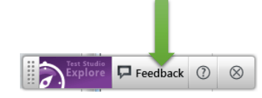
Directly from your browser. In this post we will learn how we can perform Exploratory Testing. To do exploratory testing click on Telerik Exploratory Testing Extension in the browser (Chrome is being used here}
You will get Test Studio Exploratory toolbar open. Click on Feedback button to perform exploration testing
Next click on Capture button to capture a screenshot
Now you can capture any screen short from the page. Annotate a particular element as following. Like in following case we are saying “Change the font of Welcome element.
In the left side you get Feeback panel. Here you can provide Title, Description and tag the annotation.
You can tag either as Important or Idea. After providing all the information you can send this by clicking on send button in bottom.
You can either export to
Word
HTML
Or can send in Email. You can submit it as bug as well. You can submit to Team Pulse or TFS.
If you want to export to HTML click on HTML option. You will be asked to provide name of the file and choose the location to save the file.
You will get a confirmation message that Feedback is saved to the given location.
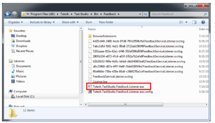
If you open file you will get all the information of the feedback submitted.
In this way you can perform Exploratory Testing right in your browser using Telerik Test Studio.
. I hope you find this post useful. Thanks for reading.
Let us assume that you are doing automated test of login functionality. While executing the test you want to encrypt the Password information provided by the user to authenticate. Test Studio allows you to encrypt the vital information in the test steps.
Suppose you have recorded a login test as following. If you see in step 4 password is displayed in the plain text.
If you want to encrypt this information select the step and open the property. Open the property window for enter password step and navigate to Behavior tab. At the top of property window you can verify that for which step property is open. You see that Encrypt behavior value is set to false.
To encrypt the password you need to change value of Encrypt to true.
After changing this value when you navigate back to test steps, you will find password has been encrypted
So in this way you can encrypt vital information while executing the test. I hope you find this post useful. Thanks for reading.
In this post we will see, “How could we submit a bug from Test Studio to TeamPulse?“
Let us assume that we executed an automated functional test and we got the following result. Step 6 in the test failed.
We need to submit this bug to Team Pulse. To submit bug to Team Pulse double click on Red Cross and you will get Step Failure Details dialog box as shown in following image.
Click on the Submit Bug. If Team Pulse is not configured then you will get dialog box to set up Team Pulse. In this dialog box click on Set this up now
If you have already configured TeamPulse or TFS in any of the other Test Project then Test Studio remember that and prompt you that whether you want to import previous setting or you want to go with New Setup. Let us go ahead with New Setup for that click on New Setup.
After clicking on New Setup now you will get below dialog box. Select TeamPulse Server and click on Configure Selected.
In next dialog box, provide
Url of TeamPulse
Username and Password to authenticate to Team Pulse.
After providing credential you need to click on the Connect button. After successful authentication you will get Project to select. Select Project, Severity and Status from drop down. At last click on Done button.
If you have successful connected to Team Pulse, you will get Green Right icon next to TeamPulse. Check on check box to make it default and click on Donebutton.
Next you will be prompted to dialog box to submit the bug.
Before submitting bug, you can Edit Title and Description of the Bug. If you want to submit files related to Failure details then check the check box Attach Failure details. To submit the bug, click on Submit button.
You will get successful message on successful submission of bug from Test Studio to TeamPulse
In this way you can submit bug to TeamPulse from Test Studio. I hope you find this post useful. Thanks for reading
I would like to thank everyone for attending webinar on “Performance and Load Testing with Test Studio”. Please find below answers of the questions come up in the webinar.
How to encrypt the password and please can you show us how to handle the parameterization?
Password encryption is set via the property panel for that test step.
Can we do Performance test & Load test with third party application that do not run through browser
Test Studio support web applications. Other applications are not supported.
Test Studio is only for .NET testing not for the JAVA or other testing. Can it test standalone java application?
Test Studio will test any web, Silverlight, or WPF application. The web application can be written on any platform. Java, Ruby, .NET, Python, PHP, it doesn’t matter as long as HTML is sent across the wire.
How many computers we can select at one shot during performance testing
We support multiple computers. We’ve tested with large configurations.
Can we have test suites for the performance testing?
Yes. Test Lists may be created which focus on performance tests.
Can we have custom performance counters added?
Custom counters will be available if they are added through the Windows Performance counter infrastructure.
Describe how to identify the memory leakage using Telerik Test Studio
Memory leakage would be monitored by using performance monitor counters for memory usage. (Total available bytes, garbage collection, etc.)
What criteria would you use to select Web transactions for load testing?
If by “transactions” you mean use cases, then you want to select as many different ones as possible in order to model your site’s traffic as accurately as possible.
How to use Regular Expression in Load Runner for web functions
This webinar is about Telerik’s Test Studio. Please see HP for questions about Load Runner.
Can do the Regression Testing also by using Test Studio
Yes. Automated tests are perfect for regression testing.
In this post we will learn different Transition Styles between Kendo UI Mobile Views.
To start with let us assume we have an application as following. This application consists of two views. On click of Kendo button, user will navigate to Other View.
There are four supported Transition styles, they are as follows
Overlay transition style
See the video for the behavior of Overlay transition style
Slide transition style
See the video for the behavior of Slide transition style
Zoom transition style
See the video for the behavior of Zoom transition style
Fade transition style
See the video for the behavior of Fade transition style
Default transition style is “slide”. We can apply transition style in three ways
At the application level
At the view level
At the control level
At Application Level
When set at application level same transition style will be applied to entire application. All views of the application will adhere to the same transition style. At application level transition style can be set by providing value of transition property in Kendo mobile initialization.
At View Level
Other option to set transition style is at view level. On navigating to this view user will experience transition style set at the view.
At Control Level
We can set transition style at control level as well. In following case we are applying transition style to a kendo button. User will experience zoom transition behavior while navigating to view set in the href property of the keno button.
If transition style is set at all the three levels then Control level has highest priority whereas application level has lowest priority.
In this way you can apply different transition style to the application. For your reference find the source code of above discussed application below.
In this post we will try to see how to work with a RadHtmlChart. We will go step by step in creating and using the RadHtmlChart in a web page. I will try to outline each piece that make up an RadHtmlChart and how to work with them. So if you are in need of using a RadHtmlChart in your pages, read through the following sections and follow along.
Pre-Requisite:
In order to follow along this blog post, you will need to have downloaded the RadControls for ASP.NET AJAX suite and installed it on your development machine/laptop. Here is the download link to RadControls for ASP.NET AJAX Suite:
Create a Web Site Project:
First and foremost thing to do is to create a Web Site which will be our playground for this blog post. Once you install the RadControls for ASP.NET AJAX you will see Telerik project templates in Visual Studio New Project dialog. For this blog post I will be creating a “C# RadControls Web Site” project. Give it a name and keep the default settings in all of the dialog that comes up.
Adding RadHtmlChart to a page:
The RadControls Web Site project template when finishes the web site creation, will create a single web page namely Default.aspx. For the sake of simplicity I will just use this page to create the chart. There are two ways to add the chart on to the web page. First, you can drag it from the Toolbox on to the source. Secondly you can just type the tag on the source.
So I am going to type out the tag name and create the chart. Here is the code to instantiate the RadHtmlChart on a web page:
We can instantiate the RadHtmlChart from the telerik namespace. If you look at the web.config the telerik tagprefix is configured to be available on all the pages. Here is the code snippet:
So if you now view the web page, you will see the following output:
As you can see from the output, we get the a base for the chart. Now that we have a base, we will build up the chart one by one.
Chart Appearance:
Now that we have a chart coming up, lets give some facelift to the chart. We can control the appearance of the chart i.e. we can provide a background color to the chart. The RadHtmlChart provides Appearance property through which we can set the background color. The Appearance contains FillStyle property which exposes BackgroundColor attribute and we set the color to this attribute. Here is the code snippet:
I have set LightGray as the background color of the chart. If we now run the application and check the output, you will see the chart as below:
Chart Title:
Next thing to do is to set the chart title. For setting the title, chart exposes ChartTitle property. ChartTitle contains a text Property and you can provide the text you want to see on the chart. The appearance of the chart title can be configured through Appearance property of the chart title. Here is the code snippet:
<ChartTitle Text="Server CPU Load By Days">
    <Appearance Align="Center" BackgroundColor="White" Position="Top" />
</ChartTitle>
Here is the snapshot of the chart after setting the title:
As you can see we have set the text and appearance of the title. Next we will take care of the legend.
Legend Appearance Settings:
Legend is nothing but a way to let the end user know what series belong to what context. So the way to style a legend is through Appearance property of Legend object. The appearance allows us to set the background color and position of the legend. Here is the code snippet for the same:
After adding the legend tag we cant see its effect immediately on the chart. That is because this comes into effect only when we provide the Y Axis items i.e. the main data points of the chart.
Plotarea Settings:
The plot area as the name goes is the area where the chart actually gets plotted. So We have the following options to play with respect to the play area:
Plotarea Appearance Settings
Plotarea X Axis Settings
Plotarea Y Axis Settings
Plotarea Series Settings
Lets look at the above points one by one.
Plotarea Appearance Settings:
The appearance of the plot area can be changed with Appearance property. Appearance property supports FillStyle child property where we can set the background color of the plot area. Here is the code snippet for the same:
So far we have just prepared the chart area and the plot area. We haven’t yet defined any axis related information on the chart. The X Axis settings are set as a child element of Plotarea object. Let me show you the code snippet of the same and explain the different attributes that make up the X Axis setting. Here is the code snippet:
On the XAxis we can first set the Color of the X Axis line. I have set it to Black; this can be of any color. Then MajorTickType is the type of the ticks that mark the major grid lines and values can be None of Outside. Similarly MinorTickType is the type of the ticks that mark the minor grid lines and this can be either None or Outside. Reversed is a setting which is used to determine if the axis will be reversed i.e. low value in place of high value and vice versa. I have set it to false. Next I have given the items that make up the x axis. The Items collection takes a AxisItem object which conatins an attribute named Labeltext. So in my example I am setting the x axis to week day names.
Also notice that we have ability to configure the LabelsAppearance i.e. the x axis labels appearance. You can format the label text and also rotate the label using the RotationAngle attribute. The MajorGridLines allows us to configure the color and width of the major grid line and similarly the MinorGridLines property. We can also provide a title to the x axis and is done so by setting the TitleAppearance property. You can position the title through Position attribute or rotate the title using the RotationAngle and also the title text through Text attribute. In my example I have given the text as Days. Here is the output of the above code configuration:
Plotarea Y Axis Settings:
Similar to X axis setting the Y axis also can be configured and pretty much the same attribute structure is used. Here is the Y Axis setting I have done for my example. Take a look at the code snippet and I will explain the code in a moment:
First, the Y axis setting is done on YAxis object of the RadHtmlChart. Pretty similar to X axis, we have the Color attribute of the Y axis line which can be configured. Then we set the MajorTickSize and MajorTickType. Similarly the MinorTickSize and MinorTickType is also set. The Min and Max value to be represented on the the Y Axis is set. We also can tell the increments in which the ticks have to be drawn through the Step attribute.
We can configure the Y axis labels through LabelsAppearance property. The MajorGridLines and MinorGridLines properties let us configure the color and width of the grid lines. The title of the Y axis is set through TitleAppearance property. Here is the output of the chart with the settings done so far:
Plotarea Series Settings:
So far we have set up the X & Y axis and configured them with respect to the axis title, major and minor grid lines. The main heart of the chart is the Series collection that Plotarea contains. Series collection is the property on which we define what kind of chart series we would like to plot. It can be a BarSeries or ColumnSeries or LineSeries etc etc. In this example I will be considering a simple example of Bar chart so we will see how to define a BarSeries.
We will need to add BarSeries object to Series collection. The BarSeries can be given a name using attribute Name. Then the actual values of the data points can be added to Items collection of BarSeries. The type of item to add is SeriesItem and it contains a attribute named YValue which needs to be filled with the data value. This is the data point which will be plotted on the chart. We can customize the labels and the tool tip of the bar series. Here is the code snippet for the same:
with the above code here is how our chart looks like now:
Notice that the axis have been shifted automatically because the series we said to plot was a BarSeries and Bar is always plotted as a horizontal line. Also notice the appearance of the legend at the bottom. This is because as soon as we provided a series with a name, the name of the series becomes the legend text.
What if I want to add another series to the chart. Simple, just add another BarSeries to the Series collection and the chart will pick up the second series and plot it along with the first one. Here is the snapshot of the same chart after I added another series:
One of the cool features of RadHtmlChart is the fact that it will render the chart as a SVG on modern browsers and as a VML on older browser. So here is a screenshot of the same chart zoomed in at around 200%. Check out the clarity of the various chart details:
Here is the entire source code of the RadHtmlChart we have done so far:
This file contains hidden or bidirectional Unicode text that may be interpreted or compiled differently than what appears below. To review, open the file in an editor that reveals hidden Unicode characters.
Learn more about bidirectional Unicode characters
In this blog post I attempted to construct a RadHtmlChart piece by piece and show how easy it is to configure different aspects of the RadHtmlChart control. Things to take care are the Chart Appearance, Chart Title, Legend and Plotarea. Hope this gives you all a jump start in to working with the RadHtmlChart.
Note:
It is not necessary to hand code all of the above mentioned configuration settings. RadHtmlChart control has a rich visual designer support. Using that with couple of clicks you can easily set all the above talked configuration settings on a GUI. I will be writing a separate blog post on this.
The appearance of the chart and other aspects of the chart need not be set explicitly by choosing color which configuring rather RadHtmlChart ships with default 19 skins and you can just set the skin on the RadHtmlChart and that will take care of the color aspect in the chart. I will be covering this in a separate blog post.
The items for the series need not be hard coded as shown in this blog post. This was just an attempt to show that how things work. The RadHtmlChart supports 9 types of data sources and the chart can be bound to any of those data source. That way the items of the Y Axis will be bound at run time from the data source. I will be covering this in a future blog post


 Helping Ninja Technologists