In this post we will take a look on working RadCharts in Windows Phone 8 Applications. I shall follow simplistic step by step approach for better learning of yours. At the end of this post we will complete creating a chart application as below.
Start with creating a Windows Phone 8 Application. To create Windows Phone Application choose Windows Phone App project template from Windows Phone tab.
Choose Windows Phone 0S 8.0 as Target Windows Phone OS version.
Next we need to add following references in the project to work with RadChart. To add references right click on the project and from context menu select Add Reference. After adding reference we are all set to work with RadCharts in Windows 8 project.
Step2: Add namespace on XAML
To work with chart now we need to add required references on XAML.
There are different kind of Axes available. We will not get into details of each type in this post. However different kind of axes are as follows,
We are using Linear Axis for Vertical Axis and Cateogrical Axis as Horizontle axis in this example. At on running application we will get chart with two axis. However there will be no data rendered on chart. We are getting message that No Series added.
Step 4: Add Series to the Chart
In this step we will add Series to chart. We can add series to chart as following ,
Likely Axis there are different kind of series is also available . We will talk about different series in later post. However different kind of series is as follows
At this point if we run application we will get message that there is no datapoint added in the chart. We will get expected output as following ,
Step 4: Add Data Point to Chart
We can add Data Point as following in the chart. We are adding data point in XAML here. In real time scenario we will have to fetch data from services and bind data point to chart at runtime. We can achieve that using data binding.
After adding two series application should render Chart like following,
Step 5: Add Data Point to Chart from Code behind
In previous steps we added Data Points in XAML. We can very much add Data Points at run time. To add data point from code behind let us go ahead and delete data point from XAML. We can add that in code behind as following,
this.chart.Series[0].ItemsSource = new double[] { 20, 30, 50, 10, 60, 40, 20, 80 };
 this.chart.Series[1].ItemsSource = new double[] {10,30,40,60,34,59,20,75 };
In this way we can work with Charts in Windows Phone 8. I hope you find this post useful. Thanks for reading.
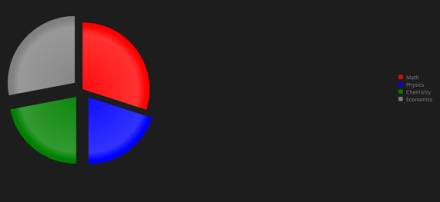
In this post we will take a look on working with Pie Charts in JavaScript based Application for Windows Store. We will follow step by step approach in this blog post.
Step 1: Add References
Very first we will add Telerik JS and CSS files references in the project. If first time you are working with Rad Controls in Windows 8, I suggest you to read blog post to setup the environment
After adding the files in the project we need to refer them on the html file . Files can be referred as given in following code snippet.
We are setting data-win-control attribute as Telerik.UI.RadChart
In data-win-options , series type is set as pie
In data-win-options data is set locally.
Data array contains two properties. They are values and categories
At this point if we go ahead and run the application, we will get an output something like below
Step 3: Configure More Pie Chart options
You can configure common options of char series as discussed in this blog post . Apart from common options you can configure options like following,
colorField
explodeField
categoryFiled
Assume you have data source as following
You can configure these values for pie chart as following
On running you will pie chart as following. You will find that colours of categories have been changed.
You can explode a category as following. Even though in following example we are setting explode attribute with explode property in data array, you are free to set any property of data array as explode field by setting explodeField attribute as we set colorField.
On running you will pie chart as following.
In this we can work with pie charts. Below is the consolidated code of above discussion
In this post we learnt working with pie Charts. We focused on only one type of series. In further posts we will explore various series type and working with remote data in the Rad Chart. I hope you find this post useful. Thanks for reading.
In this post we will take a look on working with RadChart in JavaScript based Application for Windows Store. We will follow step by step approach in this blog post.
Step 1: Add References
Very first we will add Telerik JS and CSS files references in the project. If first time you are working with Rad Controls in Windows 8, I suggest you to read blog post to setup the environment
After adding the files in the project we need to refer them on the html file . Files can be referred as given in following code snippet.
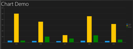
In above code snippet, we are creating column type of series with name Runs and 5 data points. At this point if we go ahead and run the application, we should get a chart as following.
Programmatically chart series can be created as following,
var performancechart = document.getElementById("performancechart").winControl;
 var wicketcolumnseries = new Telerik.UI.Chart.ColumnSeries();
 wicketcolumnseries.data = [30,100,67,123,49];
 wicketcolumnseries.name = "Wicket";
 wicketcolumnseries.color = "green";
 wicketcolumnseries.visibleInLegend = true;
 performancechart.series.push(wicketcolumnseries);
 performancechart.refresh();
In above code snippet following tasks has been performed
Line 1: Getting reference of Chart as win control
Line 2: Creating series of type Column
Line 3: Setting data for the column series
Line 4: Setting name of the column series
Line 5: Setting colour of series
Line 6: Making sure series is visible in Chart Legend
Line 7: Pushing created column series to the series collection of chart
Line 8: Refreshing the chart
Let us add one more series to chart declaratively in HTML.
In this post we learnt basics of working with Rad Chart. We focused on only one type of series. In further posts we will explore various series type and working with remote data in the Rad Chart. I hope you find this post useful. Thanks for reading.
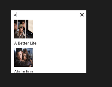
data-win-control attribute of div is set as Telerik.UI.RadAutoCompleteBox
In data-win-options attribute
You can set datasource of RadAutoCompleteBox in two ways. You can directly set datasource either in data-win-options attribute or in the JavaScript function. You can set datasource in code behind as following,
dataTextField is set as title . title is one of the property in array.
template is set as moviestemplate. Template decides how data will be displayed in the control. Template can be created by setting data-win-control property of a div or span as WinJS.Binding.Template
We are binding title of the array to h4 element and picture property of the array to image element. When you run the application, you should get RadAutoCompleteBox as following
Working with onSelect Event
You can read the selected item in RadAutoCompleteBox in onSelect event. You can attach select event and read the selected value as given in following,
movieAutoComplete.addEventListener("select", function (e) {
 document.getElementById("selectedmovie").src = movieAutoComplete.dataItem(e.item.index()).picture;
 });
In above code selectmovie is id of the image element. Image of the selected movie item will be displayed.
So in this way you can start using RadAutoCompleteBox in application. I hope you find this post useful. Thanks for reading.
In this post we will take a look on working with RadDropDownList in JavaScript based application for Windows 8. RadDropDownList allows you to select one item from list of items.
Getting Started with RadDropDownList
You can create a RadDropDownList by setting data-win-control property of a span or div element as Telerik.UI.RadDropDownList. You can do that as following,
RadDropDownList allows you to select an element from the list of elements displaying in drop down. RadDropDownList can display a local array or data returning from remote service as data. dataSource property of RadDropDown defines the data to be displayed . In above RadDropDown we have set the dataSource with inline array in the data-win-options. You can also bind dataSource of RadDropDownList from array defined in other files or JSON data returning from the remote services.
Let us say there is an array on default.js as following
var sportsArray = ['Cricket','FootBall','Hockey','Tennis','BaseBall'];
To set it as dataSource of RadDropDownList, first you need to create a Namespace. You can create that as following,
On running the application you should get RadDropDownList as populated with data from sportsArray as following,
Working with Remote Data
Above we used local data as dataSource of RadDropDownList. We can bind data from remote data source as well. For example if we want to display movies title from Netflix we can do that following below steps ,
Make a call to Netflix Odata serveice
Parse the resturned JSON
Construct array from parsed JSON data
Set array as datasource of RadDropDownList
WinJS.xhr({
 url: "http://odata.netflix.com/Catalog/Titles" + "?$format=json&$select=ShortName,BoxArt&$top=300"
 }).then(function (xhr) {
 var movies = JSON.parse(xhr.response).d;
 movies.forEach(function (i) {
 movieArray.push(i.ShortName);
 });
 var moviedropdown = document.getElementById("moviesdropdown").winControl;
 moviedropdown.dataSource.data = movieArray;
 });
In above code,
we are making call to Netflix OData feed using WinJS.xhr
Prasing returned JSON using JSON.parse
Iterting each element and pushing it to array
Taking reference of RadDropDownList using document.getElementbyID
Setting the datasource
And on HTML there is a div elment with id moviedropdown
When you run the application you will get RadDropDownList populated with movies title from Netflix.
Attaching Change Event
You can attach change event to RadDropDownList and read the selected value . You can do that as following
moviedropdown.addEventListener("change", function (e) {
 document.getElementById("output").innerText = e.target.value;

});
In above code
Output is id of the span
Selected value will be displayed as text of the output span
In this way you can work with RadDropDownList in the application. In this post we learnt on getting started, working with remote data and about change event. I hope you find this post useful. Thanks for reading.
In this post we will take a look on how to read values NotificationTemplate controls in RadHubTile. Let us say, you are working with RadHubTile and you have set the NotificationTemplate as following,
<telerik:RadHubTile x:Name="rdRunsHubTiles"
 Title="Score"
 Message="India/Eng Score"
 ImageSource="/Assets/indengmatchlogo.JPG"
 BackContent="Score of India England first Test"
 Margin="93,209,0,388">
 <telerik:RadHubTile.NotificationTemplate>
 <DataTemplate>
 <StackPanel Orientation="Horizontal" >
 <TextBlock Text="{Binding Runs}" />
 <TextBlock Text="{Binding Country}" />
 </StackPanel>
 </DataTemplate>
 </telerik:RadHubTile.NotificationTemplate>
 </telerik:RadHubTile>
There are two TextBlock Controls inside the NotificationTemplate. Both TextBlock are data bind. RadHubTile DataCoontext is set as following
protected override void OnNavigatedTo(NavigationEventArgs e)
 {
 rdRunsHubTiles.DataContext = GetRun();

 }

Data GetRun()
 {
 return new Data ()
 {
 Runs = 200,
 Country = "India"
 };

 }
And Data class is defined as following,
public class Data
 {
 public int Runs { get; set; }
 public string Country { get; set; }
 }
Now when user tapd RadHubTile you need to read values of NotficationTemplate TextBlocks. To do this you need to handle tap event. Register tap event to RadHubTile as following ,
public MainPage()
 {
 this.InitializeComponent();
 rdRunsHubTiles.Tapped += rdRunsHubTiles_Tapped;

 }
Now in the Tap event we can read controls values as following,
void rdRunsHubTiles_Tapped(object sender, TappedRoutedEventArgs e)
 {

Data valueOfNotification = (sender as RadHubTile).DataContext as Data ;
 var runsettocontrol = valueOfNotification.Runs;
 var countrysettocontrol = valueOfNotification.Country;
 }
In above code we are
1. Typecasting sender as RadHubTile
2. Reading DataContext of RadHubTile as Data
3. Reading set values as property
So in this way we can read NotificationTemplate controls value. I hope you find this post useful. Thanks for reading.
In this post we will take a look on working with RadHubTile in XAML based Windows Store Application. RadHubTile gives you same immersive experience as you see on the home screen of Windows 8. You can display message, notification, title and message on flipping of tile using RadHubTiles. RadHubTile gives you experience like below image.
To start working with RadHubTile let us start with Creating Application for Windows Store. To create this choose Blank App from Windows Store project tab. After creating project you need to add reference Of Rad Control for Windows 8 in the project. To do that right click on the reference and select Add Reference. From the Reference Manager Dialog box select Rad Control for Windows8.
After adding reference in the project, you need to add namespace on the XAML page. You can do that as following,
You can create a HubTile on XAML as following ,
Since you have not set any propery of RadHubTile like Message , Title etc , so as output you will get a simple rectangular tile as below,
Some of the important properties of RadHubTiles are as following ,
Now let us go ahead and set properties of RadHubTiles ,
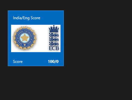
 <telerik:RadHubTile Title="Score"
 Message="India/Eng Score"
 ImageSource="/Assets/indengmatchlogo.JPG"
 Notification="100/0"
 BackContent="Score of India England first Test"
 >

 </telerik:RadHubTile>
Above we have set several properties of RadHubTiles . Now let us go ahead and run the application to see the output
Now let is go ahead and create template for BackContent. We crate template to show information in back of the RadHubTile as we want. Let us say , we want to display Image and Title in the back of the RadHubTile. We can do that by creating a DataTemplate and then setting that as value of BackContentTemplate. We can do that as following ,
You see that in above code we have created DataTemplate . There is StackPanel and one Image control along with TextBlock have put vertically in the StackPanel. When you run the application , you will get RadHubTile back content as following ,
For your reference full code with BackContent Template is given below,
 <telerik:RadHubTile Title="Score"
 Message="India/Eng Score"
 ImageSource="/Assets/indengmatchlogo.JPG"
 Notification="100/0"
 BackContent="Score of India England first Test"
 Margin="93,209,0,388">
 <telerik:RadHubTile.BackContentTemplate>
 <DataTemplate>
 <StackPanel Orientation="Vertical">
 <TextBlock Text="India England Test Series" />
 <Image Source="/Assets/indengmatchlogo.JPG" />
 </StackPanel>
 </DataTemplate>
 </telerik:RadHubTile.BackContentTemplate>

</telerik:RadHubTile>
As we set BackContentTemplate , we can set
NotificationTemplate
MessageTemplate
As well. Let us go ahead and create the NotificationTemplate. We will bind controls in NotificationTemplate with the data coming from the background. Let us say there is function returning Data. In this case I am hard coding the data value, however in real time scenario you will like to fetch data from a remote service.
 Data GetRun()
 {
 // Put code here to fetch data from remote service
 return new Data ()
 {
 Runs = 200,
 Country = "India"
 };

 }
Data class is defined as following,
namespace HubTilesXaml
{
 public class Data
 {
 public int Runs { get; set; }
 public string Country { get; set; }
 }
}
We need to set DataContext of RadHubTile as given below,
Now let us go ahead and create NotificationTemplate . NotficationTemplate can be created as following.
We are creating a DataTemplate and setting it as value of NotificationTemplate property of RadHubTile. For your reference full code with BackContentTemplate and NotficationTemplate for RadHubTile is given below,
<telerik:RadHubTile x:Name="rdRunsHubTiles"
 Title="Score"
 Message="India/Eng Score"
 ImageSource="/Assets/indengmatchlogo.JPG"

 BackContent="Score of India England first Test"
 DataContext=""
 Margin="93,209,0,388">
 <telerik:RadHubTile.BackContentTemplate>
 <DataTemplate>
 <StackPanel Orientation="Vertical">
 <TextBlock Text="India England Test Series" />
 <Image Source="/Assets/indengmatchlogo.JPG" />
 </StackPanel>
 </DataTemplate>
 </telerik:RadHubTile.BackContentTemplate>
 <telerik:RadHubTile.NotificationTemplate>
 <DataTemplate>
 <StackPanel Orientation="Horizontal" >
 <TextBlock Text="{Binding Runs}" />
 <TextBlock Text="{Binding Country}" />
 </StackPanel>
 </DataTemplate>
 </telerik:RadHubTile.NotificationTemplate>

</telerik:RadHubTile>
At this point if you run the application you should get a RadHubTile with BackContentTemplate , NotficationTemplate , Message and Image.
We can get all the information from RadHubTile in code behind and can use them. For example let us say when user is tapping on the RadHubTile , we want to display the NotificationCount. We can do that as following,
void rdRunsHubTiles_Tapped(object sender, TappedRoutedEventArgs e)
 {

var runset = (sender as RadHubTile).Notification;
 }
In this way we can work with RadHubTile in Application for Windows Store. I hope you find this post useful. Thanks for reading.
In this post we will take a look on working with RadNumericBox. If first time you are working with RadControls in JavaScript based Windows 8 Application, I recommend you to read this post .
To work with RadNumericBox simply set data-win-control property of a div or span as Telerik.UI.RadNumericBox
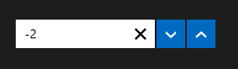
You will get RadNumericBox configured with default values as following,
You can work with RadNumericBox from JavaScript as well.
Here agebox is id of span.
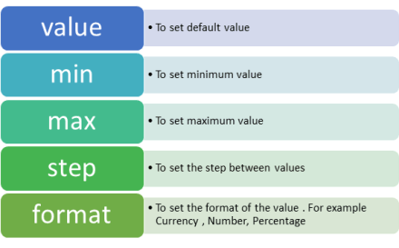
You can set different options for RadNumericBox. Some of those options are as following,
Options can be set as following,
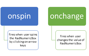
Now when you run the application, you should get RadNumericBox configured with default value 40, minimum value 0, maximum value 255 and step as 10. While working with RadNumericBox there are two important events,
In code behind you can attach event to RadNumericBox as following,
if (args.detail.kind === activation.ActivationKind.launch) {
if (args.detail.previousExecutionState !== activation.ApplicationExecutionState.terminated) {
// TODO: This application has been newly launched. Initialize
// your application here.
} else {
// TODO: This application has been reactivated from suspension.
// Restore application state here.
}
args.setPromise(WinJS.UI.processAll());
var nbage = document.getElementById("agebox").winControl;
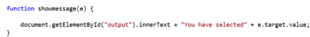
nbage.addEventListener("spin", showmessage);
nbage.addEventListener("change", function (e) {
document.getElementById("output").innerText = "You have selected" + nbage.value;
});
}
};
function showmessage(e) {
document.getElementById("output").innerText = "You have selected" + e.target.value;
}
I hope you find this post useful. Thanks for reading.
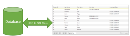
In this post we will take a look on working with RadGrid and LINQ to SQL Class. We will display data in RadGrid using LINQ to SQL Class from SQL Server database.
Very first let us create DataSource to be used with RadGrid. We will use LINQ to SQL class to create data model here. To create data model using LINQ to SQL class right click on the project and select Add then New Item. From Data tab, choose LINQ to SQL Classes
If you want you can change name of the LINQ to SQL class, however I am leaving default name and clicking on the Add button. Choose Server Explorer on the design surface to create data classes.
In Server Explorer right click on the Data Connection and Add Connection. In Add Connection dialog box provide database server name and choose the database to create data model. Click on Ok to add a new Data Connection in Server Explorer.
On successfully adding of data connection , you can see that in server explorer
Next drag and drop Tables, Views , Stored Procedures and Functions from Server Explorer on dbml design surface to make a part of data model. In this case , I am going ahead with only one table Person. Now you can see that Person is added on dbml file.
As of now we have added the data model in the project. Now let us go ahead and add a RadGrid on the page. To add RadGrid on the page drag and drop it from Toolbox on the page. If you don’t find RadControls in toolbox then right click on the General tab in tool box and select Add Tab
Give name of the tab . Right click on newly created tab and selecte Choose Items. Then browse to
C:\Program Files (x86)\Telerik\RadControls for ASP.NET AJAX Q1 2012 SP1\Bin40
and choose Telerik.Web.UI.dll and after selecting dll click on Ok button to add the controls in toolbox.
In toolbox you can see that RadControls are successfully added.
Next from the Telerik AJAX Data Component tab , drag and drop RadGrid on the page.
As of now we have added RadGrid on the page . Next we need to create data source from the data model and bind to the RadGrid. Below is the function returning List of Person.
In function we are creating instance of DataContext class and returning list of person on that. Now we need to bind data returning from this function to RadGrid. We can do that as following
using System;
using System.Collections.Generic;
using System.Linq;
using System.Web.UI;

namespace GridSample
{
public partial class _Default : Page
{
protected void Page_Load(object sender, EventArgs e)
{
RadGrid1.AllowPaging = true;
RadGrid1.NeedDataSource += RadGrid1_NeedDataSource;


}

void RadGrid1_NeedDataSource(object sender, Telerik.Web.UI.GridNeedDataSourceEventArgs e)
{
RadGrid1.DataSource = GetStudents();
}


private List<Person> GetStudents()
{
DataClasses1DataContext context = new DataClasses1DataContext();
// return context.Persons.SortBy("FirstName").ToList();
return context.Persons.ToList();
}
}
}
Now when you press F5 to run the application , you should get data in RadGrid using LINQ to SQL class.
In this way you can pull data from database using LINQ to SQL class and bind to a RadGrid. I hope you find this post useful. Thanks for reading.
In this post we will take a look at how a report designed in Standalone End User Report Designer, can be rendered from your applications – be it WPF, WinForms, SilverLight or ASP.NET. One of the customer I was working with had this requirement of end users to design the report and that report should be rendered within the application. The end users who design the report will have the flexibility to upload the designed report to the application. The application had to render the uploaded report in a reporting module. So we will see how to achieve this. If this requirement has excited you, then read through rest of this post.
Pre Requisites:
In order to design reports using the standalone end user report designer, you will need to first download the Telerik Reporting solution. This is available as a free 30 day trial download. Here is the download link:
in order to mimic the scenario of End User connecting to a staging DB and designing the report on their desktop – I will be making use of 2 Databases. So you will need a RDBMS product of your choice. In my example I will be using SQL Server 2012.
Creating Staging and Production DB:
For the sake of the demo, I will create 2 database and name them as StagingDB and ProductionDB respectively. The database will have only one table named Contacts. It will have 2 columns an Id and Name. Here is the code snippet for the table:
This file contains hidden or bidirectional Unicode text that may be interpreted or compiled differently than what appears below. To review, open the file in an editor that reveals hidden Unicode characters.
Learn more about bidirectional Unicode characters
So at his time, if you are following along, you should have created 2 databases – StagingDB and ProductionDB and in both the DB you should have 1 table named Contacts. In staging DB contacts table I will fill some dummy data and it looks like below:
Similarly in the Contacts table of production DB, I have inserted the following data:
We will mimic a scenario where in the end users will connect to the StagingDB->Contacts table and design the report using the Standalone Report Designer. After designing it they will upload to the application. And application will connect to production DB and render the report.
Designing the report:
when you install the Telerik Reporting suite, we will also install the Standalone report designer for end users. This is an executable which can be run on any system. It can be in a folder named Report Designer at the root of Telerik Reporting installation folder. When you launch the ReportDesigner,exe, you will see the following interface:
Click on New Report, give a name for the report and select a path to save the report.
Next, we will be presented with a Report Wizard. In the “Choose Data Source” dialog, create a new data source and connect to the Staging DB we have created earlier. In order to connect to our SQL Server database, select SQL Data Source in the data source selection dialog and give it a name.
In the data connection selection page, configure the connection settings to your Staging DB.
Next we configure the command i.e. the select query to fetch the report data. For this demo it’s a simple statement – “Select * from Contacts”. Next you can preview the results of the query
Click on finish to finish the connection settings configuration.
Now you will see that we have set up a data source for the report and following dialog shows the details:
Click next to select the report type. I have select a standard report type
Next we will configure the data layout of the report, In this example, we have only two columns in the table and I will show both the column in the body of the report.
Next select the report layout i.e. is the report a stepped report or outline or left aligned. I have selected Stepped report i.e. items are arranges in columns and they don’t overlap vertically.
Next you can select a report style and finish the wizard.
At this point we have successfully designed a report using the report designer. In order to preview the report, click the Preview button on the Home tab. The report will be executed and shown as below:
As you can see we have connected to our staging db and pulling data from the contacts table.I have named the report as DemoReport and is saved as DemoReport.trdx. The TRDX is a custom file format that Telerik Reporting uses. It stands for Telerik Reporting Definition XML. Next we will see how we can upload this file to a application and render the report inside the application.
Building a WPF client:
In order to mimic a production application, I have built the following WPF app.
Although I have selected WPF app for this demo, it can be anything in real world – ASP.NET Web App, WinForms or SL. Here is the work flow of this app:
An end user uploads the .TRDX report file he designed using the Standalone Report Designer, in the app.
The app saves the file in the application folder.
App will list the uploaded report file in a list box.
When the report is selected in the list box, the report will be rendered in the report viewer.
For the sake of the time, I will not be describing the portion of the app which allows us to browse and select a .TRDX file, Saves the uploaded .TRDX file in one of the application folder and listing of the uploaded report in list box. Those are pretty straight forward code that you will be familiar with. We will pay our attention to how do we render the .TRDX file inside the Report Viewer in the coming sections.
TRDX Report Rendering using URI:
The report viewer has the capability to just take a URI of a .TRDX file and render it. The ReportViewer exposes a property called ReportSource. One of the supported report source is UriReportSource. As the name goes, we are supposed to create an instance of UriReportSource and set the URI to the .TRDX file. Be it a WPF app as the one we are dealing with now or a web scenario – you just need to get the complete URI of the .TRDX file. Here is the code snippet to achieve this:
This file contains hidden or bidirectional Unicode text that may be interpreted or compiled differently than what appears below. To review, open the file in an editor that reveals hidden Unicode characters.
Learn more about bidirectional Unicode characters
In previous section we saw UriReportSource as the report source for the report viewer. The report viewer also supports XML as a report source. We can pretty much give a XML literal string which confronts to Teelrik Reporting Definition XML schema and the report viewer will be able to parse and render the same. The .TRDX report file is nothing but a XML in itself. Here is the content of the DemoReport we designed in its XML form:
This file contains hidden or bidirectional Unicode text that may be interpreted or compiled differently than what appears below. To review, open the file in an editor that reveals hidden Unicode characters.
Learn more about bidirectional Unicode characters
Here is the code snippet to prepare the XmlReportSource and bind that to ReportViewer ReportSource.
This file contains hidden or bidirectional Unicode text that may be interpreted or compiled differently than what appears below. To review, open the file in an editor that reveals hidden Unicode characters.
Learn more about bidirectional Unicode characters
Well, if you followed the post so far, you will probably be getting this question for sure. Well remember that when we designed the report using Standalone Report Designer we did set up a data source and a connection string. But that points to our staging database. Meaning the schema of the staging db and the production db are the same but they will be two different environments when it comes to reality. You will never allow somebody to work with a production environment for design. Instead you will allow people to play around in the staging or local setup and finally deploy the code to production. So when we rendered the report using the URI Report Source or XML Report Source – the report does contain the data source object embed within the report and will use that when executing in the production. Remember that the connection string set up during design points to our staging or local setup. So when the report is rendered in the production, report viewer will search for the connection string name given during the design. It may be there or may not be there – whatever it is, this is not ideal scenario to support. So how can we overcome this. In the next section, we will see what is the solution for this.
Report Xml Serializer:
when we looked at XmlReportSource, we understood the .TRDX file is nothing but a XML content. It is nothing but the report definition. The Telerik Reporting solution comes with a ready made XmlSerializer which can read this XML definition and gives us an instance of Telerik.Reporting.Report – an object representation of the Report we designed. The Report class exposes the Data Source we set up and the Connection String on that data source. So the solution to render a .TRDX file in production environment will be as follows:
Read the content of the .TRDX file as XML string
Use ReportXmlSerializer to serialize the XML to Report object
On the report object, get the SqlDataSource and change the connection string of the data source to match your production. You can either provide the complete connection string itself or the name of the connection string element from your configuration file.
Here is the code snippet on how to use the Report Xml Serializer:
This file contains hidden or bidirectional Unicode text that may be interpreted or compiled differently than what appears below. To review, open the file in an editor that reveals hidden Unicode characters.
Learn more about bidirectional Unicode characters
Standalone Report Designer is a great tool for end users who just create reports and are not technical people. Telerik Reporting Solution has provisions to use the designed report i.e. .TRDX file and render that inside the report viewer. Since it supports both URI Report Source and XML Report Source, you can decide the way you want to store the report i.e. either store it as a physical file in your app in a separate folder or store the content of the .TRDX file in a database column. In both the cases you will be able to use the Report XML Serializer to serialize the XML as a Report instance, update the connection string to match your production and set it to the report viewer.
With Telerik Reporting Solution, you now have the power in your apps to let the end user design adhoc reports, upload it in your app and render the same in a report viewer. Hope this post gave you some insights into Telerik Reporting capabilities.
Once you have done with downloading and installing Rad Control for Windows 8, create a new JavaScript based Windows Store project
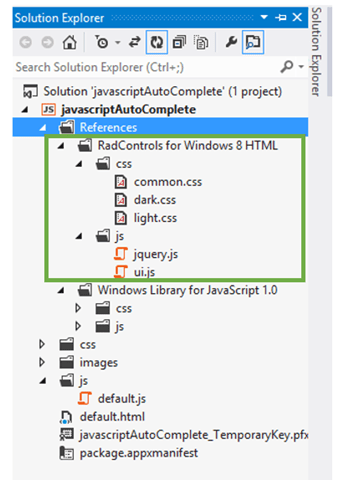
Right click on the reference in solution explorer and add a new reference. Choose Windows Library for JavaScript and add to the project.
After adding references, verify in solution explorer that you have successfully added the references
Once references are successfully added in the project, you need to add references of Rad Control JS files and CSS files on the HTML page. You can refer them as following listing,
Now you are all set to use RadControls for Windows 8 in your application. To test that whether we have added all the references correctly or not ,let us put a RadSlider control on HTML
Now when you run the application you should get a RadSlider control on the page successfully.
In this way you can get it started with Rad Controls for Windows 8 in JavaScript based application for Windows Store. I hope you find this post useful. Thanks for reading.
On Oct 17 2012, we did a release of our Telerik DevCraft bundle known as Q3 2012 release. As part of the release our UI suites have got couple of new controls added to the bundle. In this blog post we will look at what new controls have been added to our UI suites namely – RadControls for ASP.NET AJAX, RadControls for Silverlight, RadControls for WPF, RadControls for WinForms, Windows 8 Controls and RadControls for Windows Phone. So lets go over them one by one.
RadControls for ASP.NET AJAX:
ASP.NET AJAX suite gets the following new controls added to the family of already existing 70+ controls. They are:
Gauge:
This is a high performing HTML5 based radial and linear gauge control which can be used to show certain values in a scale.
PivotGrid is a control used to show pivoted data in a tabular or outline or in a compact layout. We bring the power of Pivot to Web with the introduction of this control. This control supports aggregates, drag and drop and a field list control panel.
As the name goes – this is a auto completion textbox. It auto suggests filtered list with options based on user input and supports multiple item selection. This was one of the highly requested control for ASP.NET AJAX
GanttView is a control designed for managing and visualizing complex planning data and tasks. Often used in project planning and management scenarios. Using this control it is easier to understand and analyze the data.
Download free trial of RadControls for Silverlight and evaluate them for your needs.
RadControls for WPF:
New controls introduced for WPF suite are as follows:
PivotGrid (Beta):
GanttView:
AutoCompleteBox:
HeatMap:
Download free trial of RadControls for WPF and evaluate them for your projects.
RadControls for WinForms:
There was one control added to the WinForms family. That is RadPivitGrid and released as a Beta control in this release.
You can download thirty day free trial of RadControls for WinForms with dedicated support during trial period.
RadControls for Windows Phone:
Five new controls got added to the Windows Phone controls family. They are as follows:
TimeSpanPicker:
TimeSpanPicker control provides full control over time and duration in any app where users set duration. This control allows users to define duration of certain action.
Expander:
Expander control allows users to expand or collapse conversations. Fits well in applications that rely on interaction and messaging.
PasswordBox:
As the name goes this is a ready made password input text box for Windows Phone scenario. Using this control in a registration form will automatically display the typical dots in place of the actual password being typed.
DataForm:
DataForm control provides with out of the box data forms that can be simply configured to work with business logic of your application. It also provides out of the box validation, styling and other customization mechanisms.
InputPrompt:
This control allows you to create prompts where you can ask users to enter important details such as Phone number, email, etc.
You can download a free trial of RadControls for Windows Phone to evaluate the controls.
RadControls for Windows 8:
This is a brand new suite as far as the RadControls family is concerned. This suite contains some of the controls which are not found in the SDK of Windows 8 development like date and time pickers. These controls have been built from ground up and provide you with the same UI and UX as that of Windows 8 look and feel. Currently following 15+ controls are released and many more will be added to the suite over time. At this moment we are offering this suite at an introductory price of $99 and you will receive all the new components and updates that will be added to the suite in the next year.
Hope this blog post excites you in terms of the new control offerings from our UI control suites. If you feel like trying out them go ahead and download our free 20 day trials and evaluate them. Note that during the trial period you will get dedicated support meaning you can raise support tickets and a dedicated support team will be responding to you. Give it a try and let us know how you feel about our UI controls.
You can download Demo Applications exploring the controls from here
After downloading, follow the Telerik Installer Wizard.
Make sure that Windows8 is selected. Click on OK.LET’S DO THIS. Configure installation folder , accept license terms and click on Go to Next Step
Provide credential and click on Install to start the installation.
After successful installation, you will get following message
By this step, you have successfully installed Rad Controls for Windows 8. Now go ahead and launch Visual Studio and create an Application for Windows Store. Let us choose Blank Application from the XAML Windows Store template.
Once the project is created in Solution Explorer right click on the Reference and select Add Reference
In the dialog box make sure that you have selected Extension and select Rad Controls for Windows 8.
After adding rerefence in solution explorer verify that refence of Rad Controls has been added successfully.
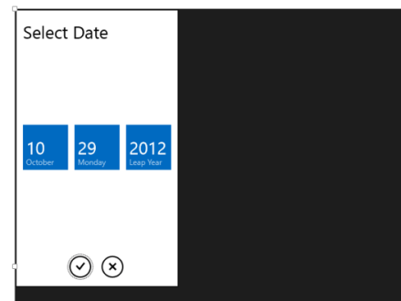
By this step you have succesfully created the project and added the required refrence. Now you are all set to use Rad Controls for Windows 8 in your application. Let us go ahead and add RadDatePicker control on the MainePage.xaml. Before using any Rad Control , you need to add namespace. Add namespace as following
After adding namespace put RadDatePicker control as following
Now press F5 and run the application. You should able to get RadDatePicker control
In this way you can start working with Rad Controls for Windows 8. In further posts we will explore each controls individually. I hope you find this post useful. Thanks for reading.
In this post we will try to see how to work with a RadHtmlChart. We will go step by step in creating and using the RadHtmlChart in a web page. I will try to outline each piece that make up an RadHtmlChart and how to work with them. So if you are in need of using a RadHtmlChart in your pages, read through the following sections and follow along.
Pre-Requisite:
In order to follow along this blog post, you will need to have downloaded the RadControls for ASP.NET AJAX suite and installed it on your development machine/laptop. Here is the download link to RadControls for ASP.NET AJAX Suite:
Create a Web Site Project:
First and foremost thing to do is to create a Web Site which will be our playground for this blog post. Once you install the RadControls for ASP.NET AJAX you will see Telerik project templates in Visual Studio New Project dialog. For this blog post I will be creating a “C# RadControls Web Site” project. Give it a name and keep the default settings in all of the dialog that comes up.
Adding RadHtmlChart to a page:
The RadControls Web Site project template when finishes the web site creation, will create a single web page namely Default.aspx. For the sake of simplicity I will just use this page to create the chart. There are two ways to add the chart on to the web page. First, you can drag it from the Toolbox on to the source. Secondly you can just type the tag on the source.
So I am going to type out the tag name and create the chart. Here is the code to instantiate the RadHtmlChart on a web page:
We can instantiate the RadHtmlChart from the telerik namespace. If you look at the web.config the telerik tagprefix is configured to be available on all the pages. Here is the code snippet:
So if you now view the web page, you will see the following output:
As you can see from the output, we get the a base for the chart. Now that we have a base, we will build up the chart one by one.
Chart Appearance:
Now that we have a chart coming up, lets give some facelift to the chart. We can control the appearance of the chart i.e. we can provide a background color to the chart. The RadHtmlChart provides Appearance property through which we can set the background color. The Appearance contains FillStyle property which exposes BackgroundColor attribute and we set the color to this attribute. Here is the code snippet:
I have set LightGray as the background color of the chart. If we now run the application and check the output, you will see the chart as below:
Chart Title:
Next thing to do is to set the chart title. For setting the title, chart exposes ChartTitle property. ChartTitle contains a text Property and you can provide the text you want to see on the chart. The appearance of the chart title can be configured through Appearance property of the chart title. Here is the code snippet:
<ChartTitle Text="Server CPU Load By Days">
    <Appearance Align="Center" BackgroundColor="White" Position="Top" />
</ChartTitle>
Here is the snapshot of the chart after setting the title:
As you can see we have set the text and appearance of the title. Next we will take care of the legend.
Legend Appearance Settings:
Legend is nothing but a way to let the end user know what series belong to what context. So the way to style a legend is through Appearance property of Legend object. The appearance allows us to set the background color and position of the legend. Here is the code snippet for the same:
After adding the legend tag we cant see its effect immediately on the chart. That is because this comes into effect only when we provide the Y Axis items i.e. the main data points of the chart.
Plotarea Settings:
The plot area as the name goes is the area where the chart actually gets plotted. So We have the following options to play with respect to the play area:
Plotarea Appearance Settings
Plotarea X Axis Settings
Plotarea Y Axis Settings
Plotarea Series Settings
Lets look at the above points one by one.
Plotarea Appearance Settings:
The appearance of the plot area can be changed with Appearance property. Appearance property supports FillStyle child property where we can set the background color of the plot area. Here is the code snippet for the same:
So far we have just prepared the chart area and the plot area. We haven’t yet defined any axis related information on the chart. The X Axis settings are set as a child element of Plotarea object. Let me show you the code snippet of the same and explain the different attributes that make up the X Axis setting. Here is the code snippet:
On the XAxis we can first set the Color of the X Axis line. I have set it to Black; this can be of any color. Then MajorTickType is the type of the ticks that mark the major grid lines and values can be None of Outside. Similarly MinorTickType is the type of the ticks that mark the minor grid lines and this can be either None or Outside. Reversed is a setting which is used to determine if the axis will be reversed i.e. low value in place of high value and vice versa. I have set it to false. Next I have given the items that make up the x axis. The Items collection takes a AxisItem object which conatins an attribute named Labeltext. So in my example I am setting the x axis to week day names.
Also notice that we have ability to configure the LabelsAppearance i.e. the x axis labels appearance. You can format the label text and also rotate the label using the RotationAngle attribute. The MajorGridLines allows us to configure the color and width of the major grid line and similarly the MinorGridLines property. We can also provide a title to the x axis and is done so by setting the TitleAppearance property. You can position the title through Position attribute or rotate the title using the RotationAngle and also the title text through Text attribute. In my example I have given the text as Days. Here is the output of the above code configuration:
Plotarea Y Axis Settings:
Similar to X axis setting the Y axis also can be configured and pretty much the same attribute structure is used. Here is the Y Axis setting I have done for my example. Take a look at the code snippet and I will explain the code in a moment:
First, the Y axis setting is done on YAxis object of the RadHtmlChart. Pretty similar to X axis, we have the Color attribute of the Y axis line which can be configured. Then we set the MajorTickSize and MajorTickType. Similarly the MinorTickSize and MinorTickType is also set. The Min and Max value to be represented on the the Y Axis is set. We also can tell the increments in which the ticks have to be drawn through the Step attribute.
We can configure the Y axis labels through LabelsAppearance property. The MajorGridLines and MinorGridLines properties let us configure the color and width of the grid lines. The title of the Y axis is set through TitleAppearance property. Here is the output of the chart with the settings done so far:
Plotarea Series Settings:
So far we have set up the X & Y axis and configured them with respect to the axis title, major and minor grid lines. The main heart of the chart is the Series collection that Plotarea contains. Series collection is the property on which we define what kind of chart series we would like to plot. It can be a BarSeries or ColumnSeries or LineSeries etc etc. In this example I will be considering a simple example of Bar chart so we will see how to define a BarSeries.
We will need to add BarSeries object to Series collection. The BarSeries can be given a name using attribute Name. Then the actual values of the data points can be added to Items collection of BarSeries. The type of item to add is SeriesItem and it contains a attribute named YValue which needs to be filled with the data value. This is the data point which will be plotted on the chart. We can customize the labels and the tool tip of the bar series. Here is the code snippet for the same:
with the above code here is how our chart looks like now:
Notice that the axis have been shifted automatically because the series we said to plot was a BarSeries and Bar is always plotted as a horizontal line. Also notice the appearance of the legend at the bottom. This is because as soon as we provided a series with a name, the name of the series becomes the legend text.
What if I want to add another series to the chart. Simple, just add another BarSeries to the Series collection and the chart will pick up the second series and plot it along with the first one. Here is the snapshot of the same chart after I added another series:
One of the cool features of RadHtmlChart is the fact that it will render the chart as a SVG on modern browsers and as a VML on older browser. So here is a screenshot of the same chart zoomed in at around 200%. Check out the clarity of the various chart details:
Here is the entire source code of the RadHtmlChart we have done so far:
This file contains hidden or bidirectional Unicode text that may be interpreted or compiled differently than what appears below. To review, open the file in an editor that reveals hidden Unicode characters.
Learn more about bidirectional Unicode characters
In this blog post I attempted to construct a RadHtmlChart piece by piece and show how easy it is to configure different aspects of the RadHtmlChart control. Things to take care are the Chart Appearance, Chart Title, Legend and Plotarea. Hope this gives you all a jump start in to working with the RadHtmlChart.
Note:
It is not necessary to hand code all of the above mentioned configuration settings. RadHtmlChart control has a rich visual designer support. Using that with couple of clicks you can easily set all the above talked configuration settings on a GUI. I will be writing a separate blog post on this.
The appearance of the chart and other aspects of the chart need not be set explicitly by choosing color which configuring rather RadHtmlChart ships with default 19 skins and you can just set the skin on the RadHtmlChart and that will take care of the color aspect in the chart. I will be covering this in a separate blog post.
The items for the series need not be hard coded as shown in this blog post. This was just an attempt to show that how things work. The RadHtmlChart supports 9 types of data sources and the chart can be bound to any of those data source. That way the items of the Y Axis will be bound at run time from the data source. I will be covering this in a future blog post
In previous blog post, we looked at the element structure that makes up a RadHtmlChart. Now that was more from a client side i.e. a visual structure of what makes the chart. In this blog post we will take a look at what makes up the RadHtmlChart API i.e. the server side hierarchy.
Server Side API:
Pretty much all the Telerik RadControls enable you to customize them according to your needs & wants and so does RadHtmlChart. RadHtmlChart allows you to perform detailed customizations when you use it. Being a Service Side control, it offers a large set of properties. A deep hierarchy exist among these properties and it is this hierarchy that makes it possible to organize the control.
Visual Hierarchy:
Below diagram depicts the visual hierarchy of properties that RadHtmlChart control supports. You can keep this diagram handy and keep it as a reference when you want to set a particular property in the markup.
When you want to customize something in the RadHtmlChart you should pay attention to the inner most tags and their properties. For e.g. in order to customize the Appearance of a RadHtmlChart – You will be customizing the Appearance property and specifically the FillStyle child property that Appearance contains.
Conclusion:
Knowing a controls hierarchy visually helps us to understand how it is organized. And also it becomes easy when we want to customize the control according to our needs and wants. Through this blog post I hope I was able to make you understand the RadHtmlChart control hierarchy.


![clip_image002[5]](https://telerikhelper.net/wp-content/uploads/2013/03/clip_image0025.png "clip_image002[5]")


 Helping Ninja Technologists