Kendo ColorPicker Wrapper for ASP.NET MVC

Overview:

This is the eight post in the series on Kendo UI wrappers for ASP.NET MVC. We will look at one more wrapper in this post namely Color Picker. This post is part of a getting started with Kendo UI wrappers for ASP.NET MVC and you can find the index post here.

What is ColorPicker Wrapper?

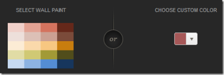
The ColorPicker is a drop-down widget for selecting colors. It’s designed to replace a HTML5 <input type="color"> field, which is not yet widely supported in browsers. ColorPicker widget provides a user-friendly interface for picking colors.

image

Fig 1: ColorPicker Widget

ColorPicker wrapper is just a kendo helper for ASP.NET MVC.

Basic Usage:

In order to use the ColorPicker widget on any page, we will use the ColorPicker wrapper or helper available as part of the kendo wrappers. Following is the code to create a color picker on any page. Note that Name() is a mandatory setting for the color picker. Without setting the name we will get an exception which will tell that name is not set.

@(
Html.Kendo().ColorPicker()
.Name("picker")
)

Here is the output of the above code:

image

Fig 2: Color Picker Basic Usage

Color Palette:

We can customize the color palette that is displayed in the color picker drop down. The wrapper provides Palette() configuration method which accepts the palette. There 2 ways of providing the palette. They are:

1. ColorPickerPalette Enumeration:

We can pass enum called ColorPickerPalette to Palette() method of the widget. The enum supports Basic, None and WebSafe palette. Here is the code for setting the palette:

@(
Html.Kendo().ColorPicker()
.Name("kPickerBasic")
.Palette(ColorPickerPalette.Basic)
)

Here is the output of setting palette to Basic, WebSafe and None:

image

Fig 3: Basic Color Palette

image

Fig 4: Web Safe Palette

image

Fig 5: No Palette

2. Provide Palette as Array

We can pass a string array to Palette() method which should contain the hex codes of the colors we want to show in the palette. Here is the code to do this:

@(
Html.Kendo().ColorPicker()
.Name("kPickerBasic")
.Palette(new string[] {
"#f0d0c9", "#e2a293", "#d4735e", "#65281a",
"#eddfda", "#dcc0b6", "#cba092", "#7b4b3a",
"#fcecd5", "#f9d9ab", "#f6c781", "#c87d0e",
"#e1dca5", "#d0c974", "#a29a36", "#514d1b",
"#c6d9f0", "#8db3e2", "#548dd4", "#17365d"
})
)

And here is the output of the code changes:

image

Fig 6: Custom Palette

Custom Color Tile Size:

So far we have seen how the color picker works and what palettes it supports. One thing to notice in palettes is the size of the individual color tiles. It looks small. What if we wanted a bigger tile? The wrapper supports a TileSize() configuration method which takes in an integer. Here is a code set the tile sizes of the color palette:

@(
Html.Kendo().ColorPalette()
.Name("color-chooser")
.Palette(new string[] { "#ddd1c3", "#d2d2d2",
"#746153", "#3a4c8b",
"#ffcc33", "#fb455f",
"#ac120f" })
.Value("#ffcc33")
.TileSize(30)
)

Here is the output of above code changes:

image

Fig 7: Custom Color Tile Size

Accessing control on client:

So far we have seen how to instantiate a control with the helpers. And since the Kendo controls are all client side, lets take a look at how to get the control using JavaScript code. Kendo controls are HTML5 compliant so we make use of HTML5 attributes like “data-“ and construct our controls. You can use the jquery data() method to get to an already instantiated control. Here is the code snippet for the same:

<p>
@(Html.Kendo().ColorPalette()
.Name("color-chooser")
.Palette(new string[] { "#ddd1c3", "#d2d2d2",
"#746153", "#3a4c8b",
"#ffcc33", "#fb455f",
"#ac120f" })
.Value("#ffcc33")
.TileSize(30)
)
</p>
<script>
$(document).ready(function () {
var colorPicker = $("#color-chooser").data("kendoColorPalette");
var selectedColor = colorPicker.value();
});
</script>

Accessing & Setting Value from client side:

All kendo controls have rich client side API support. One of the api method is value() which lets you read the selected value and also set new value of the color picker. Here is the code:

<p>
@(Html.Kendo().ColorPalette()
.Name("color-chooser")
.Palette(new string[] { "#ddd1c3", "#d2d2d2",
"#746153", "#3a4c8b",
"#ffcc33", "#fb455f",
"#ac120f" })
.TileSize(30)
)
</p>
<script>
$(document).ready(function () {
var colorPicker = $("#color-chooser").data("kendoColorPalette");
colorPicker.value("#ffcc33");
var selectedColor = colorPicker.value();
});
</script>

In the above code – we just created the color picker using the server side helpers. On client side, after document has loaded, we grab the control, use the value() method to set a new value. And then use the same method to read back the selected value.

Handling Events:

Color Picker supports four events which can be handled on the client side. They are:

  • change: Fires when a color was selected
  • select: Fires when a new color is displayed in the drop-down picker
  • open: Fires when the picker popup is opening
  • close: Fire when the picker popup is closing

Here is the code wire up the events and JavaScript code for the handlers:

<p>
@(Html.Kendo().ColorPicker()
.Name("palette-picker")
.Value("#cc2222")
.Palette(ColorPickerPalette.Basic)
.Events(events => events
.Select("pickerSelect")
.Change("pickerChange")
.Open("pickerOpen")
.Close("pickerClose")
)
)
</p>
<script>
function pickerSelect(e) {
var selectedValue = e.value;
}
function pickerChange(e) {
var selectedValue = e.value;
}
function pickerOpen(e) {
//custom code
}
function pickerClose(e) {
//custom code
}
</script>

Summary:

Through this post we looked at yet another kendo wrapper for MVC namely Color Picker. Using color picker is as easy as settings some configuration methods and the rest is done by the helper for you. Hope this excites you to test out Kendo UI in your projects.

Till next time, Happy Coding.

How to set Column Header Style of RadDataGrid in XAML based Windows Store Application

Learn more about Rad Controls for Windows 8 here

RadDataGrid is most important RadControl to create enterprise based Windows Store Application. Currently I have been writing on RadDataGrid and you can read previous two posts at below link,

Part 1: Three Steps to work with RadDataGrid in XAML based Windows Store Application

Part 2: Working with Columns width in RadDataGrid in XAML based Windows Store Application

In this post we will take a look on setting Column Header Style. You can set column header style by configuring value of

image

To start with first you need to add following references on XAML.


xmlns:telerik="using:Telerik.UI.Xaml.Controls.Grid"
xmlns:telerikgridrimitives="using:Telerik.UI.Xaml.Controls.Grid.Primitives"

After adding reference Create RadDataGrid as following. Make sure AutoGenerateColumns property is set to false


<telerik:RadDataGrid
 x:Name="ProductGrid"
 AutoGenerateColumns="False"
 Width="500">
</telerik:RadDataGrid>

After this you need to manually create columns. Create RadDataGrid.Columns inside RadDataGrid.

image

After creating RadaDataGrid.Columns you need to create RadDataGrid.Columns. In columns you can set

  1. Header : Set value of header text
  2. Width : Fixed width of the column
  3. PropertyName : Set this as property name of business object you want to display in this column.

image

In DataGridTextColumn you need to set HeaderStyle. That can be done as following. In below code we are setting

  1. Header Background
  2. Header Fontstyle
  3. Header Fontsize

image

So putting all together you can create RadDataGrid with customized column header as following


<telerik:RadDataGrid
 x:Name="ProductGrid"
 AutoGenerateColumns="False"
 Width="500">
 <telerik:RadDataGrid.Columns>

<telerik:DataGridTextColumn
 PropertyName="ProductName"
 Header="Name"
 Width="200">
 <telerik:DataGridTextColumn.HeaderStyle>
 <Style
 TargetType="telerikgridrimitives:DataGridColumnHeader">
 <Setter Property="Background" Value="SaddleBrown"/>
 <Setter Property="FontStyle" Value="Italic"/>
 <Setter Property="FontSize" Value="20"/>
 </Style>
 </telerik:DataGridTextColumn.HeaderStyle>
 </telerik:DataGridTextColumn>

 <telerik:DataGridTextColumn

 PropertyName="ProductPrice"
 Header="Price"
 Width="50"/>
 <telerik:DataGridTextColumn
 PropertyName="ProductType"
 Header="Type"
 Width="150"/>
 <telerik:DataGridTextColumn
 PropertyName="InStock"
 Header="In Stock"
 Width="100">
 <telerik:DataGridTextColumn.HeaderStyle>
 <Style
 TargetType="telerikgridrimitives:DataGridColumnHeader">
 <Setter Property="Background" Value="Blue"/>
 <Setter Property="FontStyle" Value="Oblique"/>
 <Setter Property="FontSize" Value="20"/>
 </Style>
 </telerik:DataGridTextColumn.HeaderStyle>
 </telerik:DataGridTextColumn>

</telerik:RadDataGrid.Columns>
 </telerik:RadDataGrid>

On running application you will get RadDataGrid with styled column header as following

image

In this post we used some of the discussion from last post so did not discuss about binding and Product class in earlier part of this post. However For your reference find definition of business class Product below


public class Product
 {

 public string ProductName { get; set; }
 public double ProductPrice { get; set; }
 public string ProductType { get; set; }
 public bool InStock { get; set; }
 }

ItemSource of RadDataGrid is set as below,


protected override void OnNavigatedTo(NavigationEventArgs e)
 {

this.ProductGrid.ItemsSource = GetProducts();
 }

GetProducts() class is defined as below,


private List<Product> GetProducts()
 {
 List<Product> lstProduct = new List<Product>
 {
 new Product
 {
 ProductName ="Pen",
 ProductPrice = 100,
 ProductType = "Education",
 InStock = true
 },
 new Product
 {
 ProductName ="Pencil",
 ProductPrice = 50,
 ProductType = "Education",
 InStock = false
 },
 new Product
 {
 ProductName ="Math Book",
 ProductPrice = 345,
 ProductType = "Education",
 InStock = true
 },
 new Product
 {
 ProductName ="Ball",
 ProductPrice = 23,
 ProductType = "Sports",
 InStock = true
 },
 new Product
 {
 ProductName ="Cricket Bat",
 ProductPrice = 560,
 ProductType = "Sports",
 InStock = true
 },
 new Product
 {
 ProductName ="Baseball Bat",
 ProductPrice = 550,
 ProductType = "Sports",
 InStock = false
 },
 };

return lstProduct;
 }

In this way you can work with column header style. I hope you find this post useful. Thanks for reading.

Learn more about Rad Controls for Windows 8 here

Working with Columns width in RadDataGrid in XAML based Windows Store Application

Learn more about Rad Controls for Windows 8 here

In last blog post we learnt to work with RadDataGrid in three simple steps. In this post let us have a look on how we could work with Columns in RadDataGrid. Before we move ahead and understand how to work with columns width and columns header, let us have some understanding on columns in RadDataGrid. There are two kinds of columns in RadDataGrid.

image

TextColumn renders each cell value as System.String object whereas TemplateColumn renders as DataTemplate. In this post we will focus our discussion on TextColumn. It inherits DataGridColumn.

It got following important properties

  1. Header
  2. HeaderStyle
  3. SizeMode
  4. Width
  5. SortDirection

image

We will use Product business object from LAST POST . You will notice in output of last post that RadDataGrid columns were taking default width. Width of column was stretched to maximum. We got output as following

image

Now if you want to set width of each columns you need to follow following steps

Make sure AutoGenerateColumns property is set to false

image

After this you need to manually create columns. In column creation you need to set width of the column. Create RadDataGrid.Columns inside RadDataGrid.

image

After creating RadaDataGrid.Columns you need to create RadDataGrid.Columns. In columns you can set

  1. Header : Set value of header text
  2. Width : Fixed width of the column
  3. PropertyName : Set this as property name of business object you want to display in this column.

image

So putting all together you can create fixed width text column in RadDataGrid as following. We have XAML from previous post. Modified XAML with fixed column width is as following


<Grid Background="{StaticResource ApplicationPageBackgroundThemeBrush}">
 <telerik:RadDataGrid
 x:Name="ProductGrid"
 AutoGenerateColumns="False"
 Width="500">
 <telerik:RadDataGrid.Columns>

<telerik:DataGridTextColumn
 PropertyName="ProductName"
 Header="Name"
 Width="200"/>
 <telerik:DataGridTextColumn
 PropertyName="ProductPrice"
 Header="Price"
 Width="50"/>
 <telerik:DataGridTextColumn
 PropertyName="ProductType"
 Header="Type"
 Width="150"/>
 <telerik:DataGridTextColumn
 PropertyName="InStock"
 Header="In Stock"
 Width="100"/>
 </telerik:RadDataGrid.Columns>
 </telerik:RadDataGrid>
 </Grid>

On running application you will get RadDataGrid with fixed column width as following

image

Other important property of column is SizeMode. This property can be set with following three values

image

  1. Width property takes effect only when SizeMode is set to Fixed.
  2. If SizeMode is set to Auto then column takes only width which is required. It overrides value of width.
  3. If SizeMode is set to Strech then column will override width value and stretch to all available space.

image

If you modify above RadDataGrid with setting SizeMode property of fourth column as Auto then RadDataGrid will render as following

image

In this post we used some of the discussion from last post so did not discuss about binding and Product class in earlier part of this post. However For your reference find definition of business class Product below


public class Product
 {

 public string ProductName { get; set; }
 public double ProductPrice { get; set; }
 public string ProductType { get; set; }
 public bool InStock { get; set; }
 }

ItemSource of RadDataGrid is set as below,


protected override void OnNavigatedTo(NavigationEventArgs e)
 {

this.ProductGrid.ItemsSource = GetProducts();
 }

GetProducts() class is defined as below,

private List<Product> GetProducts()
 {
 List<Product> lstProduct = new List<Product>
 {
 new Product
 {
 ProductName ="Pen",
 ProductPrice = 100,
 ProductType = "Education",
 InStock = true
 },
 new Product
 {
 ProductName ="Pencil",
 ProductPrice = 50,
 ProductType = "Education",
 InStock = false
 },
 new Product
 {
 ProductName ="Math Book",
 ProductPrice = 345,
 ProductType = "Education",
 InStock = true
 },
 new Product
 {
 ProductName ="Ball",
 ProductPrice = 23,
 ProductType = "Sports",
 InStock = true
 },
 new Product
 {
 ProductName ="Cricket Bat",
 ProductPrice = 560,
 ProductType = "Sports",
 InStock = true
 },
 new Product
 {
 ProductName ="Baseball Bat",
 ProductPrice = 550,
 ProductType = "Sports",
 InStock = false
 },
 };

return lstProduct;
 }

In this way you can work with column width. I hope you find this post useful. Thanks for reading.

Learn more about Rad Controls for Windows 8 here

Three Steps to work with RadDataGrid in XAML based Windows Store Application

Recently I was talking to Windows Store App Developers. When I show them demo of RadDataGrid , all they got very excited. One of the manager asked me to show working with RadDataGrid in simplest steps. In this post we will take a look on working with RadDataGrid in three simple steps.

Learn more about Rad Controls for Windows 8 here

Step 1: Add Rad Controls for Windows 8 reference

Go ahead launch Visual Studio and create a new Windows Store Application. Select Blank App project template to create application. After project being created add Rad Controls for Windows 8 reference in the project. To add reference right click on Reference in project and select Add Reference.

image

After adding reference on XAML add namespace to work with RadDataGrid


xmlns:telerik="using:Telerik.UI.Xaml.Controls.Grid"

Step 2: Create Business object

Next step you need to create business object. Let us create business objects for Product


public class Product
 {

 public string ProductName { get; set; }
 public double ProductPrice { get; set; }
 public string ProductType { get; set; }
 public bool InStock { get; set; }
 }

We will display Products in RadDataGrid. In real time scenario List of Products will be fetched from Services. For purpose of this post let us create List of Products as collection locally.


private List<Product> GetProducts()
 {
 List<Product> lstProduct = new List<Product>
 {
 new Product
 {
 ProductName ="Pen",
 ProductPrice = 100,
 ProductType = "Education",
 InStock = true
 },
 new Product
 {
 ProductName ="Pencil",
 ProductPrice = 50,
 ProductType = "Education",
 InStock = false
 },
 new Product
 {
 ProductName ="Math Book",
 ProductPrice = 345,
 ProductType = "Education",
 InStock = true
 },
 new Product
 {
 ProductName ="Ball",
 ProductPrice = 23,
 ProductType = "Sports",
 InStock = true
 },
 new Product
 {
 ProductName ="Cricket Bat",
 ProductPrice = 560,
 ProductType = "Sports",
 InStock = true
 },
 new Product
 {
 ProductName ="Baseball Bat",
 ProductPrice = 550,
 ProductType = "Sports",
 InStock = false
 },
 };

return lstProduct;
 }

Step 3: Create RadDataGrid and bind with the datasource

In last step you need to put RadDataGrid on XAML and bind it to data source. RadDataGrid can be created as following


<telerik:RadDataGrid x:Name="ProductGrid" />

Next you need to bind RadDataGrid to List of Products. You can do that as following


this.ProductGrid.ItemsSource = GetProducts();

Run Application

On running application you will find RadDataGrid. You will notice that by default RadDataGrid supports sorting on columns

image

In these 3 simple steps you can start working with RadDataGrid in XAML based Windows Store Application. In further posts we will get into deeper concepts of RadDataGrid. I hope you find this post useful. Thanks for reading.

Learn more about Rad Controls for Windows 8 here

Webinar Recap: Easy HTML5 Data Visualization with Kendo UI DataViz

Apr – May 2013 will see a series of webinar from Telerik India pertaining to Data Visualization, Team Pulse, Windows 8, SiteFinity, Windows Phone 8 and Kendo UI. If you are interested in any of these webinars do take a look at the following post: https://telerikhelper.net/2013/03/19/ninja-enough-telerik-india-webcasts-april-may-2013/.

On Apr 11 we delivered a webinar on HTML5 Data Visualization titled – “Easy HTML5 Data Visualization with Kendo UI DataViz”. This post is a recap of the webinar. As part of the webinar we discussed the following things:

  • What is Data Visualization ?
  • Why do we need Data Visualization ?
  • How do we do Data Visualization ?
  • What does HTML5 technology define for Data Visualization ?
  • Introducing Kendo UI DataViz
  • Demo

Here is the slide deck used for the webinar:

Here is the video recording of the webinar:

Easy HTML5 Data Visualization with Kendo UI DataViz from Telerik Helper on Vimeo.

During this webinar we had a lot of questions and I am trying to address them here:

  1. There are couple of free jquery plug-in available on the net. which do all these charts. how Kendo UI different from  them?
    Kendo UI aims at providing unified framework for HTML5 & JavaScript Apps/Sites. Kendo UI is all about HTML5 powered client side javascript frame work. The DataViz package of Kendo UI spits out the Charts/Graphs/Gauges using SVG technology on modern browsers and will render as VML on older browsers. So if you use Kendo UI DataViz to perform your data visualization rest assured that you are HTML5 complaint.
  2. Being a .Net developer why I should use HTML5 and not Silverlight for all this. same can  be achieved with Silverlight as well?
    The decision to use Silverlight or HTML5 will depend on the nature of the project. Silverlight is still a plugin based technology where as HTML5 is trying to standardize the web world with a common structure to be supported by all browsers.
  3. For running Silverlight applications , user has to download the runtime first. Is it the same for Kendo UI code?
    Kendo UI is a pure client side JavaScript framework. Kendo UI relies on Stylesheet and JavaScript. We have only one dependency and that is of Jquery. Apart from this nothing else is needed.
  4. Why we need to choose separate chart product – when asp.net charting can give the charting option?
    The charting option provided by ASP.NET as far as I know if not HTML5 based. Meaning the output of the chart/graph through ASP.NET charting is still Image based and does not use the HTML5 recommended SVG for output. Where as Kendo UI is a HTML5 compliant and outputs the charts/graphs as SVG on modern browsers and as VML on older browsers.
  5. Can we add Kendo UI references into the PHP project?
    Absolutely. Kendo UI is serer agnostic. Meaning it does not care what server side technology has been used. This is because Kendo UI is a client side JavaScript framework. And to use Kendo UI you only reference a couple of style sheets and scripts and you are up and running. For data you will need to make sure that you create JSON end points as Kendo UI works well out of the box with JSON and XML.
  6. Can we change the styles according to us?
    Yes very much. We provide an easy way to custom style all the Kendo UI widgets. We have an online theme builder for web and for mobile controls. For more information check out this page: http://demos.kendoui.com/
  7. Can we use Kendo on Windows 8 metro & mobile apps ?
    Kendo UI consists of 3 packages – Web, DataViz and Mobile. The Web can be used for Web Applications. Mobile controls can be used to develop Cross Platform Hybrid Mobile Apps. So Kendo UI Mobile Controls support Windows Phone. As of now we do not have support for Windows 8.
  8. can we use it for 3D, is there any support for that?
    We do not support 3D charting at the moment.
  9. Will this work on mobile browsers ?
    Since DataViz output SVG as the format for the chart/gauges, it can run on both desktop browsers and mobile browsers.
  10. Does the charts support Drill Down option?
    Drill-down functionality is not supported out of the box yet. However the chart exposes a seriesClick event which can be used instead. You can find a live demo here.
  11. In the demo shown, was usage of valueAxis , categoryAxis, tooltip…. are these syntax to use kendo ui or some sort of data…??
    These are the configuration settings you do on the Kendo UI DataViz objects and at runtime the chart is generated based on these settings.
  12. Can i use Kendo UI in my .net application instead of SSRS charts?
    Absolutely. You just need to make sure you provide an endpoint which can return JSON payload and the Kendo UI DataViz widgets can consume data and plot it.
  13. How do we know Kendo Chart options ? as you are passing some options to it. is there any full fledged docs ?
    The Kendo UI Documentation can be found at http://docs.kendoui.com. We have the API reference, Getting Started, Tutorials at the documentation site.
  14. Does this come with Samples?
    Yes. whether you download the trial or licensed version of Kendo UI – we ship the demo source code with it.
  15. can we populate the data from database and bind this data to kendo charts?
    Kendo UI is server side agnostic and does not care about what is the technology used for server side. Having said that the way Kendo UI works is – it can understand JSON or XML. So as long as data is passed as JSON/XML we don’t care about anything else. So you need to make sure that you create endpoint i.e. services which can return data in JSON or XML format. Kendo Widgets will be able to read data from those services out of the box.

Also, we had promised to attentive members from the audience will get our Telerik Ninja t-shirt. Well here are 2 winners we picked:

  • Ravi Gadag
  • Narendra Bisht

Congratulations to the winners and we will be getting in touch with you soon. Rest of you don’t loose heart. We have 5 more webinars in April and May and in each webinar we will be giving out 2 shirts each.

Hope you liked this webinar and we hope to see you back in our future webinars.

What is Test Oracle

Test oracle determine that whether a test executed as expected or not. Essentially you can say test oracle is a mechanism to determine whether program, software or application got executed as expected for a particular Test Case or not? A test oracle may be either manual or automated.

Let us understand test oracle with an example. You are automating test of File Download Functionality. Downloading of file may take following steps

  • User will click on a Button
  • On click of button Operating System File Download dialog will open
  • User will select download location
  • File download will start

In above test case to verify successful download of file you may want to create a test oracle which will verify size of downloaded file on the file system. Hence in this case,

image

Test Oracle is very specific to a business scenario and probably tool may not able to automate this. Test Oracle can be written as Coded Step.

We can summarize Test Oracle as parameter which verify that whether application passed a test for a particular test case or not.

What is Document Object Model?

While automating a test understating of DOM is very essential. Any tool read DOM to automate test. In this post we will try to understand what DOM is in simplest words. Tool sees whole page you are doing automation testing as DOM and searches, finds elements in DOM.

As of W3C definition: DOM stands for Document Object Model and it is a programming interface to manipulate a well formed HTML or a valid XML document. Here we will discuss DOM in context of HTML.

Technically, browsers create DOM after parsing the HTML. All browsers follow the specification given here to create the DOM. DOM created by Browsers can be accessed and manipulated by programming languages like JavaScript. Essentially, you can say that DOM connects web pages to programming languages.

image

DOM expose everything of the web page as objects to programming languages like JavaScript. Whether it is elements, events, styles etc. all are exposed as objects to JavaScript. Let us consider following HTML,


DOM will expose all the HTML elements as objects. These objects can be manipulated and updated by JavaScript.

image

In other words we can say that DOM is Application Programming Interface (API) which exposes HTML or XML as structured document to programming languages. This structure document can be manipulated by the languages like JavaScript. Above listed HTML can be exposed as following structured document by DOM.

image

DOM see a HTML document as tree. All elements can be seen as nodes of the tree. Attributes and value of elements can be seen as leaf of the tree.

Browsers generates DOM when it parses the HTML. For example, when you browse above HTML in browser it will parse the HTML and create DOM. You can view created DOM by pressing F12 in any mostly used browser.

image

I hope now you have descent understanding of DOM. You need understanding of DOM to automate test. I hope you find this post useful. Thanks for reading.

Why we need Coded Steps

image

Coded steps are the test steps which contain scripts or codes. In coded steps you write codes or scripts. Codes of coded steps will get executed as part of test execution. Coded steps can be very useful to automate testing of a complex unique business requirement which cannot be automated by tool. A good automated test should contain minimal numbers of coded steps.

Why we need coded steps

While automating test there may be many complex scenario which cannot be constructed using tool’s verification builder. In that scenario you may need to write codes to construct complex verification. This code will be executed with overall test as coded step. You may need to write coded steps in following scenario

  • Automating a complex verification which cannot be constructed by tool.
  • Writing Cleanup Steps. For example you may want to clean or delete all the temporary test files before or after executing test. It may be chances that tool might not able automate cleanup task. In this case you may have to write coded step for cleanup task.
  • Setting up Test Environment. You may need to set up test environment before executing test. Setting up environment may contain loading external test data, connecting to a dedicated server, loading user profile etc. It may be chances that tool might not able to set up environment for various testing scenario. In this case you may have to write coded step to set up test environment.
  • There may be complex test scenario like verifying that whether a particular file got downloaded successfully on file system or not. These types of tests are very tough to be automated by a particular tool. In this case you may have to write coded step to verify file size on file system.
  • There may be test scenario in which you need to create test data from multiple data sources. It may be chances that tool might not able to gather or mash up data from various data source. In this case you may have to write coded step to create test data.

Like above there could be many complex test scenarios which cannot be automated by tool. To automate those test scenario you will have to write codes steps.

Hybrid Application Development with students of G L Bajaj Institute of Management and Research

View Photos from Event here

image

I had exciting and overwhelming experience doing Cross Platform App Development workshop using ICENIUM with around 50 bright students of G L Bajaj Institute of Management and Research

image

In 4 hrs. Lab students learnt about

  • Thought Process behind Hybrid Application Development
  • How Hybrid Apps are different from Native Apps
  • When should one create Hybrid Apps or Native Apps
  • Introduction to Icenium
  • Managing certificates in Icenium
  • Creating package for Google Play
  • Working with Mobile layout, Mobile Views, Data etc.

Being a presenter for me it was nice and enchanting time interacting with students. In lab students learnt to create a Hybrid App for IPL.

image

Time was a constraint in the event but students were very interactive and I am sure they had learnt about new genre of mobile development that is Cross Platform Mobile Application Development.

Complex Object and RadAutoCompleteBox in XAML based Windows Store Application

Learn more about Rad Controls for Windows 8 here

In this post we will take a look on working with Complex Business object and RadAutoCompleteBox in XAML based Windows Store Application. To start with make sure that you have added RadControls for Windows 8 reference in project. To add reference right click on project and from Extensions tab select RadControls for Windows8.

image

After adding reference of RadControls for Windows 8 you need to create business object. Let us assume, we are going to work with Employee object. You need to create Employee class is as follows,

public class Employee
 {
 public string FirstName { get; set; }
 public string LastName { get; set; }
 public string Department { get; set; }

}
}

As of now you have created Employee class. Next you need to create or rather populate Employee data. There are many ways Employee data can be populated in application. Some of them are as follows,

  • From WCF SOAP Service
  • From WCF REST based Service returning either JSON or XML.
  • From OData Service etc

For purpose of this post we are going to populate data locally. Let us create a function returns collection of Employee

private List<Employee> GetEmployees()
 {
 List<Employee> lstEmployee = new List<Employee>
 {
 new Employee
 {
 FirstName = "Dhananjay",
 LastName = "Kumar",
 Department = "Team1"
 },
 new Employee
 {
 FirstName = "Dhananjay",
 LastName = "Kumar",
 Department = "Team1"
 },
 new Employee
 {
 FirstName = "Deepak",
 LastName = "Chwala",
 Department = "Team2"
 },
 new Employee
 {
 FirstName = "Amit",
 LastName = "Chawla",
 Department = "Team1"
 },
 new Employee
 {
 FirstName = "Arun",
 LastName = "Narayn",
 Department = "Team2"
 },
 new Employee
 {
 FirstName = "Bunty",
 LastName = "Goyel",
 Department = "Team1"
 },
 new Employee
 {
 FirstName = "Boman",
 LastName = "Irani",
 Department = "Team2"
 },
 new Employee
 {
 FirstName = "Charu",
 LastName = "Sharma",
 Department = "Team2"
 },
 new Employee
 {
 FirstName = "Depanker",
 LastName = "Banerjee",
 Department = "Team1"
 },
 new Employee
 {
 FirstName = "Ashok",
 LastName = "Singhal",
 Department = "Team2"
 },
 new Employee
 {
 FirstName = "Chabhi",
 LastName = "Rastogi",
 Department = "Team1"
 },

};

return lstEmployee;
 }

As of now you have collection of business object with you. Now you need to create RadAutoCompleteBox. Very first on XAML add following namespace


xmlns:tinput="using:Telerik.UI.Xaml.Controls.Input"

After adding namespace you need to add RadAutoCompleteBox on XAML a follows,


<tinput:RadAutoCompleteBox
 Height="70"
 Width="200"
 x:Name="autocompleteEmployee"
 DisplayMemberPath="FirstName">

 </tinput:RadAutoCompleteBox>

You can set one of the property of complex object as suggestion term. Above we are setting FirstName property as suggestion term.

In last step you need to set ItemSource of RadAutoCompleteBox. This can be set as following

protected override void OnNavigatedTo(NavigationEventArgs e)
 {
 autocompleteEmployee.ItemsSource = GetEmployees();

 }

Now on running application you will find RadAutoCompleteBox bind with complex object.

image

In this way you can work with complex object as RadAutoCompleteBox in XAML based Windows Store Application. I hope you find this post useful. Thanks for reading.

Setting up Samsung S3 to work with Icenium

In this post we will take a look on how could we configure Samsung S3 to work with Icenium . Icenium Graphite allows you to live sync application directly with connected device. You can directly deploy application on device and debug them. Follow below steps to configure Samsung S3 to work as development device with Icenium

Step 1

Download Samsung USB drivers for Mobile phones. You can download them from here

image

After downloading unzip file and you will get an exe. Double click to run that.

image

Step 2

Next you need to enable debug mode on device. To enable that go to Settings and then Developer Options and then Enable USB Debugging.

image

Step 3

Next you need to make sure that Android Debug Bridge is installed. By default it gets installed with Graphite. To verify this go to directory userprofile and then AppData\Local\Temp\ADB. On this directory type command ADB DEVICES. You should get your connected device listed there.

image

Step 4

Now to deploy and debug application on device select on device Run on Device. In graphite also you can see devices connected

clip_image002

In this way you can configure Samsung S3 to work with Icenium. I hope you find this post useful. Thanks for reading.

How to Read Accelerometer values in Icenium

In this post we will take a look on reading device Accelerometer values in Icenium . As we know Icenium is a Cloud based IDE works on top of Cordova or Phonegap. We will use Accelerometer API of Cordova to read device accelerometer values.

Let us say on click event of button we want to read current accelerometer value. Button can be created as following


<div id="homeview" data-role="view" data-title="Home View">
 <a data-click="GetData" data-role="button">Get Accelorometer Data</a>
 <div id="outputdiv" ></div>
 </div>

On click event of the button we will read Accelerometer values and display them in output div. On click event of button we are calling GetData JavaScript function. In GetData function we are making a call to function navigator.accelerometer.getCurrentAcceleration. In Icenium by default Phonegap reference gets added hence we do not need to add any referenced to work with cordova.


function GetData() {
 navigator.accelerometer.getCurrentAcceleration(onSuccess, onError);
 }

In onSuccess we will read accelerometer values and in onError function we will display error message.

In onSucess function we will read X, Y, Z and TimeStamp values as data.x, data.y,data.z respectively.

 function onSuccess(data) {
 var outputdiv = document.getElementById('outputdiv');
 outputdiv.innerHTML = 'X: ' + data.x + '<br />' +
 'Y: ' + data.y + '<br />' +
 'Z: ' + data.z + '<br />' +
 'Time: ' + data.timestamp;
 }

In onError function let us display error message as following

function onError() {
 alert("error occured");
 }

In this way we can read accelerometer values in Icenium. I hope you find this post useful. Thanks for reading.

How to place TabStrip at bottom of Android in Kendo UI Mobile

Recently I was in one of the event and while doing demo one question came up. Question was How to place tabstrip at bottom of Android.

Let me first explain you question in detail. While creating a Cross-Platform Mobile Application using Kendo UI Mobile and Icenium you will notice following default behavior of tabstrip and Mobile View Title.

By default in IOS, View Title will be displayed at the top and tabstrip at bottom

image

By default in Android, View Title would not be visible and tabstrip will be displayed at the top.

image

Above Layout being created with View Title, tabstrip as following,

 <div data-role="layout" data-id="applayout">
 <header data-role="header">
 <div data-role="navbar">
 <span data-role="view-title"></span>
 <a data-role="backbutton" data-align="left">Back</a>
 </div>
 </header>

<div data-role="footer">
 <div data-role="tabstrip">
 <a href="#dataview" data-icon="home">Audience</a>
 <a href="#createview" data-icon="action">Add Audience</a>
 <a href="#movieview" data-icon="download">Movies</a>
 </div>
 </div>
 </div>

Now question was how to achieve same behavior of tabstrip and view title for both IOS and Android? They wanted to achieve same behavior in Android also as of IOS. This can be very easily done by modifying some CSS. In CSS we will override default design.

.km-root .km-android .km-view {
 -webkit-box-direction: normal;
 -webkit-flex-direction: column;
}

.km-android .km-view-title
{
 visibility: visible;
}

&nbsp;

Above we are changing default tabstrip behavior for Android and forcing it to be in bottom. To display view-title we are setting visibility of view-title for android as true. Now on running application you will find tab-strip in bottom and view-title visible for android.

image

In this way you can place tabstrip at the bottom of Android. I hope you find this post useful. Thanks for reading.

How to list all Github Repository in Icenium to clone

image

I wrote first part of Github and Icenium series here .After this post I got a question from a reader that

“I do not remember Github repository URL. Is there any way I can see all my repository listed and can further select one of them to clone in Icenium “

I replied yes you can do that. Let us see below how could we do that?

  1. Launch Graphite and click on Clone.
  2. In Clone option select Github tab
  3. You will be prompted for Github Authorization.

image

After successful authorization, you will find all repository under that account listed. You can choose any repository to clone in Icenium

image

In this way you can clone Github repository in Icenium. I hope you find this post useful. Thanks for reading.