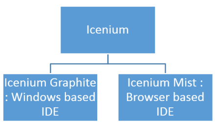
How to fetch data of selected item in KendoUI Mobile ListView

In this post we will take a look on how to read data value of selected item in KendoUI Mobile ListView. Let us say you have a ListView as given in following image,

image

As you see that there is button in each ListView item and on click of the button you need to fetch the selected phone number to make a call.

Above ListView can be created as following,


<div data-role="view" id="policestationview">

<ul data-role="listview"
id="policestationlistview"
data-style="inset"
selectable="true"
data-source="somedata"
data-template="sometemplate"
data-click="somefunction">
</ul>

</div>

In above view

  • Data source is set to somedata
  • Data Template is set to sometemplate
  • Most importantly data-click is set to a JavaScript function

Now in function you can fetch selected item on click event of ListView as following,

image

In above code snippet phonenumber and name is properties of the array set as the data source of the listview. For your reference datasource is as following. You can see that name and phonenumber are properties of the array used to create datasource.


var dataarray = [

{ name: "Darya Ganj", phonenumber: " 01123274683", group: "CENTRAL" },
{ name: "Kamla Mkt", phonenumber: "01123233743", group: "CENTRAL" },
{ name: "I.P. Estate", phonenumber: "01123318474", group: "WEST" }

];

var somedatasource = new kendo.data.DataSource.create(
{
data: dataarray,
group: "group"
});

</script>

In this way you can fetch data of slecetd itm of KendoUI Mobile ListView. I hope you find this post useful. Thanks for reading.

Kendo DateTimePicker Wrapper for ASP.NET MVC

Overview:

This is the fifth post in a series on Kendo UI wrappers for ASP.NET MVC. In this post we will look at one more wrapper named DateTimePicker. Before we get on with DateTimePicker Kendo wrapper, if you are new and want to learn more about Kendo Wrappers for ASP.NET MVC, I suggest you take a look at “Jumpstarting Development with Kendo UI for ASP.NET MVC” by Abhishek Kant. The jumpstarting blog post will give you the basics on how to get started with Kendo for ASP.NET MVC. Here is the post which has links to all other blog post of the series.

What is DateTimePicker control?

DateTimePicker is a control which allows end user to select a date & time from a calendar & time picker. It also supports to input the data directly. The DateTimePicker control supports customizing the month view by providing a custom template. The Minimum date, Maximum date, the view to start the calendar with and the time interval on the time picker, are all configurable through options.

image

Instantiating a DateTimePicker:

The first step in using a date time picker is to instantiate it on the page. To instantiate the control we make use of the DateTimePicker builder available as part of the Kendo Wrappers for ASP.NET MVC. Below is the code snippet which shows how to instantiate the control:


@(
Html.Kendo().DateTimePicker()
.Name("kdatetimepicker")
.HtmlAttributes(new { style = "width:230px"})
 )

Here is the output of the above code:

image

What we just did was to instantiate a DateTimePicker control on the page and we gave it name. When it is rendered you will basically see a textbox to enter the date and time, a calendar button and the clock button. The calendar button when clicked will allow you to select a date and when you click the clock button will allow you to select the time interval.

Set default value to control:

As you can see from the previous section, when the control is instantiated the textbox is empty. That is expected as we never set a default value to the date time picker control. The calendar when opened will always show the current date highlighted but that is not a value until use clicks on it. In order to set the default value on the control, we will use the Value() method. The Value() method takes DateTime instance or a date in string format, which will be set as the controls value. Here is the code snippet to set the default value:


@(
Html.Kendo().DateTimePicker()
.Name("kdatetimepicker")
.Value("12/12/2012 14:30")
.HtmlAttributes(new { style = "width:230px"})
)

And here is the output of the above code snippet:

image

Formatting controls value:

Previous section we saw how to set the value of the control. The default format in which the date and time is displayed is “MM/dd/yyyy hh:mm tt” i.e. Month, Day, Year, Hour, Minutes and Meridian. Lets say we want to change the format in which the date and time is shown. The control provides the options to modify the format through Format() method. The Format() method takes a string which is nothing but your new format for date and time display. Here is a code snippet to set the format:


@(
Html.Kendo().DateTimePicker()
.Name("kdatetimepicker")
.Value("12/12/2012 14:33")
.Format("On MM/dd/yyyy @ hh:mm tt")
.HtmlAttributes(new { style = "width:240px"})
)

Here is the output of the above code change:

image

As you cane see I just provided a format “On MM/dd/yyyy @ hh:mm tt” and this translates the value to “On 12/12/2012 @ 02:33 PM”. So this is a handy setting to keep in mind.

Putting constraints on date selection:

With date picker, one of the common requirement that you will have to take care is to restrict the dates a user can select. You may want to set a minimum date and maximum date restriction on the calendar itself. The date time picker control provides this option through Min() and Max() methods. Both Min and Max methods support two overloads – one takes a string format of a date and another takes an instance of DateTime. Here is the code snippet to put restrictions on the calendar:


@(
Html.Kendo().DateTimePicker()
.Name("kdatetimepicker")
.Value("12/12/2012 14:33")
.Min("12/10/2012").Max("12/21/2012")
.Format("On MM/dd/yyyy @ hh:mm tt")
.HtmlAttributes(new { style = "width:240px"})
)

image

As you can see the dates are now restricted and the user can select from only the dates allowed to select.

Setting the Time interval:

The time picker component in this control, by default, sets the time interval between hours to 30 minutes. You have the flexibility to control the interval between the hours by using the Interval() method. The Interval() method takes a integer and will set the interval based on this value. Lets say I want to set the interval to 15 minutes, find below the code snippet to do that:


@(
Html.Kendo().DateTimePicker()
.Name("kdatetimepicker")
.Value("12/12/2012 14:30")
.Min("12/10/2012").Max("12/21/2012")
.Interval(15)
.Format("On MM/dd/yyyy @ hh:mm tt")
.HtmlAttributes(new { style = "width:240px"})
)

And here is the output of the above code snippet:

image

As you can see the interval between the hour is now set to 15 minute interval and this is through the Interval() setting we have in the code.

Handling Events:

The date time picker control supports client side event handling. The control exposes 3 events namely Open, Close and Change. Note that all these are client side events and the handlers will be client side event handlers. Here is the code snippet to listen to events and provide the event handlers to those events:


@(
Html.Kendo().DateTimePicker()
.Name("kdatetimepicker")
.Value("12/12/2012 14:30")
.Min("12/10/2012").Max("12/21/2012")
.Interval(15)
.Format("On MM/dd/yyyy @ hh:mm tt")
.HtmlAttributes(new { style = "width:240px"})
.Events(e => e
.Open("kdatetimepicker_open")
.Change("kdatetimepicker_change")
.Close("kdatetimepicker_close")
)
)

<script>
function kdatetimepicker_open() {
//Handle the open event
}

function kdatetimepicker_close() {
//Handle the close event
}

function kdatetimepicker_change() {
//Handle the change event
}
</script>

Access control from client side:

So far we have seen how to instantiate and configure settings on the control from server side. And the configuration was done using the Kendo ASP.NET MVC wrapper. Once the control is rendered on the client side what if you need to perform some operation on the DateTimePicker control itself. The Kendo UI JavaScript APIs allow us to grab the control on the client side and access its properties and methods. Let’s say on date change by user, we want to get the newly selected value and prompt it. Here is the code snippet to do that:


@(
Html.Kendo().DateTimePicker()
.Name("kdatetimepicker")
.Value("12/12/2012 14:30")
.Min("12/10/2012").Max("12/21/2012")
.Interval(15)
.Format("On MM/dd/yyyy @ hh:mm tt")
.HtmlAttributes(new { style = "width:240px"})
.Events(e => e
.Change("kdatetimepicker_change")
)
)
<script>
function kdatetimepicker_change() {
var dateTimePicker = $("#kdatetimepicker").data("kendoDateTimePicker");
alert(dateTimePicker.value());
}
</script>

As you can see, we first listen to on change event and in the event handler for change we use jquery selector to get the element by its id and use the jquery data() method to get the Kendo DateTimePicker control. Once we get hold of the control, it supports the value() method which will give us the current selected value. Here is the output of the above code:

image

Summary:

In this post we looked at one more Kendo Wrapper namely DateTimePicker. This control makes a perfect match for scenarios where you need to present both the date and time selection. We saw how easy it was to work with the control from the server side. With just a few settings we can get this control working according to our needs.

Kendo DatePicker Wrapper for ASP.NET MVC

Overview:

This is the fourth post in a series on Kendo UI wrappers for ASP.NET MVC. In this post we will look at one more wrapper named DatePicker. Before we get on with DatePicker Kendo wrapper, if you are new and want to learn more about Kendo Wrappers for ASP.NET MVC, I suggest you take a look at “Jumpstarting Development with Kendo UI for ASP.NET MVC” by Abhishek Kant. The jumpstarting blog post will give you the basics on how to get started with Kendo for ASP.NET MVC. Here is the post which has links to all other blog post of the series.

What is DatePicker control?

DatePicker is a control which allows end user to select a date from a calendar or by inputting the data directly. The DatePicker control supports customizing the month view by providing a custom template. The Minimum date, Maximum date and the view to start out with are all configurable through options.

image

Instantiating a DatePicker:

to instantiate a DatePicker control on the page, we make use of the DatePicker builder available in as part of the Kendo wrapper helpers. Take a look at the below code to see how DatePicker is instantiated:

@( Html.Kendo().DatePicker().Name("kdatepicker") )

Here is the output of the above code:

image

As you can see we just instantiated the DatePicker control on the page. The control is made up of the textbox for manual input and a button (having calendar icon) which when clicked will bring up a calendar so that user can select any date.

Setting default value at instantiation:

In the previous section we saw how to instantiate a DatePicker control. But when it was rendered we did not see any default value i.e. a default date being displayed in the textbox. Well, that is because we never told the control what its default value was. DatePicker control exposes a method called Value() which can be used to set the default value. Here is a code to set the default value of the control to current day:

@(Html.Kendo().DatePicker().Name("kdatepicker")
      .Value(DateTime.Today)
)

Here is the output as a result of setting the default value to the control:

image

Formatting selected value:

We saw how to set the default value of the date picker control. The default format in which the date value is shown is MM/DD/YYYY. If you want to customize the format, the control provides the option to use the Format() method and provide any valid date time format that we are familiar with. So here is the code to set the format as “<Day Name>, <Month Name> <Date>, <Year>”:

@(Html.Kendo().DatePicker().Name("kdatepicker")
      .Value(DateTime.Today)
      .Format("dddd, MMMM dd, yyyy")
      .HtmlAttributes(new { style = "width:230px"})
)

I have used the Format() method and passed in a format “dddd, MMMM dd, yyyy” and below is the output of that code:

image

Putting constraints for selection:

When using date pickers in a real world applications, one of the common scenario is to restrict the dates a user can select. Usually we will have a minimum date and maximum date range and we would like the calendar to show only those dates and user can select only from those dates. DatePicker control provides Min() and Max() method which accept a DateTime value and use these two settings to restrict the values. Here is the code to use the Min & Max methods. I am setting the minimum date to be today and maximum date to be 4 days from today:

@(Html.Kendo().DatePicker().Name("kdatepicker")
      .Value(DateTime.Today)
      .Format("dddd, MMMM dd, yyyy")
      .Min(DateTime.Today)
      .Max(DateTime.Today.AddDays(4))
      .HtmlAttributes(new { style = "width:230px"})
)

Here is the output of the above code:

image

Customizing the Calendar Views:

So far we have seen that when the calendar is used for selecting a date, by default it shows the month view i.e. it shows current month and the days in that month. DatePicker control also has the provision to customize the calendar view and we can do that by using the Start() method. The Start() method accepts a enum of type CalendarView. CalendarView has options Century, Decade, Month and Year. You just set what view you would like to see and the calendar will show that particular view every time users open the calendar.  Here is a code to set the start view of the calendar to Century:

@(Html.Kendo().DatePicker().Name("kdatepicker")
      .Value(DateTime.Today)
      .Format("dddd, MMMM dd, yyyy")
      .Start(CalendarView.Century)
      .HtmlAttributes(new { style = "width:230px"}) )

Here is the output for the same:

image

Here is an example of all the calendar views:

image

Customizing cell rendering:

Imagine a scenario where you want to customize how a particular day needs to be rendered on the calendar. For e.g. November 9 is my birthday. So whenever Nov 9 is rendered I want to be reminded that its my birthday and I want a cake icon to be shown on that day. For such a scenario, DatePicker control has the provision to customize each cell rendering. This is done by passing a template to a method named MonthTemplate(). You can pass any valid kendo template string to this method. Here is the code to show a birthday cake on Nov 9 of every year:

@(Html.Kendo().DatePicker().Name("kdatepicker")
.Value(DateTime.Today)
.Format("dddd, MMMM dd, yyyy")
.HtmlAttributes(new { style = "width:230px"})
.MonthTemplate(" # if (data.value == 9 && data.date.getMonth() == 10) { # " +
"<div class=birthday /> " +
"# } #  " +
"#= data.value #")
)

What I have done is to pass a template string. If you look at the template itself, I am just checking if the current rendered date is 9 and current rendering month is November (remember JavaScript month array is zero index based, so Nov = 10) and if yes I am showing a div with class birthday. The stylesheet for birthday just puts a cake image. We show the date value irrespective of the check we do. Here is the output of the above code:

image

Customizing the footer:

When the calendar is open, it usually shows the current day in “<Day Name>, <Month Name> <Date>, <Year>” format at the bottom. This is known as the footer. This footer can be customized by providing a custom template. Here is the code to customize the footer:

@(Html.Kendo().DatePicker().Name("kdatepicker")
.Value(DateTime.Today)
.Format("dddd, MMMM dd, yyyy")
.HtmlAttributes(new { style = "width:230px"})
.Footer("Today - #= kendo.toString(data,'ddd, MMM dd, yyyy') # ")
)

Here is the output of the same:

image

Summary:

In this post, we looked at one more Kendo Wrapper named DatePicker. We looked at how easy it is to instantiate the control. set a default value, formatting the selected value, restricting the dates that can be picked, customizing the calendar view, customizing the cell rendering and finally how to customize the footer of the calendar. Hope this gives you a jumpstart at developing with Kendo DatePicker wrapper for ASP.NET MVC.

Till next time – Happy Coding!

Kendo ComboBox Wrapper for ASP.NET MVC

Overview:

In this third post on Kendo UI Wrapper for ASP.NET MVC, we will look at one more wrapper named ComboBox. If you are new to Kendo UI Wrappers for ASP.NET MVC, I suggest that you go through “Jumpstarting Development with Kendo UI for ASP.NET MVC” by Abhishek Kant. This post, as the name suggests will give you a jumpstart on Kendo UI Wrappers for ASP.NET MVC. Lets go ahead and look at the ComboBox Wrapper in detail. If you are looking for the index post on this getting started series, click here.

What is The ComboBox control?

The ComboBox control displays a list of values and allows the selection of a single value from this list. Custom values may also be entered via keyboard input. If you do not wish permit keyboard input – that is, custom values are not permitted – use the DropDownList.

The ComboBox represents a richer version of a <select>element, providing support for local and remote data binding, item templates, and configurable options for controlling the list behavior.

image

Instantiating a ComboBox:

To instantiate a ComboBox on any page, we make use of the ComboBox builder available within the Kendo helper. See below the code snippet to instantiate a combobox:

   1: @(

   2:     Html.Kendo().ComboBox().Name("kcombobox")

   3: )

That’s it to get a combobox control on the page. Note that the Name is mandatory to be set on the wrapper. This makes the ID of the combobox when rendered on the client side. Here is the output of our code:

image

As you can see the combobox control is created on the page. But we don’t see anything happening yet because we haven’t bound any data to the control. we will see data binding option in a minute.

Providing a Placeholder:

ComboBox wrapper, similar to that of AutoComplete wrapper provides an option to put a placeholder text in the control when there is no value selected by the user. The placeholder will be displayed only when user has not made any choice; once he  makes a choice the placeholder text will not be shown instead the text of the selected item will be shown. We set placeholder using the Placeholder() method which accepts the string to be displayed as placeholder. Here is the code snippet:

   1: @(

   2:     Html.Kendo().ComboBox().Name("kcombobox")

   3:     .Placeholder("Select a value...")

   4: )

And here is the output of the above code:

image

Providing Data Source:

So far we have been able to get the combobo on to the page with the instantiation code. Now we will see how to provide data to the combobox. The data source can be provided in three ways and they are:

  • BindTo – using BindTo() method, any IEnumerable data can be bound
  • Items – using Items() method, define items
  • DataSource – using the DataSource() method, define action method and controller to fetch data

Using BindTo() for data binding:

BindTo() method allows you to provide data to the Combobox control right at the time of instantiating the control. BindTo() method accepts any data items which is of type IEnumerable. Lets say we have a string of text to show in the combobox, we can write the code as below:

   1: @(

   2:             Html.Kendo().ComboBox().Name("kcombobox")

   3:             .Placeholder("Select a value...")

   4:             .BindTo(new string[] {"Bulgaria",

   5:                                   "United States",

   6:                                   "India","Australia",

   7:                                   "United Kingdom"}

   8:                    )

   9:  )

As you can see, we just create a string array and bind it to the control. Here is the output of the above code:

image

Normally a combobox is used to show a lookup list where in the text inside the control is usually for the end user readability, where as the value stored in the database is usually an integer. So if your data source is a complex object and you want to show text and maintain value in the backend, you would need to set 2 extra properties for this to work correctly. They are DataTextField & DataValueField. Here is the code snippet to achieve this:

   1: @(

   2:             Html.Kendo().ComboBox().Name("kcombobox")

   3:             .HtmlAttributes(new { style = "width:250px"})

   4:             .Placeholder("Select a value...")

   5:             .DataTextField("Text")

   6:             .DataValueField("Value")

   7:             .BindTo(new List<SelectListItem>() {

   8:                           new SelectListItem() {

   9:                             Text = "Bulgaria", Value = "1"

  10:                           },

  11:                           new SelectListItem() {

  12:                             Text = "Unites States of America", Value = "2"

  13:                           },

  14:                           new SelectListItem() {

  15:                             Text = "India", Value = "3"

  16:                           },

  17:                           new SelectListItem() {

  18:                             Text = "Australia", Value = "4"

  19:                           },

  20:                           new SelectListItem() {

  21:                             Text = "United Kingdom", Value = "5"

  22:                           }

  23:                       }

  24:                  )

  25:         )

In the above code snippet we create a new list of SelectListItem, bind it to the control and let the control know which property should be used to show the text & which property should be used to store the value of the selected item. The output will have no change as compared to previous example.

Using Items() for data binding:

Items() method allows you to define the items of the combobox control at the time of instantiating the control. If you ever have a scenario where the data to be bound to the control is static but you still need the flexibility of displaying text/value pair, you can use the Items() method. Here is the code snippet to use the Items() method:

   1: @(

   2:             Html.Kendo().ComboBox().Name("kcombobox")

   3:             .HtmlAttributes(new { style = "width:250px" })

   4:             .Placeholder("Select a value...")

   5:             .DataTextField("Text")

   6:             .DataValueField("Value")

   7:             .Items(item =>

   8:                     {

   9:                         item.Add().Text("Bulgaria").Value("1");

  10:                         item.Add().Text("United States Of America").Value("2");

  11:                         item.Add().Text("India").Value("3");

  12:                         item.Add().Text("Australia").Value("4");

  13:                         item.Add().Text("United Kindom").Value("5");

  14:                     }

  15:             )

  16:         )

The output again will be the same as previous output.

Using DataSource() for data binding:

If you want to get the data for combobox from a controllers action method, you will need to use DataSource() method. This allows you to set the controller name and the action name from which the data will be retrieved at runtime by issuing an AJAX request. First lets look at the controller action method:

   1: public JsonResult GetCountries()

   2:         {

   3:             var countries = new List<SelectListItem>

   4:                             {

   5:                                 new SelectListItem{Text ="Bulgaria",

   6:                                                    Value="1"},

   7:                                 new SelectListItem{Text ="United States of America",

   8:                                                    Value="2"},

   9:                                 new SelectListItem{Text ="India",

  10:                                                    Value="3"},

  11:                                 new SelectListItem{Text ="Australia",

  12:                                                    Value="4"},

  13:                                 new SelectListItem{Text ="United Kingdom",

  14:                                                    Value="5"},

  15:                             };

  16:             return Json(countries, JsonRequestBehavior.AllowGet);

  17:         }

The action method is a standard action method and the only difference is that it is returning a JsonResult. This is because the control will issue a AJAX request on loading on the client side to fetch the data. Now here is the code snippet to instantiate the control:

   1: @(

   2:             Html.Kendo().ComboBox().Name("kcombobox")

   3:             .HtmlAttributes(new { style = "width:250px" })

   4:             .Placeholder("Select a value...")

   5:             .DataTextField("Text")

   6:             .DataValueField("Value")

   7:             .DataSource(source =>

   8:             {

   9:                 source.Read(read =>

  10:                 {

  11:                     read.Action("GetCountries", "Home");

  12:                 });

  13:             })

  14:         )

Pay attention to the DataSource() method declaration. We are providing it a configurator which knows what is the read URL to fetch the data. We are just providing the controller

& action name. The control will automatically issue a AJAX request to get the data as a JSON payload.

Serverside Filtering:

If we don’t specify any filter strategy i.e. server or client, the combobox control will use the client side filtering by default. If we have huge list then it is wise to filter the data on the server instead of sending everything to client and then filter on the client side. For the server side filtering to work, we should first set the filter type and then enable the ServerSideFiltering flag on the data source itself.  We can set the filter options with valid values equal to “StartsWith” or “Contains”. Here is the action method which depicts the server side filtering:

   1: public JsonResult GetCountries(string text)

   2:         {

   3:             var countries = new List<SelectListItem>

   4:                             {

   5:                                 new SelectListItem{Text ="Bulgaria",

   6:                                                    Value="1"},

   7:                                 new SelectListItem{Text ="United States of America",

   8:                                                    Value="2"},

   9:                                 new SelectListItem{Text ="India",

  10:                                                    Value="3"},

  11:                                 new SelectListItem{Text ="Australia",

  12:                                                    Value="4"},

  13:                                 new SelectListItem{Text ="United Kingdom",

  14:                                                    Value="5"},

  15:                             };

  16:             if (!string.IsNullOrEmpty(text))

  17:             {

  18:                 countries = (from item in countries

  19:                              where item.Text.StartsWith(text)

  20:                              select item).ToList();

  21:             }

  22:             return Json(countries, JsonRequestBehavior.AllowGet);

  23:         }

Here is the combobox definition:

   1: @(

   2:             Html.Kendo().ComboBox().Name("kcombobox")

   3:             .HtmlAttributes(new { style = "width:250px" })

   4:             .Placeholder("Select a value...")

   5:             .DataTextField("Text")

   6:             .DataValueField("Value")

   7:             .Filter(FilterType.StartsWith)

   8:             .DataSource(source =>

   9:             {

  10:                 source.Read(read =>

  11:                 {

  12:                     read.Action("GetCountries", "Home");

  13:                 }).ServerFiltering(true);

  14:             })

  15:             .Template("<span><img src='/Content/Images/${data.Value}.jpg' " +

  16:                             "width='20' height='20' />&nbsp;${data.Text}</span>")

  17:         )


Controlling the data binding:

The items of the combobox control will be queries as soon as the control is instantiated on the client side. If you do not wish to go with this behavior, the control provides a mechanism to control when to load the items. You can set the control to load the items either user types in the combobox or when he open the options list. This is possible due to a method called AutoBind(). This takes a boolean value to indicate whether to load data on instantiation or wait for the user interaction with the control. Here is the code snippet to set this behavior:

   1: @(

   2:             Html.Kendo().ComboBox().Name("kcombobox")

   3:             .HtmlAttributes(new { style = "width:250px" })

   4:             .Placeholder("Select a value...")

   5:             .DataTextField("Text")

   6:             .DataValueField("Value")

   7:             .Filter(FilterType.StartsWith)

   8:             .DataSource(source =>

   9:             {

  10:                 source.Read(read =>

  11:                 {

  12:                     read.Action("GetCountries", "Home");

  13:                 }).ServerFiltering(true);

  14:             })

  15:             .Template("<span><img src='/Content/Images/${data.Value}.jpg' " +

  16:                             "width='20' height='20' />&nbsp;${data.Text}</span>")

  17:             .AutoBind(false)

  18:         )

Custom templates for combobox item display:

Consider a scenario where in you want to customize the combobox item display on the client side. i.e. let us say we want to show the country flag before the country name which is displayed as a text of the combobox item. Well, the control provides a way to provide our custom template which will be used for display on the client side. The Template() method accepts a HTML markup which will be used to display the item instead of the default template the control uses. You access data item using the {data.<property name>} syntax inside the custom template markup. Here is the code snippet to work with Template() method:

   1: @(

   2:             Html.Kendo().ComboBox().Name("kcombobox")

   3:             .HtmlAttributes(new { style = "width:250px" })

   4:             .Placeholder("Select a value...")

   5:             .DataTextField("Text")

   6:             .DataValueField("Value")

   7:             .DataSource(source =>

   8:             {

   9:                 source.Read(read =>

  10:                 {

  11:                     read.Action("GetCountries", "Home");

  12:                 });

  13:             })

  14:             .Template("<span><img src='/Content/Images/${data.Value}.jpg' " +

  15:                             "width='20' height='20' />&nbsp;${data.Text}</span>")

  16:         )

Notice the Template() method and the markup inside it. We use {data.Value} to access the value of the bound data item and {data.Text} to access the text of the bound data item. Using this method you can pretty much customize the UI if the comboxbox item.


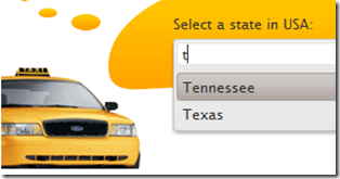
Cascading Comboboxes:

One of the typical scenarios of web is to cascade a child combobox based on the item selected in a parent combobox. for e.g. consider a categories combobox and a products combobox. We want the categories combobox to filled with items first, user should select a category and then the products belonging to that category to be shown. With Kendo Combobox this is fairly simple as it allows a method called CascadeFrom(). As the name goes we just need to pass the parent combobox based on which we need to cascade. To illustrate this, consider that we have 2 action methods named GetCategories() and GetProducts(). For getting the products we need to know the category id. So here is the code snippet for this:

   1: public JsonResult GetCascadeCategories()

   2: {

   3:     var northwind = new NorthwindDataContext();

   4:

   5:     return Json(northwind.Categories.Select(

   6:                 c => new { CategoryId = c.CategoryID,

   7:                 CategoryName = c.CategoryName }),

   8:                 JsonRequestBehavior.AllowGet);

   9: }

   1: public JsonResult GetCascadeProducts(string categories)

   2: {

   3:     var northwind = new NorthwindDataContext();

   4:     var products = northwind.Products.AsQueryable();

   5:

   6:     if (!string.IsNullOrEmpty(categories))

   7:     {

   8:         products = products.Where(p => p.CategoryID.ToString() == categories);

   9:     }

  10:

  11:     return Json(products.Select(p => new {

  12:                 ProductID = p.ProductID,

  13:                 ProductName = p.ProductName}),

  14:                 JsonRequestBehavior.AllowGet);

  15: }

Here is the combobox definition for categories:

   1: @(Html.Kendo().ComboBox()

   2:           .Name("categories")

   3:           .Placeholder("Select category...")

   4:           .DataTextField("CategoryName")

   5:           .DataValueField("CategoryId")

   6:           .DataSource(source => {

   7:                source.Read(read => {

   8:                    read.Action("GetCascadeCategories", "Home");

   9:                });

  10:           })

  11:     )

Here is the combobox definition for Products:

   1: @(Html.Kendo().ComboBox()

   2:           .Name("products")

   3:           .Placeholder("Select product...")

   4:           .DataTextField("ProductName")

   5:           .DataValueField("ProductID")

   6:           .DataSource(source => {

   7:               source.Read(read =>

   8:               {

   9:                   read.Action("GetCascadeProducts", "ComboBox")

  10:                       .Data("filterProducts");

  11:               })

  12:               .ServerFiltering(true);

  13:           })

  14:           .Enable(false)

  15:           .AutoBind(false)

  16:           .CascadeFrom("categories")

  17:     )

  18:     <script>

  19:         function filterProducts() {

  20:             return {

  21:                 categories: $("#categories").val()

  22:             };

  23:         }

  24:     </script>

Note the usage of CascadeFrom() method. We pass in the name of the categories combobox. The AutoBind() is set to false. So these two settings make sure that products combobox is not loaded when no categories is selected. When user selects a category, that’s when products combobox will issue the AJAX request for getting list of products. Since we need to know what category is selected, we make use of the additional data concept on the data source read and pass in the selected categories value. This is done using the filterProducts() javascript method.

Here is the output of the same:

imageimage

Client side access to combobox:

Using the Jquery data() method we can access the Keno Combobox from the client side. You may have a scenario where in you want to load the combobox based on a button click. Here is the code to achieve that:

   1: <script>

   2:     var kendoComboBox = null;

   3:     $(document).ready(function () {

   4:

   5:         kendoComboBox = $("#kcombobox").data("kendoComboBox");

   6:

   7:         $("#button").click(function () {

   8:             kcb.dataSource.read();

   9:         });

  10:     })

  11: </script>

First we declare a global variable which will hold the reference of the combobox. Then on page load we make use of the data() method to get access to the control. On a button click, we just access the dataSource property and issue a read() method on it.

For a complete list of client side API, have a look at this help documentation.

Summary:

In this post, we looked at how easy it is to instantiate a combobox control and set it up for data binding. We also looked at some of the features such as auto bind i.e. control when the data is bound to the control, different ways of data binding the control, cascading based on a item selection of another combobox and last but not the least how to access the combobox from the client side. Hope this gives you a jumpstart at using the Kendo Combobox Wrapper for ASP.NET MVC .

Till next time – Happy Coding!

Kendo Calendar Wrapper for ASP.NET MVC

Overview:

In this post we will learn about one more wrapper from Kendo UI library called Calendar. If you are starting new on Kendo UI, make sure to go through the blog post – Jump starting Development with Kendo UI for ASP.NET MVC. We will look at the usage of the Calendar widget and how to program the Calendar widget. If you are looking for the index post on this getting started series, click here.

To follow this blog post, just create a “C# Kendo UI for MVC Web Application” project type and work along.

What is Calendar Widget:

The Calendar Widget renders a graphical calendar that supports navigation and selection. It supports custom templates for its “month” view, configurable options for a minimum and maximum date, start view and the depth of the navigation.

image

Instantiating a Calendar:

To instantiate a Calendar widget on any page, we just make use of the Calendar builder available within the Kendo helper. Here is the code snippet to instantiate a  Calendar:

   1: @(Html.Kendo().Calendar()

   2:               .Name("kcalendar")

   3: )

Note that the “Name” is mandatory setting. This defines the ID of the control on the client side. So here is the output of the code we wrote:

image

That’s it – with just one line of code we have a Calendar on our page. Next lets see how we can control the Calendar View.

Calendar View Settings:

Be default if nothing is said about the view we need to see on the Calendar, it is going to use Month view i.e. the current month is shown in the calendar. The Calendar widget has the following view options to choose from:

  • Century – When selected, Calendar will show decades of the current century
  • Decade – When selected, Calendar will show years of the the current decade
  • Month – When selected, Calendar will show days of the current month
  • Year – When selected, Calendar will show months of the current year

The way we set the view is through a method called Start(). The different view settings are available as a CalendarView enum. Here is the code snippet to set the view of the calendar:

   1: @(Html.Kendo().Calendar()

   2:               .Name("kcalendarCentury")

   3:               .Start(CalendarView.Century)

   4:             )

Here is the output of the above code:

image

Setting Calendar Value:

So far we have been able to instantiate a calendar on the page. But if you notice clearly the current date is not highlighted by default. The current date is displayed at the footer of the calendar but the day is not highlighted. That is because, calendar has a property called Value() and to have a date highlighted this property needs to provided with a DateTime instance. It can be current day or any other day. Here is the code snippet to set the value of the calendar:

   1: @(Html.Kendo().Calendar()

   2:               .Name("kcalendarvalue")

   3:               .Value(DateTime.Today)

   4:  )

All we are doing is setting the Value of the calenda to DateTime.Today instance. Here is output of that code:
image

Setting Calendar Value:
Many a times when using calendar we will have scenarios where we need to restrict the dates that the user can select. For e.g. lets assume that we want to user to select the dates between 19 Nov and 23 Nov only. That means the minimum date that can be selected is 19 Nov and maximum date that can be selected is 23 Nov. Well to achieve this scenario, the calendar provides Min() and Max() property and both of this method accept either a string representing a date  or an instance of DateTime. Here is the code snippet for setting Min & Max property:
   1: @(Html.Kendo().Calendar()

   2:               .Name("kcalendarrestriction")

   3:               .Min("2012/11/19")

   4:               .Max("2012/11/23")

   5:  )

And here is the output of the changes we made:
image
As you can see it does not show the dates outside of the allowed Min and Max date settings.
Accessing Calendar from client side:
You may have a scenario where you want to get hold of the calendar widget from JavaScript. This can be achieved by using the jquery.data() method. Assume that we had named our calendar as “kcalendar”, here is the code snippet to access that from JavaScript:
   1: var calendar = $("#kcalendar").data("kendoCalendar");

As you can see, we just use jquery’s data() syntax to get the Kendo Calendar object. The Kendo controls all have very rich client side API that you can work with. For e.g. if we have to set the value of the calendar from client side you can use the value() method on the control. Here is the code snippet for the same:
   1: var calendar = $("#kcalendar").data("kendoCalendar");

   2: calendar.value(new Date(2012, 0, 1));

Configuring client side events:
Kendo Calendar exposes two client side events which can be hooked into while instantiating the control. The event exposed are:
  • Change – occurs when the value is changed
  • Navigate – occurs when any navigation is performed by the user i.e. month change, year change etc.
When we hook into the events exposed, we just configure the JavaScript function which will handle the event on the client side. Here is the code snippet to handle the value change event of the calendar:
   1: @(Html.Kendo().Calendar()

   2:               .Name("kcalendarevents")

   3:               .Events(evnt => evnt.Change("onValueChange"))

   4:  )

   5: <script>

   6:     function onValueChange(e)

   7:     {

   8:         var kcal = $("#kcalendarevents").data("kendoCalendar");

   9:         alert(kcal.value());

  10:     }

  11: </script>

Similarly you can handle the Navigate event also.
Summary:
Kendo Calendar is yet another wrapper available in the Kendo UI library – which lets you create a graphical calendar on a web page. We saw how simple it is to instantiate on any page. We also saw some of the properties supported by the control. We also saw how to work with the control from client side i.e. from JavaScript. Hope this provides you with a kind of quick start to work with Kendo UI Wrappers. Stay tuned for many more of these posts on Kendo UI Wrapper usage.
Till next time – Happy coding!

Kendo AutoComplete Wrapper for ASP.NET MVC

Overview:

This is the first post in the series “Getting Started Series on Kendo UI Wrappers for ASP.NET MVC”. In this post we will look at Kendo AutoComplete wrapper. If you are new to Kendo UI Wrappers for ASP.NET MVC, I suggest that you go through “Jumpstarting Development with Kendo UI for ASP.NET MVC” by Abhishek Kant . This post, as the name suggests will give you a jumpstart on Kendo UI Wrappers for ASP.NET MVC.

image

Lets go ahead and look at the AutoComplete Wrapper in detail.

What is The AutoComplete control?

The AutoComplete control provides suggestions depending on the typed text. It also allows multiple value entries. As the user types, the autocomplete control will suggest items from source that the control is bound to. The user can then select one or many items depending on the configuration. Multiple values will be separated by a delimiter.

image

Creating ASP.NET MVC Project:

If you have installed the Kendo UI Complete using the installer, you will find project templates to create a new ASP.NET MVC project with Kendo UI Wrappers. This template makes it easy to work with wrappers as it sets up all the right references to the assemblies. If you select File > New Project, select Telerik > Web from the installed template and select “C# Kendo UI for MVC Web Application” from the project template and select Ok.

SNAGHTML1af6f00

If you have the extensions but not the installer, then make sure you follow the instructions here to add the assembly’s and correct js/css references.

Instantiating Kendo AutoComplete:

Now that we have created an ASP.NET MVC project, lets see how we can use the Kendo AutoComplete control. For this post, I will be using the Razor syntax and all code will be written in Home/Index view. Now lets instantiate a Kendo AutoComplete control on the page. Here is the code snippet of how that can be done:

@(Html.Kendo().AutoComplete().Name("kautocomplete"))

As you can see we support the Fluent interface so you can chain the calls. All we have done here is to use the Kendo helper and instantiate an AutoComplete. Technically the AutoComplete() is actually a builder which knows how to spit out the Kendo AutoComplete UI js/css on the client side. One more thing that is necessary is to name the control. So we use the Name() method to provide a name to the control. With the above lines placed, we see the following output:

SNAGHTML218a5ab

Providing a Place Holder:

Placeholder is nothing but a default text that will be shown on the control when no value is selected by the user. The AutoComplete supports a PlaceHolder() method which takes a text as input. Here is a code snippet of how to use the Placeholder:

   1: @(

   2:     Html.Kendo().AutoComplete()

   3:                 .Name("kautocomplete")

   4:                 .Placeholder("Select contry...")

   5: )

The output will be as below’:

SNAGHTML2206ea5

Providing Data Source to AutoComplete control:

Now that we have the auto complete on the page lets do some data binding to the control. Currently it does nothing as it does not have a data source to work with. We can provide data in two ways.

  • Provide a data at the time of instantiating the control using the BindTo() method
  • Hooking up a controller action method which will provide data using DataSource() option.

Data binding using BindTo() method:

The signature of BindTo() method is as below:

image

The input to BindTo() method is an IEnumerable, which means you can just pass any IEnumerable data you may have during the instantiation itself and the control will be bound to that. For instance say we want to bind the auto complete control to list of country names which are held in string array. Here is the code snippet to do that:

   1: @(

   2:     Html.Kendo().AutoComplete()

   3:                 .Name("kautocomplete")

   4:                 .Placeholder("Select contry...")

   5:                 .BindTo(new string[] {"Bulgaria","USA","India","Australia","UK"})

   6: )

As you can see I have just bound a simple string array to the auto complete control and this will be the data source now. Here is the output of the above changes:

SNAGHTML22f7d64

The autocomplete control filtered the data source based on what the user has typed and presented only those items which matched the input. We will look at the filtering mechanism in a minute.

Data Binding using DataSource() option:

Another way to provide data to autocomplete control is using the DataSource() method. The DataSource method accepts a read only data source provider. We just need to configure which action method on which controller is responsible to provide the data for the control. Autocomplete will automatically issue an AJAX request to the configured action method and retrieve the data, then bind it to autocomplete. Note that the action method should return a JsonResult as autocomplete will make AJAX request to retrieve the data. Here are the code snippets to achieve this:

Controller Action Method:

   1: public JsonResult GetCountries()

   2: {

   3:     var countries = new string[] { "Bulgaria", "USA", "India", "Australia", "UK" };

   4:     return Json(countries, JsonRequestBehavior.AllowGet);

   5: }

View:

   1: @(

   2:     Html.Kendo().AutoComplete()

   3:                 .Name("kautocomplete")

   4:                 .Placeholder("Select contry...")

   5:                 .DataSource(source  => {

   6:                     source.Read(read =>

   7:                         { read.Action("GetCountries", "Home"); });

   8:                 })

   9: )

As you can see we just set the action method name & the controller name on the data source. Here is how the JSON data looks like at runtime. I have used Developer Tools inside IE to look at the payload. Just press F12 on the page, get to Network tab and start capturing the network traffic:

image

Custom Templates:

AutoComplete also has a flexibility to style the suggestion that is shown by providing your own template. For e.g. in our demo code we have written so far, we have bound the autocomplete to country names. What if we want to show the country flag before the country name when the suggestion is made. Well we can do that by providing an HTML template. We can access the data with a ${data} pattern. Here is the code snippet for providing the custom template:

   1: @(

   2:     Html.Kendo().AutoComplete()

   3:                 .Name("kautocomplete1")

   4:                 .Placeholder("Select contry...")

   5:                 .BindTo(new string[] { "Bulgaria", "USA", "India", "Australia", "UK" })

   6:                 .Template("<span><img src='/Content/Images/${data}.jpg' " +

   7:                             "width='20' height='20' />&nbsp;${data}</span>")

   8: )

Here is the output of the same:
SNAGHTML32a02fd

Filtering the results:

By default the autocomplete filters the suggestions based on a logic “Starts With” i.e. it searches for the items which starts with the user typed text. Autocomplete provides a way to control this filtering by means of Filter() method. The Filter method has 2 overloads – one accepts the string “StartsWith” & “Contains” and another accepts a enum of type FilterType. So here is the code snippet to set the filter type to be “Contains”:

   1: @(

   2:  Html.Kendo().AutoComplete()

   3:                 .Name("kautocomplete1")

   4:                 .Placeholder("Select contry...")

   5:                 .BindTo(new string[] { "Bulgaria", "USA", "India", "Australia", "UK" })

   6:                 .Template("<span><img src='/Content/Images/${data}.jpg' " +

   7:                             "width='20' height='20' />&nbsp;${data}</span>")

   8:                 .Filter(FilterType.Contains)

   9: )

I have the filter logic to be Contains. So here is the output of above code change:

SNAGHTML3371c85

Filtering data on Server:

By default the AutoComplete will do the filtering of items based on user typed text on the client side. This may work fine for small list of data. But if you have very huge list of  data items, this pattern may be a hit on performance because everything needs to be downloaded to the client side and then do the filter. If you ask if there is any better way, well answer is yes and the solution is server side filtering. Instead of filtering the data on the client side, autocomplete control provides a way to send the user typed text to server side. The server side code can then filter the data based on the text passed and return only the matching items. Lets look at the code to achieve this:

For the same of the demo, assume we have a EF context created for Northwind database and we want to list the products in an autocomplete control based on user typed text. We will have a GetProducts action method which accepts a single parameter of type string and lets call it as queryText. Here is the controller action method code snippet:

   1: public JsonResult GetProducts(string text)

   2: {

   3:     var northwind = new NorthwindDataContext();

   4:     var products = northwind.Products.Select(product =>

   5:                                     new ProductViewModel

   6:     {

   7:         ProductID = product.ProductID,

   8:         ProductName = product.ProductName,

   9:         UnitPrice = product.UnitPrice ?? 0,

  10:         UnitsInStock = product.UnitsInStock ?? 0,

  11:         UnitsOnOrder = product.UnitsOnOrder ?? 0,

  12:         Discontinued = product.Discontinued

  13:     });

  14:     if (!string.IsNullOrEmpty(text))

  15:     {

  16:         products = products.Where(p => p.ProductName.Contains(text));

  17:     }

  18:     return Json(products, JsonRequestBehavior.AllowGet);

  19: }

We first instantiate the EF context and get the products. We then check if any text has been passed and if passed, filter the products based on the text and return only the matching list.

Now we will see how to configure the autocomplete to support this. Here is the code snippet for this change:

   1: @(Html.Kendo().AutoComplete()

   2:           .Name("products")

   3:           .DataTextField("ProductName")

   4:           .Filter("contains")

   5:           .DataSource(source => {

   6:               source.Read(read =>

   7:               {

   8:                   read.Action("GetProducts", "Home")

   9:                       .Data("onAdditionalData");

  10:               })

  11:               .ServerFiltering(true);

  12:           })

  13:     )

  14:

  15: <script>

  16: function onAdditionalData()

  17: {

  18:     return {

  19:             text: $("#products").val()

  20:            };

  21: }

  22: </script>

First we have created autocomplete control with name “products”. Then for the read action we have given the action method name and the controller name. One addition to the read method is the Data() method. This in-fact is a hook to the read action of autocomplete and allows us to stick any additional data we want to pass on to the action. Take a look at the action method GetProducts, it has a parameter by name text. We are passing whatever user types as a parameter to the method and get back a filtered list. That’s all there it is to achieve a server side filtering.

Accessing AutoComplete control on the client side:

All Kendo wrappers have a very rich client side API. Using the client side API’s we can access the kendo control on the client side and access a rich set of properties, methods and events. Kendo wrappers are built on the latest and greatest HTML5 standards, so the client side code generated makes use of the new “data-“ (data dash) attributes. We can use the jquery data() method and retrieve them. Here is the code to access a autocomplete control on page load:

   1: var autocomplete = $("#kautocomplete").data("kendoAutoComplete"),

Here “kautocomplete” is the id of the control and we use the jquery data() method to retrieve the kendo control by passing the string “kendoAutoComplete”. This is pretty much a pattern we use to get access to any kendo wrapper from JavaScript.

This comes in handy for instance, when we want to refresh the auto complete on page load. As you saw in the example of data source binding, an AJAX request is issued to get the items the first time a user types in the textbox. What if you want to load the items on page load and keep the autocomplete ready for filtering. This can be done with the following code snippet:

   1: var kac = $("#kautocomplete").data("kendoAutoComplete");

   2: kac.refresh();

You can find the complete list of client side API supported by Kendo AutoComplete widget here.

Summary:

In the first of the many posts to come on Kendo Wrappers for ASP.NET MVC, in this post, we looked at AutoComplete control. We looked at the basics of the using the control and various features like Data Binding, Filtering, Custom Templates and accessing the control from the client side. Hope this excites you to take a dig at the Kendo Wrappers for ASP.NET MVC. Download the free 30 day trial and kick start your kendo adventure.

Till next time – Happy Coding.

Getting Started Series on Kendo UI Wrappers for ASP.NET MVC

Kendo UI is a flag ship product from Telerik. Kendo UI is everything you need to build super-fast HTML5 web apps. It is a JavaScript UI library and has only one dependency and that is JQuery. With Kendo UI, gone are the days of slow and server heavy web UI page creations. Using Kendo UI you can build web apps in one compact easy-to-use package which includes: UI Widgets, Data Source, Validation and MVVM Framework. As you can see Kendo UI is one package you need and nothing else to cater to your UI needs.

image

Kendo UI doesn’t just stop at being a client side UI framework. If you are one of those many who love server side programming, we do have Kendo UI Server Side Wrappers for ASP.NET MVC development. These wrappers help you produce Awesome HTML5 apps powered by Kendo UI without forcing you to write javaScript. Simply program on the server and the Kendo UI wrappers will handle the HTML and JavsScript.

Here is a example of Kendo UI JavaScript Widgets Vs Kendo UI Server Side Wrappers code:

JavaScript:

   1: <div id="calendar"></div>

   2: <script>
   1:

   2:     $(document).ready(function() {

   3:         // create Calendar from div HTML element

   4:         $("#calendar").kendoCalendar();

   5:     });

</script>

Kendo UI Wrapper for ASP.NET MVC:

   1: @(Html.Kendo().Calendar().Name("kcal"))

As you can see the wrappers makes it easy for you to write code in Razor or ASP.NET syntax and without forcing you to write JavaScript.

So with this blog post we are starting what we call “Getting Started Series on Kendo UI Wrappers for ASP.NET MVC”. Following is the list of blog post that we will be covering in next 4 weeks time. They are:

AutoComplete Wrapper NumericTextBox Wrapper
Calendar Wrapper PanelBar Wrapper
ComboBox Wrapper Slider Wrapper
DatePicker Wrapper Splitter Wrapper
DateTimePicker Wrapper TabStrip Wrapper
DropDownList Wrapper TimePicker Wrapper
Editor Wrapper TreeView Wrapper
Grid Wrapper Upload Wrapper
ListView Wrapper Window Wrapper
Menu Wrapper

As and when the post for individual wrappers are ready we will be updating the above table with the links. So if you are starting on ASP.NET MVC with Kendo UI Wrappers, you may want to book mark this post. This will become an index post for the wrappers.

Hope this series will give you a jump start on using kendo UI Wrappers in ASP.NET MVC development.

Till next – Happy Coding!

Conditional Navigation between Views in Kendo UI Mobile

Recently while working with Kendo UI Mobile, I had to navigate from one view to other view inside if else condition. I had scenario, something like following

image

To achieve this, first I tried something like following,

image

In above approach, I was able to navigate to views. However after navigating views were not adhering to the layout set for the application because I was creating new instance of the Application. So certainly this approach was not a suitable solution to go ahead with.

To solve this, you need to navigate on instance which you already created while initializing the html for mobile application. You create something like this on HTML.

image

To navigate conditionally just call navigate function on app. essentially you do not need to recreate instance of application. So if we modify above solution, you do not need first line of the code. Point to be noted here is that app is the variable name we are using while initializing the application on the html.

image

In this way you can navigate to different views from JavScript in KendoUI Mobile. I hope you find this post useful. Thanks for reading.

How to find which button is selected in KendoUI Mobile ButtonGroup

In this post we will take a look on, how to find which button is selected in KendoUI Mobile ButtonGroup . Let us suppose we have a ButtonGroup like following,

image

ButtonGroup will look like following

image

In JavaScript we can find index of selected button as following.

image

buttonsearchgroupis the id of the ButtonGroup. We can check for the selected index in if condition to perform a task according to the selected button in ButtonGroup. This can be done as following,


if ( $("#buttonsearchgroup").data("kendoMobileButtonGroup").current().index() == 1)
 {
 console.log("session button selected");
 }
 else
 {
 console.log("speaker button selected");
 }

In this way you can find which button is selected in KendoUI Mobile ButtonGroup. I hope you find this post useful. Thanks for reading.

Using Kendo AutoComplete in ASP.Net MVC 4.0

In this post, we will see how we could work with Kendo AutoComplete in ASP.Net MVC. We will fetch data from SQL Server table in Kendo AutoComplete using LINQ to Sql class

Adding the Model

Follow Adding Model section of this post to create model.

Adding Controller

We have created the Model, now we need to fetch data using Model in the Controller. I am going to use default created HomeController and Action Index. Go ahead and in HomeController.cs file modify the Action Index.

image

Here we need to create instance of model and pass the data to view. That can be done as following

image

Adding Kendo AutoComplete on View

We are passing data from Index action, so we need to put Kendo AutoComplete in IndexView. Go to View and Home folder and open Index.cshtml

image

Very first you need to make View as strongly typed. You can make a View strongly typed as following

image

Next add Kendo UI AutoComplete. Make sure that you are providing the name attribute. In DataTextField pass the name of the column on which you want to filter the data.

image

For your reference code in view is as following


@model IEnumerable<mvcwrappersample1.Models.Person>

<h3>Kendo AutoComplete</h3>

@(Html.Kendo().AutoComplete()
.Name("name")
.DataTextField("FirstName")
.BindTo(Model)
.Filter("contains"))

Press F5 to run the application, you should able to get data from model in Kendo AutoComplete.

image

I hope you find this post useful. Thanks for reading.

Using Kendo Grid in ASP.Net MVC 4.0

In this post we will see, how we could work with Kendo Grid in ASP.Net MVC. We will display data from SQL Server table in Kendo Grid using LINQ to Sql class. Pictorially we can represent it as follows

image

Before you start with this post, I strongly recommend you to read

Getting started with Kendo UI MVC Wrapper in ASP.Net MVC 4.0

Adding Model

Once you are done with setting up environment go ahead and add a model. We are going to use LINQ TO SQL Class as model. To add model right click on model folder and select New Item. Select Data tab and choose LINQ to SQL Classes to add as model. Give any name to model, I am leaving the default name.

image

Next on the design surface choose Server Explorer

image

If in the Server Explorer, you do not find Data Connection you want to use then go ahead and right click on the Data Connection and select Add New Connection

image

In Add Connection dialog box provide server name and from drop down choose desired database.

image

Click on Ok to add a new connection. Next from Server Explorer drag and drop the tables on dbml file to create the model. I am choosing only Person class from School database.

image

In Solution explorer you can see a dbml file has been added.

image

Adding Controller

We have created the Model, now we need to fetch data using Model in the Controller. I am going to use default created HomeController and Action Index. Go ahead and in HomeController.cs file modify the Action Index.

image

Here we need to create instance of model and pass the data to view. That can be done as following

image

Adding Kendo Grid on View

We are passing data from Index action, so we need to put Kendo Grid in IndexView. Go to View and Home folder and open Index.cshtml

image

Very first you need to make View as strongly typed. You can make a View strongly typed as following

image

Next we can bind data from Model to Kendo Grid as following. Make sure you provide name of the Kendo Grid. This is mandatory because name act as id attribute of the Grid element.

image

For your reference code in view is as following


@model IEnumerable<mvcwrappersample1.Models.Person>

<h3>Kendo Grid</h3>

@(Html.Kendo().Grid(Model)
.Name("personGrid")
.Columns(columns =>
{
columns.Bound(p => p.FirstName);
columns.Bound(p => p.LastName);
columns.Bound(p => p.HireDate);
columns.Bound(p => p.EnrollmentDate);
})
.Pageable() //Enable paging
)

Press F5 to run the application. You should able to get data from model in Kendo Grid.

image

I hope you find this post useful. Thanks for reading.

Creating First Cross-Platform Application using Kendo UI Mobile and Icenium


Learn and explore more about Icenium here

Learn more about Kendo UI Mobile here

Yes as you see in below image that I am developing an application for IPhone on my Windows Machine and this is possible using Icenium.

Being an application developer I am very much excited with the launch of ICENIUM .Icenium is Cloud Based IDE to create Hybrid Application. If you are new to Hybrid Application then you may want to read what is a Hybrid Mobile App? And you may want to read As a Developer why should I worry about Hybrid Application Development?

Learn and explore more about Icenium here

Icenium provides you two different types of IDE.


In this post we are going to use Icenium Graphite to create our first Cross-platform application. To start with launch Icenium Graphite IDE. You will be asked to Login to Icenium. You can login using any of the following as given in the image below.

Let us choose Telerik ID to login into Icenium IDE.


After successful login you will get a Project dashboard. On project dashboard you can perform following three tasks

Create New Project
Browse existing Projects
Clone a project

In below image you can see list of existing projects. To create new project click on New.

There are three project templates as following

  • Blank
  • Using jQuery
  • Using Kendo UI Mobile

Let us go ahead and create a cross-platform device application using Kendo UI Mobile.


Give name of the project. You will notice that you are not asked to select a location to save the project. Since Icenium is a cloud IDE, it saves the project in the cloud rather than saving it locally. Click ok to create the application.

Let us go ahead and explore Project Navigator. You will find project structure as given in following image,


On opening of index.html, you will find some prior code there for reference. As you see in below image that to create Hybrid application using Kendo UI Mobile, you need minimum following references.


There are three default files you will be working on. However you are free to give any name to files.


Let us go ahead and run the default application got created by choosing Kendo project template.


There are two ways you can run the application. You can run application either

  1. On Device
  2. In Simulator

On running you get application running in iPhone simulator.


There are four simulator supported in Icenium.


If you want to run the application in Android Simulator change the Device simulator and you are done

There are many other options available in Device Simulator. We will discuss them in detail in further blog posts.


In this way you can create, test and deploy a truly cross-platform application using Kendo UI Mobile and Icenium. I hope you find this post useful. Looking forward to share more learning on Icxenium and Kendo UI Mobile with you in further blog posts.

Getting started with Kendo UI MVC Wrapper in ASP.Net MVC 4.0

In this post we will learn getting started with Kendo UI MVC Wrapper.

Download Kendo UI free trial from here

Launch visual studio and create a new MVC 4 Web Application.


Choose Internet Application as type of application and Razor engine as the View Engine.


To test whether we have created application correctly or not press F5 and run the application. If application is successfully running then you are all set to start using Kendo UI MVC Wrapper in your application. Very first you need to add reference of Kendo.Mvc.dll. You will find this file in location \wrappers\aspnetmvc\Binaries\Mvc3. Right click on the reference in project and browse to add Kendo.Mvc.dll in the project.


After adding the reference open Web.config file


You need to make sure that following entry is present in the Web.config file.


If above entry is not present then make sure to add them in Web.config file.


<runtime>
<assemblyBinding xmlns="urn:schemas-microsoft-com:asm.v1">
<dependentAssembly>
<assemblyIdentity name="System.Web.Helpers" publicKeyToken="31bf3856ad364e35" />
<bindingRedirect oldVersion="1.0.0.0-2.0.0.0" newVersion="2.0.0.0" />
</dependentAssembly>
<dependentAssembly>
<assemblyIdentity name="System.Web.Mvc" publicKeyToken="31bf3856ad364e35" />
<bindingRedirect oldVersion="1.0.0.0-4.0.0.0" newVersion="4.0.0.0" />
</dependentAssembly>
<dependentAssembly>
<assemblyIdentity name="System.Web.WebPages" publicKeyToken="31bf3856ad364e35" />
<bindingRedirect oldVersion="1.0.0.0-2.0.0.0" newVersion="2.0.0.0" />
</dependentAssembly>
</assemblyBinding>
</runtime>

Now you add Kendo JS files and CSS files in the project. To add Kendo JS files right click on Script folder and select add existing item


Browse to JS folder in Kendo UI installation directory and add all the JS files in the Scripts folder. After adding JS files add CSS files in the project. To add that right click on Content folder in the project and choose option to add existing items


Browse to Styles folder in Kendo UI installation directory and all the CSS files in the Content folder. If you are going to use some specfic style like Metro or Silver then make sure you add texture folder in the Content directory as well. Make sure you have added Texture folder and Default folder also in the Contnet folder of the project.

After adding all the css files and folder , Content folder in the project should look like as following


By this step , you have added all the required dll, js files and css files in the project. Next open Web.config from the Views


Here you need to add following namespace


You need to add this namespace in root level Web.config as well. So open root level Web.config and add the name space.


And add the namespace as following

last step you need to add references of CSS and JS file in _layout.cshtml file. You will find this file in Shared folder.


Open this file and scroll down. Comment the like referring to jquery file. You will find that reference just before closing body tag.


And at the beginning of the file add the following references ,


Above we have referred Metro CSS for metro styled UI experience. So go ahead and following references in _layout.cshtml file


<link rel="stylesheet" href="@Url.Content("~/Content/kendo.common.min.css")" />
<link rel="stylesheet" href="@Url.Content("~/Content/kendo.metro.min.css")" />
<script src="@Url.Content("~/Scripts/jquery.min.js")"></script>
<script src="@Url.Content("~/Scripts/kendo.web.min.js")"></script>
<script src="@Url.Content("~/Scripts/kendo.aspnetmvc.min.js")"></script>

Now you are all set to use Kendo UI MVC Wrappers in the project. Let us go ahead and put a Kendo Calendar widget on index.cshtml . You can put that as following


Now press F5 to run the application. You should get the Kendo UI Calendar on the index view as following,


In this way you can start working with Kendo UI MVC Wrapper in ASP.Net MVC 4.0 Application. I hope you find this post useful. Thanks for reading!

JumpStarting Development with Kendo UI for ASP.NET MVC

Today in the ASP.NET world, MVC is the talk of the town. Every enterprise and every developer is looking to adopt it at some time. Even the architecture guidance from Telerik recommends ASP.NET MVC liberally.

While MVC does have its benefits, it still is not as close to the ease of development that ASP.NET Web Forms provides. The default controls with ASP.NET MVC in Visual Studio are very limited. Telerik fills this productivity gap by providing the toolset that adds many powerful HTML Helpers that aid in faster development. Kendo UI Complete for ASP.NET MVC is the toolset that has the server wrappers that you can use in your ASP.NET MVC project.

In the video below, we explore quickly getting started with Kendo UI for ASP.NET MVC in your project.

We look forward to hearing your experiences using the HTML Helpers from Kendo UI for ASP.NET MVC.