How to set Column Header Style of RadDataGrid in XAML based Windows Store Application

Learn more about Rad Controls for Windows 8 here

RadDataGrid is most important RadControl to create enterprise based Windows Store Application. Currently I have been writing on RadDataGrid and you can read previous two posts at below link,

Part 1: Three Steps to work with RadDataGrid in XAML based Windows Store Application

Part 2: Working with Columns width in RadDataGrid in XAML based Windows Store Application

In this post we will take a look on setting Column Header Style. You can set column header style by configuring value of

image

To start with first you need to add following references on XAML.


xmlns:telerik="using:Telerik.UI.Xaml.Controls.Grid"
xmlns:telerikgridrimitives="using:Telerik.UI.Xaml.Controls.Grid.Primitives"

After adding reference Create RadDataGrid as following. Make sure AutoGenerateColumns property is set to false


<telerik:RadDataGrid
 x:Name="ProductGrid"
 AutoGenerateColumns="False"
 Width="500">
</telerik:RadDataGrid>

After this you need to manually create columns. Create RadDataGrid.Columns inside RadDataGrid.

image

After creating RadaDataGrid.Columns you need to create RadDataGrid.Columns. In columns you can set

  1. Header : Set value of header text
  2. Width : Fixed width of the column
  3. PropertyName : Set this as property name of business object you want to display in this column.

image

In DataGridTextColumn you need to set HeaderStyle. That can be done as following. In below code we are setting

  1. Header Background
  2. Header Fontstyle
  3. Header Fontsize

image

So putting all together you can create RadDataGrid with customized column header as following


<telerik:RadDataGrid
 x:Name="ProductGrid"
 AutoGenerateColumns="False"
 Width="500">
 <telerik:RadDataGrid.Columns>

<telerik:DataGridTextColumn
 PropertyName="ProductName"
 Header="Name"
 Width="200">
 <telerik:DataGridTextColumn.HeaderStyle>
 <Style
 TargetType="telerikgridrimitives:DataGridColumnHeader">
 <Setter Property="Background" Value="SaddleBrown"/>
 <Setter Property="FontStyle" Value="Italic"/>
 <Setter Property="FontSize" Value="20"/>
 </Style>
 </telerik:DataGridTextColumn.HeaderStyle>
 </telerik:DataGridTextColumn>

 <telerik:DataGridTextColumn

 PropertyName="ProductPrice"
 Header="Price"
 Width="50"/>
 <telerik:DataGridTextColumn
 PropertyName="ProductType"
 Header="Type"
 Width="150"/>
 <telerik:DataGridTextColumn
 PropertyName="InStock"
 Header="In Stock"
 Width="100">
 <telerik:DataGridTextColumn.HeaderStyle>
 <Style
 TargetType="telerikgridrimitives:DataGridColumnHeader">
 <Setter Property="Background" Value="Blue"/>
 <Setter Property="FontStyle" Value="Oblique"/>
 <Setter Property="FontSize" Value="20"/>
 </Style>
 </telerik:DataGridTextColumn.HeaderStyle>
 </telerik:DataGridTextColumn>

</telerik:RadDataGrid.Columns>
 </telerik:RadDataGrid>

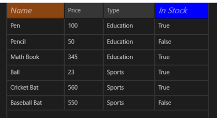
On running application you will get RadDataGrid with styled column header as following

image

In this post we used some of the discussion from last post so did not discuss about binding and Product class in earlier part of this post. However For your reference find definition of business class Product below


public class Product
 {

 public string ProductName { get; set; }
 public double ProductPrice { get; set; }
 public string ProductType { get; set; }
 public bool InStock { get; set; }
 }

ItemSource of RadDataGrid is set as below,


protected override void OnNavigatedTo(NavigationEventArgs e)
 {

this.ProductGrid.ItemsSource = GetProducts();
 }

GetProducts() class is defined as below,


private List<Product> GetProducts()
 {
 List<Product> lstProduct = new List<Product>
 {
 new Product
 {
 ProductName ="Pen",
 ProductPrice = 100,
 ProductType = "Education",
 InStock = true
 },
 new Product
 {
 ProductName ="Pencil",
 ProductPrice = 50,
 ProductType = "Education",
 InStock = false
 },
 new Product
 {
 ProductName ="Math Book",
 ProductPrice = 345,
 ProductType = "Education",
 InStock = true
 },
 new Product
 {
 ProductName ="Ball",
 ProductPrice = 23,
 ProductType = "Sports",
 InStock = true
 },
 new Product
 {
 ProductName ="Cricket Bat",
 ProductPrice = 560,
 ProductType = "Sports",
 InStock = true
 },
 new Product
 {
 ProductName ="Baseball Bat",
 ProductPrice = 550,
 ProductType = "Sports",
 InStock = false
 },
 };

return lstProduct;
 }

In this way you can work with column header style. I hope you find this post useful. Thanks for reading.

Learn more about Rad Controls for Windows 8 here

Three Steps to work with RadDataGrid in XAML based Windows Store Application

Recently I was talking to Windows Store App Developers. When I show them demo of RadDataGrid , all they got very excited. One of the manager asked me to show working with RadDataGrid in simplest steps. In this post we will take a look on working with RadDataGrid in three simple steps.

Learn more about Rad Controls for Windows 8 here

Step 1: Add Rad Controls for Windows 8 reference

Go ahead launch Visual Studio and create a new Windows Store Application. Select Blank App project template to create application. After project being created add Rad Controls for Windows 8 reference in the project. To add reference right click on Reference in project and select Add Reference.

image

After adding reference on XAML add namespace to work with RadDataGrid


xmlns:telerik="using:Telerik.UI.Xaml.Controls.Grid"

Step 2: Create Business object

Next step you need to create business object. Let us create business objects for Product


public class Product
 {

 public string ProductName { get; set; }
 public double ProductPrice { get; set; }
 public string ProductType { get; set; }
 public bool InStock { get; set; }
 }

We will display Products in RadDataGrid. In real time scenario List of Products will be fetched from Services. For purpose of this post let us create List of Products as collection locally.


private List<Product> GetProducts()
 {
 List<Product> lstProduct = new List<Product>
 {
 new Product
 {
 ProductName ="Pen",
 ProductPrice = 100,
 ProductType = "Education",
 InStock = true
 },
 new Product
 {
 ProductName ="Pencil",
 ProductPrice = 50,
 ProductType = "Education",
 InStock = false
 },
 new Product
 {
 ProductName ="Math Book",
 ProductPrice = 345,
 ProductType = "Education",
 InStock = true
 },
 new Product
 {
 ProductName ="Ball",
 ProductPrice = 23,
 ProductType = "Sports",
 InStock = true
 },
 new Product
 {
 ProductName ="Cricket Bat",
 ProductPrice = 560,
 ProductType = "Sports",
 InStock = true
 },
 new Product
 {
 ProductName ="Baseball Bat",
 ProductPrice = 550,
 ProductType = "Sports",
 InStock = false
 },
 };

return lstProduct;
 }

Step 3: Create RadDataGrid and bind with the datasource

In last step you need to put RadDataGrid on XAML and bind it to data source. RadDataGrid can be created as following


<telerik:RadDataGrid x:Name="ProductGrid" />

Next you need to bind RadDataGrid to List of Products. You can do that as following


this.ProductGrid.ItemsSource = GetProducts();

Run Application

On running application you will find RadDataGrid. You will notice that by default RadDataGrid supports sorting on columns

image

In these 3 simple steps you can start working with RadDataGrid in XAML based Windows Store Application. In further posts we will get into deeper concepts of RadDataGrid. I hope you find this post useful. Thanks for reading.

Learn more about Rad Controls for Windows 8 here

What is Test Oracle

Test oracle determine that whether a test executed as expected or not. Essentially you can say test oracle is a mechanism to determine whether program, software or application got executed as expected for a particular Test Case or not? A test oracle may be either manual or automated.

Let us understand test oracle with an example. You are automating test of File Download Functionality. Downloading of file may take following steps

  • User will click on a Button
  • On click of button Operating System File Download dialog will open
  • User will select download location
  • File download will start

In above test case to verify successful download of file you may want to create a test oracle which will verify size of downloaded file on the file system. Hence in this case,

image

Test Oracle is very specific to a business scenario and probably tool may not able to automate this. Test Oracle can be written as Coded Step.

We can summarize Test Oracle as parameter which verify that whether application passed a test for a particular test case or not.

What is Document Object Model?

While automating a test understating of DOM is very essential. Any tool read DOM to automate test. In this post we will try to understand what DOM is in simplest words. Tool sees whole page you are doing automation testing as DOM and searches, finds elements in DOM.

As of W3C definition: DOM stands for Document Object Model and it is a programming interface to manipulate a well formed HTML or a valid XML document. Here we will discuss DOM in context of HTML.

Technically, browsers create DOM after parsing the HTML. All browsers follow the specification given here to create the DOM. DOM created by Browsers can be accessed and manipulated by programming languages like JavaScript. Essentially, you can say that DOM connects web pages to programming languages.

image

DOM expose everything of the web page as objects to programming languages like JavaScript. Whether it is elements, events, styles etc. all are exposed as objects to JavaScript. Let us consider following HTML,


DOM will expose all the HTML elements as objects. These objects can be manipulated and updated by JavaScript.

image

In other words we can say that DOM is Application Programming Interface (API) which exposes HTML or XML as structured document to programming languages. This structure document can be manipulated by the languages like JavaScript. Above listed HTML can be exposed as following structured document by DOM.

image

DOM see a HTML document as tree. All elements can be seen as nodes of the tree. Attributes and value of elements can be seen as leaf of the tree.

Browsers generates DOM when it parses the HTML. For example, when you browse above HTML in browser it will parse the HTML and create DOM. You can view created DOM by pressing F12 in any mostly used browser.

image

I hope now you have descent understanding of DOM. You need understanding of DOM to automate test. I hope you find this post useful. Thanks for reading.

How to automate “once login and perform many operation Test ” in Test Studio

I was talking to a customer and they wanted to test a CRM application. There test scenario more or less like below image. They wanted to execute Entry Test and Exit Test only once and Main Test any number of times. When we do manual testing of this scenario this is usual kind of test cases. However automating this test is not that simple. In this post we will take a look that how Test Studio simplify automating this type of test scenario.

image

Let us assume you need to automate a test for following scenario,

Test Step 1: Login to application

Test Step 2: Perform various operations

Test Step 3: Logout from application

Requirement is that user will Login only once, perform operations any number of times and then logout from application. Essentially step 1 and step 3 will be executed by user only once and step 2 will be executed any number of times. Iteration of step 2 depends on external data source. This may be usual automated testing scenario you always come across.

Now let us assume that you have recorded test as following,

image

In above test we are data driving step 6. We are performing usual data driven testing. Problem with this approach is that each steps will get executed number of times depending on rows in data source. So if there are 10 rows in test data then this each test steps will be executed 10 times.

Our requirement is different in above test steps we want to execute only test step 6 ten times and other test steps only once. Let us see how we can do this.

Step 1: Move test steps you want to execute many times in different test. Let us call this test as INNERTEST

Step 2: Make sure to data bind the INNERTEST

Step 3: Record OUTERTEST. In OUTERTEST record all the steps you want to execute only once.

So in above recorded test we can record step 6 as separate test. We are calling that test as INNERTEST. This test is data bind.

image

This INNERTEST will contain all the test steps we want to execute repeatedly. In this case we have test step in INNERTEST.

image

After recording INNERTEST, let us go ahead and record OUTERTEST. We need to put all test need to executed only once part of this test. So all test steps for Login and Logout will be part of OUTESTEST. You notice that we want these test steps to be executed only once.

image

Now from ribbon add a Test as step in OUTERTEST.

image

You need to choose INNERTEST as test as step to be part of OUTERTEST

image

We have added INNERTEST as test as step in OUTERTEST at step 6.

image

Now on execution of test you will find that all test steps are getting executed only once however test steps of INNERTEST will executed many times depending on number of rows of data source. So we can conclude that

image

In this way you can work with multilevel test using Test Studio. I hope you find this test useful. Thanks for reading.

How to work with Loops in Test Studio

You may come across many scenario in which you need to execute a particular test several number of times or in other words you need to execute certain number of test steps in a loop.

Let us consider following test. These are automated test steps for login functionality. Assume, you need to run step 2 to step 7 5 times with same data. In this scenario you need to execute from step 2 to step 7 in loop.

image

To automate above scenario Test Studio provides you out of box solution. You can automate above scenario with Logical Steps. In Test view you will find Logical Steps in Add section.

image

To put test steps in loop select loop Logical step from Add section and add a Logical Test Step in test. After adding logical step you can change Count. We are setting count as 5 here.

image

After setting Count drag and drop test steps you want to execute under test. Here we need to drag and drop step 2 to 7 in the loop. After dragging and dropping test steps test will look like below image. Now test step 2 to 7 will be executed 5 times.

image

In this you can execute a test in loop. Loop Logical steps should be used when you need to execute same test with same data many number of times. I hope you find this post useful. Thanks for reading.

Kendo Editor

Kendo Editor Wrapper for ASP.NET MVC

Overview:

This is the seventh post in the series on Kendo UI wrappers for ASP.NET MVC. We will look at one more wrapper in this post namely Editor. This post is part of a getting started with Kendo UI wrappers for ASP.NET MVC and you can find the index post here.

What is Editor Wrapper?

First lets understand what is a Editor control all about. The Editor allows users to create rich text content by means of a WYSIWYG interface. The generated widget value is comprise of XHTML markup.

imageFig 1: Kendo Editor

The Editor Wrapper for ASP.NET MVC is a server side wrapper for Kendo UI Editor which is a JavaScript based widget.

Basic Usage:

In order to use the kendo editor on any web page, we will use the Editor wrapper available as part part of the Kendo Wrappers for ASP.NET MVC. Following is the code for the basic usage where in we just instantiate the kendo editor and give it a name while setting the width & height.

@(
Html.Kendo().Editor()
.Name("kEditor")
.HtmlAttributes(new {style="width:740px;height:440px"})
)

Note that you need to set the Name for the editor. Other wise we will be issued a InvalidOperation exception at runtime which will say “Name cannot be blank”. Following is the screen shot of the output:

image

Fig 2: Kendo Editor Basic Usage

Tools Bar:

The top bar on the editor is known as Tools bar. By default the editor will display the basic necessary tools without we explicitly specifying them. The editor supports the following tool options:

1. Bold 13. InsertUnorderedList
2. Italic 14. InsertOrderedList
3. Underline 15. Indent
4. Strikethrough 16. Outdent
5. FontName 17. FormatBlock
6. FontSize 18. CreateLink
7. FontColor 19. Unlink
8. BackColor 20. InsertImage
9. JustifyLeft 21. SubScript
10. JustifyCenter 22. SuperScript
11. JustifyRight
12. JustifyFull

Table 1: Tool Bar Configuration Option

So here is the code to get all the tools on the tool bar:

@(
Html.Kendo().Editor()
.Name("kEditor")
.Tools(tools => tools
.SubScript()
.SuperScript()
)
.HtmlAttributes(new {style="width:740px;height:240px"})
)

Here is the output of the above code changes:

image

Fig 3: All Tools on the Tool Bar

Note: In order to get all the tools we just added Subscript() and Superscript() options. That is because, editor control will default add tools from 1 to 20 in the above table. So we just added missing tools. If you want to keep only some tools on the tool bar, you will need to first clear the tools and then add the tool option you want. Following code will add only FontName, FontSize, ForeColor and BackColor to the tool bar:

@(
Html.Kendo().Editor()
.Name("kEditor")
.Tools(tools => tools
.Clear()
.FontName()
.FontSize()
.FontColor()
.BackColor()
)
.HtmlAttributes(new {style="width:740px;height:240px"})
)

Here is the output of the above code changes:

image

Fig 4: Custom Options in Tool Bar

Custom Tool Bar Options:

So far we saw the default tool bar options available in Kendo. What if we want to have a custom tool bar option. Lets say we want to provide a button to draw a horizontal rule in the editor – it can be done by making use of the CustomButton() support in the editor. Here is the code to do that:

@(
Html.Kendo().Editor()
.Name("kEditor")
.Tools(tools => tools
.Clear()
.FontName()
.FontSize()
.FontColor()
.BackColor()
.CustomButton(cb => cb
.Name("HorizontalRule")
.ToolTip("Insert a horizontal rule")
.Exec(@<text>
function(e)
{
var editor = $(this).data("kendoEditor");
editor.exec("inserthtml",{value:"<hr />"});
}
</text>)
)
)
.HtmlAttributes(new {style="width:740px;height:240px"})
)

Here is the output of the above code changes:

image

Fig 5: Custom Button in Tool Bar

Adding Snippets:

Snippets are short piece of text and can be anything. For e.g. an email signature is a text snippet we normally create and store in our mail programs. The mail programs inserts the signature whenever we compose new mail. Similarly Kendo Editor provides ability to create snippets and enable end users to pick the snippet to insert as text. Following is the code:

@(
Html.Kendo().Editor()
.Name("kEditor")
.Tools(tools => tools
.Clear()
.Snippets(snippets => snippets
.Add("Signature","<p>Regards,<br /> Lohith G N,<br /><a href='mailto:lohith.nagaraj@telerik.com'>lohith.nagaraj@telerik.com </a></p>")
.Add("Kendo Online Demos"," <a href='http://demos.kendoui.com'>Kendo online demos</a> ")
)
)
.Value(@<text>
Put the cursor after this text and use the "Insert HTML" tool.
</text>)
.HtmlAttributes(new {style="width:740px;height:240px"})
)

Here is the output of the above code changes:

image

Fig 6: Snippets Feature

Custom Styling of content:

So far we have seen some of the core functionality of the editor. Another awesome feature of editor is the support for custom styling to the content. You can pretty much define your own style classes and within the editor provide it like a drop down option. Editor supports Styles() option to provide the custom style. Here is the code to achieve this:

<!--Editor Styles-->
.hlError
{
background-color:#fea;
color:#f33;
}
.hlOK
{
background-color:#aef;
color:#060;
}
.inlineCode
{
font:bold 12px monospace;
}
@* Code *@
@(
Html.Kendo().Editor()
.Name("kEditor")
.Tools(tools => tools
.Clear()
.Styles(styles => styles
.Add("Highlight Error", "hlError")
.Add("Highlight OK", "hlOK")
.Add("Inline Code", "inlineCode")
)
)
.StyleSheets(styles => styles.Add(Url.Content("~/Content/EditorStyles.css")))
.Value(@<text>
Kendo UI Editor allows your users to edit HTML in a familiar, user-friendly way.<br />
In this version, the Editor provides the core HTML editing engine, which includes basic
text formatting, hyperlinks, lists,
and image handling. The widget <strong>outputs identical HTML</strong> across all major
browsers, follows
accessibility standards and provides API for content manipulation.
</text>)
.HtmlAttributes(new {style="width:740px;height:240px"})
)

If you look at the code what we have done is, created 3 styles for the demo sake and created a new stylesheet named editorStyles.css. We use the Styles() options to add the custom styles and use the Stylesheets() option to add reference to EditorStyles.css. Note the styling Kendo has added to Styles drop down. while setting it up – we just had given a text value pair for a style. Kendo applies the style for the drop down item – neat I say. Here is the output of the above code changes:

image

Fig 7: Custom Styling of content

Handling client side events:

Kendo widgets being client side controls, we have very rich API support on the client side. One of the API feature is that of client side event handling. Editor supports the following events:

  • change – Fires when Editor is blurred and its content has changed
  • execute – Fires when an Editor command is executed
  • paste – Fires before when content is pasted in the Editor
  • select – Fires when the Editor selection has changed

Here is the code to hook on to the client events for the editor:

@(
Html.Kendo().Editor()
.Name("kEditor")
.Events(events => events
.Change("change")
.Execute("execute")
.Select("select")
.Paste("paste")
)
.Value(@<text>
Kendo UI Editor allows your users to edit HTML in a familiar, user-friendly way.<br />
In this version, the Editor provides the core HTML editing engine, which includes basic text
formatting, hyperlinks, lists,
and image handling. The widget <strong>outputs identical HTML</strong> across all major browsers,
follows
accessibility standards and provides API for content manipulation.
</text>)
.HtmlAttributes(new {style="width:740px;height:240px"})
)
</p>
<div class="console"></div>
<script>
function change(e) {
$(".console").append("change <br />");
}
function execute(e) {
$(".console").append("execute command :: " + e.name + "<br />");
}
function select(e) {
$(".console").append("selection change <br />");
}
function paste(e) {
$(".console").append("paste <br />");
}
function contentLoad(e) {
$(".console").append("Content loaded in <b>" + $(e.item).find("> .k-link").text() +
"</b> and starts with <b>" + $(e.contentElement).text().substr(0, 20) + "...</b> <br />");
}
function error(e) {
$(".console").append("Loading failed with " + e.xhr.statusText + " " + e.xhr.status + "<br />");
}
</script>

Here is the output of the above code changes:

image

Fig 8: JavaScript Event Handling

Accessing Editor from client side:

As mentioned in the previous section all Kendo widgets support a rich API and once instantiated we can grab the control at runtime. Here is the JavaScript code do that:

<p>
@(
Html.Kendo().Editor()
.Name("kEditor")
.HtmlAttributes(new {style="width:740px;height:240px"})
)
</p>
<script>
$(document).ready(function () {
var editor = $("#kEditor").data("kendoEditor")
editor.value("Text added at runtime")
});
</script>

As you can see, on document ready we grab the element which has the id kEditor and then use jquery’s data() method to get the Kendo Editor component. After that we set the content of the editor using the value() method. The client side API support a rich set of methods, properties and events. For a complete API listing, check out our docs page: Kendo Editor API.

Summary:

In this post we looked at one more wrapper namely Editor. It is very easy to work with Editor ASP.NET MVC wrapper and with just couple of lines we have a fully working editor set up. Also we saw how the control supports a rich set of client side API to work with. Hope this post helps you with your endeavor on Kendo Editor.

Webinar Recap: Automated Functional Testing can be affordable with Test Studio

Ninja Enough? – Telerik India Webcasts (April – May 2013)

clip_image001

On 21st March 2013 we at Telerik India hosted webinar on Automated Functional Testing Can be affordable with Test Studio . We thank you for attending the webinar. In this webinar we tried a story way of presenting and on poll 75% audience liked that. This data was very motivating.

Find Test Studio resources at below links,

Download free trial from here

Learn more about Test Studio here

Read documentation here

In webinar, we started from scratch and did demo on

  • Recording a Test
  • Working with verification steps
  • Integrating bugs with TFS and Team Pulse
  • Data Driven Testing
  • AJAX Testing

Find below presentation from webinar,

If  you have any technical query feel free to reach me at

Dhananjay.kumar@telerik.com

And for any sales related query feel free to send a mail to

Abhishek.kant@telerik.com and sales@telerik.com

Thanks once again for attending webinar. See you in next webinar.

How to perform localization on RadGrid for ASP.NET AJAX

Overview:

I attended TechEd India 2013 which was held at Bangalore on Mar 18 & 19. I was talking to couple of developers on their experience with our Rad Controls. One of the developer with whom I was talking to wanted to know if localizing string is easy or difficult with our Grid. He was talking about the static texts which we have in our Grids like – message shown on the group bar, message shown in mouse over of columns for sorting, message shown in our filter menu items etc. His project was looking at using a 3rd party control and localizing the controls with minimal effort was one of the main criteria for them. I told him that it was as easy as creating one file and adding it to the project. In this post we will explore our option on localizing Telerik controls in general the RadGrid.

Global Resource Files:

When you download and install the RadControls for ASP.NET AJAX, we also ship resource files for all our controls and is installed in “App_GlobalResources” folder. Below is a screen shot of the resource files installed on your hard disk:

image

Fig1: Global Resources for RadControls

Notice the resource file for Grid high lighted. The file name is RadGrid.Main.resx. This contains all the resource string for neutral culture and will be used by our RadGrid control.

When you create a ASP.NET project, you can add certain specific named folders which the ASP.NET recognizes and specific types of content can be kept in this folder. One such folder is App_GlobalResources and can contain resources namely .resx files and .resources files. These are compiled into assemblies with global scope. These resources are strongly typed and can be accessed programmatically also.

Steps involved in Localizing the RadGrid

Following steps are involved in localizing the RadGrid:

  1. Add RadGrid.Main.resx file to your application’s App_GlobalResources folder
  2. Create a language pack i.e. RadGrid.Main.<locale id>.resx and add it to App_GlobalResources folder
  3. Set the culture to use on the RadGrid

We will go through the above steps one by one in following sections.

1. Adding RadGrid resource files:

Open Visual Studio and create a new project. Select Telerik > Web template and “C# RadControls Web Application”.

SNAGHTML263dbfce

Fig2: New Project Dialog

Once Visual Studio finishes creating the project, solution will look like below:

image

Fig3: Solution Explorer

Open Default.aspx and add a RadGrid from the toolbox. We will bind the grid to Products table from Northwind database. We will make use of OpenAccess to create a Data Model or Domain Model and OpenAccess Data Source for data binding. If you are not familiar with OpenAccess, it is a free ORM tool from Telerik. I encourage you to download and play with it. Add a new item to the project of type “Telerik OpenAccess Domain Model”.

image

Fig4: Add New Item Context Menu

For this demo, I have selected only Products table and created my OpenAccess Domain Model. Here is how the domain model should look like now:

image

Fig5: OpenAccess Domain Model Diagram

After adding the domain model, do a build to make sure everything is ok. Next, open the Default.aspx in designer mode, click on the smart tag of RadGrid, the smart tag property window will be shown. From the choose data source dropdown select <New data source> option. You will be presented with “Choose a Data Source Type” window. Select OpenAccessLinqDataSource. Specify  name for the data source and proceed. Next in “Select OpenAccess Context Type” window, it will automatically select the domain model we have added and select the products table as the entity and click Next. In “Configure Data Selection” window select the columns that needs to be shown on the grid and click Finish. Now we have  a data source and our RadGrid is bound to that data source. Enable Paging, Sorting, Grouping and Filtering on the grid by using the smart tag.

image

Fig6: RadGrid Smart Tag

Add a new folder called “App_GlobalResources”. Add RadGrid.Main.resx file from App_GlobalResources folder found in your RadControls for ASP.NET AJAX installation folder and paste it in your applications App_GlobalResources folder. At this point run the application and you will see the below output of the grid:

image

Fig7: RadGrid output

Notice the static text on – grouping bar, Sort tool tip (when you mouse over on the columns), filter conditions and the page size. So we will see how to localize these.

2. Add language pack:

For the purpose of this blog post I will try to create a French language pack or resource file and the RadGrid will use the strings from it to display the static text. In order to add a language pack for RadGrid, copy the RadGrid.Main.resx and paste it in App-GlobalResources folder. Rename the pasted file to RadGrid.Main.fr-FR.resx. Here fr-FR is the locale that we would like to localize the grid. This can be any other locale that you need to support in your applications. If you double click RadGrid.Main.fr-FR.resx in Visual Studio, you will see the resource editor open and show the strings as a grid. Here is the screenshot of that:

image

Fig8: RESX Editor

As you can see we see the string name and value for that. Since we copied from language neutral resource file, the values are all in English locale. Now all we are required to do is to change the value of the keys to French locale. I will use Bing translator to translate the values and replace them in the RadGrid.Main.fr-FR.resx. After translating some of the values to French, here is how the RESX file looks like:

image

Fig9: French Resource File

3. Set locale on RadGrid

In order for the RadGrid to pick up the right locale you can either set the Culture property of the RadGrid explicitly or set the Culture property to CurrentUICulture. For the purpose of this demo, I am explicitly setting the culture of RadGrid to fr-FR i.e. French.

image

Fig10: RadGrid Culture property

Here is the RadGrid with culture set to fr-FR:

image

Fig11: RadGrid localized to fr-FR locale

Note: The column headers are not localized because I haven’t provided any strings for them. You can pretty much use the same global resource file and use the resource strings instead of the static text. This blog post was to show how parts of RadGrid can be easily localized.

Summary:

With simple 3 steps we were able to localize different texts of RadGrid without much hassle. All we needed to do was to create a language pack and keep it in App_GlobalResources folder. All Telerik controls respect the ASP.NET folder and know how to use the resources from this folder. Hope this helps you all those folks who are looking at localizing our controls. Do leave any feedback if you may have.

Join me for the webinar Automated Functional Testing Can be affordable with Test Studio

Register to attend webinar here

When: Thursday, March 21, 2013 3:00PM to 4:00PM India Time

clip_image001

Should your functional testing only be manual? Are you shying away from testing only because of the cost considerations? Are you paying through your nose to maintain your testing tool? In this webinar, we will talk about an affordable solution that covers the testing capabilities you need. If you are enthusiastic about finding bugs in software and find solace in testing, we have a Ninja tool for you. Explore this chart buster software – Telerik Test Studio from the comfort of your seat. We are excited to invite you for a webinar on Telerik Test Studio.

In this webinar we will cover and see how easy it is to do

  • Automated Web Testing
  • Data Driven Testing
  • Working with Test Lists
  • Test Result Analysis and Reporting
  • Ajax Testing
  • Performance Testing

To attend webinar register here

I am excited to see you in webinar on 21st March 2013 at 3 PM India time.

How to ask questions in Telerik Forums?

Recently one of our customer sent me mail that how could I ask questions in Forums. She was a fresher with assigned job to work on Rad Controls for AJAX. I helped her over the call and found a step by step guide could be useful for many Telerik products users. To ask question in forums follow following steps,

Step 1

Navigate to http://www.telerik.com/ and login with your Telerik Credentials. You should able to see your name at the right top.

clip_image001


Step 2

Next select the specific product for which you want to ask question. Let us say you want to ask question for any of the DevTools. From top click on Product Families and select DevTools.

clip_image003

Step 3

Now from menu select Community & Support and then choose Forums.

clip_image004clip_image006

Step 4

Next you need to choose specific product. Let us assume you want to ask question for Rad Controls for AJAX. For that choose ASP.NET AJAX

clip_image008

Alternatively you can search in entire forum also. For that put your search term and click green Search button.

Step 5

Now you need to select category of your question. For instance if you want to ask question for Calendar control then choose Calendar from listed option. After choosing category click on green New Thread button to ask question.

clip_image010

While asking question following points are important,

  • · Give descriptive title of the question.
  • · Embed code using code button from menu
  • · Be specific in asking question.

At end make sure to check subscribe me to this thread such that on every reply you get a mail.

clip_image012

In this way you can ask questions in forum. I hope you find this post useful. Thanks for reading.

How to use a smaller test as Step of bigger test in Test Studio

Let us assume a scenario that we need to automate test of a complex functionality. This complex function may be constituted of other small functions. Now all small functions are tested separately. To automate test of this bigger function we have two choices

  1. Record all steps in bigger function testing
  2. Use various smaller functional tests as a step in bigger function testing.

Test Studio provides us a feature in which we can use a functional test as step of another functional test. You can get that option in Add section of ribbon.

clip_image002

Assume we need to test CRM application. We have separately created automated test for Login functionality of application as given below,

clip_image003

And steps of this test is recorded as following

clip_image004

Next we want to record test for bigger function Add Contact in CRM. To do that let us create a test as following,

clip_image005

Now we want to use Login Test as a step in Add Contact test. To do this double click on Add Contact test to open the test. After that from Add section in ribbon select Test as Step option.

clip_image006

You will get option to choose from all the tests added in the test project. In this case there is only one test other than Add Contact Test. So select Login Test to add as step in Add Contact test.

clip_image008

After adding Login Test as step right click on the test and from context menu select Run then To here option.

clip_image010

On selecting this option Test Studio will first execute all the steps of Login Test and allow you to record further steps for Add Contact test.

In this way we can add a test as step in Test Studio to use a functional test as part of another bigger functional test. I hope you find this post useful. Thanks for reading.

Working with Manual Steps in Test Studio

Recently I was talking to a customer. Customer was automating there CRM functionally test and they had to perform test steps as following,

Step 1: Navigate to portal

Step 2: Login to portal

Step 3: Browse through portal

Step 4: Logout from portal

They recorded test to automate as given in below image

clip_image002

Now they had requirement that they want to perform login steps manually. In other words they wanted to manually perform steps 2, step 3 and steps 4. They had a question that

Can we add manual steps to an automated test in Test Studio? “. Answer is “YES”.

To add manual step Add section in ribbon and select more option. In drop down you will find Manual Step option to add.

clip_image004

Select Manual Step to add a manual step in Test Steps. Give desired name of manual step and click on OK to add it.

clip_image005

After adding manual step deleted automated test steps for login. After adding manual step and removing automated test steps for login test will look like following

clip_image007

Now while running test after step 1 Test Studio will wait to perform manual step. In manual step login to CRM can be done manually.

clip_image008

After manually login further test steps will be executed automatically.

clip_image009

In this way I answered customer to work with manual steps in automated test. I hope you find this post useful. Thanks for reading.


Download Source codes, Slides and Recording from 7th march Webinar: Developing Applications for Nokia Lumia using Telerik Controls

On 7th March 2013 we at Telerik India hosted webinar on Developing Applications for Nokia Lumia using Telerik Controls. We appreciate that you joined in. We hope that webinar was useful to you. If you have any further queries, please feel free to reach us.

Learn more about Rad Controls for Windows Phone here

Download trial from here

Download webinar resources from here

In webinar we explored various controls with focus on following three controls.

  • Conversation View
  • QR and Barcodes
  • Different kind of charts

Please find recorded webinar below.

Learn more about Rad Controls for Windows Phone here

Download trial from here

Download webinar resources from here

If you have any query feel free to reach us. You can reach me any time at dhananjay.kumar@telerik.com .

Create QR Code for Windows Phone 8 Apps using Telerik RadBarcodeQR Control

In this post we will take a look on creating QR Code in Windows Phone 8 Applications. We will use Telerik RadBarcodeQR control to create QR code. We will follow step by step approach to achieve this. At the end of this post we will create application as following,

image

Let us follow following steps to work with QR codes.

Step 1

In Windows Phone Application project we need to add Telerik Rad Controls for Windows Phone dll as reference. After adding that add following namespace on XAML.


xmlns:telerikPrimitives="clr-namespace:Telerik.Windows.Controls;assembly=Telerik.Windows.Controls.Primitives"
 xmlns:telerikDataViz="clr-namespace:Telerik.Windows.Controls;assembly=Telerik.Windows.Controls.DataVisualization

Step 2

After we have added reference we can simple create QR code with hard coded information as follows. We can create QR code using RadBarcodeQR control.

<telerikDataViz:RadBarcodeQR x:Name="qrContact"
 Opacity="1" Version="20"
 ErrorCorrectionLevel="H"
 Mode="Byte"
 ECI="ISO8859_1"
 FNC1="FNC1SecondPosition"
 Text="your data"
 ApplicationIndicator="00"/>

At this point on running application we will get QR code generated with hard coded data. We will get application running as following,

clip_image002

As we can see that following properties of QR code is configurable.

image

Step 3

As of now we have created QR code with hardcoded data. Let us go ahead and take user input as data and then create QR code of that data.

In XAML, divide content grid in two rows. In first row we will put QR code and in second row RadTextBox to enter user input. On click event of the button we will create QR code

Let us put following XAML to take user input


<StackPanel Orientation="Vertical" Grid.Row="1">
 <TextBlock Text="Contact details"
 Foreground="{StaticResource PhoneSubtleBrush}"
 Margin="12, 6, 12, -6"/>

<telerikPrimitives:RadTextBox Watermark="First and last name"
 Margin="0, -6, 0, 0"
 x:Name="nameTextBox"/>
 <telerikPrimitives:RadTextBox Watermark="Phone number"
 InputScope="TelephoneNumber"
 Margin="0, -12, 0, 0"
 x:Name="phoneTextBox"/>
 <telerikPrimitives:RadTextBox Watermark="Email"
 InputScope="EmailNameOrAddress"
 Margin="0, -12, 0, -2"
 x:Name="mailTextBox"/>

<Button Content="generate QR code"
 x:Name="btngenerateCode"
 />
 </StackPanel>

&nbsp;

Now on click event of the button we will set text property of QR code. We need to make sure that we have not set text property declaratively in XAML.


<telerikDataViz:RadBarcodeQR x:Name="qrContact"
 Opacity="0" Version="20"
 ErrorCorrectionLevel="H"
 Mode="Byte"
 ECI="ISO8859_1"
 FNC1="FNC1SecondPosition"
 ApplicationIndicator="00"/>

On click event of the button we need to set text property. That can be done as following. In below code we are doing concatenation of name, phone number and email as single string and then setting that as text property of QR code.


void btngenerateCode_Click(object sender, RoutedEventArgs e)
 {

 string qrdata = nameTextBox.Text + " " + mailTextBox.Text + " " + phoneTextBox.Text;
 qrContact.Text = qrdata;
 qrContact.Opacity = 1;
 }

On running application we can create QR code from use provided information.

clip_image002[6]

In this very simple we can create QR code using Telerik RadBarcodeQR control. I hope you find this post useful. Thanks for reading.