Step by Step working with Telerik Charts in Windows Phone 8

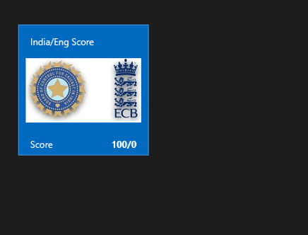
In this post we will take a look on working RadCharts in Windows Phone 8 Applications. I shall follow simplistic step by step approach for better learning of yours. At the end of this post we will complete creating a chart application as below.

Learn more Rad Controls for Windows Phone here

image

Step1: Create a Windows Phone 8 Application

Start with creating a Windows Phone 8 Application. To create Windows Phone Application choose Windows Phone App project template from Windows Phone tab.

clip_image002

Choose Windows Phone 0S 8.0 as Target Windows Phone OS version.

clip_image003

Next we need to add following references in the project to work with RadChart. To add references right click on the project and from context menu select Add Reference. After adding reference we are all set to work with RadCharts in Windows 8 project.

clip_image004

Step2: Add namespace on XAML

To work with chart now we need to add required references on XAML.


xmlns:chart="clr-namespace:Telerik.Windows.Controls;assembly=Telerik.Windows.Controls.Chart"
xmlns:chartEngine="clr-namespace:Telerik.Charting;assembly=Telerik.Windows.Controls.Chart"

After adding namespace we can put Chart on Xaml. A Chart can be created with following mark-up.


<chart:RadCartesianChart x:Name="chart">

 </chart:RadCartesianChart>

At this point if we go ahead and run application, we will find message that HorizontalAxis not set VerticalAxis not set.

image

Step3: Add VertialAxis and HorizontalAxis

Next step we need to add VerticalAxis and HorizontalAxis to chart. We can add axis as following,


<chart:RadCartesianChart x:Name="chart">
 <chart:RadCartesianChart.HorizontalAxis>
 <chart:CategoricalAxis/>
 </chart:RadCartesianChart.HorizontalAxis>
 <chart:RadCartesianChart.VerticalAxis>
 <chart:LinearAxis Maximum="100"/>
 </chart:RadCartesianChart.VerticalAxis>

</chart:RadCartesianChart>

There are different kind of Axes available. We will not get into details of each type in this post. However different kind of axes are as follows,

image

We are using Linear Axis for Vertical Axis and Cateogrical Axis as Horizontle axis in this example. At on running application we will get chart with two axis. However there will be no data rendered on chart. We are getting message that No Series added.

image

Step 4: Add Series to the Chart

In this step we will add Series to chart. We can add series to chart as following ,


<chart:RadCartesianChart.Series>
 <chart:LineSeries Stroke="Orange" StrokeThickness="2"></chart:LineSeries>
 </chart:RadCartesianChart.Series>

Likely Axis there are different kind of series is also available . We will talk about different series in later post. However different kind of series is as follows

image

At this point if we run application we will get message that there is no datapoint added in the chart. We will get expected output as following ,

image

Step 4: Add Data Point to Chart

We can add Data Point as following in the chart. We are adding data point in XAML here. In real time scenario we will have to fetch data from services and bind data point to chart at runtime. We can achieve that using data binding.

<chart:RadCartesianChart.Series>
 <chart:LineSeries Stroke="Orange" StrokeThickness="2">
 <chart:LineSeries.DataPoints>
 <chartEngine:CategoricalDataPoint Value="20"/>
 <chartEngine:CategoricalDataPoint Value="40"/>
 <chartEngine:CategoricalDataPoint Value="35"/>
 <chartEngine:CategoricalDataPoint Value="40"/>
 <chartEngine:CategoricalDataPoint Value="30"/>
 <chartEngine:CategoricalDataPoint Value="50"/>
 </chart:LineSeries.DataPoints>
 </chart:LineSeries>
</chart:RadCartesianChart.Series>

At this point on running application we should get chart as following,

clip_image002

If we want we can add one more series to Chart as following

 <chart:RadCartesianChart.Series>
 <chart:LineSeries Stroke="Orange" StrokeThickness="2">
 <chart:LineSeries.DataPoints>
 <chartEngine:CategoricalDataPoint Value="20"/>
 <chartEngine:CategoricalDataPoint Value="40"/>
 <chartEngine:CategoricalDataPoint Value="35"/>
 <chartEngine:CategoricalDataPoint Value="40"/>
 <chartEngine:CategoricalDataPoint Value="30"/>
 <chartEngine:CategoricalDataPoint Value="50"/>
 </chart:LineSeries.DataPoints>
 </chart:LineSeries>
 <chart:LineSeries Stroke="Red" StrokeThickness="2">
 <chart:LineSeries.DataPoints>
 <chartEngine:CategoricalDataPoint Value="10"/>
 <chartEngine:CategoricalDataPoint Value="20"/>
 <chartEngine:CategoricalDataPoint Value="45"/>
 <chartEngine:CategoricalDataPoint Value="60"/>
 <chartEngine:CategoricalDataPoint Value="50"/>
 <chartEngine:CategoricalDataPoint Value="40"/>
 </chart:LineSeries.DataPoints>
 </chart:LineSeries>

&nbsp;

After adding two series application should render Chart like following,

clip_image002[5]

Step 5: Add Data Point to Chart from Code behind

In previous steps we added Data Points in XAML. We can very much add Data Points at run time. To add data point from code behind let us go ahead and delete data point from XAML. We can add that in code behind as following,

this.chart.Series[0].ItemsSource = new double[] { 20, 30, 50, 10, 60, 40, 20, 80 };
 this.chart.Series[1].ItemsSource = new double[] {10,30,40,60,34,59,20,75 };

In this way we can work with Charts in Windows Phone 8. I hope you find this post useful. Thanks for reading.


Webinars in India

Webinar Recap : ASP.NET MVC–Better User Experience with Kendo UI

On Feb 28 we at telerik India hosted a webinar for Asia Pacific Region titled “ASP.NET MVC – Better User Experience with Kendo UI”. This blog post will allow you to get a recap of the same in the form of presentation slide deck and video recording

The webinar was an aim at letting you the user know about Kendo UI Web framework and how Kendo UI can work with ASP.NET MVC and improve the user experience of ASP.NET MVC applications. As you know ASP.NET MVC is a pattern based web application development stack from Microsoft and allows complete control over the mark up that gets generated. This means that there is no server control or control state or view state to maintain. You are left with plain HTML markup to play with.

Kendo UI is a HTML5 based client side JavaScript framework. Kendo UI  control supports around 20+ controls which can be instantiated using pure JavaScript coding or using the ASP.NET MVC server side wrappers. With the Server Side wrappers you get the power of JavaScript with productivity of the server. The wrappers make it easy for you and you need not know JavaScript coding at all. The wrapper code makes it easy for you to work with Razor or Webforms engine as it supports both.

Through this webinar – I showcased the use cases of how ASP.NET MVC Wrappers allow you to integrate Kendo UI Web controls with your existing ASP.NET MVC applications and improve the user experience of your apps.

Here is the presentation slide deck used in the webinar:

Here is the video recording of the webinar:

Hope you find this webinar useful and try our Kendo UI ASP.NET MVC Wrappers in your application too.

Till next time – Happy Coding.

Telerik conducted Cross Platform Mobile Application Development workshop for students in India office

View Photos from Workshop here

Download Icenium from here

Cross Platform Mobile Application Development or Hybrid Application development is gaining huge popularity among mobile application developers. Seeing popularity of this paradigm we at Telerik decided to educate about Hybrid App Development to college students. We conducted 8 hrs. Regress training session for 13 students on 2nd March 2013 in our India office.

image

To select students we asked them two simple questions,

  1. Where is head office of Telerik ?
  2. Why we should select you for the workshop ?

There were more than 80 students who shown interest in attending workshop. We chosen 13 out of them. Event started at 11 am . Workshop was scheduled till 6 pm but seeing high energy and enthuse of students , we extended workshop by 2 hrs more. Workshop got over at 8pm.

Students learnt mainly on following topics and created two hybrid apps titled “Twitter Search “ and “Indian States”

  • Icenium IDE
  • Kendo UI Mobile
  • Difference between Native Apps and Hybrid Apps
  • Design guidelines for Hybrid App

image

Day started with keynote session by Telerik Country manger Abhishek Kant. He did set up dais for the day . Students got charged and motivated for day long coding after interaction with him.

image

As day progressed students learnt about various aspect of Hybrid App development paradigm. They created app using Icenium and Kendo UI Mobile.

All 13 students created these two Hybrid Apps

  1. Twitter Search Application
  2. Indian State App

In order to create these two apps students learnt about ,

  • Working with Kendo UI data source
  • Working with Kendo UI Mobile ListView
  • Working with Kendo UI Template
  • Understanding Icenium IDE
  • Building and packaging app using Icenium
  • Certificate management in Icenium
  • Creating APK package using Icenium.

It was a learning day for young students with lot of fun. There was visible happiness on each face when they installed APK package on their Android devices. They were on blue sky seeing app created by them running on their devices.

image

For us it was great day intercating and tecahing young students on latest of the mobile app development paradigm. We are excited for more of these types of events.

View Photos from Workshop here

Download Icenium from here

How to Activate Test Studio Installation

In this post we will take a look on Activation process of Test Studio. After successful installation of Test Studio, you will be prompted to activate the installation.

clip_image002

Either you can activate the purchase license or activate as trial. To activate the purchase license select first option and click on Next to proceed further.

clip_image004

Again you have two options to activate. Either you can activate online which is recommended or offline using license key. You can find license key for Test Studio under Manage Product section of your Telerik Account. To activate online select online option and click on Next to proceed further.

clip_image006

Here you need to provide your Telerik credential. After providing Telerik Credential click on Activate to activate Test Studio.

clip_image008

After successful activation you will get above message. If you are running Test Studio as trial then you can activate it later as well. To activate it later launch Test Studio and click on the Help menu. In Help menu select View from About tab.

clip_image010

If you Test Studio installation is already activated then you will get license information as following image.

clip_image011

If you are running trial version then you will get an option to activate license.

clip_image012

In this way you can activate Test Studio. I hope you find this post useful. Thanks for reading.

How to create Data Model of SQL Azure database using Telerik Open Access ORM

In this post we will take a look on creating data model using Open Access ORM from a data base in SQL Azure.

image

To create data model add new item to project and select Telerik Open Access Domain Model from Data tab.

clip_image002

Next select option Populate from database and from drop down choose Microsoft SQL Azure. If you want you can change the model name and then click on the Next.

clip_image004

Telerik Open Access ORM does not provide you to create a connection in case of SQL Azure. You will have to manually copy and paste connection string of SQL Azure database to create Domain Model. You can find connection string of SQL Azure database in Windows Azure portal.

clip_image006

In the quick glance click on the Show Connection strings to see the connection string. Choose ADO.NET connection string. Do not forget to change the password with the real password.

clip_image007

Copy this connection string of ADO.NET and paste it to Set Connection Manually section and click on the Next.

clip_image009

Next you need to choose Schemas, Tables, Views, Stored Procedure to create data model. Let us say we are choosing only one table to create data model. After choosing items click on the next.

clip_image011

Now you can define naming rules of Classes, Fields and Properties if required. Let us leave to default and click on next to proceed further. In last step you can configure Code Generation Settings. Let us leave settings to default and click on Finish to generate data model.

Once Data Model is created you will find *.rlinq file added in the project. Click on *.rlinq file to view the data model.

clip_image012

In this way you can create a data model using Telerik Open Access ORM from a SQL Azure database. I hope you find this post useful. Thanks for reading.

Kendo DateTimePicker Wrapper for ASP.NET MVC

Overview:

This is the fifth post in a series on Kendo UI wrappers for ASP.NET MVC. In this post we will look at one more wrapper named DateTimePicker. Before we get on with DateTimePicker Kendo wrapper, if you are new and want to learn more about Kendo Wrappers for ASP.NET MVC, I suggest you take a look at “Jumpstarting Development with Kendo UI for ASP.NET MVC” by Abhishek Kant. The jumpstarting blog post will give you the basics on how to get started with Kendo for ASP.NET MVC. Here is the post which has links to all other blog post of the series.

What is DateTimePicker control?

DateTimePicker is a control which allows end user to select a date & time from a calendar & time picker. It also supports to input the data directly. The DateTimePicker control supports customizing the month view by providing a custom template. The Minimum date, Maximum date, the view to start the calendar with and the time interval on the time picker, are all configurable through options.

image

Instantiating a DateTimePicker:

The first step in using a date time picker is to instantiate it on the page. To instantiate the control we make use of the DateTimePicker builder available as part of the Kendo Wrappers for ASP.NET MVC. Below is the code snippet which shows how to instantiate the control:


@(
Html.Kendo().DateTimePicker()
.Name("kdatetimepicker")
.HtmlAttributes(new { style = "width:230px"})
 )

Here is the output of the above code:

image

What we just did was to instantiate a DateTimePicker control on the page and we gave it name. When it is rendered you will basically see a textbox to enter the date and time, a calendar button and the clock button. The calendar button when clicked will allow you to select a date and when you click the clock button will allow you to select the time interval.

Set default value to control:

As you can see from the previous section, when the control is instantiated the textbox is empty. That is expected as we never set a default value to the date time picker control. The calendar when opened will always show the current date highlighted but that is not a value until use clicks on it. In order to set the default value on the control, we will use the Value() method. The Value() method takes DateTime instance or a date in string format, which will be set as the controls value. Here is the code snippet to set the default value:


@(
Html.Kendo().DateTimePicker()
.Name("kdatetimepicker")
.Value("12/12/2012 14:30")
.HtmlAttributes(new { style = "width:230px"})
)

And here is the output of the above code snippet:

image

Formatting controls value:

Previous section we saw how to set the value of the control. The default format in which the date and time is displayed is “MM/dd/yyyy hh:mm tt” i.e. Month, Day, Year, Hour, Minutes and Meridian. Lets say we want to change the format in which the date and time is shown. The control provides the options to modify the format through Format() method. The Format() method takes a string which is nothing but your new format for date and time display. Here is a code snippet to set the format:


@(
Html.Kendo().DateTimePicker()
.Name("kdatetimepicker")
.Value("12/12/2012 14:33")
.Format("On MM/dd/yyyy @ hh:mm tt")
.HtmlAttributes(new { style = "width:240px"})
)

Here is the output of the above code change:

image

As you cane see I just provided a format “On MM/dd/yyyy @ hh:mm tt” and this translates the value to “On 12/12/2012 @ 02:33 PM”. So this is a handy setting to keep in mind.

Putting constraints on date selection:

With date picker, one of the common requirement that you will have to take care is to restrict the dates a user can select. You may want to set a minimum date and maximum date restriction on the calendar itself. The date time picker control provides this option through Min() and Max() methods. Both Min and Max methods support two overloads – one takes a string format of a date and another takes an instance of DateTime. Here is the code snippet to put restrictions on the calendar:


@(
Html.Kendo().DateTimePicker()
.Name("kdatetimepicker")
.Value("12/12/2012 14:33")
.Min("12/10/2012").Max("12/21/2012")
.Format("On MM/dd/yyyy @ hh:mm tt")
.HtmlAttributes(new { style = "width:240px"})
)

image

As you can see the dates are now restricted and the user can select from only the dates allowed to select.

Setting the Time interval:

The time picker component in this control, by default, sets the time interval between hours to 30 minutes. You have the flexibility to control the interval between the hours by using the Interval() method. The Interval() method takes a integer and will set the interval based on this value. Lets say I want to set the interval to 15 minutes, find below the code snippet to do that:


@(
Html.Kendo().DateTimePicker()
.Name("kdatetimepicker")
.Value("12/12/2012 14:30")
.Min("12/10/2012").Max("12/21/2012")
.Interval(15)
.Format("On MM/dd/yyyy @ hh:mm tt")
.HtmlAttributes(new { style = "width:240px"})
)

And here is the output of the above code snippet:

image

As you can see the interval between the hour is now set to 15 minute interval and this is through the Interval() setting we have in the code.

Handling Events:

The date time picker control supports client side event handling. The control exposes 3 events namely Open, Close and Change. Note that all these are client side events and the handlers will be client side event handlers. Here is the code snippet to listen to events and provide the event handlers to those events:


@(
Html.Kendo().DateTimePicker()
.Name("kdatetimepicker")
.Value("12/12/2012 14:30")
.Min("12/10/2012").Max("12/21/2012")
.Interval(15)
.Format("On MM/dd/yyyy @ hh:mm tt")
.HtmlAttributes(new { style = "width:240px"})
.Events(e => e
.Open("kdatetimepicker_open")
.Change("kdatetimepicker_change")
.Close("kdatetimepicker_close")
)
)

<script>
function kdatetimepicker_open() {
//Handle the open event
}

function kdatetimepicker_close() {
//Handle the close event
}

function kdatetimepicker_change() {
//Handle the change event
}
</script>

Access control from client side:

So far we have seen how to instantiate and configure settings on the control from server side. And the configuration was done using the Kendo ASP.NET MVC wrapper. Once the control is rendered on the client side what if you need to perform some operation on the DateTimePicker control itself. The Kendo UI JavaScript APIs allow us to grab the control on the client side and access its properties and methods. Let’s say on date change by user, we want to get the newly selected value and prompt it. Here is the code snippet to do that:


@(
Html.Kendo().DateTimePicker()
.Name("kdatetimepicker")
.Value("12/12/2012 14:30")
.Min("12/10/2012").Max("12/21/2012")
.Interval(15)
.Format("On MM/dd/yyyy @ hh:mm tt")
.HtmlAttributes(new { style = "width:240px"})
.Events(e => e
.Change("kdatetimepicker_change")
)
)
<script>
function kdatetimepicker_change() {
var dateTimePicker = $("#kdatetimepicker").data("kendoDateTimePicker");
alert(dateTimePicker.value());
}
</script>

As you can see, we first listen to on change event and in the event handler for change we use jquery selector to get the element by its id and use the jquery data() method to get the Kendo DateTimePicker control. Once we get hold of the control, it supports the value() method which will give us the current selected value. Here is the output of the above code:

image

Summary:

In this post we looked at one more Kendo Wrapper namely DateTimePicker. This control makes a perfect match for scenarios where you need to present both the date and time selection. We saw how easy it was to work with the control from the server side. With just a few settings we can get this control working according to our needs.

How to document Test Script in Test Studio

In this post we will take a look on documentation of Test Steps in Test Studio. On selection of a Test in project, you can see all the steps of the Test.

clip_image002

To create documentation of Test, select Test and from the ribbon select Storyboard

clip_image004

In Storyboard you can see screen short of all the test steps.

clip_image006

In Storyboard on the top you get option to “Export Storyboard as HTML documentation

clip_image008

You will be asked to select path to save extracted document.

clip_image009

After successful extraction, Test Studio will prompt you to view the exported test.

clip_image010

In this way you can create document of a Test in Test Studio. I hope you find this post useful. Thanks for reading.

Kendo DatePicker Wrapper for ASP.NET MVC

Overview:

This is the fourth post in a series on Kendo UI wrappers for ASP.NET MVC. In this post we will look at one more wrapper named DatePicker. Before we get on with DatePicker Kendo wrapper, if you are new and want to learn more about Kendo Wrappers for ASP.NET MVC, I suggest you take a look at “Jumpstarting Development with Kendo UI for ASP.NET MVC” by Abhishek Kant. The jumpstarting blog post will give you the basics on how to get started with Kendo for ASP.NET MVC. Here is the post which has links to all other blog post of the series.

What is DatePicker control?

DatePicker is a control which allows end user to select a date from a calendar or by inputting the data directly. The DatePicker control supports customizing the month view by providing a custom template. The Minimum date, Maximum date and the view to start out with are all configurable through options.

image

Instantiating a DatePicker:

to instantiate a DatePicker control on the page, we make use of the DatePicker builder available in as part of the Kendo wrapper helpers. Take a look at the below code to see how DatePicker is instantiated:

@( Html.Kendo().DatePicker().Name("kdatepicker") )

Here is the output of the above code:

image

As you can see we just instantiated the DatePicker control on the page. The control is made up of the textbox for manual input and a button (having calendar icon) which when clicked will bring up a calendar so that user can select any date.

Setting default value at instantiation:

In the previous section we saw how to instantiate a DatePicker control. But when it was rendered we did not see any default value i.e. a default date being displayed in the textbox. Well, that is because we never told the control what its default value was. DatePicker control exposes a method called Value() which can be used to set the default value. Here is a code to set the default value of the control to current day:

@(Html.Kendo().DatePicker().Name("kdatepicker")
      .Value(DateTime.Today)
)

Here is the output as a result of setting the default value to the control:

image

Formatting selected value:

We saw how to set the default value of the date picker control. The default format in which the date value is shown is MM/DD/YYYY. If you want to customize the format, the control provides the option to use the Format() method and provide any valid date time format that we are familiar with. So here is the code to set the format as “<Day Name>, <Month Name> <Date>, <Year>”:

@(Html.Kendo().DatePicker().Name("kdatepicker")
      .Value(DateTime.Today)
      .Format("dddd, MMMM dd, yyyy")
      .HtmlAttributes(new { style = "width:230px"})
)

I have used the Format() method and passed in a format “dddd, MMMM dd, yyyy” and below is the output of that code:

image

Putting constraints for selection:

When using date pickers in a real world applications, one of the common scenario is to restrict the dates a user can select. Usually we will have a minimum date and maximum date range and we would like the calendar to show only those dates and user can select only from those dates. DatePicker control provides Min() and Max() method which accept a DateTime value and use these two settings to restrict the values. Here is the code to use the Min & Max methods. I am setting the minimum date to be today and maximum date to be 4 days from today:

@(Html.Kendo().DatePicker().Name("kdatepicker")
      .Value(DateTime.Today)
      .Format("dddd, MMMM dd, yyyy")
      .Min(DateTime.Today)
      .Max(DateTime.Today.AddDays(4))
      .HtmlAttributes(new { style = "width:230px"})
)

Here is the output of the above code:

image

Customizing the Calendar Views:

So far we have seen that when the calendar is used for selecting a date, by default it shows the month view i.e. it shows current month and the days in that month. DatePicker control also has the provision to customize the calendar view and we can do that by using the Start() method. The Start() method accepts a enum of type CalendarView. CalendarView has options Century, Decade, Month and Year. You just set what view you would like to see and the calendar will show that particular view every time users open the calendar.  Here is a code to set the start view of the calendar to Century:

@(Html.Kendo().DatePicker().Name("kdatepicker")
      .Value(DateTime.Today)
      .Format("dddd, MMMM dd, yyyy")
      .Start(CalendarView.Century)
      .HtmlAttributes(new { style = "width:230px"}) )

Here is the output for the same:

image

Here is an example of all the calendar views:

image

Customizing cell rendering:

Imagine a scenario where you want to customize how a particular day needs to be rendered on the calendar. For e.g. November 9 is my birthday. So whenever Nov 9 is rendered I want to be reminded that its my birthday and I want a cake icon to be shown on that day. For such a scenario, DatePicker control has the provision to customize each cell rendering. This is done by passing a template to a method named MonthTemplate(). You can pass any valid kendo template string to this method. Here is the code to show a birthday cake on Nov 9 of every year:

@(Html.Kendo().DatePicker().Name("kdatepicker")
.Value(DateTime.Today)
.Format("dddd, MMMM dd, yyyy")
.HtmlAttributes(new { style = "width:230px"})
.MonthTemplate(" # if (data.value == 9 && data.date.getMonth() == 10) { # " +
"<div class=birthday /> " +
"# } #  " +
"#= data.value #")
)

What I have done is to pass a template string. If you look at the template itself, I am just checking if the current rendered date is 9 and current rendering month is November (remember JavaScript month array is zero index based, so Nov = 10) and if yes I am showing a div with class birthday. The stylesheet for birthday just puts a cake image. We show the date value irrespective of the check we do. Here is the output of the above code:

image

Customizing the footer:

When the calendar is open, it usually shows the current day in “<Day Name>, <Month Name> <Date>, <Year>” format at the bottom. This is known as the footer. This footer can be customized by providing a custom template. Here is the code to customize the footer:

@(Html.Kendo().DatePicker().Name("kdatepicker")
.Value(DateTime.Today)
.Format("dddd, MMMM dd, yyyy")
.HtmlAttributes(new { style = "width:230px"})
.Footer("Today - #= kendo.toString(data,'ddd, MMM dd, yyyy') # ")
)

Here is the output of the same:

image

Summary:

In this post, we looked at one more Kendo Wrapper named DatePicker. We looked at how easy it is to instantiate the control. set a default value, formatting the selected value, restricting the dates that can be picked, customizing the calendar view, customizing the cell rendering and finally how to customize the footer of the calendar. Hope this gives you a jumpstart at developing with Kendo DatePicker wrapper for ASP.NET MVC.

Till next time – Happy Coding!

Working with RadAutoCompleteBox in JavaScript based Application for Windows Store

In this post we will take a look on working with RadAutoCompleteBox in JavaScript based Windows Store Application.

Getting Started with RadAutoCompleteBox

You can create RadAutoCompleteBox by setting data-win-control property of a div or span as Telerik.UI.RadAutoCompleteBox. See the code below,


<div id="sportsAutoComplete"
 data-win-control="Telerik.UI.RadAutoCompleteBox"
 data-win-options="{placeholder:'enter player...'}">
</div>

In above code

  • data-win-control attribute of div is set as Telerik.UI.RadAutoCompleteBox
  • In data-win-options attribute

You can set datasource of RadAutoCompleteBox in two ways. You can directly set datasource either in data-win-options attribute or in the JavaScript function. You can set datasource in code behind as following,


var sportsArray = ['Sachin Tendulkar', 'Saurabh Ganguli', 'MS Dhoni', 'Rahul Dravid', 'Kevin Pierson', 'Kalis'];
 var sportsAutoComplete = document.getElementById("sportsAutoComplete").winControl;
 sportsAutoComplete.dataSource.data = sportsArray;

In above code we are

  • Creating an array named sportsArray
  • Creating reference of RadAutoCompleteBox as winControl
  • Setting datasource of RadAutoCompleteBox with the sportsArray

At the point if you run application you should get Auto Complete Box as following,

image

Working with Template for RadAutoCompleteBox

There may be scenario when you need to set data source of RadAutoCompleteBox to array of complex objects. For example there is an array as following,

 var movieArray = [
 { title: "The Artist", picture: "images/TheArtist.jpg" },
 { title: "A Better Life", picture: "images/abetterlife.jpg" },
 { title: "Abduction", picture: "images/abduction.jpg" },
 { title: "African Cats", picture: "images/africancats.jpg" },
 { title: "Angel Crest", picture: "images/angelscrest.jpg" },
 { title: "Arthur", picture: "images/arthur.jpg" },
 { title: "Anonymous", picture: "images/anonymous.jpg" },
 { title: "A Dangerous Method", picture: "images/adangerousmethod.jpg" },
 { title: "A Good Old Fashioned Orgy ", picture: "images/agoodoldfashionedorgy.jpg" },
 { title: "A Seperation ", picture: "images/aseparation.jpg" },
 { title: "Another Earth ", picture: "images/anotherearth.jpg" },
 { title: "A Heartbeat Away ", picture: "images/aheartbeataway.jpg" },
 { title: "Bad Teacher ", picture: "images/badteacher.jpg" },
 { title: "Begineers ", picture: "images/beginners.jpg" },
 { title: "Brotherhood ", picture: "images/brotherhood.jpg" },
 { title: "Bridesmaids ", picture: "images/bridesmaids.jpg" },
 { title: "Born To Be Wild ", picture: "images/borntobewild.jpg" },
 { title: "Blackthorn ", picture: "images/blackthorn.jpg" },
 { title: "Bellflower ", picture: "images/bellflower.jpg" },
 { title: "Butter ", picture: "images/butter.jpg" },
 { title: "Bunraku ", picture: "images/bunraku.jpg" },
 { title: "Cars 2 ", picture: "images/cars2.jpg" },
 { title: "Cost Of A Soul", picture: "images/costofasoul.jpg" },
 { title: "Carnage ", picture: "images/carnage.jpg" },
 { title: "Crazy Stupid Love ", picture: "images/crazystupidlove.jpg" },
 { title: "Cracks ", picture: "images/cracks.jpg" },
 { title: "Colombiana ", picture: "images/colombiana.jpg" },
 { title: "Cedar Rapids ", picture: "images/cedarrapids.jpg" },
 { title: "Captain America ", picture: "images/captainamerica.jpg" },
 ];

You can set this array also, as data source of RadAutoComplte Box. This can be done as following,


var movieAutoComplete = document.getElementById("movieAutoComplete").winControl;
 movieAutoComplete.dataSource.data = movieArray;

On HTML RadAutoComplete with id movieAutoComplete is created as following

<div id="movieAutoComplete"
 data-win-control="Telerik.UI.RadAutoCompleteBox"
 data-win-options="{placeholder:'enter movie...',
 template:moviestemplate,
 dataTextField: 'title'}">
</div>

  • Placeholder is set as enter movie
  • dataTextField is set as title . title is one of the property in array.
  • template is set as moviestemplate. Template decides how data will be displayed in the control. Template can be created by setting data-win-control property of a div or span as WinJS.Binding.Template

We have created moviestemplate as following

<div id="moviestemplate" data-win-control="WinJS.Binding.Template">
 <div style="width: 100px;height: 100px;">
 <img src="#" style="width: 70px;height: 70px;" data-win-bind="src:picture" />
 <h4 data-win-bind="innerText:title" />
 </div>
 </div>

We are binding title of the array to h4 element and picture property of the array to image element. When you run the application, you should get RadAutoCompleteBox as following

image

Working with onSelect Event

You can read the selected item in RadAutoCompleteBox in onSelect event. You can attach select event and read the selected value as given in following,

movieAutoComplete.addEventListener("select", function (e) {
 document.getElementById("selectedmovie").src = movieAutoComplete.dataItem(e.item.index()).picture;
 });

In above code selectmovie is id of the image element. Image of the selected movie item will be displayed.

So in this way you can start using RadAutoCompleteBox in application. I hope you find this post useful. Thanks for reading.

Working with RadDropDownList in JavaScript based Windows Store Application

Read here to set up environment to use RadControls in your application.

In this post we will take a look on working with RadDropDownList in JavaScript based application for Windows 8. RadDropDownList allows you to select one item from list of items.

Getting Started with RadDropDownList

You can create a RadDropDownList by setting data-win-control property of a span or div element as Telerik.UI.RadDropDownList. You can do that as following,


<span id="sportsdropdown"
 data-win-control="Telerik.UI.RadDropDownList"
 data-win-options="{height: 250,
 dataSource:['Cricket','Soccer','Tennis']
 }"
 >
 </span>

RadDropDownList allows you to select an element from the list of elements displaying in drop down. RadDropDownList can display a local array or data returning from remote service as data. dataSource property of RadDropDown defines the data to be displayed . In above RadDropDown we have set the dataSource with inline array in the data-win-options. You can also bind dataSource of RadDropDownList from array defined in other files or JSON data returning from the remote services.

Let us say there is an array on default.js as following


var sportsArray = ['Cricket','FootBall','Hockey','Tennis','BaseBall'];

To set it as dataSource of RadDropDownList, first you need to create a Namespace. You can create that as following,

WinJS.Namespace.define("sportsdata", { sports: sportsArray }
 );

So far we have create array and namespace. Now you can set dataSource of RadDropDownList with array defined on default.js as following,

<div id="sportsdropdown"
 data-win-control="Telerik.UI.RadDropDownList"
 data-win-options="{height: 250,
 dataSource:sportsdata.sports
 }"
 >
 </div>

On running the application you should get RadDropDownList as populated with data from sportsArray as following,

image

Working with Remote Data

Above we used local data as dataSource of RadDropDownList. We can bind data from remote data source as well. For example if we want to display movies title from Netflix we can do that following below steps ,

  • Make a call to Netflix Odata serveice
  • Parse the resturned JSON
  • Construct array from parsed JSON data
  • Set array as datasource of RadDropDownList

WinJS.xhr({
 url: "http://odata.netflix.com/Catalog/Titles" + "?$format=json&$select=ShortName,BoxArt&$top=300"
 }).then(function (xhr) {
 var movies = JSON.parse(xhr.response).d;
 movies.forEach(function (i) {
 movieArray.push(i.ShortName);
 });
 var moviedropdown = document.getElementById("moviesdropdown").winControl;
 moviedropdown.dataSource.data = movieArray;
 });

In above code,

  • we are making call to Netflix OData feed using WinJS.xhr
  • Prasing returned JSON using JSON.parse
  • Iterting each element and pushing it to array
  • Taking reference of RadDropDownList using document.getElementbyID
  • Setting the datasource

And on HTML there is a div elment with id moviedropdown


<div id="moviesdropdown"
 data-win-control="Telerik.UI.RadDropDownList"
 data-win-options="{height: 250,

 }"
 >
 </div>

When you run the application you will get RadDropDownList populated with movies title from Netflix.

image

Attaching Change Event

You can attach change event to RadDropDownList and read the selected value . You can do that as following


moviedropdown.addEventListener("change", function (e) {
 document.getElementById("output").innerText = e.target.value;

});

In above code

  • Output is id of the span
  • Selected value will be displayed as text of the output span

In this way you can work with RadDropDownList in the application. In this post we learnt on getting started, working with remote data and about change event. I hope you find this post useful. Thanks for reading.

Getting Started Series on Kendo UI Wrappers for ASP.NET MVC

Kendo UI is a flag ship product from Telerik. Kendo UI is everything you need to build super-fast HTML5 web apps. It is a JavaScript UI library and has only one dependency and that is JQuery. With Kendo UI, gone are the days of slow and server heavy web UI page creations. Using Kendo UI you can build web apps in one compact easy-to-use package which includes: UI Widgets, Data Source, Validation and MVVM Framework. As you can see Kendo UI is one package you need and nothing else to cater to your UI needs.

image

Kendo UI doesn’t just stop at being a client side UI framework. If you are one of those many who love server side programming, we do have Kendo UI Server Side Wrappers for ASP.NET MVC development. These wrappers help you produce Awesome HTML5 apps powered by Kendo UI without forcing you to write javaScript. Simply program on the server and the Kendo UI wrappers will handle the HTML and JavsScript.

Here is a example of Kendo UI JavaScript Widgets Vs Kendo UI Server Side Wrappers code:

JavaScript:

   1: <div id="calendar"></div>

   2: <script>
   1:

   2:     $(document).ready(function() {

   3:         // create Calendar from div HTML element

   4:         $("#calendar").kendoCalendar();

   5:     });

</script>

Kendo UI Wrapper for ASP.NET MVC:

   1: @(Html.Kendo().Calendar().Name("kcal"))

As you can see the wrappers makes it easy for you to write code in Razor or ASP.NET syntax and without forcing you to write JavaScript.

So with this blog post we are starting what we call “Getting Started Series on Kendo UI Wrappers for ASP.NET MVC”. Following is the list of blog post that we will be covering in next 4 weeks time. They are:

AutoComplete Wrapper NumericTextBox Wrapper
Calendar Wrapper PanelBar Wrapper
ComboBox Wrapper Slider Wrapper
DatePicker Wrapper Splitter Wrapper
DateTimePicker Wrapper TabStrip Wrapper
DropDownList Wrapper TimePicker Wrapper
Editor Wrapper TreeView Wrapper
Grid Wrapper Upload Wrapper
ListView Wrapper Window Wrapper
Menu Wrapper

As and when the post for individual wrappers are ready we will be updating the above table with the links. So if you are starting on ASP.NET MVC with Kendo UI Wrappers, you may want to book mark this post. This will become an index post for the wrappers.

Hope this series will give you a jump start on using kendo UI Wrappers in ASP.NET MVC development.

Till next – Happy Coding!

Reading NotficationTemplate controls value in RadHubTile for Windows 8

In this post we will take a look on how to read values NotificationTemplate controls in RadHubTile. Let us say, you are working with RadHubTile and you have set the NotificationTemplate as following,


<telerik:RadHubTile x:Name="rdRunsHubTiles"
 Title="Score"
 Message="India/Eng Score"
 ImageSource="/Assets/indengmatchlogo.JPG"
 BackContent="Score of India England first Test"
 Margin="93,209,0,388">
 <telerik:RadHubTile.NotificationTemplate>
 <DataTemplate>
 <StackPanel Orientation="Horizontal" >
 <TextBlock Text="{Binding Runs}" />
 <TextBlock Text="{Binding Country}" />
 </StackPanel>
 </DataTemplate>
 </telerik:RadHubTile.NotificationTemplate>
 </telerik:RadHubTile>

There are two TextBlock Controls inside the NotificationTemplate. Both TextBlock are data bind. RadHubTile DataCoontext is set as following


protected override void OnNavigatedTo(NavigationEventArgs e)
 {
 rdRunsHubTiles.DataContext = GetRun();

 }

Data GetRun()
 {
 return new Data ()
 {
 Runs = 200,
 Country = "India"
 };

 }

And Data class is defined as following,


public class Data
 {
 public int Runs { get; set; }
 public string Country { get; set; }
 }

Now when user tapd RadHubTile you need to read values of NotficationTemplate TextBlocks. To do this you need to handle tap event. Register tap event to RadHubTile as following ,


public MainPage()
 {
 this.InitializeComponent();
 rdRunsHubTiles.Tapped += rdRunsHubTiles_Tapped;

 }

Now in the Tap event we can read controls values as following,


void rdRunsHubTiles_Tapped(object sender, TappedRoutedEventArgs e)
 {

Data valueOfNotification = (sender as RadHubTile).DataContext as Data ;
 var runsettocontrol = valueOfNotification.Runs;
 var countrysettocontrol = valueOfNotification.Country;
 }

In above code we are

1. Typecasting sender as RadHubTile

2. Reading DataContext of RadHubTile as Data

3. Reading set values as property

So in this way we can read NotificationTemplate controls value. I hope you find this post useful. Thanks for reading.

How to find which button is selected in KendoUI Mobile ButtonGroup

In this post we will take a look on, how to find which button is selected in KendoUI Mobile ButtonGroup . Let us suppose we have a ButtonGroup like following,

image

ButtonGroup will look like following

image

In JavaScript we can find index of selected button as following.

image

buttonsearchgroupis the id of the ButtonGroup. We can check for the selected index in if condition to perform a task according to the selected button in ButtonGroup. This can be done as following,


if ( $("#buttonsearchgroup").data("kendoMobileButtonGroup").current().index() == 1)
 {
 console.log("session button selected");
 }
 else
 {
 console.log("speaker button selected");
 }

In this way you can find which button is selected in KendoUI Mobile ButtonGroup. I hope you find this post useful. Thanks for reading.

Working with RadNumericBox in JavaScript Windows 8 Application

In this post we will take a look on working with RadNumericBox. If first time you are working with RadControls in JavaScript based Windows 8 Application, I recommend you to read this post .

To work with RadNumericBox simply set data-win-control property of a div or span as Telerik.UI.RadNumericBox


You will get RadNumericBox configured with default values as following,

You can work with RadNumericBox from JavaScript as well.


Here agebox is id of span.

You can set different options for RadNumericBox. Some of those options are as following,

Options can be set as following,

Now when you run the application, you should get RadNumericBox configured with default value 40, minimum value 0, maximum value 255 and step as 10. While working with RadNumericBox there are two important events,

In code behind you can attach event to RadNumericBox as following,

You can work with spin event as following

And showmessage function is written as below,


For your reference code is given below,

Default.html

<!DOCTYPE html>
<html>
<head>
 <meta charset="utf-8" />
 <title>javascriptAutoComplete</title>

<!-- WinJS references -->
 <link href="//Microsoft.WinJS.1.0/css/ui-dark.css" rel="stylesheet" />
 <script src="//Microsoft.WinJS.1.0/js/base.js"></script>
 <script src="//Microsoft.WinJS.1.0/js/ui.js"></script>

<!--Telerik references -->
 <script src="///Telerik.UI/js/jquery.js"></script>
 <script src="/Telerik.UI/js/ui.js"></script>
 <link href="/Telerik.UI/css/dark.css" rel="stylesheet" />
 <link href="/Telerik.UI/css/common.css" rel="stylesheet" />

<!-- javascriptAutoComplete references -->
 <link href="/css/default.css" rel="stylesheet" />
 <script src="/js/default.js"></script>
</head>
<body>
 <h1>Numeric Box Demo</h1>
 <div id="agebox"
 data-win-control="Telerik.UI.RadNumericBox"
 data-win-options="{value: 40,
 min: 0,
 max: 255,
 step: 10,
 decimals: 2,
 format: 'n0',
 }">
 </div>
 <br />
 <span id="output" >

 </span>
</body>
</html>

&nbsp;

Default.js


if (args.detail.kind === activation.ActivationKind.launch) {
 if (args.detail.previousExecutionState !== activation.ApplicationExecutionState.terminated) {
 // TODO: This application has been newly launched. Initialize
 // your application here.
 } else {
 // TODO: This application has been reactivated from suspension.
 // Restore application state here.
 }
 args.setPromise(WinJS.UI.processAll());
 var nbage = document.getElementById("agebox").winControl;
 nbage.addEventListener("spin", showmessage);
 nbage.addEventListener("change", function (e) {
 document.getElementById("output").innerText = "You have selected" + nbage.value;
 });
 }
 };

 function showmessage(e) {

document.getElementById("output").innerText = "You have selected" + e.target.value;
 }

I hope you find this post useful. Thanks for reading.

Working with LINQ to SQL Class and AJAX RadGrid

In this post we will take a look on working with RadGrid and LINQ to SQL Class. We will display data in RadGrid using LINQ to SQL Class from SQL Server database.

image

Very first let us create DataSource to be used with RadGrid. We will use LINQ to SQL class to create data model here. To create data model using LINQ to SQL class right click on the project and select Add then New Item. From Data tab, choose LINQ to SQL Classes

image

If you want you can change name of the LINQ to SQL class, however I am leaving default name and clicking on the Add button. Choose Server Explorer on the design surface to create data classes.

image

In Server Explorer right click on the Data Connection and Add Connection. In Add Connection dialog box provide database server name and choose the database to create data model. Click on Ok to add a new Data Connection in Server Explorer.

image

On successfully adding of data connection , you can see that in server explorer

image

Next drag and drop Tables, Views , Stored Procedures and Functions from Server Explorer on dbml design surface to make a part of data model. In this case , I am going ahead with only one table Person. Now you can see that Person is added on dbml file.

image

As of now we have added the data model in the project. Now let us go ahead and add a RadGrid on the page. To add RadGrid on the page drag and drop it from Toolbox on the page. If you don’t find RadControls in toolbox then right click on the General tab in tool box and select Add Tab

image

Give name of the tab . Right click on newly created tab and selecte Choose Items. Then browse to

C:\Program Files (x86)\Telerik\RadControls for ASP.NET AJAX Q1 2012 SP1\Bin40

and choose Telerik.Web.UI.dll and after selecting dll click on Ok button to add the controls in toolbox.

image

In toolbox you can see that RadControls are successfully added.

image


Next from the Telerik AJAX Data Component tab , drag and drop RadGrid on the page.

<pre><asp:Content runat="server" ID="BodyContent" ContentPlaceHolderID="MainContent">
<telerik:RadGrid ID="RadGrid1" runat="server" AllowPaging="True">

</telerik:RadGrid>
</asp:Content>


As of now we have added RadGrid on the page . Next we need to create data source from the data model and bind to the RadGrid. Below is the function returning List of Person.


private List<Person> GetStudents()
{
DataClasses1DataContext context = new DataClasses1DataContext();
return  context.Persons.ToList();
}

In function we are creating instance of DataContext class and returning list of person on that. Now we need to bind data returning from this function to RadGrid. We can do that as following


using System;
using System.Collections.Generic;
using System.Linq;
using System.Web.UI;

namespace GridSample
{
public partial class _Default : Page
{
protected void Page_Load(object sender, EventArgs e)
{
RadGrid1.AllowPaging = true;
RadGrid1.NeedDataSource += RadGrid1_NeedDataSource;


}

void RadGrid1_NeedDataSource(object sender, Telerik.Web.UI.GridNeedDataSourceEventArgs e)
{
RadGrid1.DataSource = GetStudents();
}


private List<Person> GetStudents()
{
DataClasses1DataContext context = new DataClasses1DataContext();
// return context.Persons.SortBy("FirstName").ToList();
return context.Persons.ToList();
}
}
}

Now when you press F5 to run the application , you should get data in RadGrid using LINQ to SQL class.

image

In this way you can pull data from database using LINQ to SQL class and bind to a RadGrid. I hope you find this post useful. Thanks for reading.